CSS is one of the best ways to control your website's design and functionality.
Before doing so, you must first understand one of the most fundamental web design principles: the CSS box model. CSS — or Cascading Style Sheets — enables you to make stylistic changes to your web page layouts and the elements on those pages to ultimately improve your site's look and feel.
- What is the CSS Box Model, and How Does it Work?
- CSS Box Model Examples
- Using the CSS Box Model for Your Website
Using the links above, you can quickly navigate this page to find the content you are looking for. Let's get started.
Download Now: 25 Free HTML & CSS Hacks
What is the CSS Box Model, and How Does it Work?
The CSS box model is a set of rules that help dictate how items are displayed within your website or web project. It defines the parameters of elements, their boundaries, and spacing both in and outside the target element.
What is the box model in CSS?
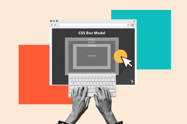
The box model in CSS is a set of rules that determine how your web page is rendered on the internet. In this model, a rectangular box is generated for HTML elements. Each is laid out according to its dimension, type, positioning, relationship to other elements, and external factors like viewport size. This box consists of content, padding, a border, and margin.
Here’s an example that illustrates each layer of the CSS box model. We'll discuss these layers in more depth below.
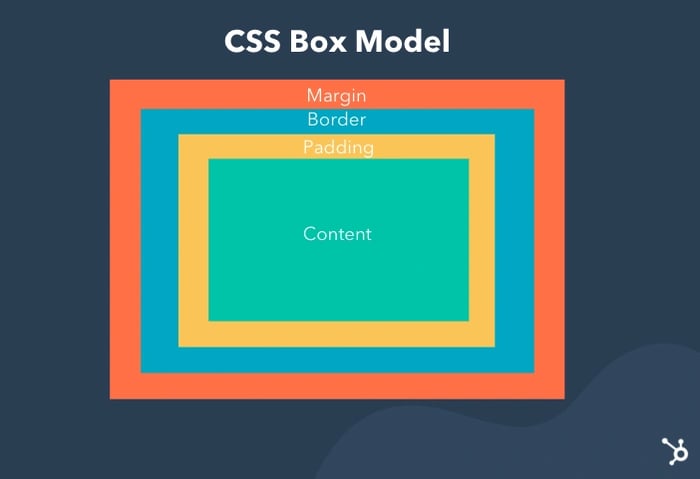
This means any web page you see is made up of elements wrapped in rectangular boxes and arranged in relation to each other. These elements can exist beside, above, below, and within each other, depending on the type of element they are.
There are two types of HTML elements: block-level elements and inline elements. Let's take a closer look at each below.
Block-Level Elements
By default, block-level elements start on a new line and take up 100% of the space available — which might be the full width of the viewport or its container if it’s inside another element. Since they start on a new line by default, block-level elements break the flow of the document.
As mentioned before, block-level elements can contain other elements, including inline elements and other block-level elements. For example, a div element can contain a heading, paragraph, or another div element.
With the padding, border, and margin properties applied to a block-level element, other elements will be forced away from the box around the element. As a result of this — and the fact that they span the full width of their container — block-level elements take up more space than inline elements and can create larger structures.
Of course, the width and height of these elements can be specified in CSS to take up less space.
Block-level elements include the following: <p>, <h1>, <h2>, <h3>, <h4>, <h5>, <h6>, <ol>, <ul>, <pre>, <address>, <blockquote>, <dl>, <div>, <fieldset>, <form>, <hr>, <nonscript>, and <table>.
Inline Elements
By default, inline elements do not begin on a new line or take up the full width of the viewport. Width and height properties do not apply. Unlike block-level elements, inline elements do not break the flow of the document.
Inline elements can contain other inline elements and data but not block-level elements. For example, a paragraph element can contain an emphasis element — but not a heading element.
If the padding, border, and margin properties are applied vertically, other inline boxes will not be forced away from the box around the element. If the padding, border, and margin properties are applied horizontally, other inline elements will be forced away from the box around the element.
Inline level elements include <b>, <big>, <i>, <small>, <tt>, <abbr>, <acronym>, <cite>, <code>, <dfn>, <em>, <kbd>, <strong>, <samp>, and <var> — among others.
Here's a helpful illustration of the key differences between inline and block-level elements.

CSS Box Model Examples
Now, let’s examine the CSS box model in action with these CSS box model examples. Each example focuses on a specific layer of the box, moving from the inside out. We'll start with the content area.
Content Area Example
The innermost rectangle, known as the content area, may contain text or other visual elements.
Its dimensions are content width and content height. When specified, the width and height attributes determine the content edge or perimeter of the content box. Often, the width and height aren't specified, so the rendered content determines the content edge. In other words, the content area is only as wide and tall as it needs to be to hold the content, which might be as little as one word. If the element is a block element, then the content edge can also be set with the min-width, max-width, min-height, and max-height properties.
Let's look at an example of a standard CSS box model.
The height and width attributes are specified in a standard CSS box model. This determines the size of the content area. If the padding, border, and margin properties are also specified, then they must be added to the width and height to calculate the total size of the element.
Say you specify the content width to 400px and add 30px padding, 10px border, and 10px margin. Then the total width of the box is 500. You get that total by adding the content-width, padding-left and padding-right, border-left and border-right, and margin-left and margin-right (400 + 30 + 30 + 10 + 10 + 10 + 10). The total height of the box is 250. You get that by adding the content-height, padding-top and padding-bottom, border-top and border-bottom, and margin-top and margin-bottom (150 + 30 + 30 + 10 + 10 + 10 + 10).
Here's the HTML and CSS:
Here's the result:
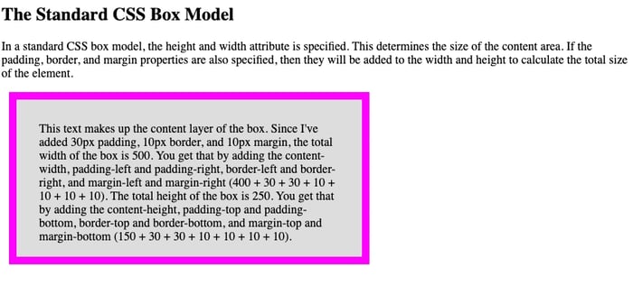
Since adding up the border, padding, and margin to calculate the real size of the box can be time-consuming, you can use the alternative box model. To “turn on” this model, use the box-sizing property and set it to “border-box.” This will tell the browser to render the box (including everything but the margin) to the size you set. We'll use this model in the example below.
Padding Example
Padding is the space between the border and content of an element. Padding is important in web design because it helps make content more visible and readable.
An element's padding can be defined with the following properties: padding-top, padding-bottom, padding-left, padding-right, or the shorthand property padding.
If you'd like to add the same padding on all four sides of the content area, then you can set the shorthand padding property with one value. If you'd like to set different amounts of padding, then you can use the long-form method. Let's use both methods in the example below.
Here's the HTML and CSS:
Here's the result:
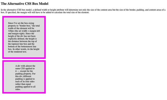
Borders Example
The border property lets us add and style a line around the content padding area. This line's thickness, color, and style can be defined by the border-width, border-color, and border-style properties, or you can use the shorthand border property to define all three. Border-style values include solid, dotted, dashed, double, groove, ridge, and none.
The dimensions of the border area are the border-box width and border-box height. When specified, the width and height attributes determine the perimeter of the border area. If the box-sizing property is set to border-box, you can define the border size with min-width, max-width, min-height, and max-height.
Let's use the max-width and min-height properties in the example below. We'll also use as many properties and values as possible to show the versatility of the border area.
Here's the HTML and CSS:
Here's the result:
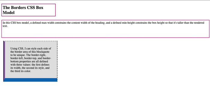
Margins Example
The margin is the empty space separating the element from its neighbors and the outermost layer of the CSS box model. Its dimensions are the margin-box width and the margin-box height.
Its size can be defined by the following properties: the margin-left, margin-right, margin-top, margin-bottom properties, or the shorthand margin property.
If the shorthand property is used, and only one value is defined, it applies to all sides of the element. If two values are defined, the first value represents the top and bottom margins, and the second represents the right and left margins. If three values are defined, the first value represents the top margin, the second represents the left and right, and the fourth represents the bottom margin. If four values are defined, they represent the top, right, bottom, and left, respectively.
Before we dive into an example, you may realize that margins and padding seem similar. In case you get confused about what the right option is for a certain element or layout, consider the following key differences between CSS margin and padding:
- Margin is the space outside the border area, whereas padding is inside the border area.
- Margin backgrounds are always transparent, whereas the background of the padding area of a box is specified by the background property of the element.
- When increased, margins increase the gap between an element and adjacent elements. When increased, padding increases the size of the element.
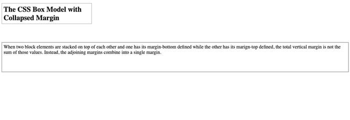
- In CSS, adjoining margins of two or more boxes can combine to form a single "collapsed" margin. While margin areas can collapse vertically, padding areas cannot.
Let's look at an example of a CSS box model with a collapsed margin.
Say a heading and paragraph are stacked on top of each other. The heading has a bottom margin of 60px, and the paragraph has a top margin of 40px. To figure out the vertical margin between the heading and paragraph, you might be tempted to add both margins together for a total margin of 100px. That would look something like this:
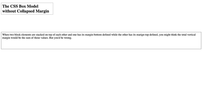
However, the actual vertical margin would only be 60px. Why? Because the two margins collapse vertically. Here's how it would look on the front end:
Using the CSS Box Model for Your Website
The CSS box model is one of the fundamentals of website development. Understanding this model will enable you to better align elements with other elements and create more complex layouts.



![Responsive Text: Making Your Font Look Great on Every Device [+CSS & HTML Tips]](https://knowledge.hubspot.com/hubfs/responsie-text-1-20250206-8138788.webp)

![How to Create Scrolling Text With CSS [+ Code Examples]](https://www.hubspot.com/hubfs/Google%20Drive%20Integration/scrolling%20text%20css.jpeg)


