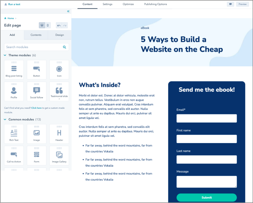
That‘s why I’ve spent the past month analyzing the most successful webinar landing pages across industries. Here are 25 webinar landing page examples that get people to show up. But first, why do webinar landing pages matter at all?
Purpose of Webinar Landing Pages
Webinar landing pages are the same as any other landing page in their ultimate goal: to make a user take a desired action. In this case, the action is registering for a webinar event or getting access to a recorded webinar. Visitors may also need to create an account to view the webinar, in which case the goal of the landing page is to lead them into the account creation process.
Webinar landing pages showcase what your webinar will focus on and the topics you plan to cover. This is also where you put your sign-up form so people can attend the webinar.
For more information, I talked to Kaitlin Milliken, a senior program manager at HubSpot. Before joining our team, Milliken was a multimedia producer for a business-to-business publication. In her role, she hosted over 80 webinars and created the landing page for each.
“I think that your landing page is the most important part of your marketing strategy,” Milliken says. “That’s the link that you’ll plug in every email newsletter, social post, and CTA to drive sign-ups. If someone is even a little interested in your webinar, they’re going to that page.”
Milliken notes that webinar landing pages should clearly explain what attendees will get from coming to the session. She recommends listing out takeaways and any “buzzy” topics covered during the conversation. Beyond that, she recommends noting any guest speakers that you plan on featuring.
“One of the most successful webinars I hosted was a Q&A with Steve Blank, an entrepreneur who’s a huge thought leader in the innovation space. We made his participation super prominent on our landing page, which helped us drive sign-ups,” she notes.
Beyond that, you’ll want to make sure that your page has accurate information about when the webinar will take place, any information on the recording, and a signup form that is properly embedded on the page.
“When I first started working as an intern, I had the wrong sign-up form on a webinar landing page. It was a huge learning lesson. From then on, I tripled checked and tested the form to make sure signups work properly,” Milliken says.
I’ll share more from Milliken later. But first, let’s check out some landing pages that put these tips into action.
25 Webinar Landing Page Examples
1. Airbnb
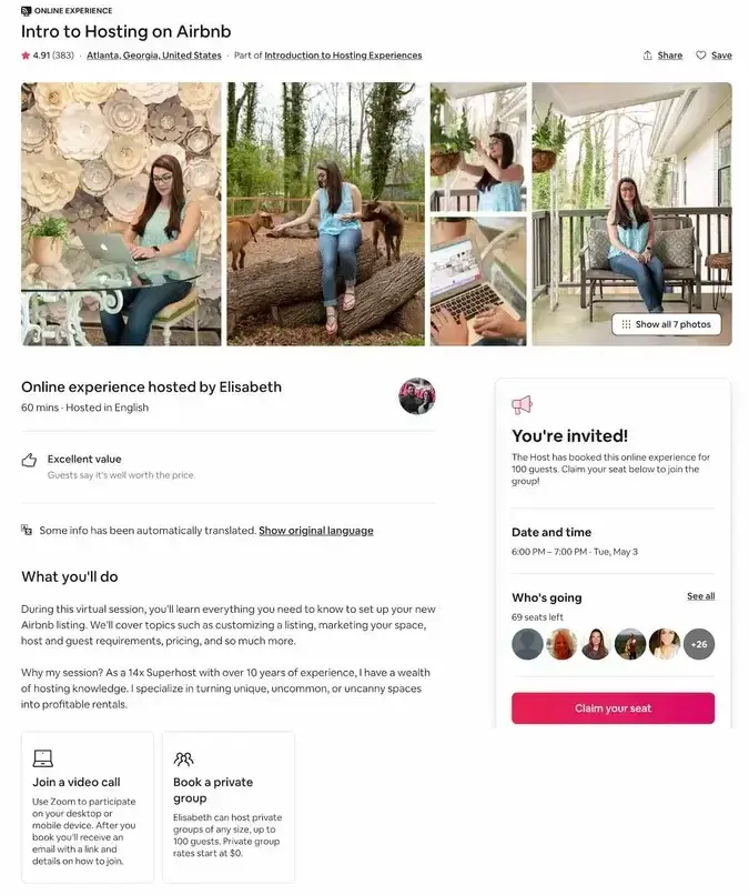
Listing your place on Airbnb sounds easy — until you realize how much actually goes into it. Pricing, photos, guest expectations — one mistake can tank your reviews before you even get started.
That’s why Airbnb offers a free webinar to help new hosts avoid rookie mistakes and set up a listing that attracts bookings from day one.
Why this landing page works
- Human touch: The human element plays a big role in the Airbnb experience. After all, you’re staying in someone else’s home. I love how the webinar positions the host as an experienced and friendly teacher — you’re in good hands.
- Bright CTA: The “Claim your seat” CTA is visible on the side, along with a guest list. The CTA sticks to the screen as you scroll and always stays in view. It’s extremely convenient since the signup option is always visible to me without being intrusive.
2. Slack
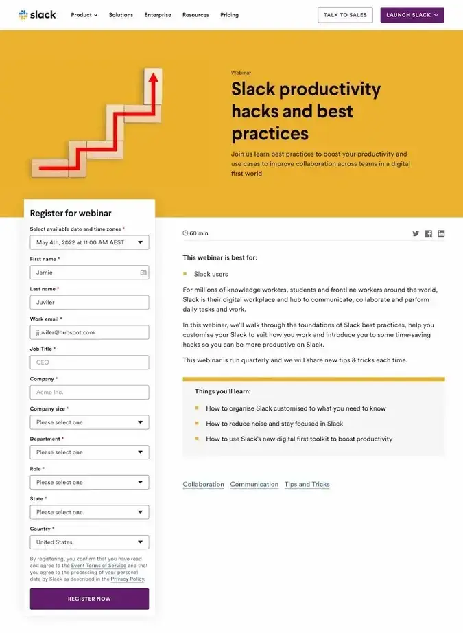
Most Slack users barely scratch the surface of what the platform can do. Channels, workflows, integrations — without the right setup, work still feels chaotic.
Slack’s webinars teach users how to streamline communication, automate tasks, and make the most of new features.
And its webinar landing pages? Designed for one goal: getting users to register in seconds.
Why this landing page works
- Modern design: Just looking at the visuals of the landing page shows me that Slack goes above and beyond what most companies put into their page design patterns. The look is clean and effective, and each page even has its own image that makes it memorable to me.
- To-the-point copy: The copy is refreshingly concise — I appreciate how they get straight to the point about who should attend and what they'll learn.
3. Dock
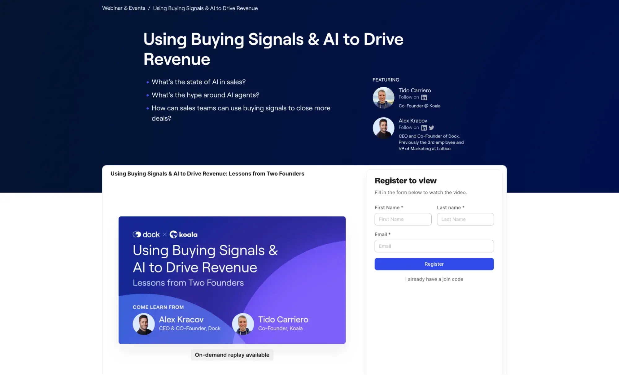
As a B2B sales enablement platform, Dock runs webinars that consistently deliver practical insights for revenue teams rather than surface-level sales advice. Their webinars feature founders and sales leaders who share honest takes about what‘s working (and what isn’t) in modern sales.
Why this landing page works
- Expert credibility: The page establishes immediate authority by featuring two founders with complementary expertise – one in deal rooms (Dock) and one in pipeline generation (Koala). What stands out is how they transparently share their challenges, like Tido's experience transitioning from dev to sales audiences.
- Practical focus: Rather than getting lost in theoretical AI discussions, the content stays grounded in practical applications for revenue teams. The blend of strategic insights (buying signals, AI agents) with tactical applications (business cases, follow-up content) makes this great for sales professionals.
4. Hootsuite
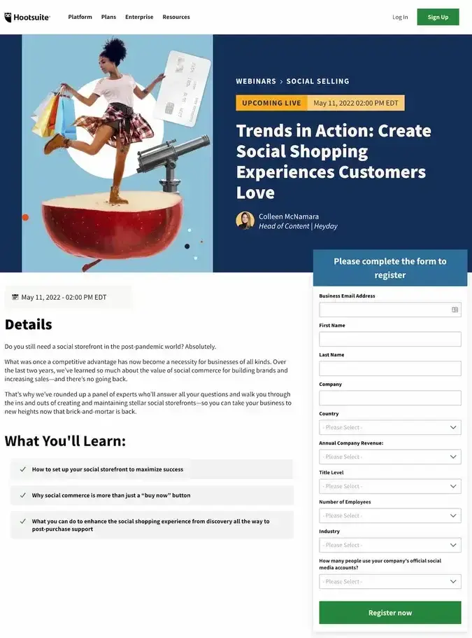
Another leading social media management platform, Hootsuite makes webinars headed by content strategists and aimed at digital marketers, including this one based on content experimentation in 2025.
Why this landing page works
- Urgency: The copy on the page prompts sign-ups by creating urgency: You need to be doing something different in 2025.
- Social proof: I love how they’ve highlighted the hosts’ affiliations with Meta, Canva, and LinkedIn — it instantly boosts the webinar’s credibility.
5. UXPin
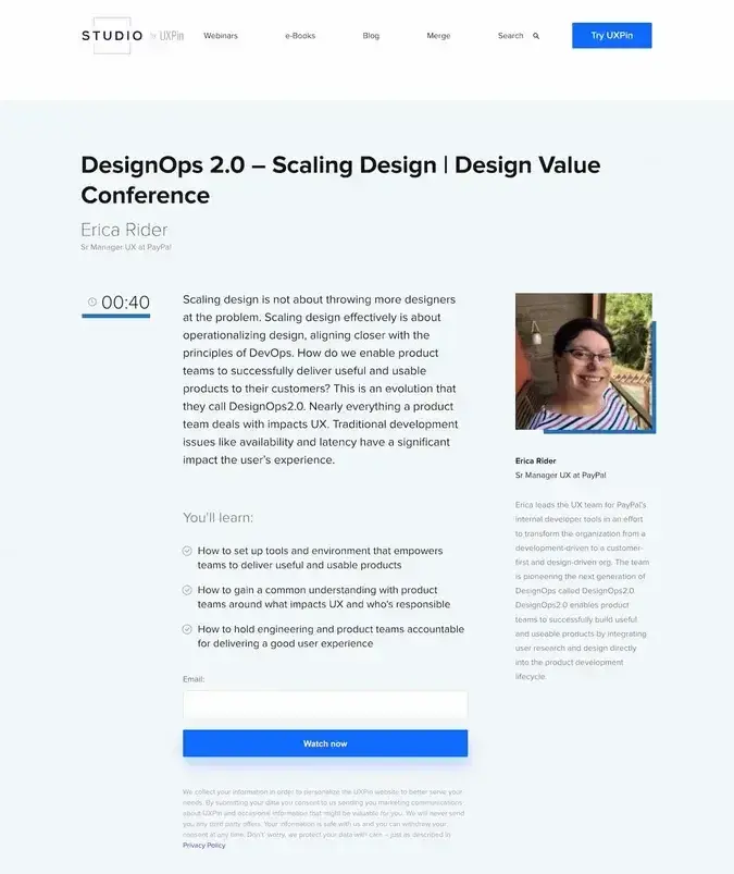
Product design platform UXPin offers educational content through UXPin Studio, which includes recorded webinars on UX strategy, techniques, and best practices.
Why this landing page works
- Clear benefits: To a new reader like me, it’s obvious how valuable this webinar is to them and why they’d want to go with this teacher in particular.
- Minimal info required: I only need to provide my email address to access this webinar, which is the bare minimum of information a landing page can ask for. The goal here is to win users over with great webinar content so they’ll be receptive to promotional email follow-ups.
6. Calendly
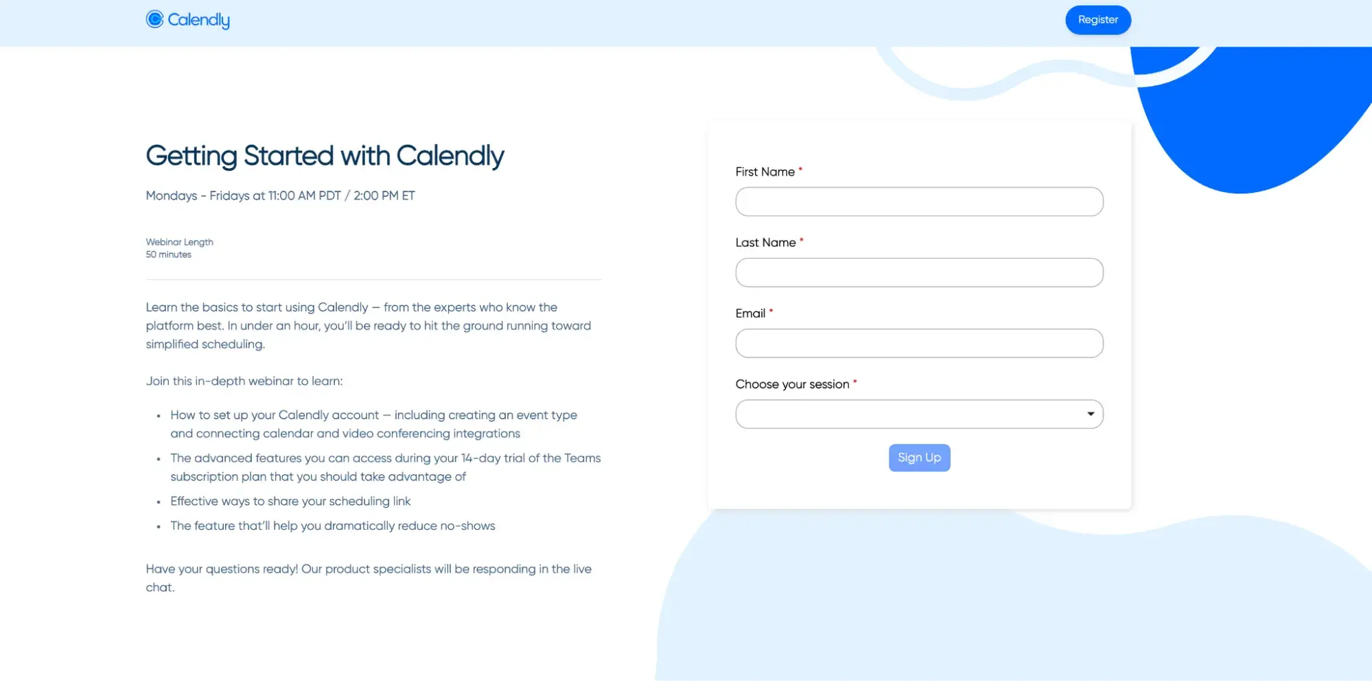
Calendly offers a super-straightforward webinar for new users who want to learn how to make the most of their Calendly accounts.
Why this landing page works
- Short and simple: I love how Calendly’s page doesn’t overwhelm me with information. It provides need-to-know info and a short signup form while keeping everything visually cohesive and on-brand.
- Multiple CTAs: Besides the signup form, the landing page also promotes Calendly’s software to capture any potential visitors ready to talk to sales.
7. WordPress
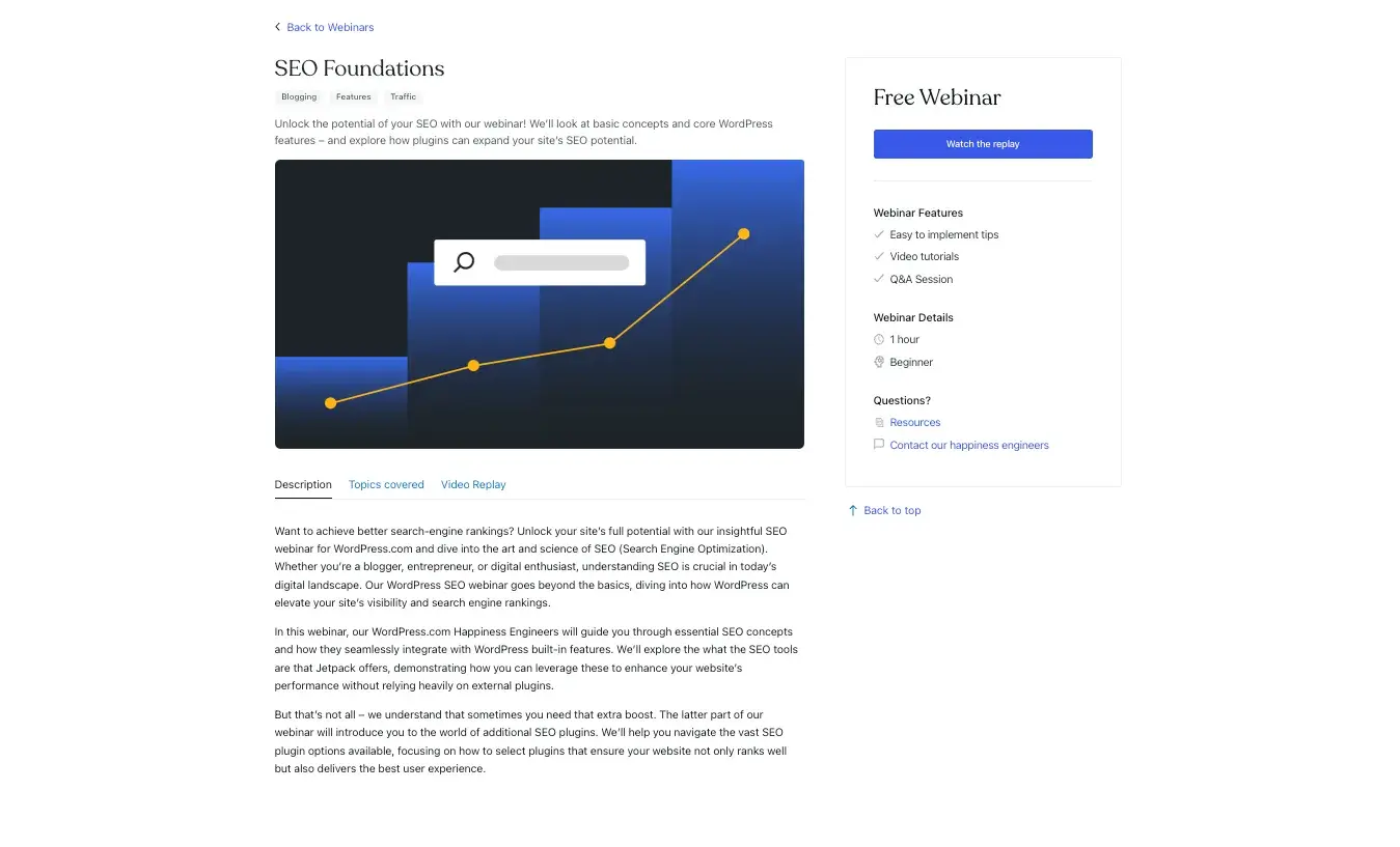
WordPress has basic webinars available to get started with SEO. Its landing page aims to appeal to WordPress beginners. It also captures long-tail question keywords with the topics covered.
Why this landing page works
- Consolidated information: This landing page contains more content than the average landing page but limits its length by putting some text inside switchable modules in the middle. This way, I don’t get overwhelmed by the information and can pick and choose what I want to know.
- Webinar details: WordPress highlights the webinar’s length as well as how it’s a beginner-friendly webinar, leaving little room for confusion on the specifics.
8. BrightEdge
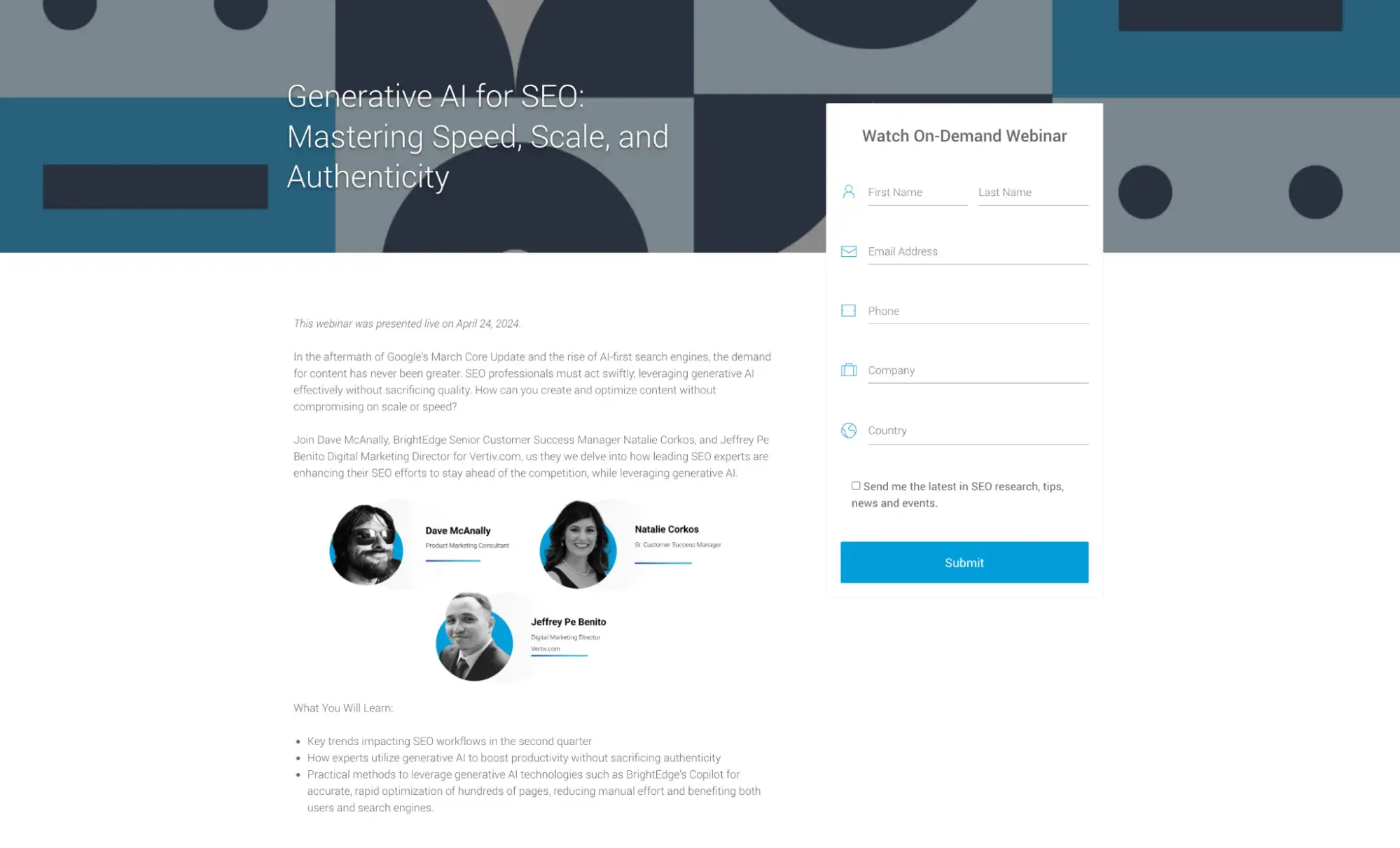
BrightEdge is another platform that offers short webinar classes as a supplementary resource. As an SEO tool, BrightEdge offers on-demand webinars where its experts share insights — available to anyone willing to provide an email address.
Why this landing page works
- Friendly faces: It’s a good idea to include high-quality headshots of your speakers (along with their roles and company). It builds extra trust with me and I know exactly who I’ll be hearing from.
- Immediacy: This landing page stresses that the course can be viewed immediately, on-demand. The “Watch Now” CTAs encourage visitors to complete the form and start learning immediately.
9. Notion
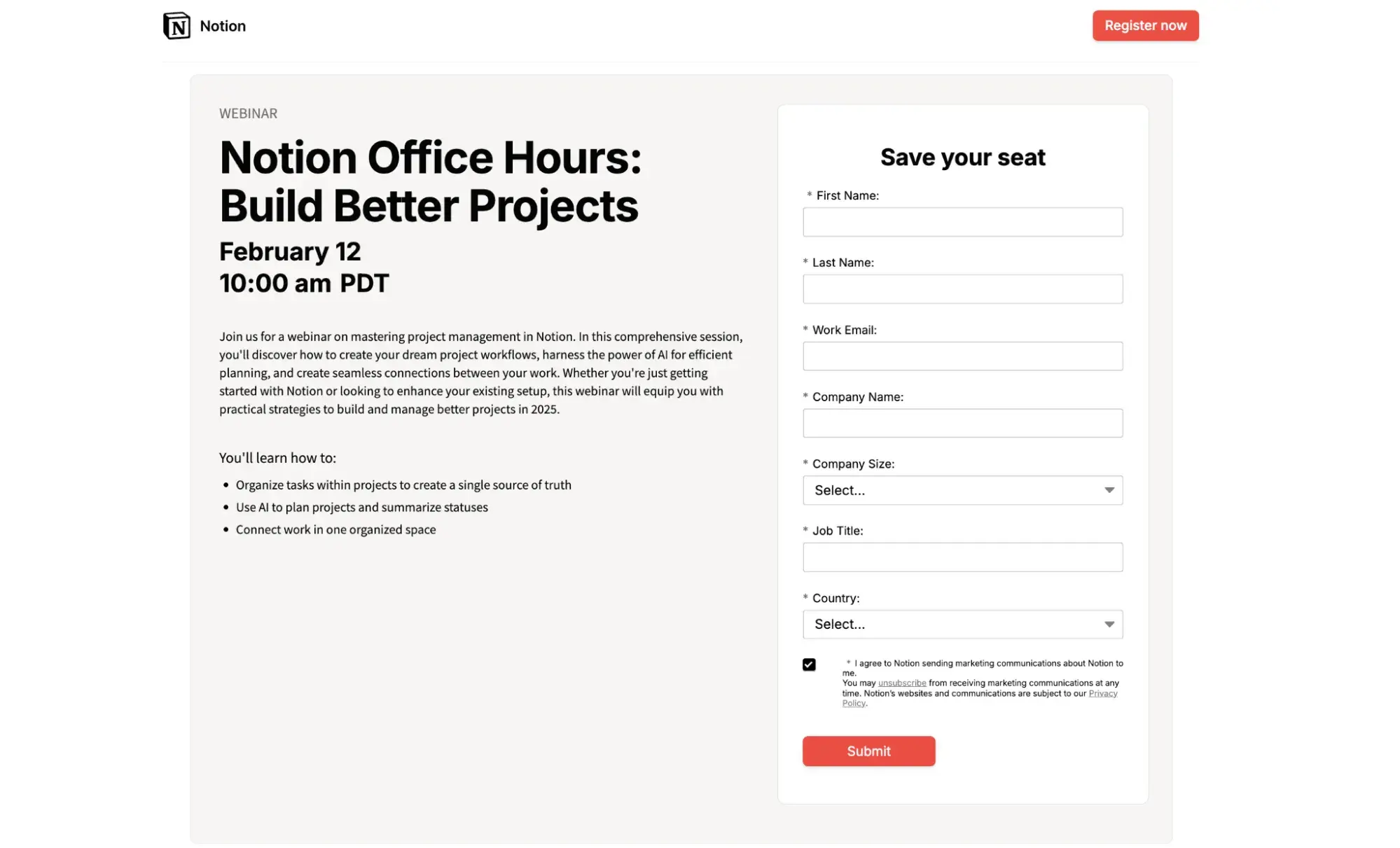
Notion, a productivity and project management tool, holds office hours to help users master a project management system. It’s clean and simple and makes the value prop easy to sign up.
Why this landing page works
- Simplicity: I love how Notion stripped away everything except what potential attendees truly need to know. Their clear presentation of the value proposition (“create your dream project workflows”) directly addresses a pain point I often see in project management.
- Technical without overwhelm: What impresses me most is how they‘ve communicated the webinar’s comprehensive nature while keeping the bullet points specific and actionable.
10. Shopify
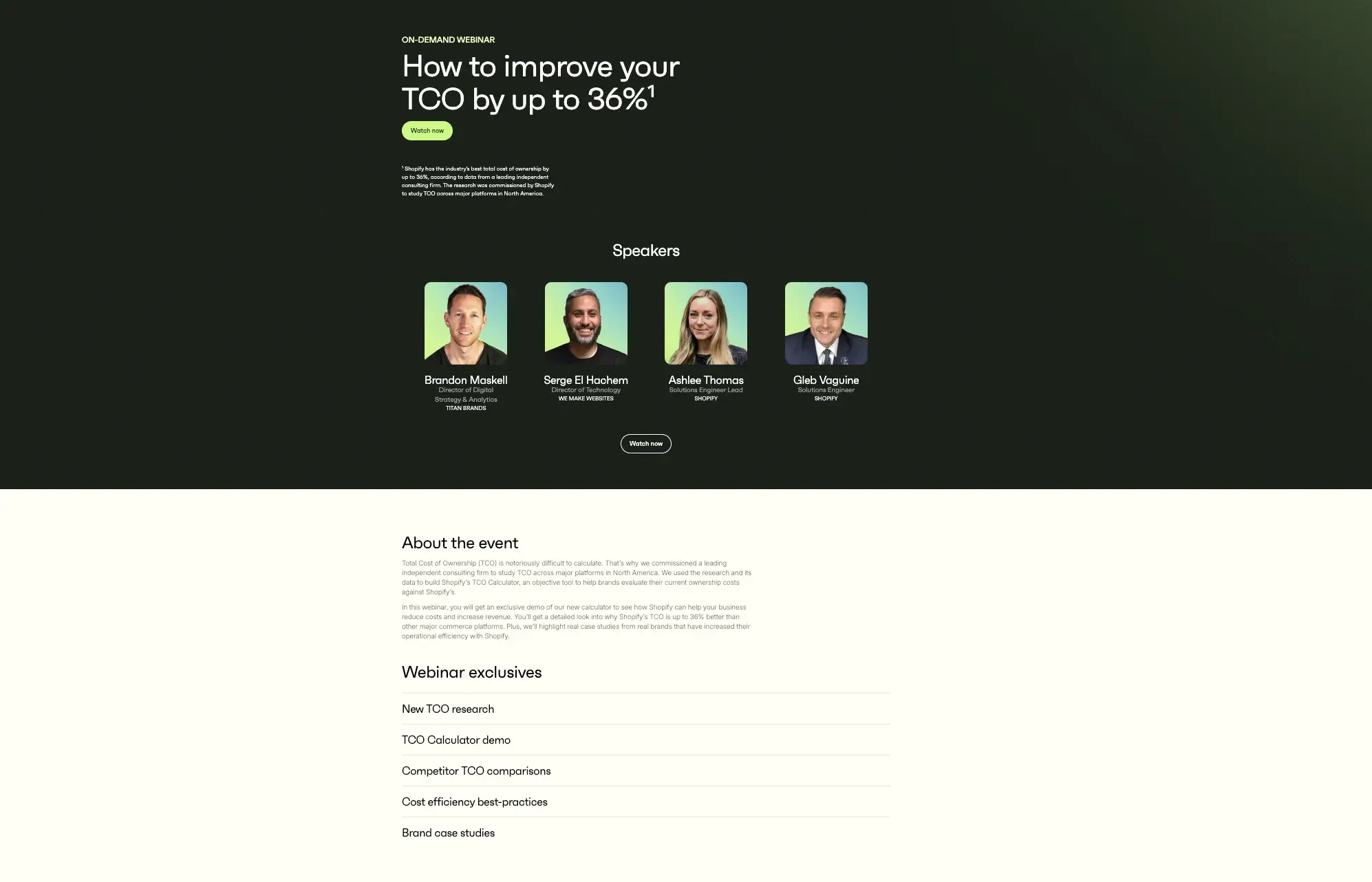
Shopify's webinars consistently focus on the practical aspects of running an ecommerce business, bringing together their own platform experts with successful merchants and agency partners. Their focus on quantifiable results sets these sessions apart — they regularly share specific metrics and improvements their merchants have achieved.
Why this landing page works
- Clear value proposition: I appreciate how they‘ve structured the "Webinar exclusives" section as distinct, concrete deliverables – from the TCO Calculator demo to competitor comparisons. Each item promises a specific tool or insight you’ll walk away with.
- Visual hierarchy: Looking at the design, the dark emerald background with gradient speaker cards creates a premium feel that matches the sophisticated nature of the content. The “Watch now” CTA buttons stand out effectively against this backdrop without feeling aggressive.
11. Sprout Social
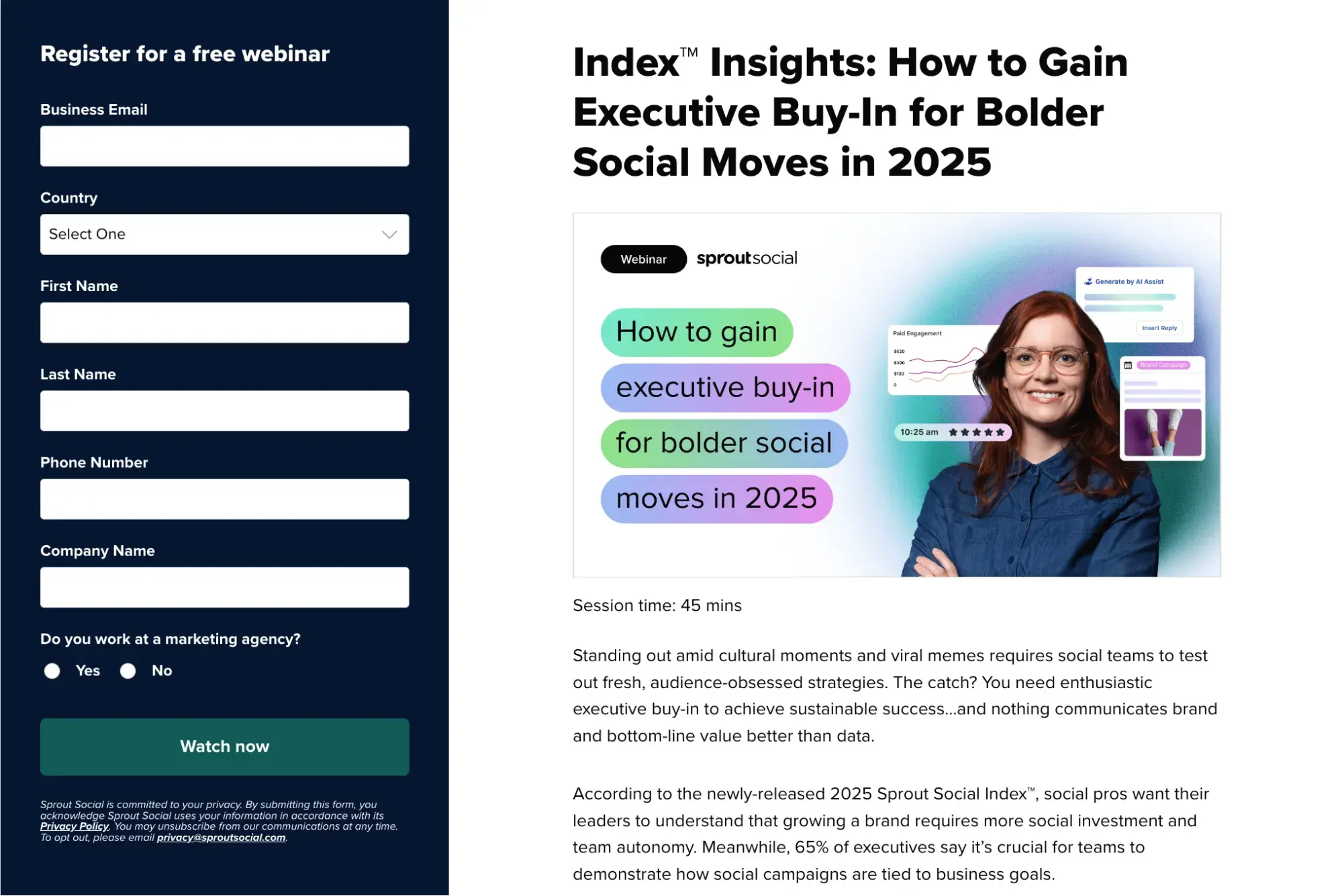
If you’re looking to grow your social media presence, Sprout Social hosts a couple dozen webinars on the topic. Each webinar landing page gets straight to the point with a clear value proposition and prominent form.
Why this landing page works
- Short form: Design forms that ask visitors for only what you need. This way, filling out the forms is less work and users feel like they don’t need to give as much away for access to your content.
- Above-the-fold content: Everything users need to know about the event and sign up fits on the page without the need to scroll. The less work users need to do, the better.
12. Google Digital Garage
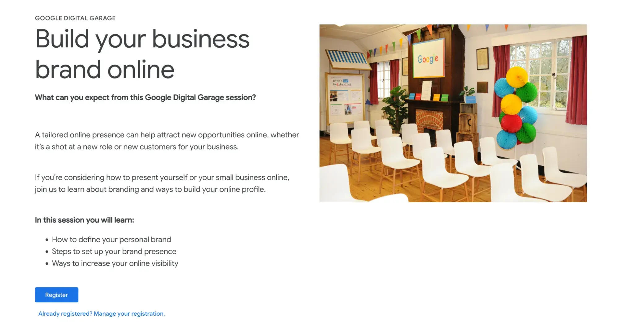
Google Digital Garage is a nonprofit learning platform that helps professionals stay ahead with free webinars, courses, and certifications. Whether it’s digital marketing, data analytics, or AI, these expert-led sessions help businesses grow.
Why this landing page works
- Careful CTA language: Before users can actually sign up for the course, they first need to create an account. However, the CTA doesn’t reveal this – when clicked, I’m directed to make an account if I’m not already signed in. This makes users more likely to commit to making an account than had the CTA said “Create an account” or something similar.
- Minimal information: Most landing pages on the Google Digital Garage website are pretty simple and don’t contain much text. This is consistent with Google’s minimal presentation across its other services. It also helps the webinar seem more beginner-friendly and low-commitment.
13. INBOUND
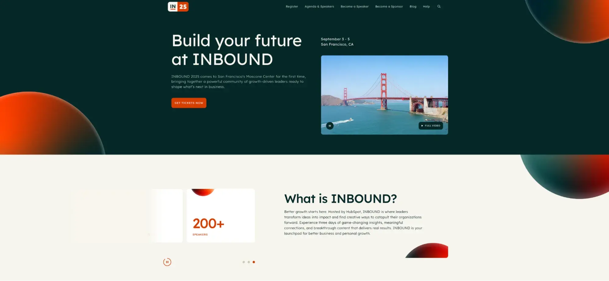
Every year, INBOUND brings thousands of digital marketer, salespeople, and success specialists together worldwide to learn from the best in their industry. For the past several years, INBOUND has transitioned to an online experience with dozens of webinar sessions throughout the week.
Why this landing page works
- Visual impact: We’ve played with a bold interplay of colors and abstract shapes against the clean white space. Including San Francisco's iconic Golden Gate Bridge creates an immediate sense of place while maintaining our signature design aesthetic.
- Strategic navigation: We’ve organized the top menu to serve different audience needs – from potential attendees to speakers and sponsors – without cluttering the main message.
- Dynamic content mix: The page combines key event details (dates, location) with aspirational messaging (“Build your future”) and social proof (200+ speakers). This layered approach helps our visitors quickly understand both the practical and inspirational value of attending.
14. Canva
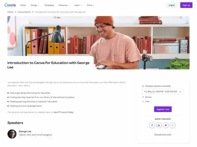
Like other platforms featured on this list, Canva hosts webinar sessions to help you use it. Some webinars also tackle bigger topics like social media marketing and design thinking.
Why this landing page works
- Vibrant colors: I love the photos that Canva uses for its webinar landing pages. Cleary, a lot of thought was put into this seemingly minor detail to make the webinar feel more approachable.
- Sessions dropdown: This particular webinar is offered multiple times, and Canva lets you sign up for any of them on one page instead of visiting five different landing pages for five different session times. (Yes, I’ve seen this before and no, it’s not a good idea.)
15. Interaction Design Foundation
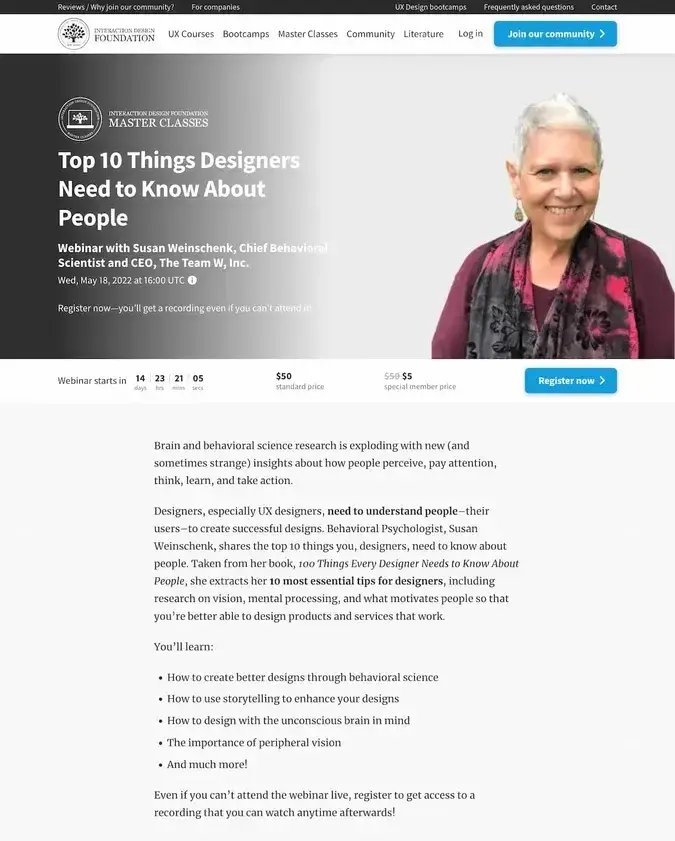
The Interaction Design Foundation is packed with resources for UX and UI designers, from masterclasses to bootcamps, all led by industry experts. Whether you’re leveling up or just starting out, this is where designers go to grow.
Why this landing page works
- Pricing discount: While it’s a paid webinar, I like how they’ve highlighted how the price goes down from $50 to $5 for special members. This way, they’re selling the webinar and the memberships together.
- Clean, balanced design: Compositionally, the page presents the most important information first, then follows up with a description without it seeming like an afterthought. They give elements plenty of space to prevent the page from looking cluttered.
16. Pew Research Center
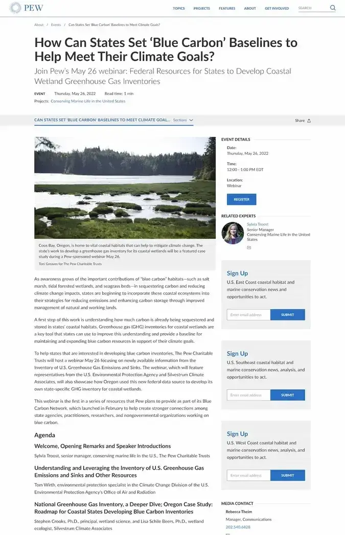
As a leading nonpartisan research center, Pew studies the sociological and demographic shifts shaping our world. And through its webinars, it breaks down the latest findings, helping policymakers, businesses, and curious minds make informed decisions.
Why this landing page works
- Knowing its audience: Pew knows that its readers want to know more about the event in question than your typical landing page viewer. I love how this landing page goes considerably more in-depth than your typical landing page.
- Responsive design: Every landing page should be responsive, but I’ll give props to this one for being dense but still mobile-friendly when viewed on a smaller screen.
17. Sequel.io
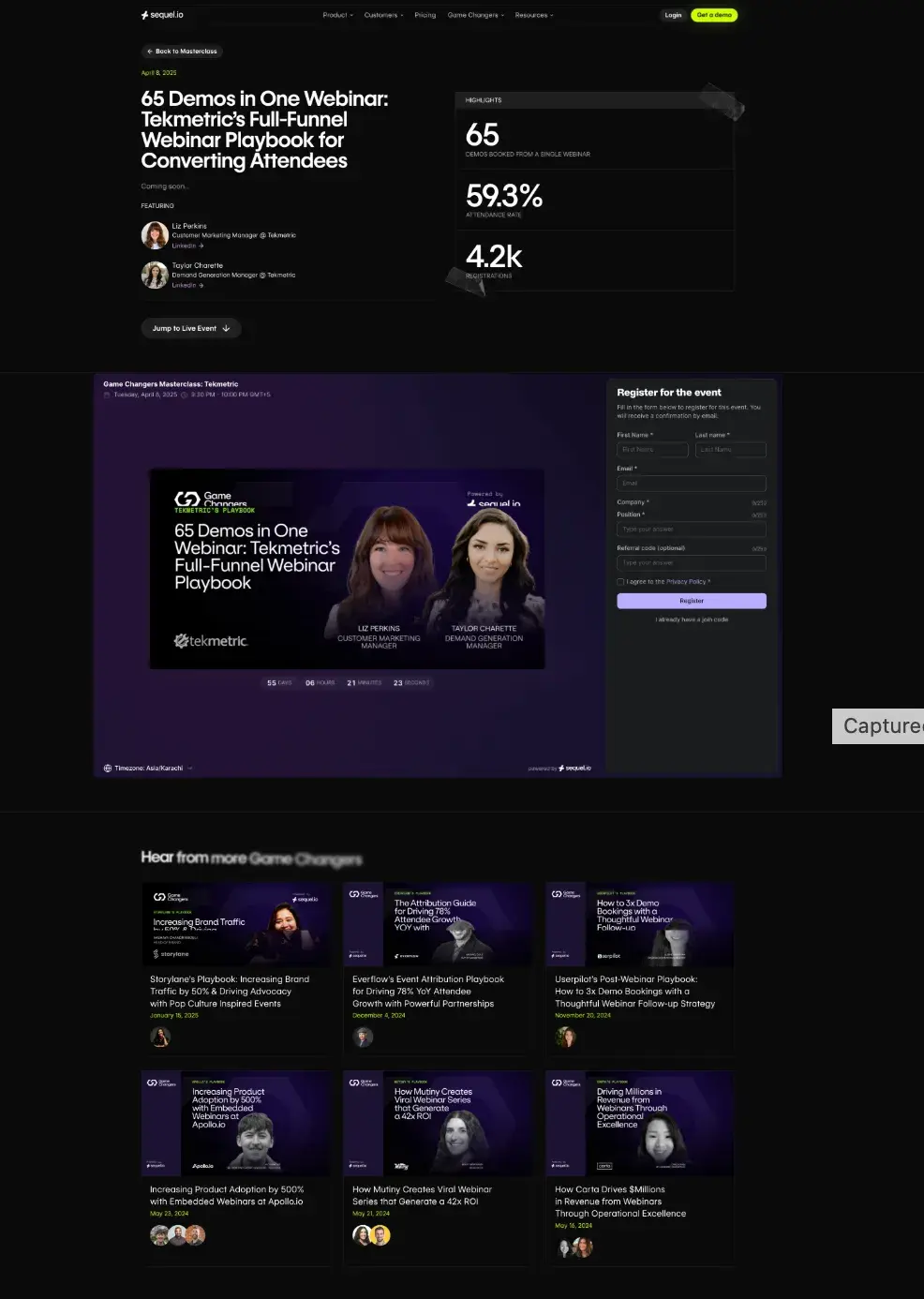
As a webinar platform provider, Sequel approaches its event landing pages with a deep understanding of conversion principles. Their “Game Changers” series particularly stands out to me for how it transforms detailed case studies into compelling event previews.
Why this landing page works
- Social proof hierarchy: The design cleverly stacks different types of proof — from the headline metrics to speaker credentials to related webinar recordings below.
- Content ecosystem: What impresses me most is how they showcase related webinar recordings below the main event. It shows the ongoing value of their content while giving potential registrants confidence in the quality they can expect.
18. Mailchimp
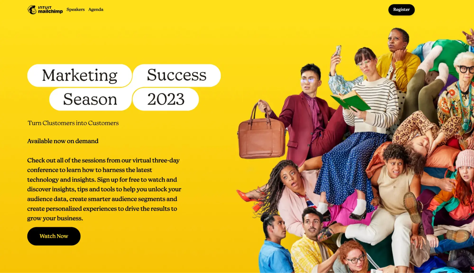
Mailchimp converts potentially dry marketing topics into vibrant, engaging experiences. Looking at their landing pages, I'm consistently impressed by how they balance their playful brand identity with serious business value.
Why this landing page works
- Bold visual identity: The high-energy hero image against the signature Mailchimp yellow immediately captures attention. What I find clever is how the diverse, dynamic group photo reinforces their message about connecting with different customer segments.
- Speaker presentation: The keynote section does something smart — it mixes leadership (their CEO), external expertise (a trend curator), and industry authority (an e-commerce expert) to create a well-rounded value proposition. Each speaker's contribution is clearly defined without overwhelming detail.
19. Gartner
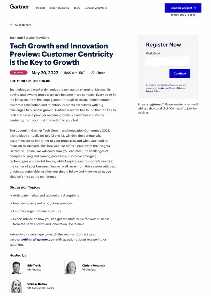
Tech consulting firm Gartner has insights into the industry that it knows are valuable, and webinars are one way it shares the knowledge. Judging from just how many webinars the company hosts every month, it’s clear the marketing team has landing page design down to a science.
Why this landing page works
- Segmented signup: To get started with signup, you first provide your email address. Clicking “Continue” reveals the rest of the form, which you’ll be more motivated to fill out now that you’ve provided an email address. It’s a classic “foot-in-the-door” tactic.
- Progress bar: The form also shows a progress bar encouraging visitors to complete the entire form. Of course, I think it would be simpler to just feature a shorter form to generate more signups, but these tricks are the next best thing.
20. Adobe
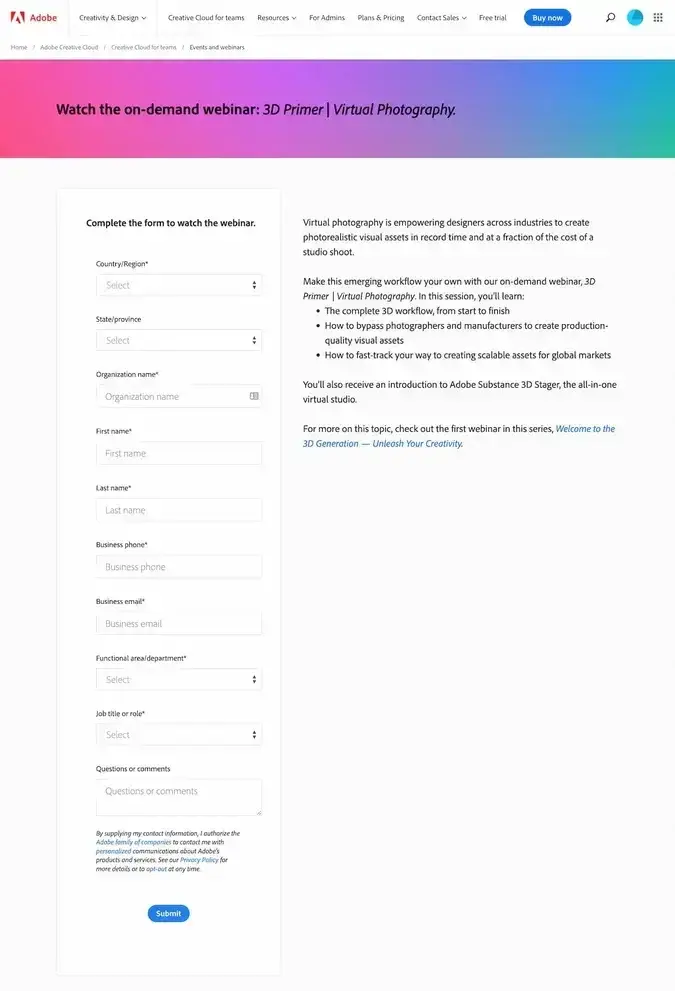
Adobe’s live and on-demand webinars cover everything from design trends to advanced tool techniques, built for visual creatives who want to sharpen their skills. Each session comes with its own registration page, making it easy to jump in and start learning.
Why this landing page works
- Form is the focus: This form is relatively long, so the page makes it the main focus and doesn’t waste time with a lengthy description of the event.
- Link to another webinar: Usually we don’t want to send people away from the landing page before they click submit, but here’s an exception – if there’s a prerequisite that viewers should see first. Here, the landing page non-intrusively links out to a separate webinar in the body copy.
21. The New York Times
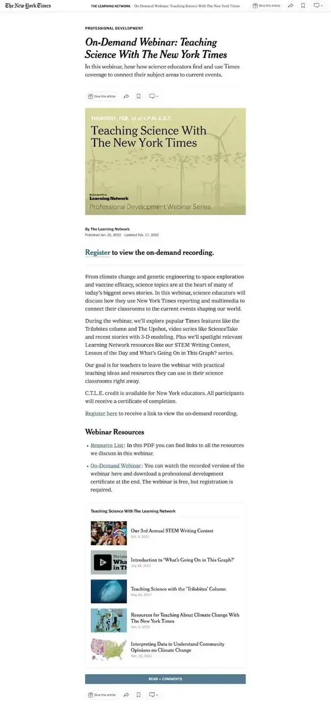
The New York Times Learning Network offers resources designed for teachers — including on-demand webinars that turn current events, opinion writing, and media literacy into engaging lessons for students.
Why this landing page works
- Consistent aesthetic: I love how the webinar landing page looks like other pages on the website, like a news article itself.
- On-brand CTAs: It would probably go against the Times’s style rules to put a big red CTA button at the top of the article. On news sites like this one, that could be viewed as distasteful. Instead, the registration form is linked in the copy, but still prominent enough for me to spot.
22. Forrester
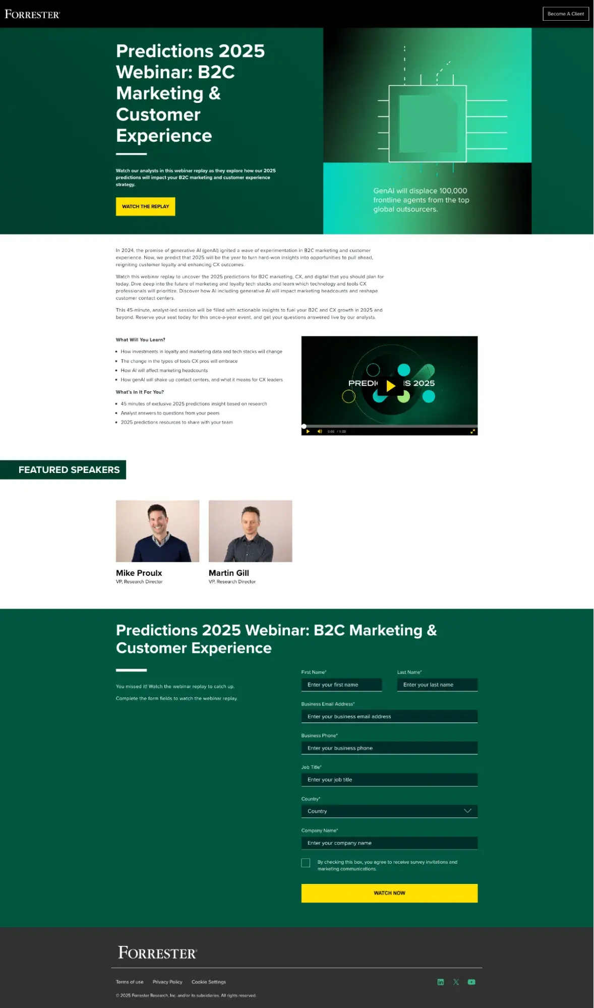
Forrester's webinars consistently deliver research-backed insights with precise data and expert analysis. Their sessions are methodically structured around their latest research findings, always connecting high-level trends to specific business implications.
Why this landing page works
- Clear structure: The “What Will You Learn?” and “What's In It For You?” sections efficiently break down the session contents. I appreciate how they specify the exact length (45 minutes) and deliverables (2025 predictions resources), respecting attendees' time.
- Strategic form placement: Looking at the registration form, they‘ve thoughtfully placed it below the value proposition and speaker credentials. This gives potential attendees enough context to commit before asking for their information – a detail that shows they understand their audience’s decision-making process.
23. LinkedIn Learning
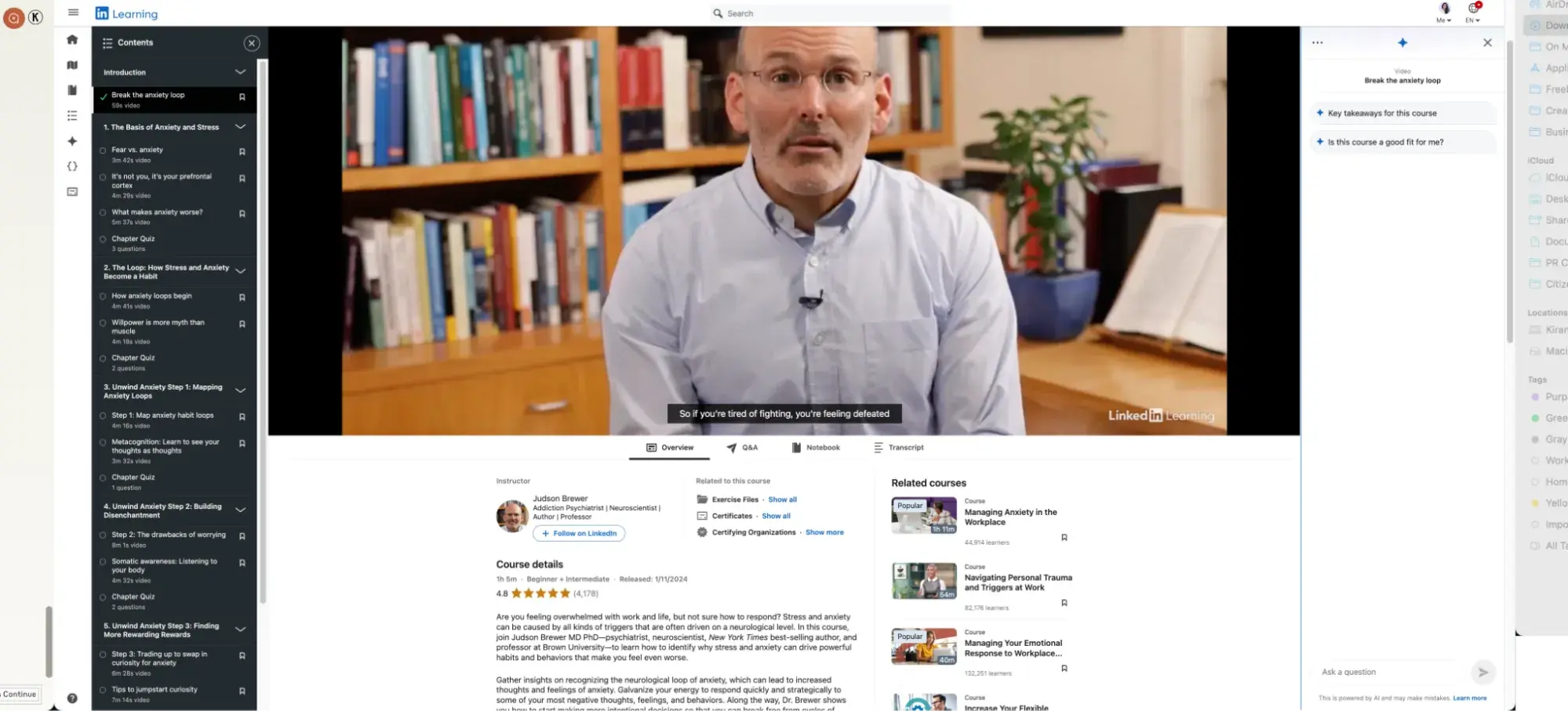
Linkedin Learning’s vast network of professional development courses is one of the best educational resources today. Each course page has a lot of information to convey, but manages to pull everything together cohesively.
Why this landing page works
- Social proof: Right below the course title is the course rating and number of learners. Social proof can be a powerful means to sway visitors, especially if the signup process is more demanding (e.g., creating an account on a website vs. just providing an email).
- Clear benefits: Not only do I get knowledge from the course – that’s implied – but I also get a shareable certificate, which could make the difference between someone signing up or heading elsewhere.
24. DesignerUp
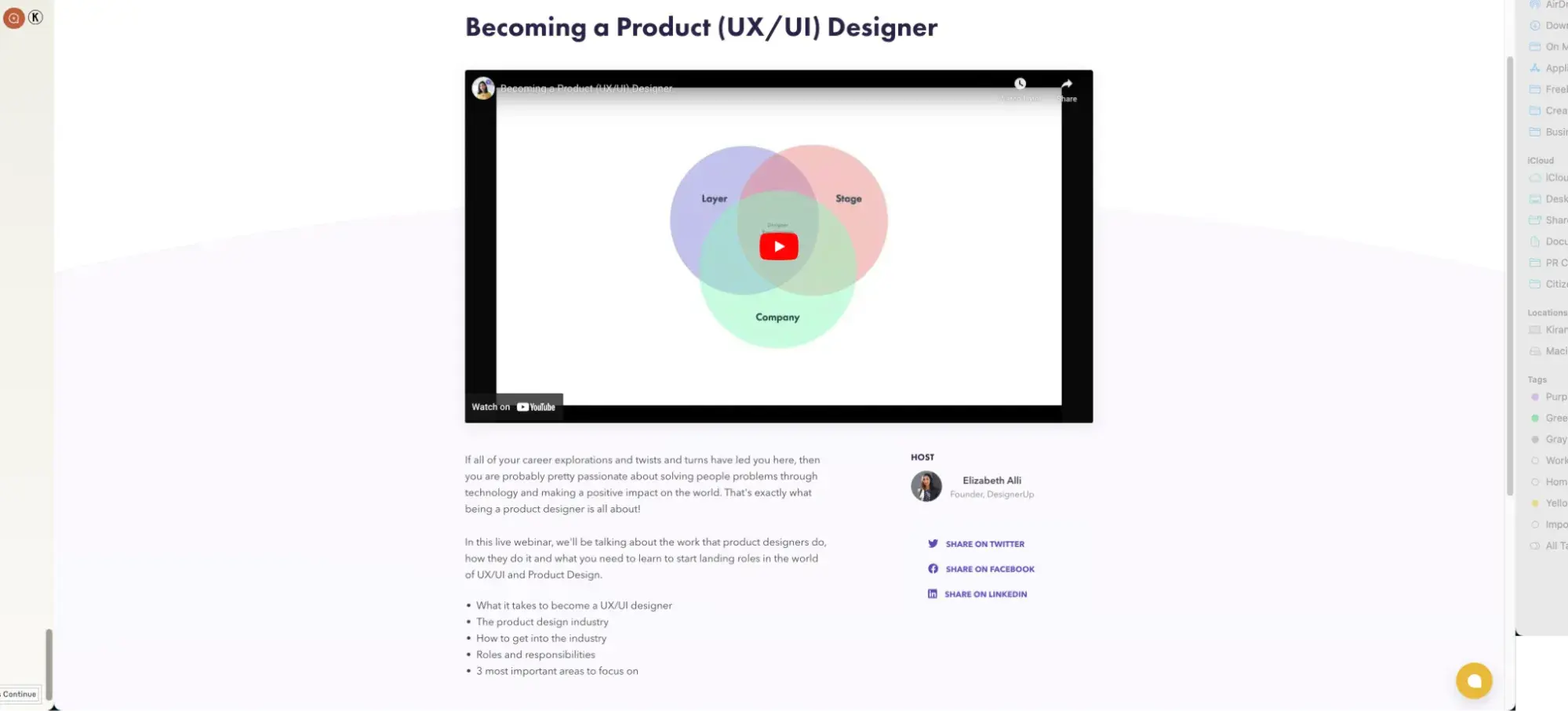
DesignerUp helps you make a career transition into the design world. Though its primary focus is its courses, the site offers some free webinars to get you started.
Why this landing page works
- Above-the-fold content: The page is arranged so the webinar title and signup form are always above the fold. Any additional info is relegated to the bottom of the page. Since this landing page targets new visitors and is marketing a low-commitment offer, this works well.
25. Sandler
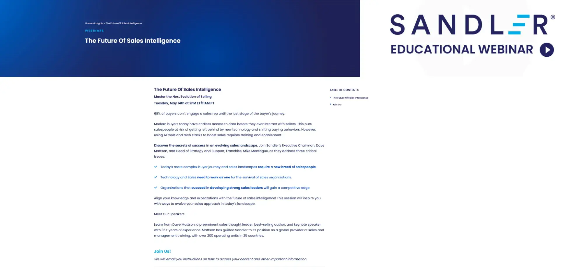
Sandler's webinars focus on practical sales training and methodology, consistently bridging the gap between traditional sales techniques and modern buying behaviors. Their sessions stand out for their emphasis on actionable frameworks that sales teams can implement immediately.
Why this landing page works
- Clear structure: The three-point format they use to outline key issues is particularly effective. Each point builds on the previous one, creating a logical flow from problem to solution.
- Speaker credibility: I appreciate how they highlight speaker expertise without overwhelming the page — focusing on relevant experience (35+ years) and concrete achievements (growing to 200 operating units) rather than lengthy bios.
Webinar Landing Page Design Tips
In many ways, building a webinar landing page is like building any other type of landing page, and the same best practices apply. However, webinar pages have their own quirks that you should know about.
Craft a headline that converts.
The title of your webinar is the most important part of the page besides your CTA and form. It not only tells visitors what the webinar is about but can also convince them to watch in the first place.
Make your headline simple but attention-grabbing, something that people will actually want to invest their valuable time in watching. A title shouldn’t be packed with jargon that the average visitor wouldn’t understand — make it approachable to anyone, including beginners to the topic.
Milliken recommends featuring any special guests, timely topics, or “secret-sauce” guides that will be shared during the webinar.
“I noticed that evergreen topics could drive sign-ups, but headlines that felt particularly timely had more engagement, especially from our repeat viewers,” she said.
Make it look good.
Yes, I know, what “looks good” varies from person to person. But, if you have brand style guidelines, carry those onto your webinar landing pages. Oftentimes website owners get lazy on event registration pages in lieu of other, seemingly more important pages. But don't slack off here if you want these pages to convert better.
“Make sure that your webinar pages look like the rest of your site, following the same brand guidelines. There are lots of webinars out there. You want to make sure attendees know who you are and your brand, even if they’ve never heard of you before this webinar,” Milliken says.
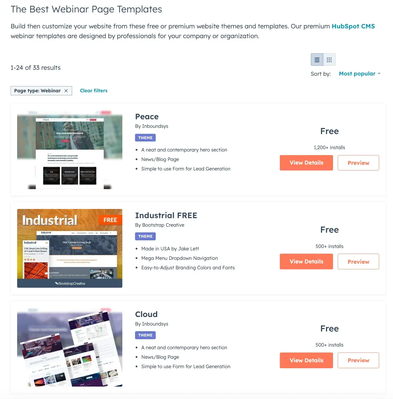
HubSpot’s Template Marketplace is stacked with plenty of designs that balance aesthetics with user-friendliness. If you’re looking to cut down on design work and want to save time, it’s the perfect place to start.
Simplify.
Good landing page design (and web design in general) is all about removing obstacles to the conversion. This means tossing out anything that visitors don’t need, like links to other pages, extraneous details, and overly long forms. Your landing page accomplishes exactly one thing: convert. It shouldn’t have to do it all.
“When I built landing pages, I kept text short and tried to make every word impactful. I almost always used bullet points and bolded text to keep visitors’ attention,” Milliken says. “Shorter is better. Clean formatting is better. Think about impact before length and complexity.”
Place eye-catching CTAs.
Guiding visitors to your CTA is the whole point of the landing page, so it should be plainly visible. If users must fill out a form, make that stand out from the rest of the content. Buttons should be bright and clear, and their text should concisely state what the user is doing by clicking. If you need more tips, check out these CTA examples we love.
Also, consider placing multiple CTAs (or one sticky CTA) throughout the page — including one above the fold — so there’s always somewhere for the visitor to click as they scroll.
Pro tip: If you're using HubSpot's free CMS, the CTA tool allows you to make and test CTA buttons, pop-ups, and sticky CTAs. You can also view your clicks and conversions to optimize their performance.
Don’t forget the time and date.
“Double and triple-check calendar information. Make sure you have the timezone correct and clearly stated. Don’t make the same mistake I made as an intern and flub up this important information,” Milliken says.
Live webinars are events, which means your landing page should list the event date and time. You don’t have to explain where users can access the webinar on the landing page, but make sure it’s clear in your confirmation email what link they need to click at that time.
A/B test your designs.
Landing pages can always be optimized with consistent A/B testing. Never go off your own assumptions. Instead, tweak everything you can and see what results in more conversions. Colors, CTA text, CTA placement, font and text size, and amount of body copy are just a handful of things you can test.
Once you know something works, take note for next time. You can then stack these impactful changes that drive conversions.
Add engaging visuals.
Whether it’s a headshot of your webinar speaker or a playful illustration, images make your landing page more engaging and prevent them from becoming walls of text. Images featuring people can show how your visitors feel during or after watching your webinar (ideally, it’s happy).
While images can help engage visitors, avoid too many images or images that distract from relevant information. “A limited number of images can really draw in the eye,” Milliken says. “Too many different colors and fonts or total images only clutter your page.”
Make it mobile-friendly.
Over 60% of all global web traffic comes from mobile devices, and your site’s traffic share might look similar. Every page on your site should utilize a responsive design that adapts to any sized screen, but landing pages are especially important since they’re often a visitor’s first experience on your site. If your page isn’t mobile-optimized, you’re turning away a huge chunk of potential leads.
For more tips on landing page design, check out our video guide to effective landing pages:
Win visitors over with a webinar.
After attending hundreds of webinars and analyzing these landing page examples, I've learned that success comes down to building trust and delivering clear value. Your landing page creates that crucial first impression — one that convinces people not just to register but to attend and engage.
Every webinar you run can benefit from a well-crafted landing page. Doing so will help ensure more users sign up for your offer and then come back for more.
Editor's note: This post was originally published in May 2022 and has been updated for comprehensiveness.
Landing Page Design


