
Marketers use web forms for a number of reasons: completing orders, collecting lead information, personalizing recommendations through surveys, and more. But what makes one web form effective and another uninspired?
In this article, I’m going to show you how to make a web form, best practices for creating powerful forms, and tools that can make the process faster.
What are web forms?
A web form (or HTML form) is a place where users enter data or personal information that’s then sent to a server for processing. For example, users can share their name and email address to sign up for a newsletter or place an order.
When it comes to web forms, design and UX matters. HubSpot research found that 28% of marketers say the right form fields help improve lead scoring, which means more qualified leads.
According to Venture Harbor, a well-designed multi-step form converted 53% of site visitors to leads.
Web forms vary in length, format, content type, and appearance — there’s no “one size fits all.” In my experience, they should simply fit your business’s needs and help you gather the information you want from your leads.
This also means there’s no single way to create a web form.
So, let’s get into it and review several forms to see what might work for you. I’ve also rounded up some tools below to help you create web forms.
First, let’s dive into why you should create web forms.
HubSpot's Free Online Form Builder
Generate leads from your website using a powerful online form builder.
- Customer Surveys
- Lead Capture
- Event Registration
- And More!
Why should I create web forms?
Web forms allow you to collect and manage information easily and efficiently. They’re embedded right into your website, which makes it easy for your leads to share their information.
Once a lead completes a form on your website, their information is stored until it’s ready for analysis. Web forms are crucial tools for businesses to obtain the information they need from their potential customers.
Use Cases for Web Forms
I’ve found there are several ways that you can use web forms, such as:
- Collecting contact information.
- Gathering shipping information.
- Surveying your customers.
- Providing a way for leads to contact you.
- Offering ecommerce checkout.
Web forms can help you get the information you need from your leads so you can analyze or manage it as needed.
I’ll talk about the various types of web forms below, which will give you a better idea of specific use cases and which forms fit best in certain instances.
How To Make a Web Form
- Make the purpose of your form clear.
- Choose your web form type.
- Add your form fields.
- Embed your web form on your website.
- Make your web form secure.
- Test your web form and analyze your results.
Let’s discuss how to build a web form. As you follow the steps below, I encourage you to think about what information you really need from your leads.
If your web form doesn’t make sense to your leads — if it’s complicated or asks for too much information — potential leads may lose interest and leave your site.
Consider how much the offer at the end of the form is worth and adjust your web form accordingly.
Creating a web form starts with determining its purpose.
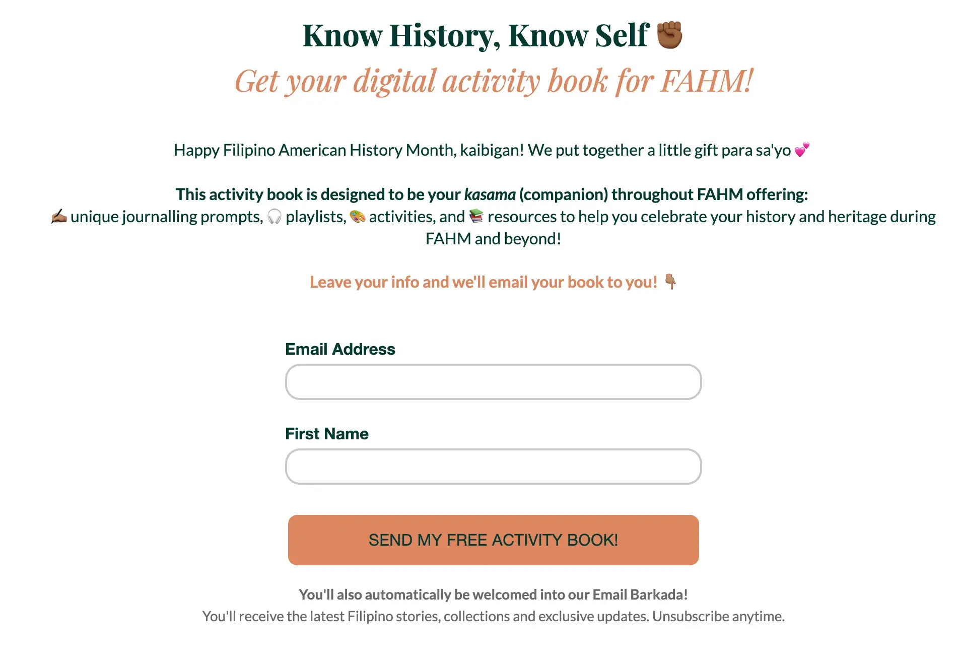
Download HubSpot’s free ebook guide to web forms.
1. Make the purpose of your form clear.
It’s crucial to make the purpose of your web form clear. Your leads should know exactly what your web form is for and why they are completing it.
Here are a few ways to do this.
Include straightforward headers.
Straightforward headers let your leads know exactly how to complete your form. Headers help avoid confusion which speeds up the form-filling process.
Examples of straightforward headers include:
- “Contact Us”
- “First Name”
- “Preferred Method of Contact”
Give clear instructions.
Clearly communicate what you need from your leads using the fewest words possible.
At the top of your form, I find it best to include a sentence or two about what you’re asking from your leads. You can also include a short statement about why you need that information to remain transparent with your leads.
For example, you can state the purpose of your form fields. They could say, “This web form will be used to get more information about you so we can tailor our newsletter content towards your background, experiences, and interests.”
By ensuring your web form’s purpose is clear, you build credibility and trust between your business and lead.
Consider the appearance of your form.
Keeping your form organized, attractive, and clean will give your leads an easy end-to-end experience.
Trust me, nobody wants to read long paragraphs to find what they’re looking for, and cluttered text looks unprofessional.
With a well-designed form, your leads will know in seconds whether you took the time to create your form thoughtfully.
Why should you improve web form usability?
- You create a simple transaction.
- You will build trust.
- You will appear more professional.
- You will increase conversions.
Letting your visitors know exactly which form they need to complete and why you’re asking specific questions makes them more likely to engage. Whether it’s a shipping form, a sign-up form, a survey, or a quiz, you want your visitor’s experience to be easy.
When I visit another company’s website that’s designed in a way that screams “customer first,” I’m likely to feel that the business is professional and thoughtful. The same goes for web forms.
I find that when you increase web form usability and create a positive user experience, your business will pull in more conversions. For example, according to HubSpot research, decreasing the number of form fields can increase conversion rates.
If you make your form easy to use, clear, and visually pleasing, your leads will want to complete it and become customers.
HubSpot's Free Online Form Builder
Generate leads from your website using a powerful online form builder.
- Customer Surveys
- Lead Capture
- Event Registration
- And More!
2. Choose your web form type.
The purpose of your web form informs what type you should use, as well as which questions to ask and how you should format your responses.
Here are some common types of web forms to consider. (I will review examples of each of these types of web forms shortly.)
Contact Form
Your contact form can have a specific purpose or be more general.
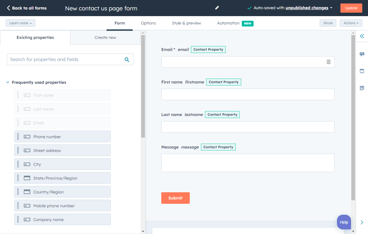
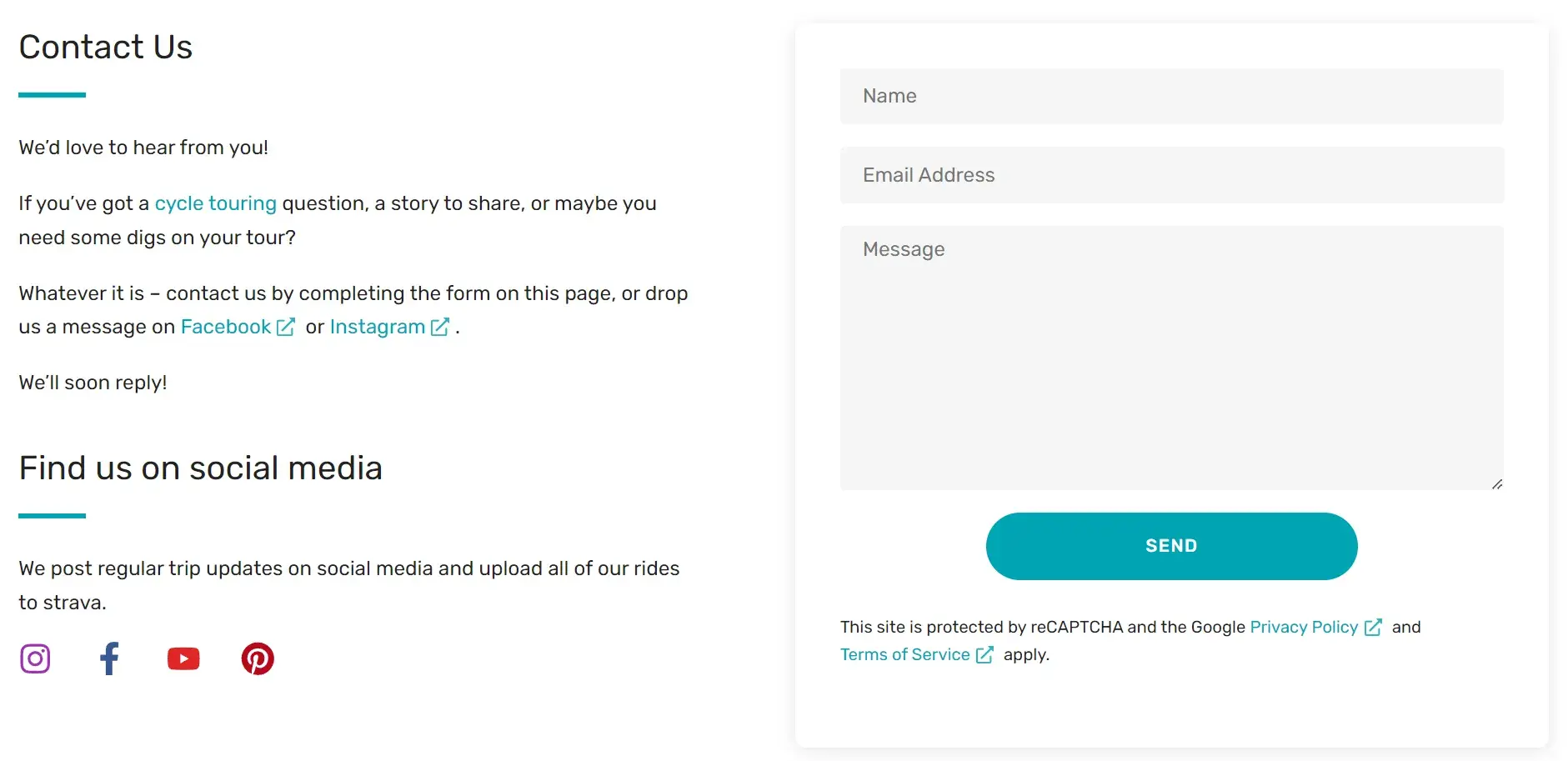
Here’s an example of a general contact form. This one is taken from my blog. It’s very simple in design and has only three fields, “name,” “email address,” and “message.”
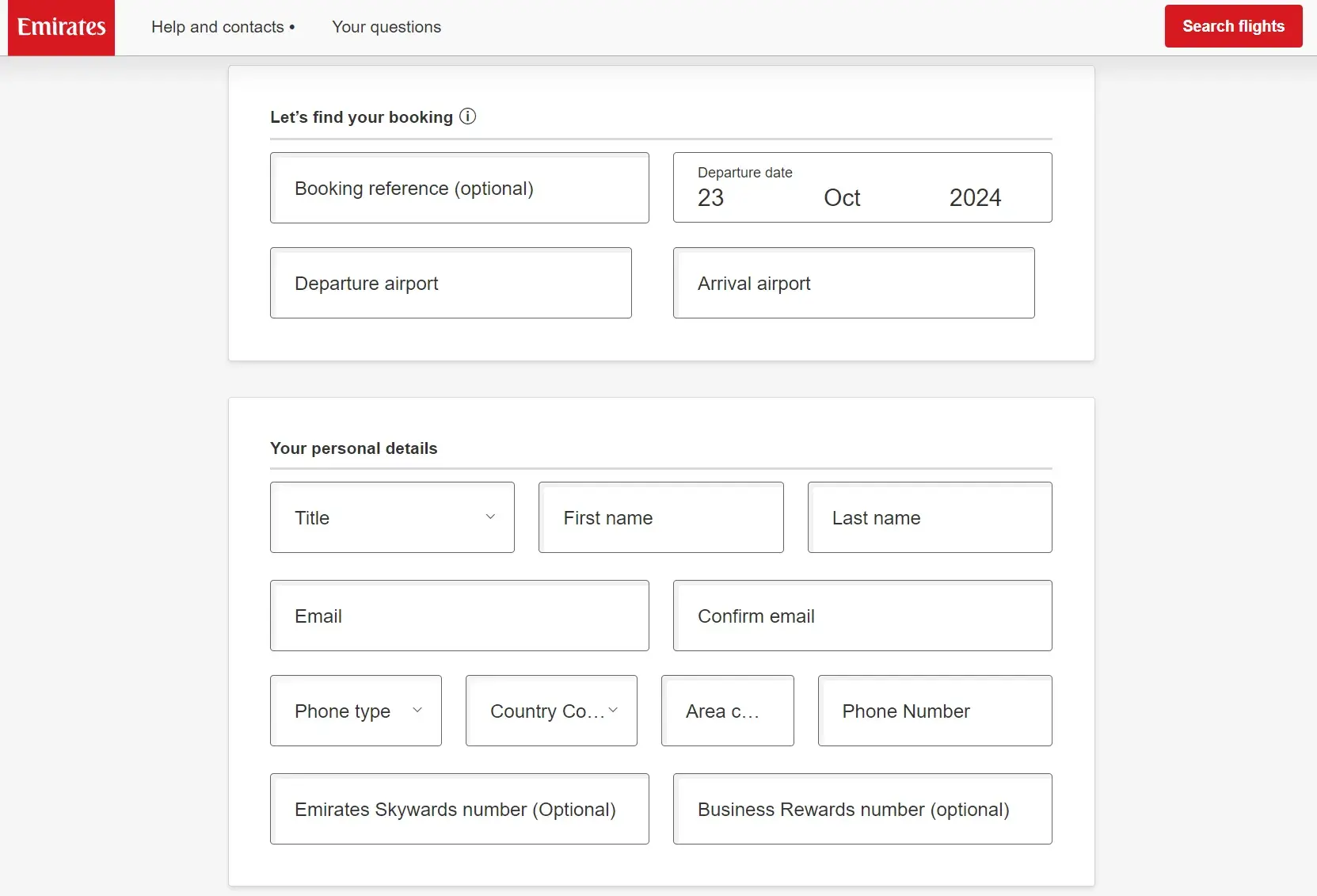
Other contact forms let your leads ask your business a question, voice a concern, or even explain their need for a refund. These web forms typically contain fields that require leads to list their name, contact information, and other details, such as an order number. They may also have a drop-down or text-entry field for leads to explain their reason for reaching out and their preferred method of contact.
Below is an example of Emirates’ refund form.
Pro tip: Help your website visitors understand what the form is used for or how they can use it. Using my blog’s contact form as an example, I really want to encourage people to get in touch, so on the left, I’ve set the expectation with the text "Whatever it is, contact us by completing the form…” I wanted people to know they can message me about anything!
Lead Generation Form
These web forms convert your website visitors into leads. They typically require personal information, such as a name, company, email address, phone number, and sometimes a username and password for return visits to the site.
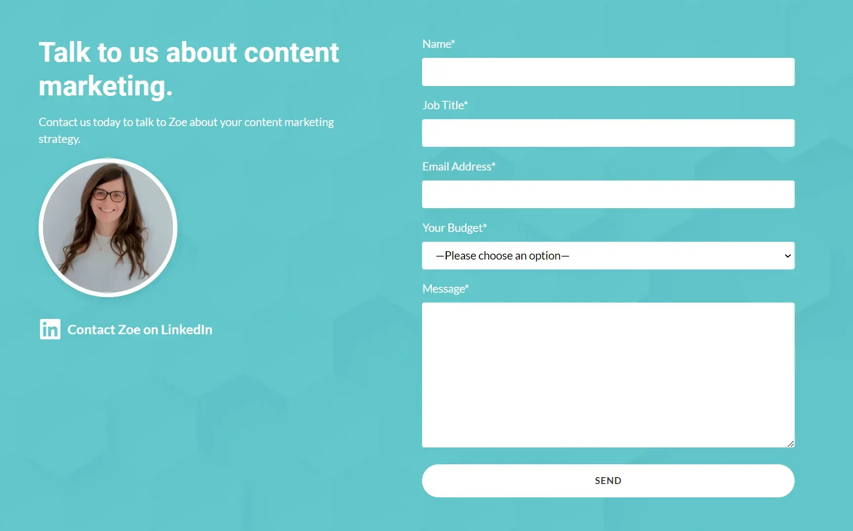
I use a lead generation form on my own website. The fields are for “name,” “job title,” “email address,” “budget,” and a message. I’m using my form as a simple lead generation tool, but it’s also set up to help me validate the inquiry. I’ve deliberately added “job title” and “budget” so I can gauge how likely the lead will be to close and whether or not they have the budget for my services.
Pro tip: On your form, you can often add invisible fields. I add an invisible field to the contact forms on my service pages to know where the form was submitted.
It’s great for tracking. The invisible field (mine might say: “content marketing page”) is sent along with the details of the form that the user filled out but is not visible on the front end of my website.
Order Form
Order forms do exactly what you’d expect them to do — they allow your website visitors to place orders. They also give customers a way to pay for items and have the products sent directly to them.
Order forms may include multiple steps as they often require a credit card, shipping and billing information, and contact information.
Below is an example of the Shopify one-page checkout, including a form asking for card details and the order in review.
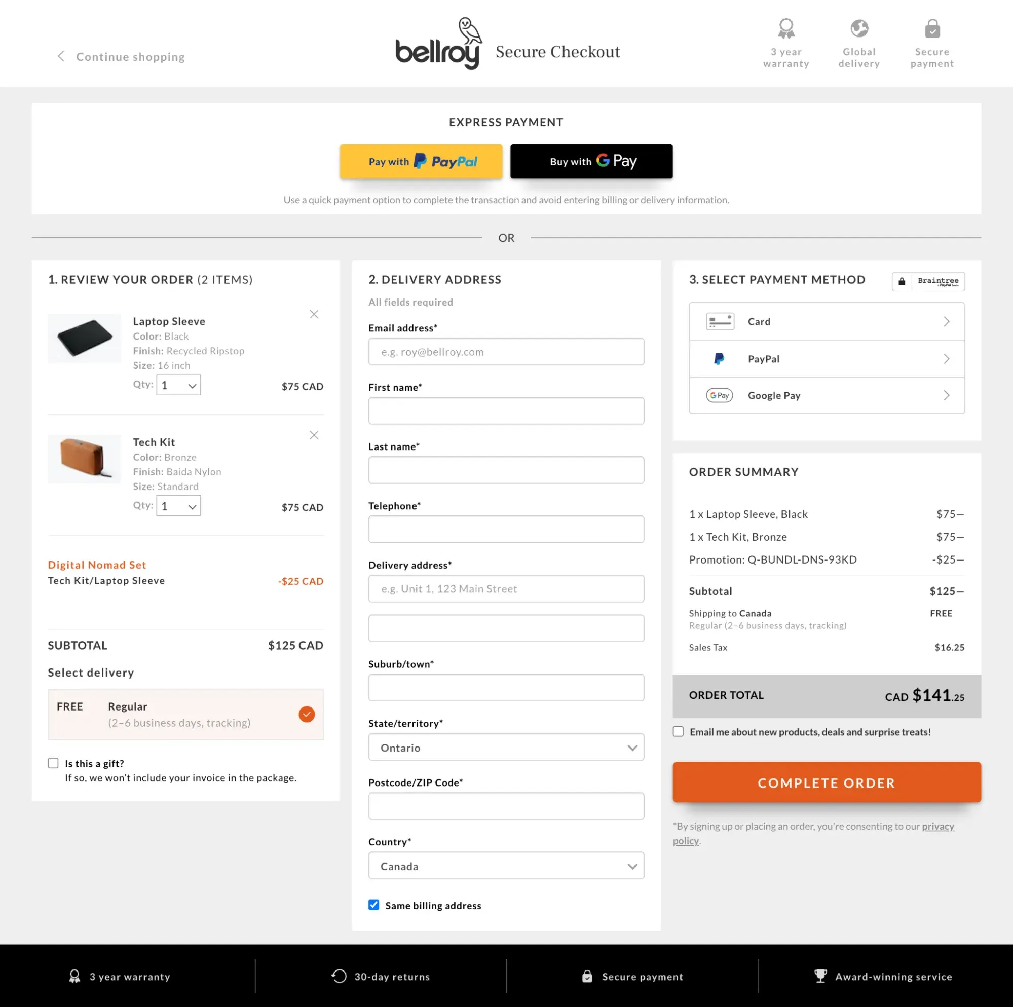
Pro tip: Bellray are using a single-column form for their order form. The single-column form is considered less daunting and is generally faster to complete. With this, you’ll likely get more form completions.
Registration Form
A lead will complete a registration web form if they want to sign up for your service. This is common on sites such as Craigslist, Ebates, and eBay.
If a lead was looking to list an item on one of these sites, they would complete a registration form to create an account and then post the item.
Survey Form
Survey web forms may include multiple-choice, fill-in-the-blank, and long-form responses. I find they can help you learn more about your customers’ experiences with your products and services.
They also help you improve future interactions with your customers, as well as educate leads about the ways in which your business can help them.
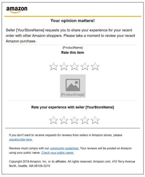
Pro tip: When asking for feedback, you can add some visual elements to the form, like the five stars Amazon has used. This satisfaction measure is sometimes reflected by smiling faces/emojis ranging from very happy to angry.
Onboarding Form
An onboarding form is a form employed by digital businesses, like web and mobile apps, to gather necessary information from new users and familiarize them with the platform's functionality.
It is an integral part of the user onboarding process, designed to enhance user experience by simplifying the initial setup or use.
This form might ask users to input data like their name, contact information, preferences, and more — all to help onboard, activate, and increase the likelihood of product or service adoption and retention.

Pro tip: An onboarding form may get long. If it does, I suggest segmenting the onboarding process into multiple forms. As above, Tango has done this.
To make the form feel accessible and easy to fill out, they’ve added a progress bar and some friendly copy, such as “Just a few questions, Mike!” which provides an indicator of the length.
3. Add your form fields.
Think about what responses you need from your leads when you begin creating your form fields.
I recommend starting with the answers you’ll need. Then, you’ll be able to decide how to title your form fields, what questions to ask, and which types of fields you actually need your visitors to complete.
Regardless of what you’re asking your visitors, you should always require their basic contact information (like name and email address) so you can identify individual submissions.
Next, choose the right software to create your web form. I’ve listed several tools you can choose from below, but I’ll quickly show you HubSpot’s form builder tool.
In HubSpot, drag-and-drop features make it easy to build your form however you want. Form fields are predefined, which means you have several options to pick from and add to your form.
Once you choose your web form template, review the predefined form fields and begin creating your form.
If you are asking your leads questions that need detailed answers, you can create short or long-text entry fields that accept one sentence up to a paragraph or two.
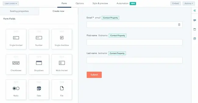
There are also several other field-entry types for you to include in your forms, including:
- Multiple choice.
- Drop-down menus.
- Checkboxes.
- Radio buttons.
4. Embed your web form on your website.
Once you create your web form, it’s time to publish it and embed it on your website. This is how your website visitors will access your form. Start by determining where you want your form located on your website.
Decide where to embed your form.
Determine which page of your website should include the web form. I suggest asking yourself these questions:
- Do you want your email sign-up located at the bottom of your main landing page?
- If you have a contact form, is there a page on your website solely meant for visitors who want to contact you?
- And if someone purchases an item, do you have your web forms in an order that makes sense (first shipping, then billing and payment)?
How to Embed Your Form
To embed your form, copy and paste the form’s code into the desired location on your site.
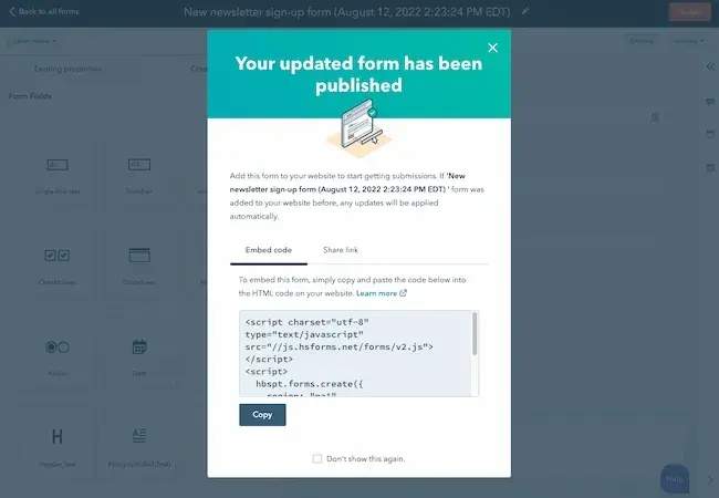
Once you embed and publish your web forms, website visitors can start completing and submitting forms. Next, you’ll begin receiving data about your leads that will be crucial for maintaining a healthy business.
If you are using a website creator or external website, you can still embed your code from HubSpot’s form builder into your site’s source code (the collection of code used to build your website).
5. Make your web form secure.
Data protection has become a top priority for businesses and consumers alike. I don’t think this is an area where you should cut corners.
A secure web form makes sure that you’re protecting your leads’ data. This will result in more submissions. With HubSpot’s form builder, creating a secure form for both your business and your leads is easy.
The form builder stops spam submissions from coming through with an email address validation process. This ensures only real email addresses can be submitted in your web forms, which I find super helpful as a small business owner.
HubSpot also allows people to add CAPTCHAs, which are the questions at the end of a form that require people to confirm they’re not robots. These act as a second layer of protection against spam.
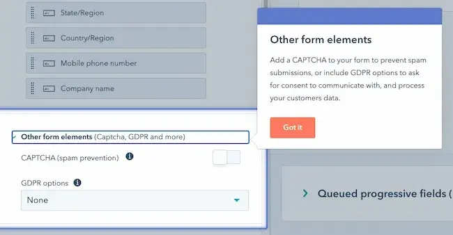
Lastly, HubSpot allows you to block specific email providers and domains that you determine are unnecessary to receive submissions from.
6. Test your web form and analyze your results.
Once you create your web form and embed it on your website, run some analytics and make sure it works.
I recommend thinking about things from your visitor’s point of view. Do they have enough space to respond to a question in the short-text entry field? If not, try switching over to the long-text entry field and see how their responses change.
If you receive the same feedback repeatedly from your website visitors, try altering the form or adding different form fields to improve the experience for your leads.
I’m a firm believer that your customers and leads should be your top priority when it comes to all of your marketing tactics, including your web forms.
If you set up email notifications on your web form creator software, you should double-check that these are working as well.
You can do this by going to the web form on your website, completing it as a lead would, and making sure you receive an email notification about the completed form. If it doesn’t work, try working through the email notification setup again.
Congrats! You have just completed the creation of your web form. Now, I’ll share some design tips that will enhance the user experience of your web form.
HubSpot's Free Online Form Builder
Generate leads from your website using a powerful online form builder.
- Customer Surveys
- Lead Capture
- Event Registration
- And More!
Web Form Design Tips
When creating and reviewing your web form, consider some of my following design tips. These will make your form easy to use, effective, and helpful for your business and leads.
Be direct.
By keeping your web form as direct as possible, you will improve your leads' experience and avoid any possible confusion. To be more direct, I suggest doing the following:
- Create a web form header.
- Use clear form field titles.
- Place your web form in a sensible location on your website.
- Remove non-essential wording.
This infographic demonstrates the impact of direct language. On the left, “enter your credit card details,” and on the right, “card number.”

Use correct form fields.
I know this may seem obvious, but it’s important to use form fields that make sense to your leads and give you the answers you’re looking for.
If your leads need to provide you with that information in paragraph format, then include long-text entry fields. Include short-entry fields if they only need to write a few words or a sentence.
For something like a survey, add multiple-choice responses, and for any questions that could have several answers, use checkboxes or radio buttons.
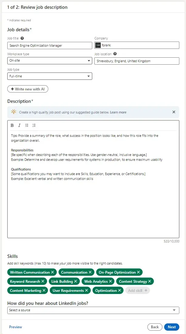
I think the LinkedIn job posting form below is a great example of how different fields are done well. Within one form, they’ve got:
- Fields for short text (job title).
- Drop-downs (workplace type).
- Long text (description).
- Multi-choice options with a limit of ten selections (the skills).
Use input constraints.
Consider using input constraints for specific form fields.
For example, if you know you only need one sentence in your short-entry form field, add a constraint that ensures your lead can only type in one sentence. This will save time for your lead and the form reviewer.
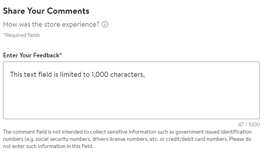
The form image below is taken from Walmart’s store and corporate feedback form. In the bottom right, they have a character count. You can see that my message reached 47/1,000 characters.
With this constraint, Walmart manages the length of the feedback. It’s really useful that Walmart displays the character count because it manages the user's expectations.
As I typed, the character count increased, showing how close I was to meeting that form constraint of 1,000 characters.
Add a form submit button.
By adding a “Submit” button, your website visitors will be able to complete the web form and send it to the server without any hesitation or confusion.
It will also make them feel confident that you and your fellow employees will receive their submissions and listen to what they have to say.
Add a form completion message.
For me, it’s frustrating when I fill out a form and don’t know whether the submit button has actually worked.
Make sure there’s something obvious and visual to show that a form submission is successful.
On my form, when you click send, you get a message (pictured below) reading, “Thank you for your message. We’ll be back to you as soon as possible.”
The message is important because it leaves the form submitter confident that the form will be received. My message assures them that I’ll reply as soon as possible.
I think my form’s message is adequate since it is accurate, but I deliberately didn’t specify a response timeframe so as to not set false expectations.
For professional forms or complaints, a more direct message could be better. For example, you might want to assure the customer that a member of customer service will contact them within 24 hours.

Match the keyboard to the input.
When you’ve got a form on a mobile device, consider changing the keyboard to match the input so your users can fill in their forms quickly.
I’ve found there are a couple of ways you can help your mobile users.
The most obvious is showing the numbers instead of the letters when they need to type something like a phone number.
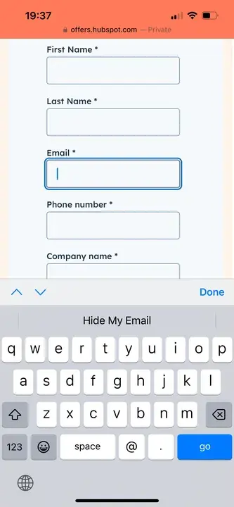
On mobile, you can also show the @ symbol on the main keypad when entering an email address. Below is an example of this in action using HubSpot’s “get a demo” form from my mobile.
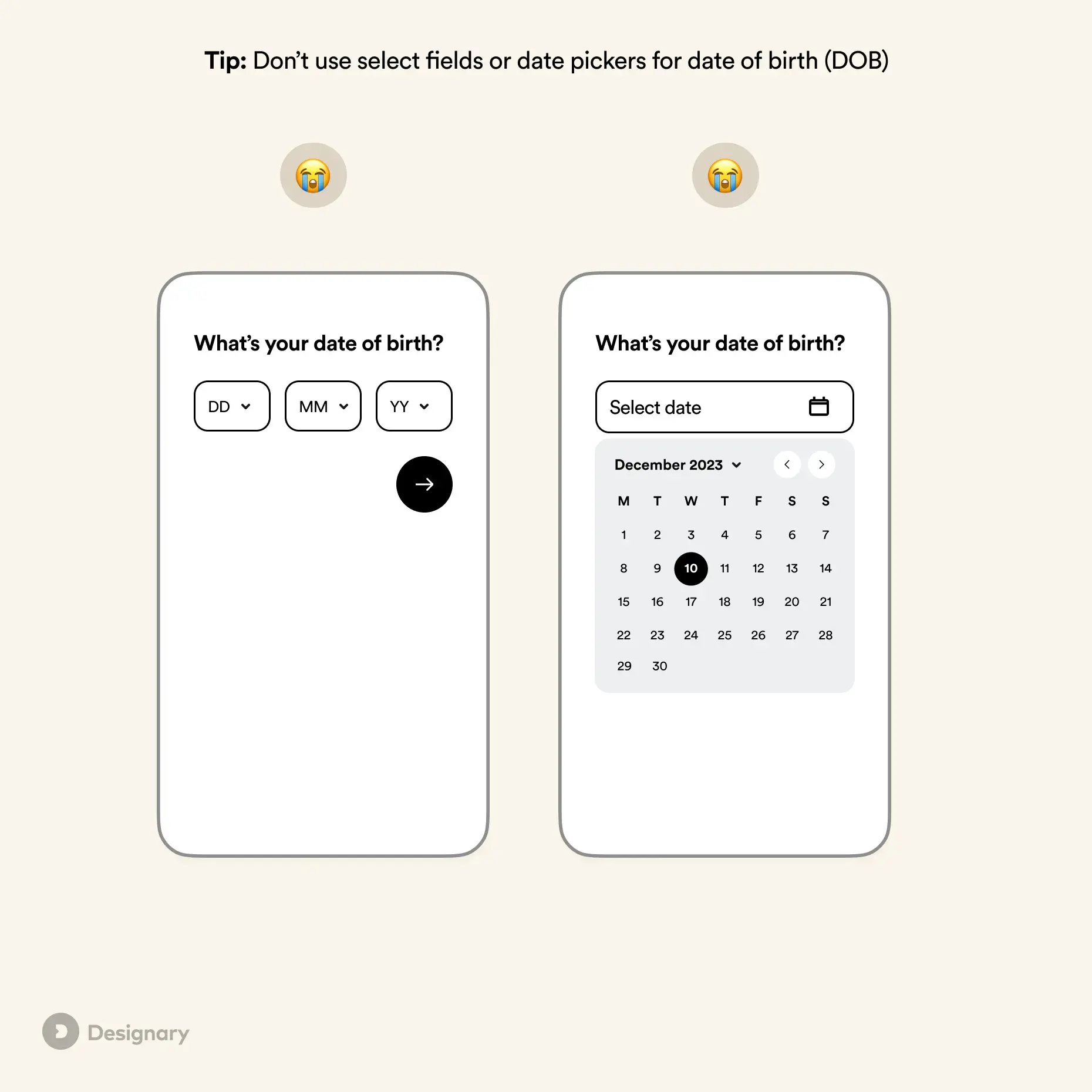
Finally, you’ve got date pickers or scrolling date options for fields like date of birth. However, Filippos Protogeridis, a product design leader, does not recommend them.
In his UX tip article, Protogeridis says, “Even though mobile pickers are considerably better than dropdowns on desktop, they are still slower to fill in than standard text fields.”
Make your form visually appealing.
Did you know that it takes an average of 50 milliseconds for a website visitor to look at your website’s landing page and decide if they want to stay?
Web form first impressions matter, too. Keep these design tips in mind as you create your web forms:
- Brand your forms to make them look professional.
- Match your company’s aesthetic to ensure consistency and promote a polished look.
- Consider colors, text font and size, and layout.
- Keep things clean and organized.
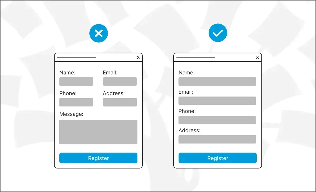
Use a single column.
If you have a long and detailed web form, make it easy to read and complete for your leads by keeping everything in one column. I also recommend only keeping form fields on the same line when it makes sense to the reader.
For example, keep information like the date (day, month, and year) on one line. Keeping all other form fields in a single column will prevent your lead from feeling overwhelmed or bombarded by questions.
A single-column form is better for usability than a two-column form. The image below demonstrates why. You can see how the form with a single column is less overwhelming. It’s easier to see what the form is asking for.
Additionally, the single-column form is thought to reduce errors, too.
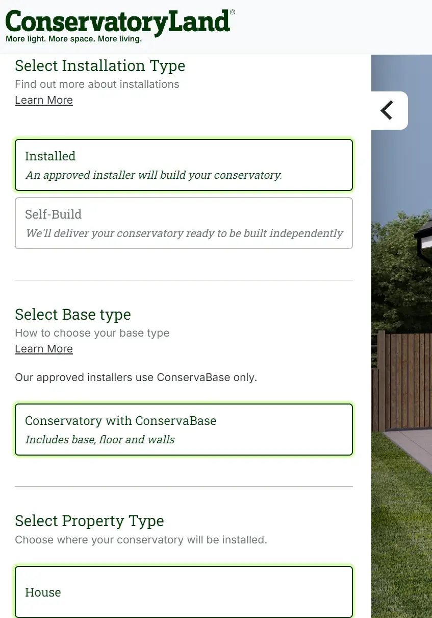
Organize your form.
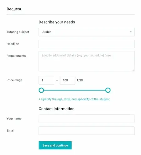
It’s helpful to organize your form using headings. Conservatory Land has quite a complex form, but the information is required to provide a quote.
Within the form, I like how they add headings to help break up the form and give the user a clear directive of what they’re doing within the section.
Use smart fields.
Imagine I’ve already made an account on a website and am completing a different web form on that same site. If that form field asks me some of the same questions a previous web form asked, I feel I’m wasting my time.
Smart fields are a great feature for keeping your leads from having to do unnecessary work. HubSpot uses smart fields to remove form fields that a customer or lead has previously submitted.
Smart fields make your business and website appear more professional by providing a smooth process for your leads or customers. They also remove the frustration of filling out the same information multiple times.
Use smart defaults.
Have you ever started completing a web form that automatically filled in your zip code based on your current location? That’s a smart default.
This feature also speeds up the web form completion process and creates a seamless user experience.
Smart defaults are commonly used for addresses. The LinkedIn job posting form above is a great example of that. When you fill out your location, it auto-finds your details.
Include error messages.
When a lead is completing your web form, you should tell them whether or not they are doing it correctly.
Include error messages if they accidentally enter an area code that doesn’t exist, add their state to the “Town” field, or are exceeding the character limit.
Again, I find this not only saves time for your leads but also keeps things simple when you need to review the submitted content.
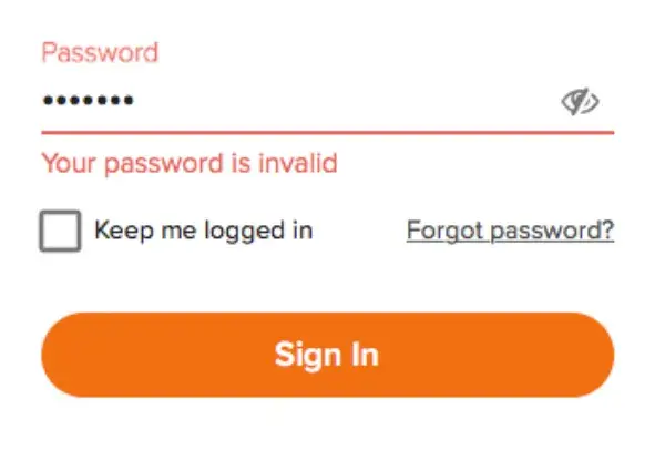
Pro tip: Use these tips to create error messages that make sense to your customers.
Explain why you are asking for specific content.
Imagine I was completing a web form on another business’s website, and I noticed a question asking for my credit card information when I wasn't buying anything.
I would definitely think, “Well, this is sketchy.” or “Am I going to be charged for something without even knowing it?”
This is an easy way to lose a lead or compromise your credibility.
To avoid this, include information on your web form that explains why you’re asking for specific information. By anticipating questions your leads may have, you will come off as professional, thoughtful, and customer-oriented.
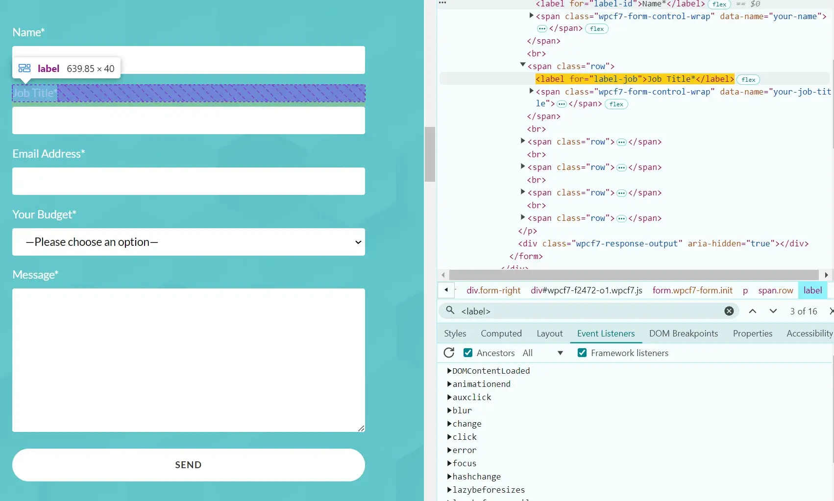
Make sure your form is accessible.
I know it’s easy to get caught up in the components of a web form, including the visual design and the fields. Still, a web form must also be accessible so that people using screen readers or those with visual impairments can use it easily.
You might need to speak with your developer to get these elements right, but ensure that your web form has labels within the code. This helps screen readers identify the purpose of each input.
A label could be as simple as “name” so the user knows in which field to put their name. This label is different from the placeholder text and must be within the code.
In the screenshot below, you can see how labels are used on my contact form. On the right is the developer tool (right-click and inspect to bring that up), and on the left is the form itself.
You can check if your form has labels by viewing the inspect tool and then searching <label>. If you find it in the code and hover over it, you’ll get a view like the screenshot below. See how the label “job title” is on my form's “job title” text.
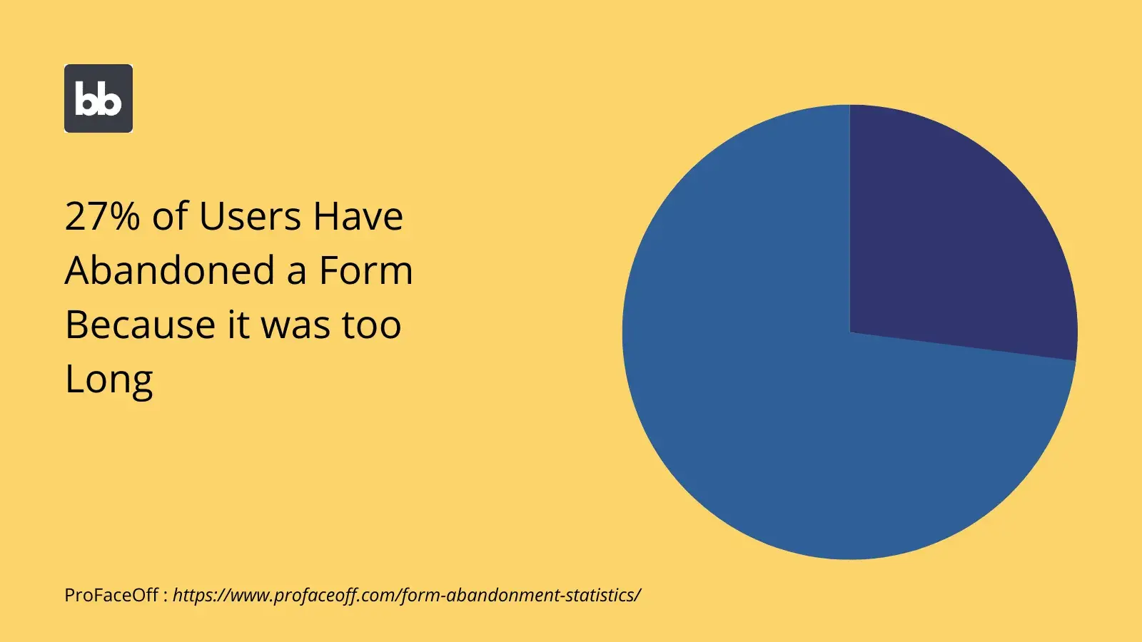
Ask for what you need, but no more than that.
According to Budibase, 27% of users have abandoned a form because it was too long. You want your form to be concise while gathering the information you need.
It can be tempting to ask for more information on a form. Perhaps you want to feed sales and marketing data or qualify a lead. I get it, but it’s important not to overwhelm your users.
Decide what you need and what information you can gather later.
HubSpot's Free Online Form Builder
Generate leads from your website using a powerful online form builder.
- Customer Surveys
- Lead Capture
- Event Registration
- And More!
Web Form Examples
Examples are a great way to get inspired and improve your marketing practices. I’ll share some top examples below.
Contact Web Forms
Sun Bum
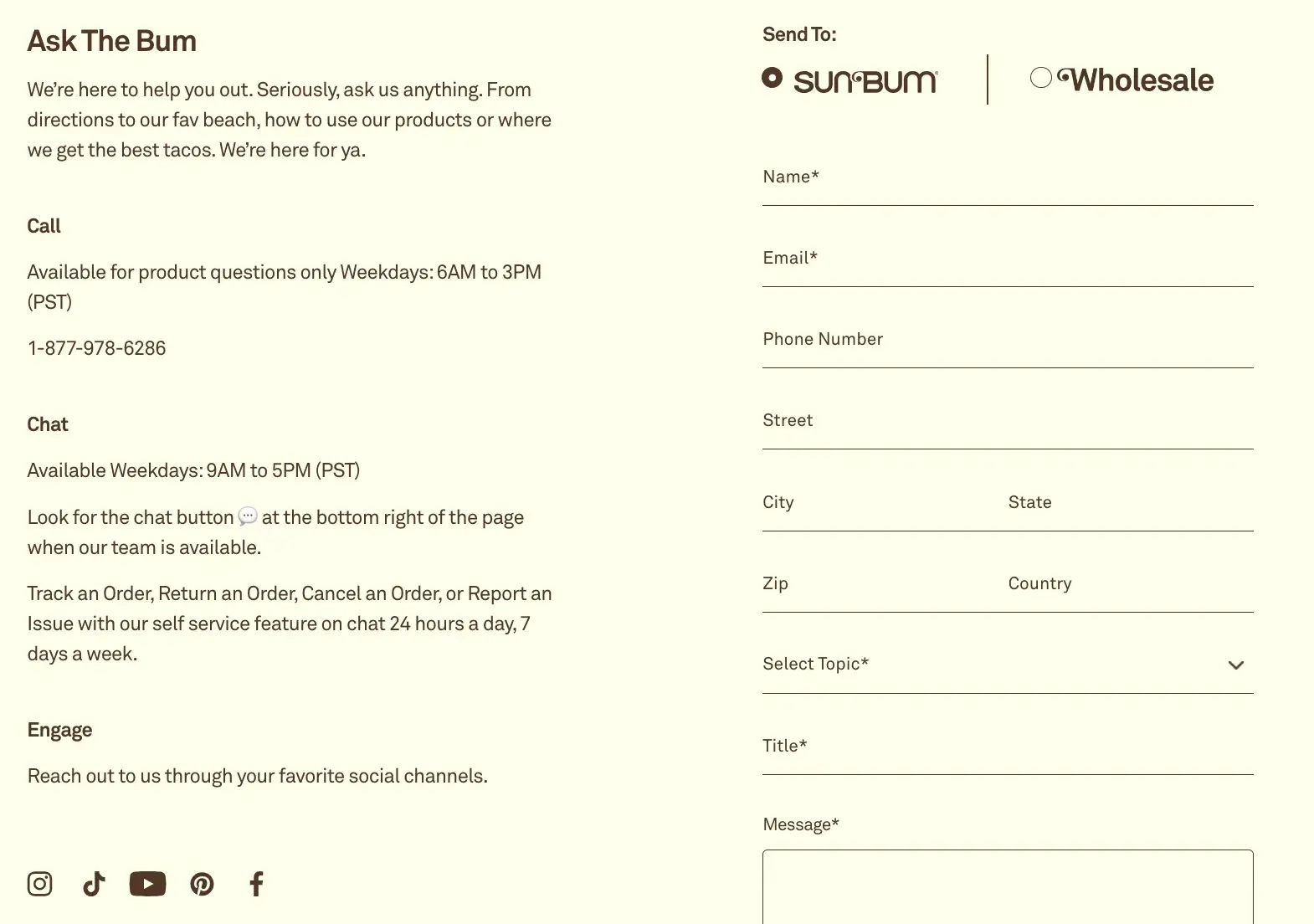
Sun Bum has a contact form on its website that enhances the user experience.
The form is on a contact landing page. They even have a unique name for their contact form, “Ask The Bum,” that meshes with their brand and resonates with users.
Why I like this web form: It looks clean and organized, and the form fields make sense for the form’s purpose. Users can select the reason why they are contacting Sun Bum and how they want to be contacted. Then, they can enter their contact information, select a topic, and write the company a message.
I like how the tone of the copy on the form also reminds users that they are talking to a company with a personality.
Preserve
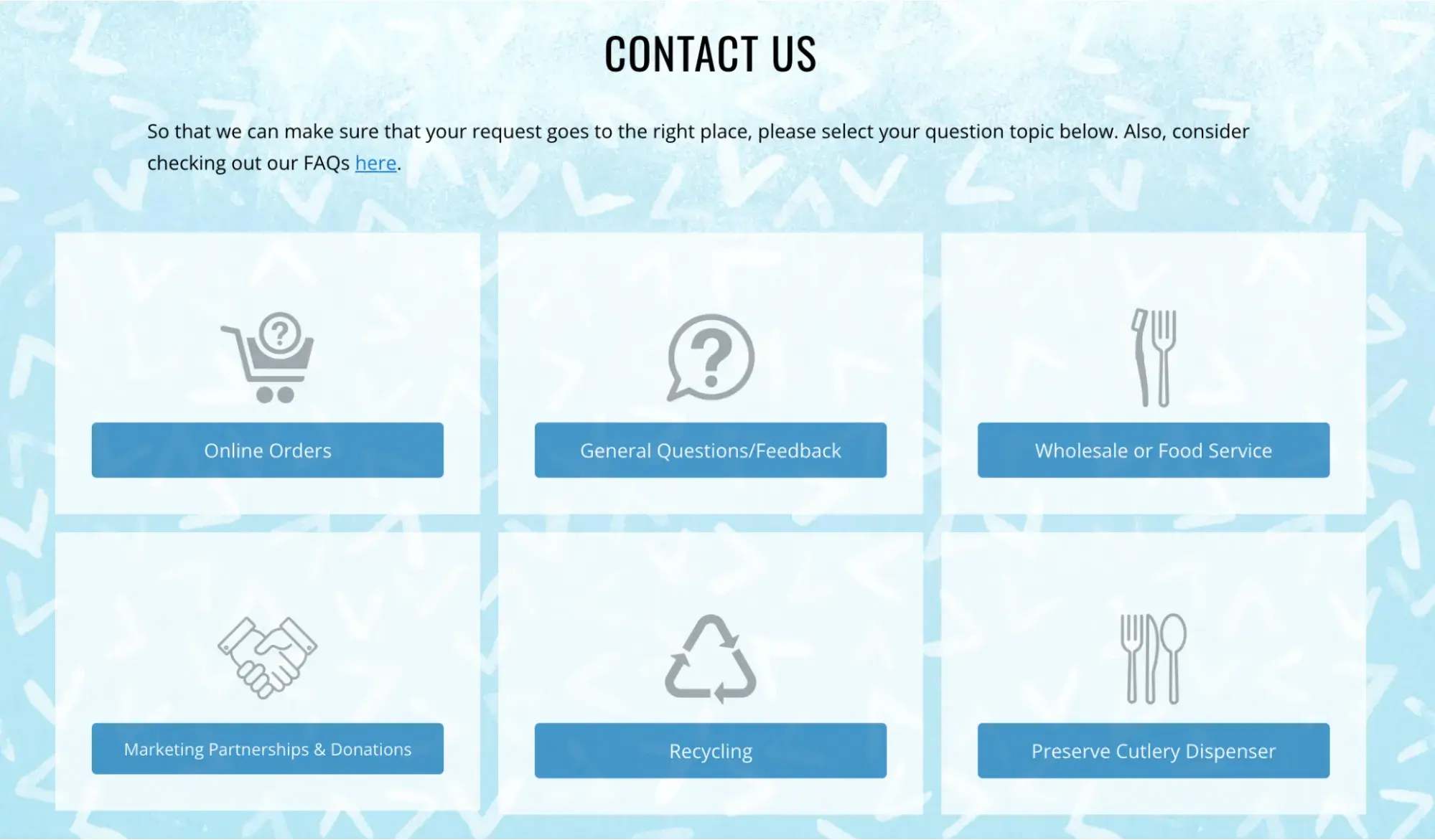
The contact experience at Preserve starts with an easy-to-scan page that helps users figure out what topic their question falls under so that their question goes to the right person.
I think the simple icons and clear, direct copy help users understand the company's size and focus.
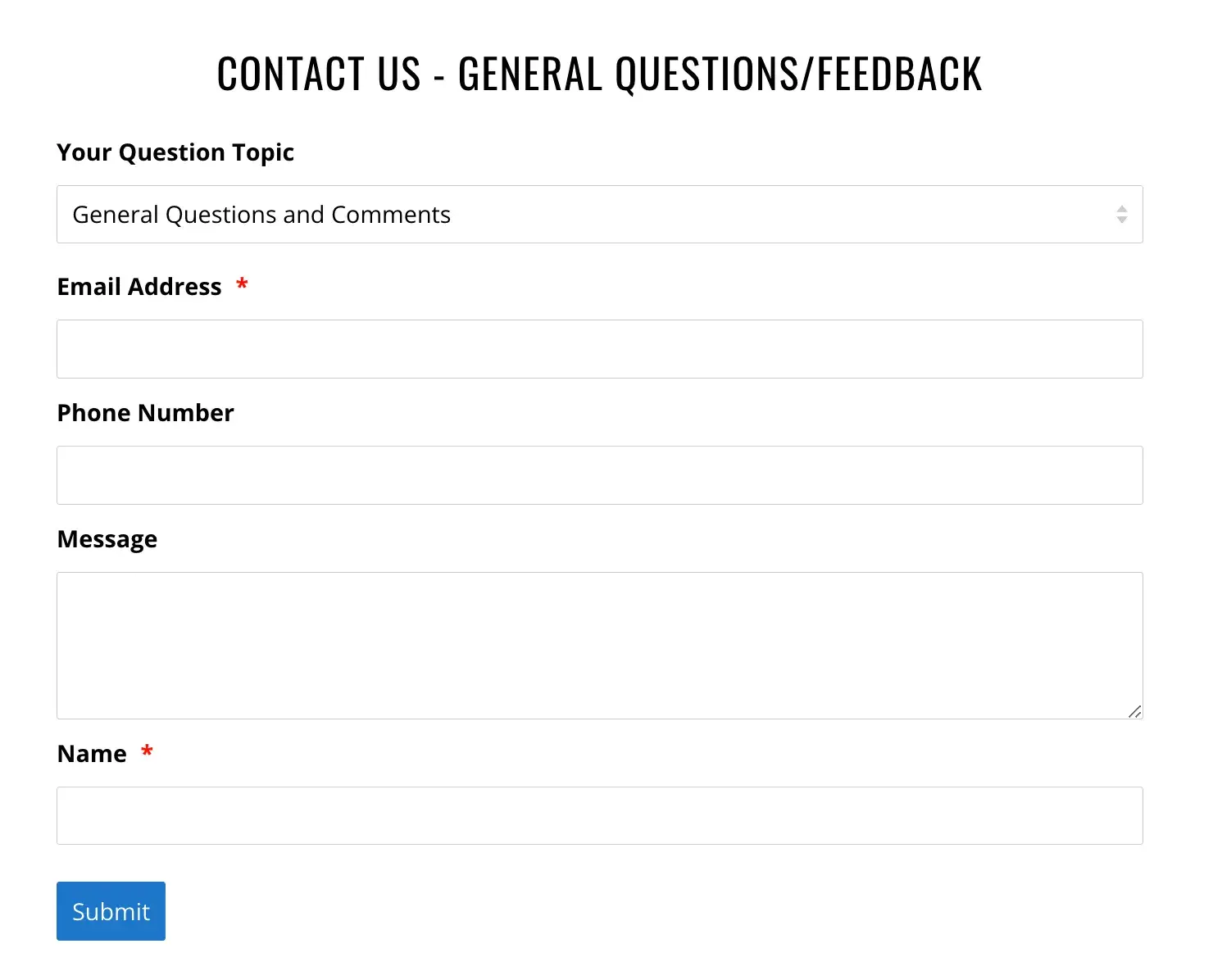
After you click on a topic, their web form pops up. It’s also quick to scan and complete, whether you have a quick request or need to ask a more complicated question.
Why I like this web form: The use of multiple web forms allows customers to take things one step at a time. The two-step process also shows users that giving customers the right answer quickly is essential.
This web form also sets clear expectations by highlighting the main topics for questions and copy that talks about the availability of their small team.
Lead Generation Web Forms
Help Scout
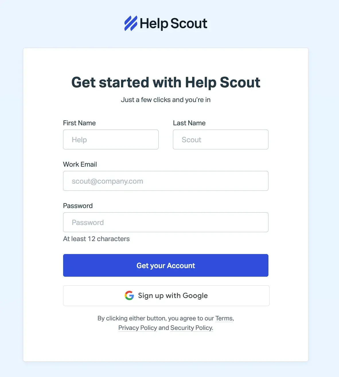
Help Scout has a lead generation form on their site that allows leads to quickly create an account.
The web form header states what the form is for and only requires a few pieces of personal information (name, password, and work email) to create an account.
Why I like this web form: This Help Scout web form has a nice layout for users and keeps all fields contained in a box.
I think the layout of the form fields makes sense as well — the fields for a lead’s first and last name are side-by-side and the rest is in a column format, which helps visitors work through the form step-by-step.
Cambio & Co.
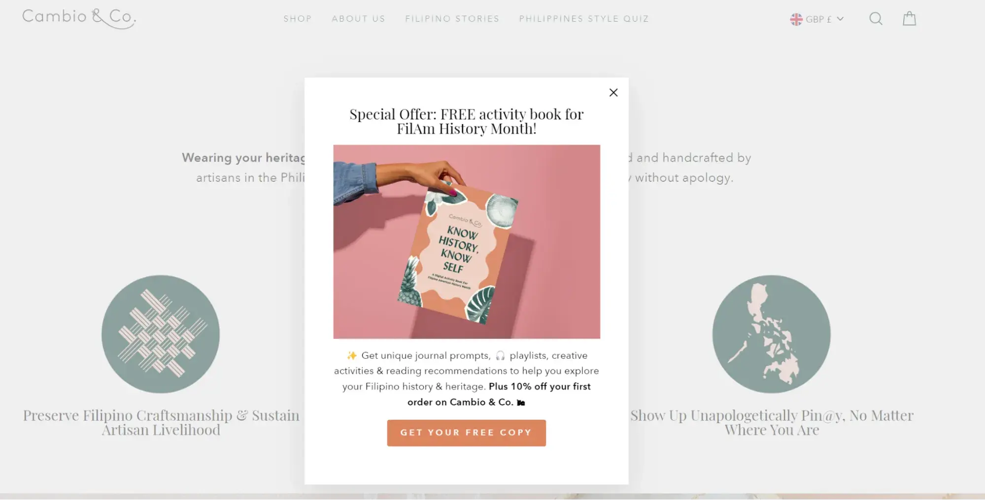
This lead generation form stands out with an engaging headline, a striking image, and a quick outline of two offers. The first offer reinforces their brand story and gives users a chance to connect, and the second is an enticing discount.
Why I like this web form: This pop-up web form packs a lot of value into a single form. The copy is succinct but useful, and it only requires two form fields, name and email address, to get started.
Order Forms
Seventh Generation
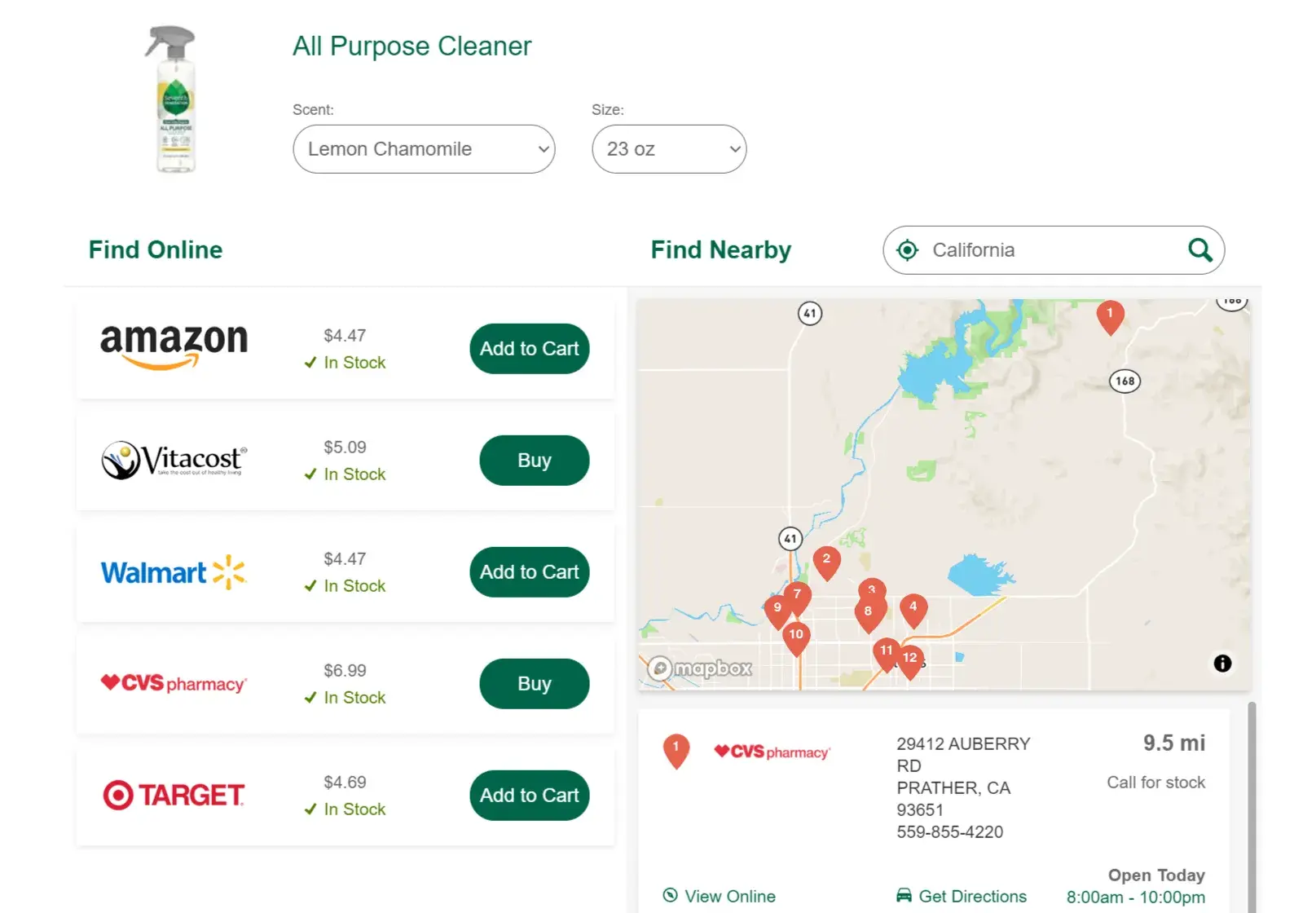
There are a lot of different places where customers can buy Seventh Generation products.
So, for example, when you search for a product like glass cleaner online, you might be looking for a local store where you can buy that cleaner or you might want to buy it and have it shipped.
I appreciate how this web form anticipates multiple user needs and puts them all in one simple form.
Why I like this web form: This form is clear and easy to understand. It gives you a chance to choose different sizes and versions of their product and offers a range of locations both in-person and online to make a purchase.
Starbucks
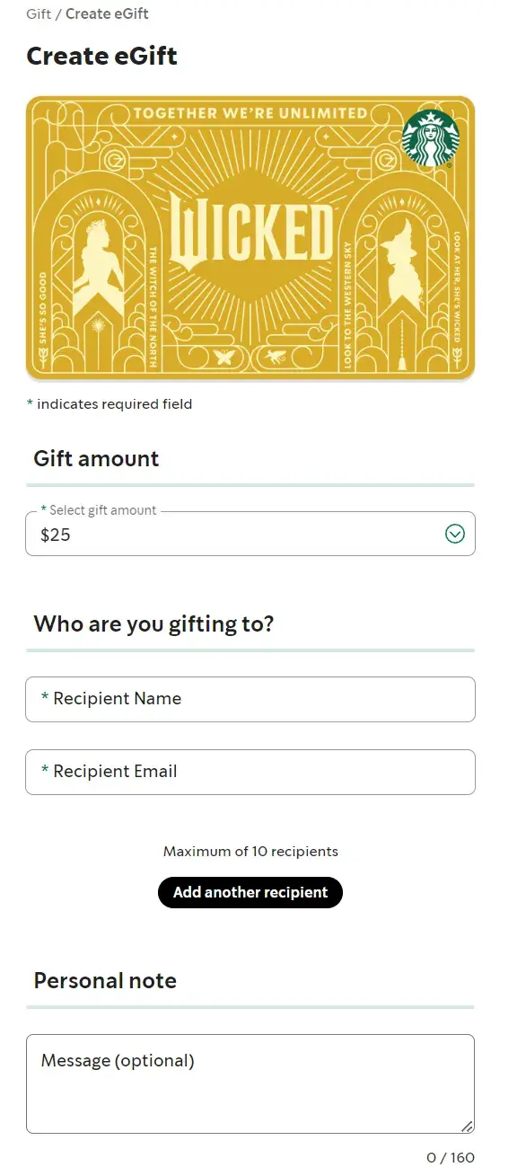
Starbucks has an online order web form that customers complete when they want to send a gift card. The first step is to select bright images that represent the wide range of gift cards that Starbucks offers.
After clicking on a gift card, customers fill in the blank short-text entry form fields for gift card amount, recipient, sender, and an optional message.
Once that information is submitted, users can sign in to their online account or complete the form as a guest. Then they’ll add or update their billing information.
Why I like this web form: This process is clear and makes what could be a complicated process feel quick and easy. I like that the web form design and form fields are straightforward.
They have clear headings and state why Starbucks needs certain information like the customer’s email and the recipient's email.
Registration Forms
Airbnb
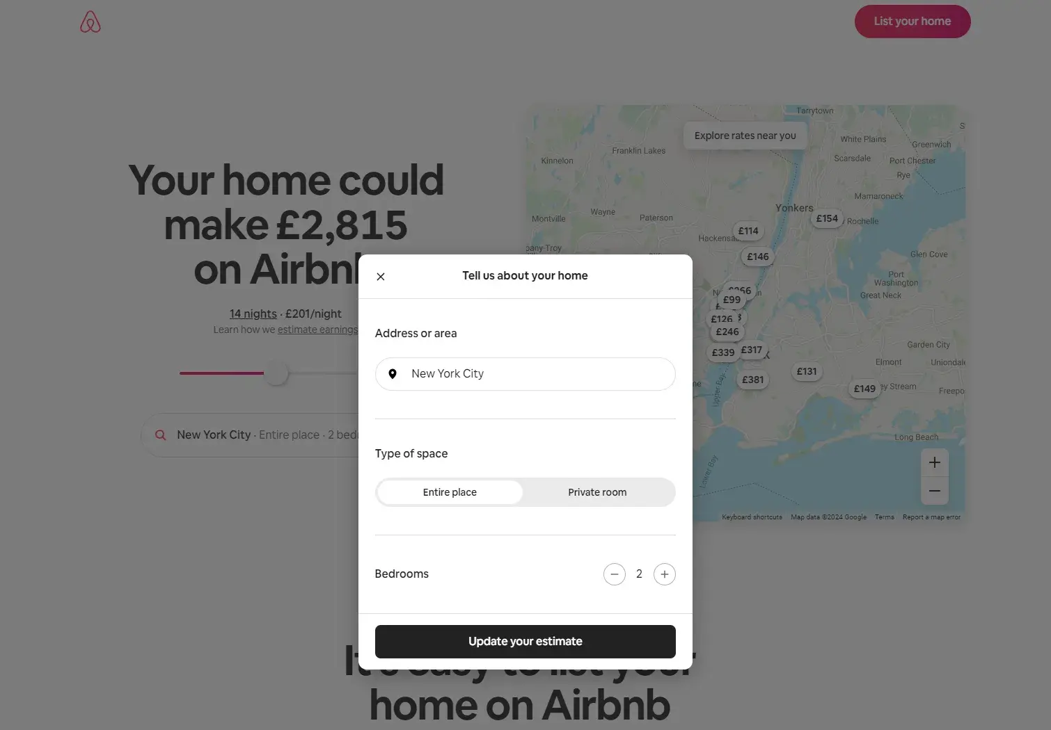
When someone wants to list their home on Airbnb, they first need to register for an account.
Airbnb has simple registration web forms that get hosts excited about listing their space on the site — allowing potential hosts to discover how much money they could make through their listing.
Who wouldn’t want to make an extra $4,000+ per month?
Why I like this web form: Airbnb takes its potential hosts through several web forms and allows them to work through the process at their own pace. The web forms are also visually pleasing and match the company’s look and style.
I think another nice touch is that the “continue” and “submit” buttons are in a bold color that stands out on the page whether the form is on a desktop or mobile device.
Survey Web Forms
WebMD
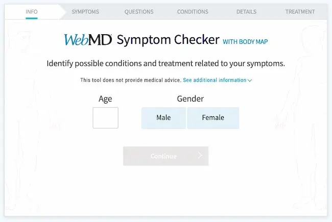
WebMD has a symptom survey that allows website visitors to self-diagnose through a series of questions.
The survey includes several web forms with various form fields. The final web form submission takes patients to a landing page that includes a possible diagnosis.
Why I like this web form: These web forms are an efficient and effective way for patients to get the answers they are looking for. I like that the form uses both visual aids and checklists to streamline the process of connecting symptoms to possible conditions and treatments.
Avocado Green Mattress
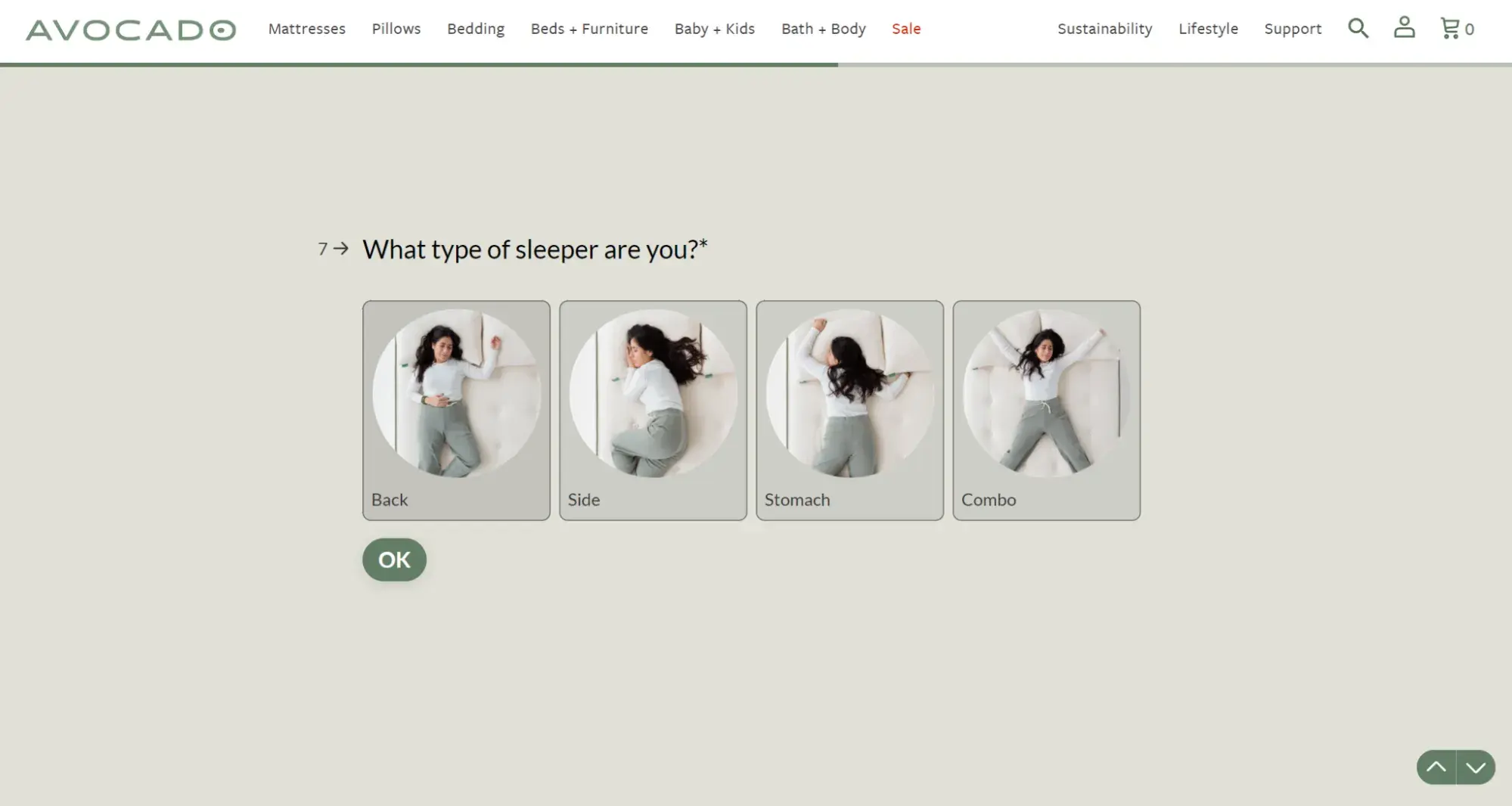
The process of choosing a mattress has a lot of variables. This can make it difficult to narrow down choices. This form uses lighthearted and thoughtful copy to steer shoppers toward the right mattress for them.
Why I like this web form: The design and text are well-designed and quick to scan. At the same time, the questions and responses go into enough detail to make this quiz worth filling out. This web form survey also gives this company a chance to highlight its unique selling points.
Onboarding Form
Tango

This form is minimalist and straightforward.
Users are able to provide their intended use for the application, share their role and job-related information, and even invite their teammates — a proven way to increase product stickiness and adoption.
Why I like this web form: This onboarding form provides a progress bar, gamifying the onboarding process to increase completion rates and reducing user drop-off by providing a clear indication of progress.
If you’re looking for more inspiration, check out these web form and feedback form examples.
Now, let’s review some tools and programs that can help you build the web forms you need.
HubSpot's Free Online Form Builder
Generate leads from your website using a powerful online form builder.
- Customer Surveys
- Lead Capture
- Event Registration
- And More!
Web Form Tools and Software Programs
There are many online form creators and software programs that businesses can use to get information from their leads.
Some form builders are free, some need a subscription fee, and some have features that work for different types of forms and businesses.
I’ll highlight some of each below.
HubSpot
Get HubSpot's Free Online Form Builder
HubSpot’s form builder has easy-to-use drag-and-drop features that allow you to efficiently create, embed, and publish your ideal form. One feature that is unique to HubSpot’s form builder is that it uses progressive profiling.
Progressive fields prevent anyone from having to complete the same form fields multiple times. This helps you make sure your business isn’t getting duplicate responses. It keeps things as simple and professional as possible for both the lead and the business using the form builder.
My experience with HubSpot’s form builder: HubSpot’s form builder is brilliant. I’ve used it with clients. Recently, I was working with a client to edit a web form.
We simply changed the functionality so the HubSpot form was embedded directly on a conversion-ready page, added a picture, and the client received 30 conversions. That’s what I call a successful web form!
Feathery

Feathery is a powerful form builder for product and marketing teams.
It empowers users to build highly customizable and brand-native forms for onboarding, payment flows, feedback surveys, user applications, and signup/login.
Also, Feathery offers users a beautiful template library for all form use cases, integrations with 5,000+ apps, including HubSpot, and the ability to extend their form functionality using developer SDKs for React and Javascript.
JotForm
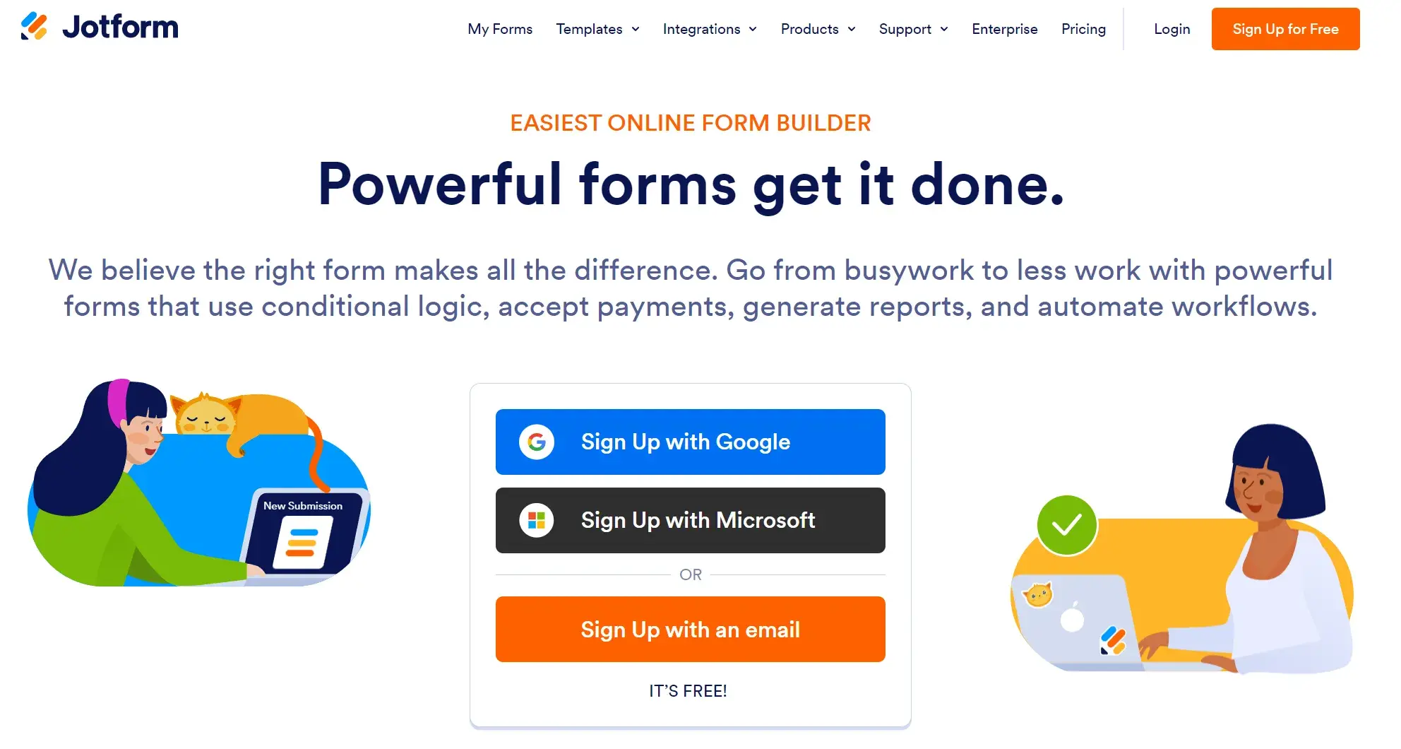
JotForm is an easy-to-use web form software. It’s a free online form builder that allows businesses to not only create and embed their web forms but also receive notifications through email whenever they complete a form.
With JotForm, anyone can create their desired, customized web forms in a matter of minutes.
Formstack
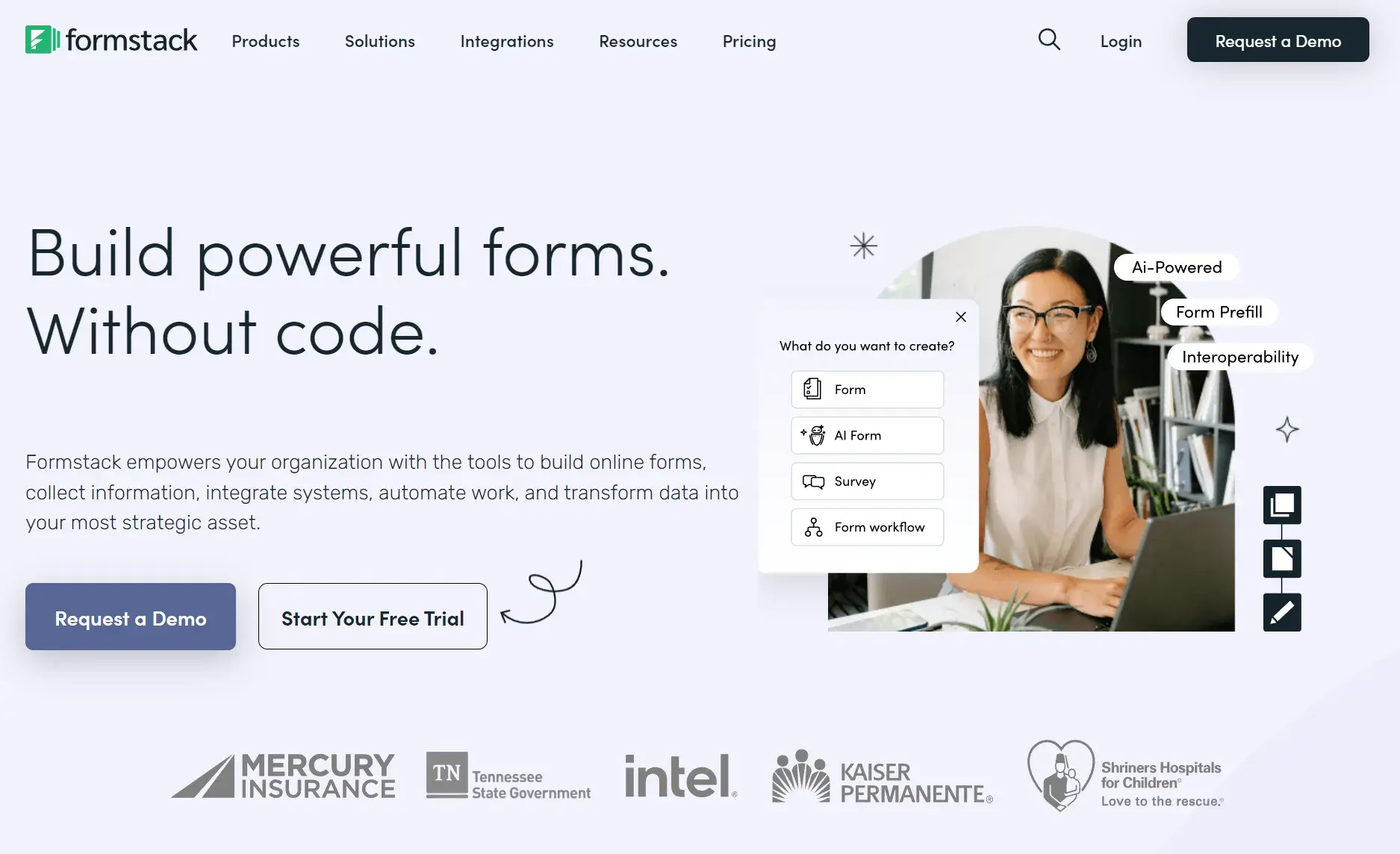
Formstack allows businesses to build their web forms, track them, and use conversion tools to analyze data received through the forms.
Companies are able to brand their forms and integrate them with other apps they may be using to control their workflows (such as MailChimp, Google Sheets, PayPal, or HubSpot).
Contact Form 7
Contact Form 7 is my favorite WordPress plugin for creating web forms. Once you install it on your WordPress website, the plugin is available in the left-hand menu.
It’s highly customizable, and you can create multiple forms for different pages and with different purposes if you need to.
Sometimes, I duplicate forms to help with tracking, though, as mentioned above, you can also do this with an invisible field.
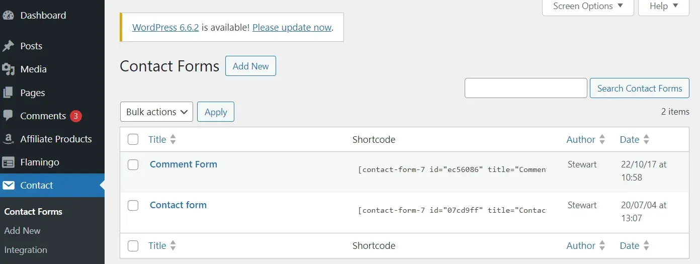
The screenshot above is taken from my blog. As you can see, I’ve got two forms: a comment form and a contact form.
My experience with Contact Form 7 form builder: I’ve used Contact Form 7 for over five years now. I can’t code but this builder is simple even for me.
WPForms
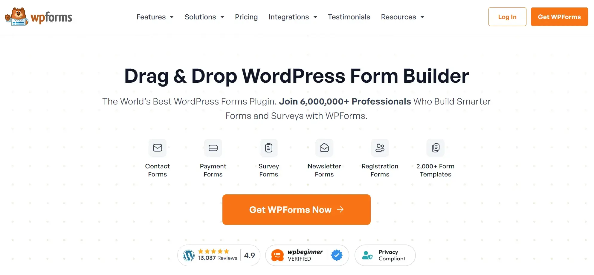
WPForms is the WordPress contact form plugin.
I like that this plugin has a drag-and-drop feature that easily moves your contact form from the plugin to your website, making it one of the most straightforward contact form builders available.
With multiple contact form templates to choose from, businesses can create a form that works for their needs.
Other perks I like: The plugin notifies you when a lead completes your form, has a mobile-friendly design, and integrates with many other apps.
Drupal
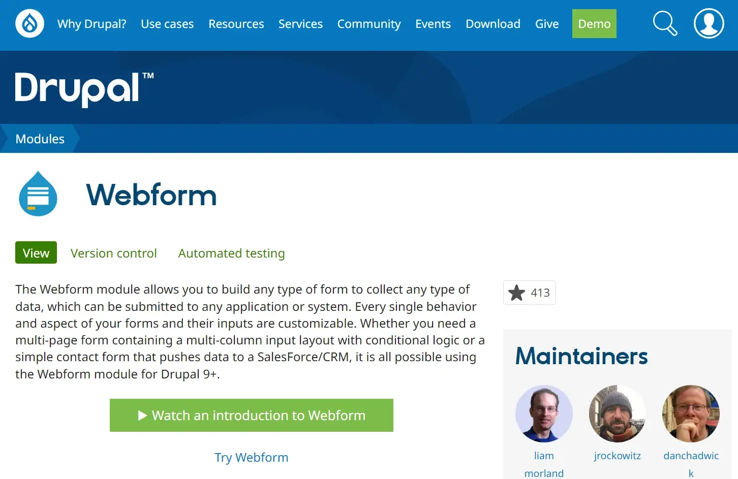
Drupal is an open-source CMS (content management system) that has a web form creator module called Webform. The module allows Drupal users to create surveys and forms and manage the results on a spreadsheet application.
The module also has basic statistical review features so businesses can keep track of what is working and what they need to modify.
Typeform
Typeform allows businesses to create website forms, surveys, quizzes, and more.
The software also has a sophisticated way of keeping track of data and results from all forms across a given site. These web forms are not only easy to create, but they can be quickly embedded and are compatible with all devices.
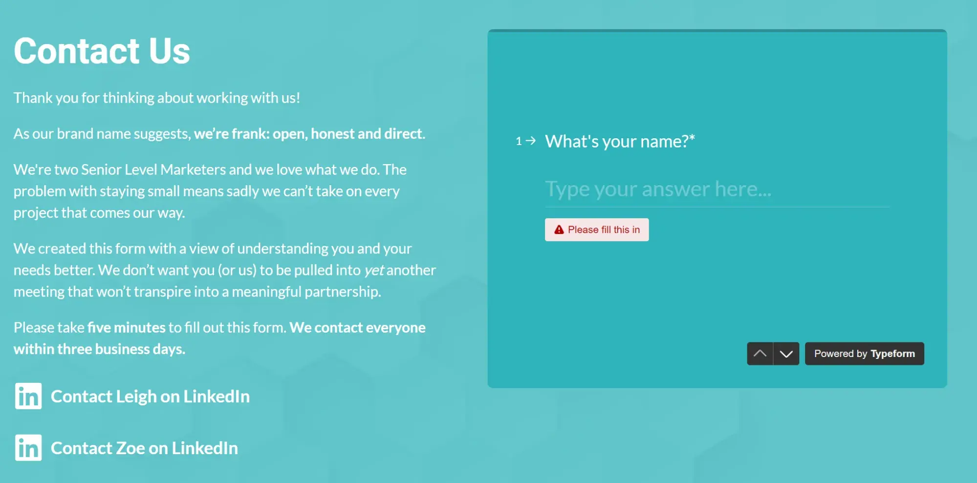
My experience with Typeform: I love Typeform and I use it on my website. One of the reasons why I chose Typeform was that I wanted to create a slightly longer form. I also really wanted to stop spam getting through on my website and the embedded form stopped it overnight.
You get a lot of data from Typeform in the backend which is really helpful — and it’s really easy to use, too.
Create Your Own Web Form
Of course, if you have the wherewithal, you can also code web forms directly into your website code using HTML, CSS, PHP, or Javascript.
Create Great Web Forms
I’ve found the embedded forms on my website are a great help to generating leads and giving prospects an easy way to contact me.
With the tips in this article, I hope you’ll be able to create web forms that help you grow your business and expand your network today. I think you will be amazed at what a well-designed and optimally placed web form can do for you.
Editor's note: This post was originally published in October 2018 and has been updated for comprehensiveness.
HubSpot's Free Online Form Builder
Generate leads from your website using a powerful online form builder.
- Customer Surveys
- Lead Capture
- Event Registration
- And More!
Forms