One of the tenets of inbound marketing is to not annoy people. So why is it that many websites are still chock full of the elements that so many visitors have bemoaned over and over?

Perhaps with the sheer excitement (or terror, depending on your personality) that comes with designing your own website, all of the user experience quirks that have driven you crazy over the years escape your mind.
But poor user experience can cause high page abandonment rates, low visitor-to-lead conversion rates, poor organic search listing positions, and a plain ol' bad reputation.
So we compiled a list of the 17 most annoying things we've seen on websites to act as a sort of guide for what not to do when designing your website. Let's take a look at the worst offenders!
17 Reasons Visitors Hate Your Website
1) It takes forever to load.
Our shortening attention spans are not just making us check our phones several hundred times per day; they're also making us really impatient when it comes to waiting for websites to load. According to a KISSmetrics report, 47% of consumers expect a web page to load in two seconds or less, and 40% abandon a website that takes more than three seconds to load. Even a one-second delay decreases customer satisfaction by about 16%.
Slow loading time frustrates your site visitors and affects conversion rate and brand perception -- especially for mobile users, who are sometimes relying on slower cellular internet connections when browsing the web. How does slow load time impact brand perception, you might be wondering? According to an Ericsson study, the longer it takes a website to load, the more website visitors blame the content provider instead of their mobile service providers.
But if you want people to stick around your website, you're going to have to put optimizing your site's load performance at the top of your to-do list. Page load time can be impacted by image size, code, videos, and other factors. Learn how to monitor and improve page load time in general here, and learn more about improving the page load time of your mobile website here.
2) It isn't optimized for mobile.
When browsing the internet on a mobile phone, have you ever been forced to scroll from side-to-side to read copy on a website? Or have you had to pinch-to-zoom because the words or buttons on a page were way too small? These are all examples of the painful UX people can have on websites that aren't optimized for mobile.
Google announced a major mobile algorithm update in summer 2015 that penalizes websites that aren't mobile-friendly, and it announced it would strengthen the ranking signal from mobile-friendly websites starting on May 1, 2016.
A big part of why Google continues to make these changes is to improve the web browsing experience for mobile users. So if your site isn’t optimized for mobile devices, you'll likely lose out significantly in the organic search rankings. Can you really afford to miss out on all that traffic and all those sales? It's unlikely. Learn more about choosing a mobile optimization approach here.
(HubSpot customers: The HubSpot Website Platform uses responsive design, has automatic image compression, and is backed by our CDN for loading your website really quickly -- so you don't need to worry about these things.)
3) It offers poor navigation.
When someone lands on your site, do they know what to do? Where to go? What their next steps should be?
While this might seem like a no-brainer, research by Small Business Trends suggests that 80% of small B2B business websites lacked a call-to-action -- as recently as 2013. They weren't missing out on leads and sales because their CTAs were poorly written; they were missing out because they simply didn't provide any direction on their website or ask people to click around.
Include clear headline copy, jargonless page copy that explains the value of what you do, and a clear primary call-to-action that shows visitors how to take the next steps -- whether that's subscribing to your blog, getting a free trial, watching a video, or any other action you hope visitors will perform on your site.
As for your actual navigation bar, read this blog post to learn how to nail down the perfect website navigation, including how to phrase your navigation copy, how to analyze visitor flow, and more.
4) It uses excessive pop-ups.
Excessive pop-ups that disrupt the reading experience can be seriously annoying -- especially when the CTA copy is made to guilt-trip you. You know, the ones that include a button that says something like, "No thanks, I don't want to improve my website." Can't they just let you live your life?
If you're going to use pop-ups there is a right way:
- Use them in moderation. That way, you aren't constantly bombarding your visitors with content they may not be interested in.
- Make them "smart." Smart CTAs let you display a different pop-up (or no pop-up at all) to different types of visitors based on whether they've visited your site before, or whether they're at a certain stage in the buying cycle. (HubSpot customers: Learn how to create a smart CTA here.)
- Track them for effectiveness. Assess the number of views and clicks on each pop-up CTA, along with how many submissions the pop-up actually leads to. If you find it isn't performing very well, consider editing or removing it to create a better user experience for your visitors. You can also run A/B variation tests to test out various copy and offers. (HubSpot customers: Learn how to run an A/B test on a pop-up CTA here.)
- Use delightful copy. Far too many sites use language meant to guilt-trip visitors into taking the desired action. Don't follow their lead. Check out the example below in the exit intent CTA Make My Persona, which uses polite language in the "no" option.
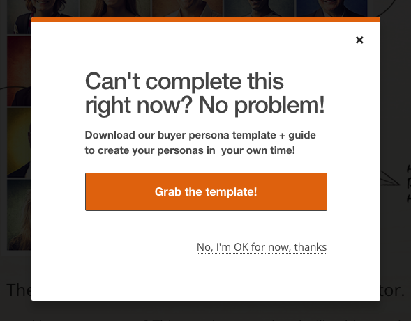
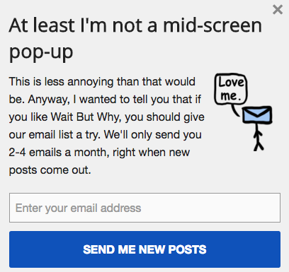
An alternative to pop-ups altogether? Slide-in CTAs, which are small banners that slide in from the side or bottom of the page with a call-to-action. They tend to be less obtrusive, providing users with more information while still allowing them to continue reading the piece of content. This one from Wait But Why says it all:
5) It contains multimedia content that autoplays.
Shhhh ... I wasn't supposed to be on this site at work!
If someone's enjoying what they thought was a silent browsing session and they're bombarded with your theme song or a talking head on a video for which they didn't press "play" -- especially if they can't find the button for "stop" -- what do you think they're going to do?
Some might fumble for their mute button ... but I can more easily locate the back button in my browser than my computer's volume controls. Although Facebook and Twitter now autoplay videos in our feeds, note that they're always on mute unless users choose to unmute them.
Extend the same courtesy to your visitors by not forcing your multimedia content on them. Either let them choose when to play it, or at the very least have it start with the sound off.
6) It boasts disorienting animations.
You're probably familiar with the blink test by now. You know, the three seconds users have to orient themselves on any given web page before they click "back" in their browser.
Animations, autoplay videos, blinking and flashing paid advertisements, and other interactive entertainment may seem really cool, but if they're too obtrusive or disorienting, they can detract from a visitor's focus during those critical three seconds.
Keep any animations on your website simple, like the one below from this blog post.

This is a simple animated GIF that catches the reader's eye without being too distracting. (If you want to learn how to make animated GIFs like this one using Photoshop, here's a simple tutorial.)
7) It's littered with generic or cheesy stock photography.
You may already know that using images is great for your inbound marketing. So when it comes to adding images to your website, you go browsing and ... find this gem:

Hmm. Are we supposed to believe these people work at your company? And are they always that happy about work?
This is an example of a bad stock photo. Bad stock photos are generic at best, and ridiculous at worst. Images are helpful if they clarify something for a visitor, and generic stock photography doesn't help visitors or your business.
It's much better to show real pictures of customers, employees, your company, your product, and your location. If you don't have any of those, browse this list of the best free, non-cheesy stock photo websites. If you're particularly design savvy, you can create visuals yourself that directly relate to what you do. (Download this beginner's guide to visual content creation if you need some extra guidance.)
8) It contains a contact form, but no additional contact information.
A 'Contact Us' form may seem like an easy way to generate an opt-in email list, but it's really the least valuable form of lead generation for you and your site visitors. Not only is it terribly generic, but it also doesn't indicate whether or not the contact actually wants to receive ongoing communications from you. It's more likely that they have a one-time problem or request that needs to be addressed.
So, let's say they do in fact have a one-time request. There's nothing wrong with having a "Contact Us" module on your site, but it should never be the only means of communication between you and your customers. If your visitor or customer needs help, they want it now. They don't want to fill out a form and wait to see when, if ever, they get a response.
Let people get in touch with you via email, the phone, and social media, and make that information available on your website. (Read this blog post to learn more about how to create a great 'Contact Us' page.)
9) It has an unintelligible 'About Us' page.
Does your 'About Us' page explain what you do in business babble, or using the words and phrases common to the general population?
Let's play a translation game using HubSpot's 'About Us' page copy. Our 'About Us' page doesn't say this, but read the copy below and think to yourself: Would you know what HubSpot did if it this was what it said?
HubSpot assists organizations across multiple countries reduce churn by backfilling the sales pipeline with highly qualified traffic that generates leads that convert into customers with high lifetime value. We achieve this through leading-edge software that integrates all marketing channels for a synergistic view of the data that determines and prioritizes the high-value marketing activities."
Uh, what?
Instead, we chose to tell a story on our 'About Us' page. Here's an excerpt from our company story:
People have transformed how they consume information, research products and services, make purchasing decisions and share their views and experiences. The customer is more in control than ever — and tunes out traditional sales and marketing messages more than ever. Yet businesses still rely on the same sales and marketing playbook they have used for more than a decade. This mismatch in buyer behavior and company tactics is what led Brian Halligan and Dharmesh Shah to start HubSpot in 2006 and create the vision for the inbound experience."
Ahh, that's better. Why? Because it's written in a way that people actually speak. It doesn't make your brain hurt like the first iteration did.
Check out this post for 12 great examples of 'About Us' pages.
10) It doesn't clearly explain what your company does.
In the same vein as a bad 'About Us' page, it's really frustrating to click around a company's website and not get a clear sense of what the company actually offers.
The best webpages clearly explain who they are, what they do, and/or what you (the visitor) can do there. If you're a well-known brand or company (i.e., Coca-Cola) you may be able to get away with not having to describe who you are and what you do. However, most businesses still need to answer these questions so that each visitor knows they are in the "right place."
Steven Krugg sums it up best in his best-selling book, Don't Make Me Think: If visitors can't identify what it is you do within seconds, they won't stick around long. Here are 15 examples of great homepage design from companies who did this particularly well.
11) It contains keyword-stuffed copy.
Remember back in the early 2000s when you went to a website and saw paragraphs and paragraphs of copy? Aside from being visually overwhelming, if you read that copy you'd find nothing more than a bunch of keywords meant for crawlers, not humans.
Unfortunately, some websites are still writing for bots, even though Google's algorithm is far more sophisticated at determining a page's relevancy than it was 10 years ago. Stuffing your content with keywords is one of the most common search engine optimization (SEO) mistakes marketers make. While keywords are crucial to driving SEO success, Google will penalize your website in search for keyword-stuffing.
Even more importantly, keyword-stuffed copy makes for a bad reader experience. So instead or cramming a keyword in every chance you get, read this blog post to learn the five parts of your website where you should optimize for keywords.
12) It's missing social sharing buttons on content.
If you're writing for humans, you probably have some really interesting content on your site -- content that people want to share on social media, perhaps. That's why it's a huge disappointment to scroll up and down looking for a "Tweet This!" button, only to realize there aren't any social sharing buttons on your website.
Social sharing buttons make it easy for your readers to share your content on social networks because they don't have to manually copy and paste your URL and compose a tweet. And easy social sharing options means your content gets more visibility, which means more site traffic, better search engine rankings, and more lead generation opportunities.
Read this blog post to learn how to create social sharing and follow buttons for the major social networks.
13) It doesn't have a blog.
If you don't have a blog, you're missing out on an opportunity to provide your visitors with a ton of valuable information. (And you're missing out on ranking opportunities, too.)
These days, consumers are empowered to perform in-depth company research on their own before ever contacting a salesperson. If they find answers to their common questions in articles on your company's blog, they're much more likely to come into the sales process trusting what you have to say because you've helped them in the past. (This is one of the many benefits of business blogging.)
14) It employs titles and headlines that are incongruous with your content.
If you're an avid content creator, you know how important a well-crafted title is. Great titles are what cause people to click through to read what you have written. But if they're met with content that's unrelated to the title you provided, you'll disappoint visitors -- and they'll often abandon your site.
This is why click-baity headlines aren't a very fair way to get people to your site. They take advantage of our natural curiosity. If you're going to use that tactic, you'd better deliver content that excites as much as the title. If not, you'll just annoy people.
The lesson: While it's important to capture peoples' attention in titles, make sure it isn't misleading and your content can actually live up to what you promised you'd deliver.
15) It displays call-to-action copy that doesn't align with the offer.
Along the same lines, your calls-to-action should align with what visitors receive when they redeem your offer. There's nothing more frustrating than being promised a 50% off coupon in the call-to-action copy, only to redeem it and find there's a caveat that says you must first spend $1,000. On select items. In-store purchases only.
This is not only insulting to your visitors, but it will also hurt your reputation -- not to mention your conversion rates.
16) It contains internal linking that isn't user-friendly.
When done correctly, internal links are helpful for readers and website alike. They point readers to other relevant information, and help you improve the organic ranking for important pages on your own website. But some websites seem to have trouble executing internal linking correctly, pointing users to irrelevant pages, linking strange phrases within the copy, and overdoing it to the point of making content unreadable.
Include internal links only to relevant pages on your website that will enhance a reader's experience, and include that link on the anchor text that makes the most sense.
(Pro Tip: Be sure to have all links open into a new tab in your browser, not the same window. Visitors may not be done reading the content on this page, and you don't want to navigate them away while they're still reading!)
17) It displays image sliders that take forever to load.
Image sliders, also known as image carousels, serve as a way to showcase multiple images in a space-efficient manner. But you have to be careful with these because there's a right way and a wrong way to use them.
The right way: Your slider loads images quickly and doesn't require a new page to load every time a user clicks.
The wrong way: Every time you click the arrow for the next image, your page loads an entirely new web page. This can increase page load time by several seconds as the entire webpage reloads.
Remember: The longer it takes a webpage to load, the more people will abandon it. So make sure yours loads quickly and doesn't require a reload. You'll also want to accompany the visual elements with written copy above or below the slider. Many readers are scanners and wont' invest the time to click through every image in the slider.
(HubSpot customers: Read this post to learn how to include an image slider on a page using HubSpot.)
What website components drive you nuts? Share them in the comments.
Editor's Note: This post was originally published in April 2012 and has been updated for freshness, accuracy, and comprehensiveness.

