I've seen firsthand that the marketers who treat email as a living, testable system rather than a one-and-done broadcast are the ones who consistently improve their open rates, click-through rates, and bottom-line results. These email marketing tips are designed for exactly that: small and growing teams ready to stop guessing and start optimizing.
Email Marketing Tips for Small Businesses
- Do not buy email addresses.
- Abide by CAN-SPAM rules.
- Ensure your opt-in process complies with GDPR.
- Email new contacts within 24 hours.
- Send your emails from a real person, not your company.
- Pre-set the preview text.
- Write clear and clickable subject lines.
- Keep your emails concise.
- Include one call-to-action button per email
- Add alt text to your CTA image
- Hyperlink your emails' images
- Include noticeable text links.
- Place at least one clickable item above the fold
- Add alt text to all of your images
- Avoid background images
- Add social sharing buttons
- Simplify sharing with ready-made tweets
- Add an email forwarding option
- Clean up the plain text version of your emails
- Optimize your emails for mobile users
- Preview and test your emails before sending them
- Don‘t be afraid to ’clean up' your contact list
- Monitor each email's performance
1. Do not buy email addresses.
I know what you're thinking: in the early stages of building an email marketing newsletter, you want to do whatever it takes to get eyes on your business. Resist the urge to purchase a list.
The owners of those email addresses never agreed to hear from you, which means your engagement rates will tank — and your sender reputation will follow. A bought list also violates GDPR (more on that in a moment). It's always a bad investment.
2. Abide by CAN-SPAM rules.
CAN-SPAM (Controlling the Assault of Non-Solicited Pornography And Marketing) is a law passed in 2003 that governs commercial email. It gives recipients the right to stop receiving your messages and outlines penalties for violations. Your emails must follow these rules, which are available on the FTC's website. Key highlights:
- Include your valid physical postal address in every email.
- Give recipients a clear, obvious way to unsubscribe.
- Use accurate “From,” “To,” and “Reply to” language.
- Avoid “no-reply” sender names that prevent recipients from opting out.
- Never sell or transfer email addresses to another list.
When in doubt, consult your legal counsel.
3. Ensure your opt-in process complies with GDPR.
The General Data Protection Regulation (GDPR), enacted across Europe in May 2018, requires that you get explicit consent before emailing someone. That means no pre-checked opt-in boxes. European users must actively choose to subscribe — you can't decide for them.
This might sound like a constraint, but it‘s actually a gift. A list of people who genuinely want to hear from you will always outperform a larger list of people who didn’t ask to be on it. Expect better open rates, better click-through rates, and more qualified leads as a result.

4. Email new contacts within 24 hours.
When someone subscribes or downloads an offer, your brand is at the top of their mind — right now. Don't waste that window.
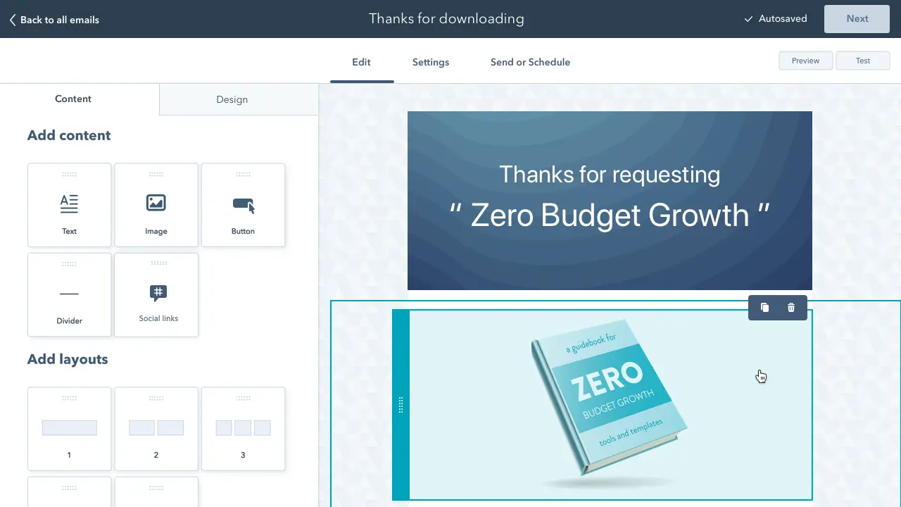
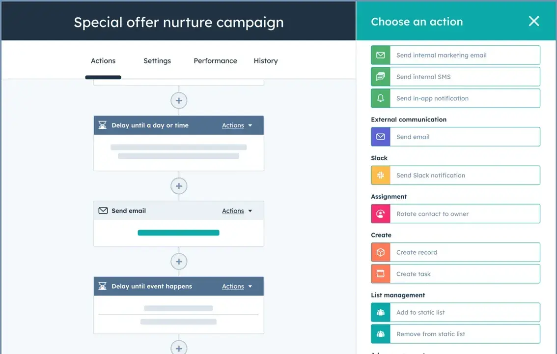
Send a welcome or follow-up email within the first 24 hours. Use it to set expectations, deliver on what you promised, and start establishing your brand voice. If you're a HubSpot customer, HubSpot's Workflows tool makes it easy to automate this triggered send so no new contact falls through the cracks.
5. Send your emails from a real person, not your company.
People are drowning in promotional emails. They‘re more likely to open a message from "Sarah Chen" than from "The Marketing Team." Based on tests we’ve run at HubSpot, emails sent from a named individual consistently outperform generic sender addresses in both open and click-through rates.
Try this format:
- Sender name: Paul Smith
- Sender email: psmith@company.com
Instead of:
- Sender name: Marketing Team
- Sender email: marketing@company.com
You can also combine a person‘s name with your company name — "Paul at HubSpot" — which performs well for brand recognition while still feeling human. A/B test what resonates best with your audience. And don’t forget to set up an email signature with your name, role, and a photo to reinforce that there's a real human behind the message.
6. Pre-set the preview text.
The preview text — those 40–90 characters visible alongside your subject line in most inboxes — is one of the most underused real estate in email marketing. When left blank, your email client pulls random body copy, which often looks messy and wastes a prime engagement opportunity.
Use the preview text to complement your subject line with a secondary hook. Keep it to 50 characters or less and treat it like a second subject line — concise, clear, and compelling. HubSpot customers can set this directly in the email editor.
7. Write clear and clickable subject lines.
Your subject line is the gatekeeper to everything else you‘ve worked hard to create. If it doesn’t earn the open, nothing else matters.
Use HubSpot‘s Campaign Assistant’s AI Email Subject Line Generator
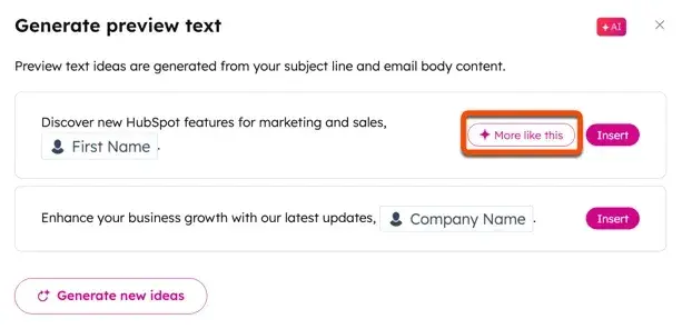
Strong subject lines:
- Stay under 50 characters so they don't get cut off on mobile.
- Use action-oriented language that creates urgency or curiosity.
- Speak the language your specific audience uses, not generic marketing-speak. The more you mirror how your audience thinks and talks, the better your results. I‘ve seen hyper-specific, audience-native language drive open rates that generic copy simply can’t touch.
- Include an exclusive value prop when relevant (“Free template inside,” “Your Q3 report is ready”).
- Avoid spam trigger words like “Cash,” “Quote,” or “Save.”
- Use personalization like a first name or location sparingly and strategically.
One of my favorite examples: Warby Parker's “Uh-oh, your prescription is expiring.” Timely, specific, and impossible to ignore. For a deeper dive, check out HubSpot's guide to writing better subject lines.
8. Keep your emails concise.
People scan email. They‘re not reading it the way they’d read an article — they're looking for a reason to click or a reason to delete. Respect that reality.
Write like you're talking to someone in person: get to the point quickly, cut filler, and make the value obvious. If your email must run long, break it into short paragraphs with visual breathing room.
A practical shortcut: tools like HubSpot's Campaign Assistant or AI Email Writer can help you draft concise, focused email copy. Specify the word count you want right in your prompt.
Pro Tip: Overly long emails are also a red flag for spam filters. Concise copy keeps you out of the junk folder.
For insight into the key components of good email copy, click here.
9. Include one call-to-action button per email.
Every email you send should have one clear next step. Not three. Not five. One.
Multiple CTAs create decision paralysis and dilute your click-through rate. Pick the single most important action you want recipients to take — download, register, buy, read — and design the email around that one conversion goal. For informational newsletters where multiple links are appropriate, a single dominant CTA button should still anchor the email visually.
Place your CTA where it‘s impossible to miss, and make sure it’s large enough to tap easily on mobile (more on that below). HubSpot customers can add CTA buttons directly in the email editor.
10. Add alt text to your CTA image.
Many email clients block images by default — which means your beautifully designed CTA button may never load for a portion of your audience. When you add descriptive alt text to your CTA image, those recipients still see clear, clickable text telling them exactly what to do.
Make your alt text action-oriented: instead of “button image,” write “Download your free guide.” You can add alt text directly in your email tool's rich text editor or in the HTML editor.
11. Hyperlink your emails' images.
People click images. It's instinctive. So if your email includes an image related to your offer — an ebook cover, a product shot, an event graphic — hyperlink it to the same destination as your CTA.
This is one of the simplest ways to increase clicks without adding more copy. Every visual element is an opportunity for engagement.
12. Include noticeable text links.
Don't rely solely on your CTA button. Link to your featured offer in multiple places throughout the email body — in-line text links give readers additional entry points to click, especially those who are skimming rather than reading.
More link opportunities = more chances to convert.
13. Place at least one clickable item above the fold.
Don't make readers scroll before they see something to engage with. Placing a CTA button, text link, or clickable image near the top of your email captures attention immediately — and is especially important for mobile users who may not scroll at all.
Think of above-the-fold real estate as your most valuable email space. Use it.
14. Add alt text to all of your images.
This isn‘t just about your CTA — every image in your email should have descriptive alt text. When images don’t load, alt text tells the story your visuals were supposed to tell.
Where images are linked, make your alt text actionable: “Click to download the content creation kit” is far more effective than “image.” Treat every linked image as a backup CTA.
15. Avoid background images.
Microsoft Outlook — still one of the most widely used email clients in professional environments — doesn't render background images. If a significant portion of your audience uses Outlook, background images will appear as blank white space, breaking your design entirely.
Play it safe: use a solid background color instead, and incorporate your visual storytelling through inline images like Harry's does effectively in their campaigns.
Pro Tip: Checkout some examples of excellent email design for some inspiration to see how you can approach designing your own. Even the color of text ontop of an image can highlight, or hinder visibility.
16. Add social sharing buttons.
The life of your email doesn't have to end when the recipient closes it. Social sharing buttons let engaged readers pass your content along to their networks — extending your reach without any additional send.
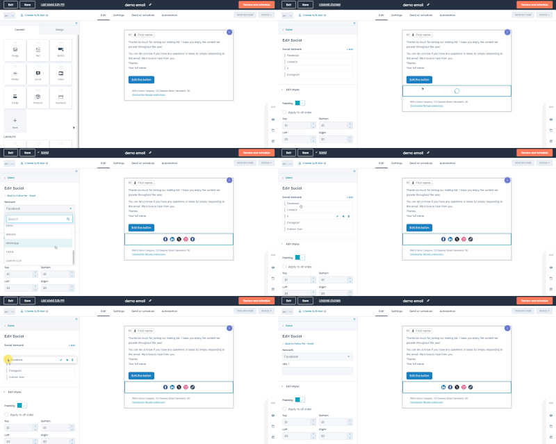
One important distinction: sharing buttons (which let recipients share the email's URL with their followers) are different from follow buttons (which prompt people to follow your social accounts). For driving clicks and reach, sharing buttons are what you want.
17. Simplify sharing with ready-made tweets.
Want readers to share your content on X (formerly Twitter)? Make it effortless. Tools like ClickToTweet let you generate a pre-written tweet with a trackable link — all the recipient has to do is click and post.
This is especially effective when you're emailing a segment that skews toward active social media users. Pre-written sharing removes all friction.
18. Add an email forwarding option.
Research from Litmus found that the most forwarded emails were significantly more likely to include explicit “Share With Your Network” calls-to-action. A simple P.S. at the end of your email — “Know someone who'd find this useful? Forward it their way” — puts the idea in readers' heads.
You can make it even easier by linking to a pre-composed email using a mailto: link, so all they have to do is enter an address and hit send.
19. Clean up the plain-text version of your emails.
Not everyone sees your polished HTML design. Some email clients only display plain text, and if you haven't optimized that version, it can look like a jumbled mess of broken code and tracking URLs — which is a fast path to the spam folder.
Take five extra minutes before every send to clean up the plain-text version: remove extraneous characters, replace long tracking URLs with shortened ones, and make sure the copy reads cleanly. Don't change the actual wording, though — inconsistencies between HTML and plain text can trigger spam filters.
20. Optimize your emails for mobile users.
More than half of all emails are now opened on mobile devices. If your email doesn‘t render well on a phone, you’re effectively invisible to a huge portion of your list.
Key mobile optimizations:
- Compress image file sizes to account for slower mobile connections. (HubSpot auto-compresses images; otherwise, use a tool like TinyPNG.)
- Make CTA buttons and links at least 45–57 pixels tall for easy tapping.
- Use responsive email templates that adapt to any screen size.
Test every email on mobile before it goes out. What looks great on desktop can be completely broken on an iPhone.
21. Preview and test your emails before sending them.
Before you hit send, do a final review — every time. Check how your email renders across the email clients and devices your audience uses most. HubSpot customers can preview emails across 30+ clients and on desktop, tablet, and mobile simultaneously.
Always send yourself a test email, too. It‘s the fastest way to catch formatting issues, broken links, or personalization tokens that didn’t fire correctly. Build this into your pre-send checklist as a non-negotiable step.
22. Don't be afraid to “clean up” your contact list.
A large list is only valuable if it‘s an engaged list. Subscribers who stopped opening your emails months ago aren’t just disengaged — they're actively dragging down your deliverability metrics and skewing your analytics.
Regularly remove (or re-engage) contacts who haven't interacted with your emails over a defined period. Invalid, temporary, and abusive email addresses also damage your sender reputation, which affects inbox placement across your entire list.
At HubSpot, we use “active lists” that automatically add and remove contacts based on engagement behavior, so your segments stay clean without manual intervention. A third-party tool like ZeroBounce can also help scrub addresses that pose a deliverability risk.
23. Monitor each email's performance — then A/B test what you learn.
Tracking open rates and click-through rates is just the beginning. The real value comes from using that data to run structured experiments that tell you why something is or isn't working.
Here's how to make performance monitoring drive real improvement:
Start with a clear hypothesis. Don't change five things at once. Isolate one variable (subject line, CTA copy, send time, sender name, image placement) and test it against a control. Even small changes, like adding an emoji to a subject line or moving the CTA above the fold, can produce measurable lifts.
Test send timing systematically. Industry benchmarks (Tue–Thu, 8–10am) are starting points, not gospel. Teachers, retail shoppers, and B2B executives all behave differently. Analyze your own data to find when your audience is most likely to engage, then test variations around those windows.
Segment before you optimize. If 10 emails in your last send are getting double the engagement of the other 20, the first question to ask is: who received which emails? Segmentation differences often explain performance gaps before creative or timing factors do. The better you know your audience — their language, their pain points, their behavior — the sharper your tests will be.
Run re-engagement campaigns as a diagnostic tool. Before suppressing inactive subscribers, send a targeted re-engagement sequence. How that segment responds tells you a lot about whether your content, frequency, or targeting is the problem.
Use your tool's built-in analytics. HubSpot's Marketing Analytics and Dashboard Software makes it easy to track performance at the campaign and individual email level, compare variants in A/B tests, and visualize trends over time, all in one place without exporting data to a separate tool.
The goal isn‘t to find a winning formula and stick with it forever. It’s to build a testing culture where every send teaches you something you can apply to the next one.
Leveling Up Your Email Marketing
Improving email marketing isn‘t about finding one silver bullet — it’s about stacking smart, consistent improvements across every part of the send. From list hygiene and compliance, to subject line optimization and mobile design, to disciplined A/B testing, each of these tips compounds over time.
HubSpot's Email Marketing tools bring all of this together in one platform — so you can write, send, test, and analyze your campaigns without stitching together a dozen different tools. If you‘re ready to put these strategies into practice, that’s a good place to start.

