Wondering how to connect these two concepts and convert more website visitors into loyal customers?
Let’s get into it!
Table of Contents
- What Is Conversion Rate Optimization (CRO)?
- What Is User Experience (UX)?
- How UX Affects Your CRO
- How to Optimize Your Website’s User Experience to Improve CRO
- Tips for Designing Experiences that Boost Conversion
- Connect UX and CRO to Build Lasting User Experiences
CRO lets you understand how users navigate your site, what encourages them to convert, and what’s stopping them from taking the next step.
So, you focus on nurturing your existing visitors vs attracting new traffic.
There are many CRO tactics out there, such as:
- A/B testing different versions of web pages.
- Optimizing website forms and call-to-action buttons.
- Creating live chats and interactive knowledge bases.
And so on.
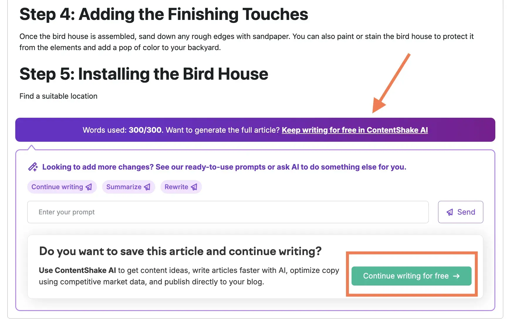
For example, Semrush offers free AI content creation tools to convert visitors into paying customers. To achieve this, the company runs experiments with adding various conversion mechanisms, such as in-product features and banners that drive users to the paid product.
When it comes to marketing, UX is about the overall impression your website or app gives to visitors. It includes things like:
- Ease of navigation.
- Accessibility of information.
- Speed and responsiveness.
- Delivering relevant content based on each user’s needs.
Good UX helps marketers facilitate desired user actions, encourage users to explore more content, and increase customer engagement.
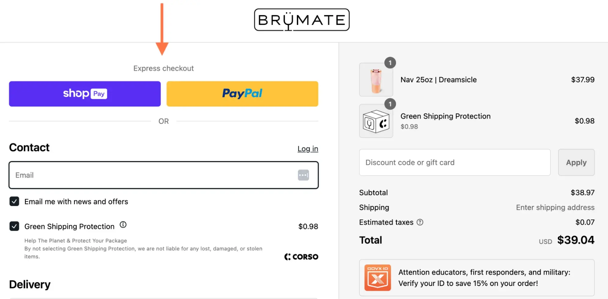
For example, companies like BrüMate offer express checkout, which makes purchasing on their website faster and easier.
How UX Affects Your CRO
UX and CRO tackle similar goals. They aim to help users accomplish tasks — such as converting — with minimal effort.
However, there are several key differences between these two concepts, which I outlined in the following chart.
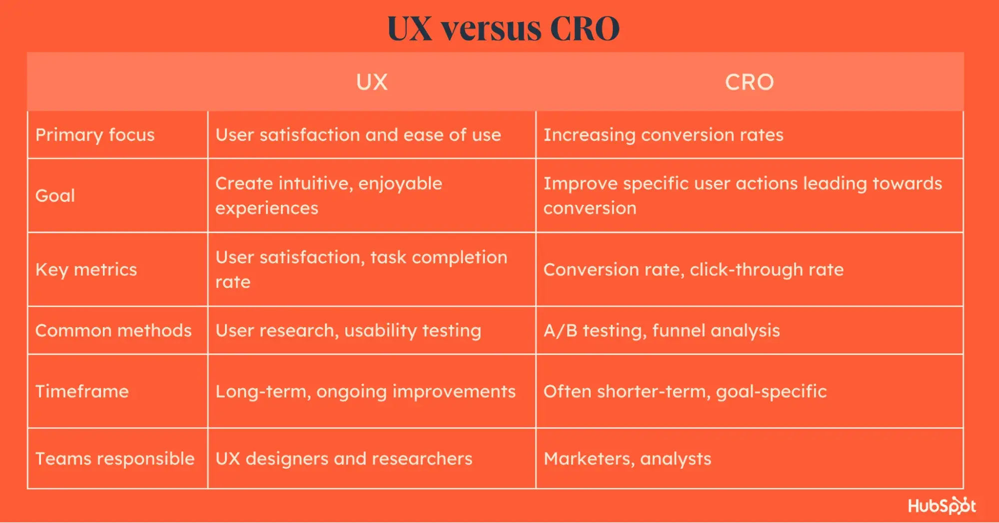
As you can see, CRO involves quick actions to increase conversion rates. And UX is where you generate essential knowledge about your audience and connect the dots.
The best part?
These two disciplines can help you build a coherent and high-converting user journey when you combine them.
Here’s how UX and CRO complement each other:
- UX research identifies important user behavior patterns. By analyzing how visitors navigate your site, you can understand where they drop off or hesitate. This can help you increase conversion rates with less effort.
- UX research methods inform CRO experiments. A/B testing is a great CRO method — as long as you know what to test. Ongoing UX research provides essential customer data you can use to build experiment hypotheses.
- Good UX makes conversion feel natural. UX improvements reduce friction in the user journey. Making sure your customers end up exactly where they’re supposed to be. For example, when your site is intuitive and easy to use, visitors are more likely to convert without frustration or confusion.
As you can see, CRO and UX produce a unique synergy. Joining their forces helps you build an environment where conversions happen naturally.
However, I've seen many businesses creating silos between these processes and the teams responsible for them.
Is it similar in your company?
If so, focus on building a platform for collaboration between UX and CRO specialists and design common processes to bring them together.
How to Optimize Your Website’s User Experience to Improve CRO
Improving UX for CRO means improving the overall user journey on your website or app to increase user conversions.
It's about maximizing the value of converting while minimizing the effort needed to complete the desired action.
Here are some ways I think you can do it.
1. Set your CRO and UX goals.
I recommend starting by defining your key objectives. Opt for clear, measurable goals that align both with UX and CRO objectives.
Here’s how:
- Identify key business objectives. Example: Fix stagnant sales despite growing traffic.
- Translate them into specific, measurable UX and CRO goals. Example: Reduce bounce rate on product pages.
- Set realistic goals. Example: Increase conversion rate by 15% within six months.
- Align UX metrics with CRO outcomes. Example: Improve page load time to under three seconds to boost user engagement and reduce abandonment rates.
Your final goal could look like this:
“Increase product page conversion rate from 0.7% to 3% within 3 months by improving product information clarity and layout, as measured by both decreased bounce rate and increased add-to-cart actions.”
Pro tip: If you’re looking to master CRO and increase your online conversions, try this free 8-week conversion optimization planner.
2. Continuously collect user data.
Next, collect and analyze relevant customer data. Look at the following metrics:
- Conversion rates. Overall and page-specific.
- User flow. Entry points, exit pages, and common paths through your site.
- Engagement metrics. Engagement rate and bounce rate.
- Click-through rates. Especially for CTAs and important links.
- Form analytics. Completion rates and drop-off points.
- Page load times. Particularly for key conversion pages and for your website overall.
- User feedback. From surveys, support tickets, customer development, and user testing.
These data points can spot bottlenecks in your user experience and help you make necessary improvements.
For example, imagine you noticed that your product pages have a high engagement rate and users interact with various on-page events. However, the main conversion event has a low CTR.
After additional analysis, you realize that this is happening because users struggle to find technical specifications about products and abandon the purchase process frustrated. So, adding this quick fix to the user experience could boost the conversion rates.
There are many methods for collecting customer data. Here are a few examples:
- Conduct user surveys and interviews to gather direct feedback.
- Analyze customer support interactions to look for common issues.
- Set up heatmaps and session recordings with tools like Hotjar or Crazy Egg.
- Use tools like Google Analytics (GA4) and HubSpot’s Marketing Analytics to analyze your conversion funnels.
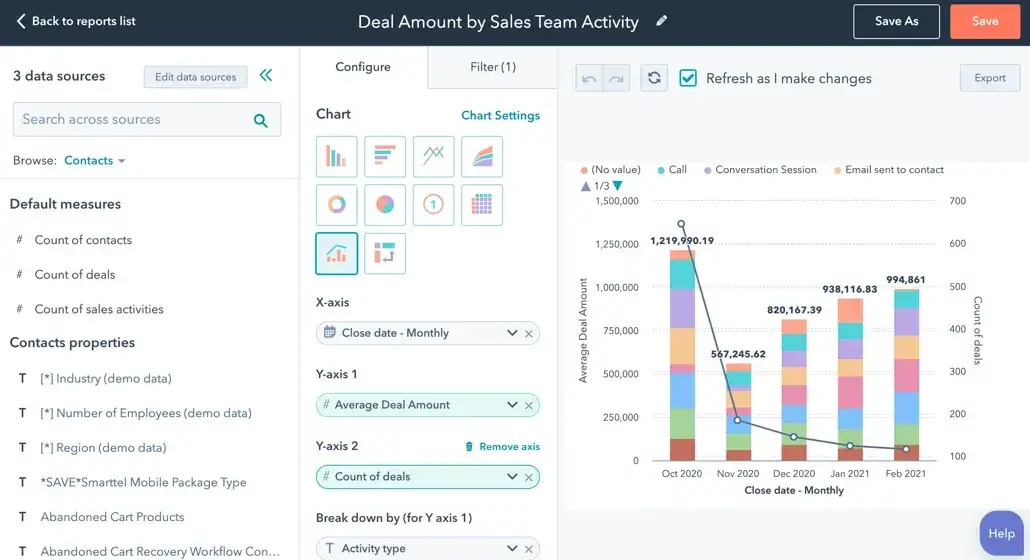
For example, HubSpot’s Marketing Analytics tool lets you track the complete customer lifecycle. This way, you can see how every marketing interaction contributes to your revenue goals and make adjustments in real time.
3. Identify key user pain points.
After collecting customer data, identify key pain points in the user experience that may be slowing down conversions. Here's how to spot them:
- Analyze drop-off points in your conversion funnel (where users bounce the most).
- Review negative user feedback and requests from surveys and support tickets.
- Examine heatmaps and session recordings for unusual behavior.
- Look at pages with high exit rates or low engagement.
- Consider load times and technical issues.
Once you have a list of important user pain points, prioritize them based on their impact on conversions and ease of fixing.
Then, create hypotheses about how addressing each pain point could improve the user experience and increase conversions.
Let’s look at an example.
Sometimes, brands capitalize on user pain points in a curious way.
Have you noticed that it takes a lot of time to choose the next show to watch on Netflix?
Apparently, the streaming provider deliberately designs its interface to encourage prolonged browsing.
Wondering why?
The paradox of choice and decision fatigue keep users engaged with the platform. Investing all this time into looking for a show increases the value of the content they finally select.
At the same time, Netflix uses algorithms to make its suggestions relevant for each specific user.

4. Map out the customer journey.
From here, you can identify the main areas of focus and work on customer journey mapping.
The customer journey is the path people take from realizing they have a problem to buying a solution. It includes every interaction they have with a brand along the way.
Here’s how to go about it:
- First, create user personas based on the key pain points spotted during previous steps.
- Then, define journey stages (e.g., awareness and consideration) and list the key touchpoints. Those are the key interactions users have with your brand at each stage, both digital and offline. For example: your website, social media, physical stores.
- Next, identify key actions for each touchpoint. It could be interacting with website content, downloading something, requesting a demo, or adding to cart.
- Finally, mark areas where users commonly struggle and spot potential areas for improvement.
For instance, you might spot high issues with your checkout process and add fixes, leading to a tremendous increase in conversion rates.
Let’s look at a real-life example of a customer journey map. HubSpot created a highly detailed Customer Journey Map capturing the complex B2B decision-making process.

5. Design relevant website experiences.
With a clear understanding of your users and their journey, you can design experiences that meet their needs and improve conversions.
Remember to focus on the specific user pain points and bottlenecks identified during your research. Some potential fixes might include:
- Auditing friction points. Spotting and removing unnecessary steps in the user journey. For example, by allowing guest check out on an e-commerce website.
- Behavioral flow optimization. Designing intuitive navigation based on analyzed user paths.
- Optimizing for mobile. Ensuring your site is fully responsive and easy to use on all devices.
- Improving page load times. Using different tactics like compressing images to speed up your site.
- Contextual personalization. Dynamically adjusting content based on user behavior and preferences.
- Enhancing micro interactions. Improving CTAs, forms, and other website elements.
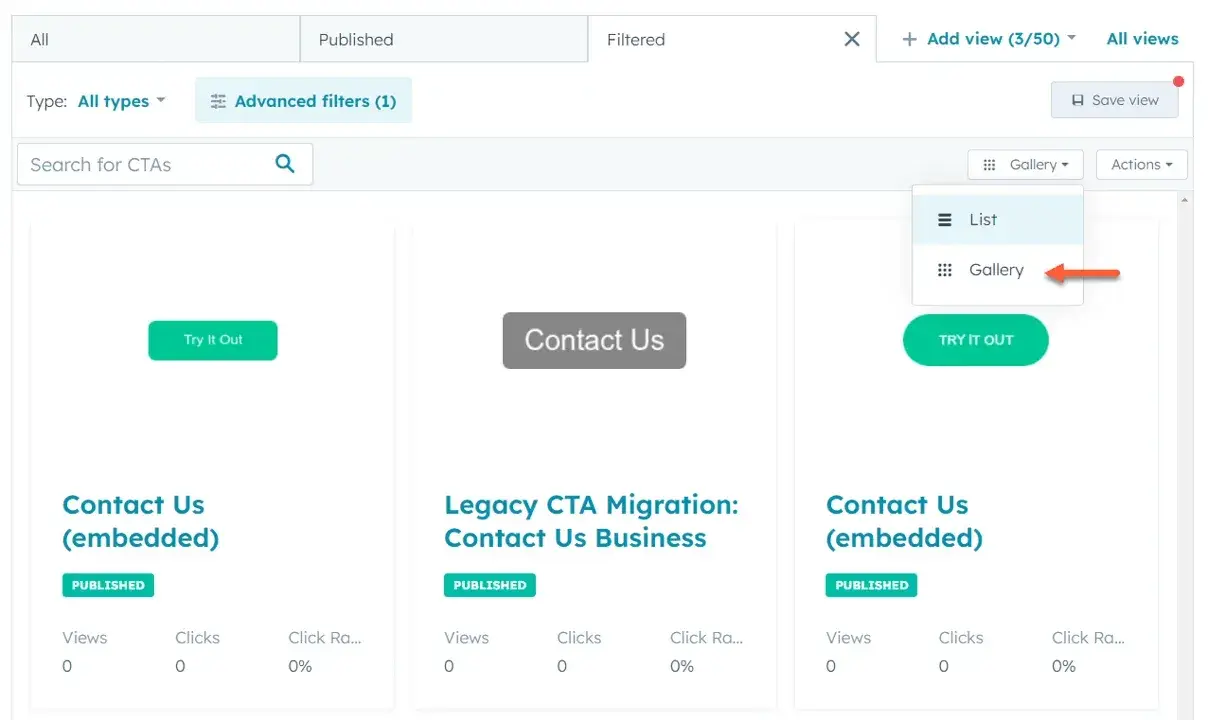
Take it further: HubSpot lets you analyze CTA performance across your entire website and prioritize high-converting design, text and placements. Spotting such patterns in your CTAs helps you create best practices to be used across the entire company.
6. Continuously analyze and optimize.
Both CRO and UX require ongoing analysis and optimization. This helps you adjust to the changing user needs and maintain high conversion rates.
Start by formulating hypotheses based on the data you collected and pain points you identified.
These hypotheses should address both UX improvements and conversion goals. For example, "Simplifying our checkout process by adding fast Apple Pay and PayPal payment options will reduce cart abandonment by 19%."
Next, design and prioritize your experiments. Consider:
- A/B testing for comparing two versions of a page or element (forms, CTAs, content sections, etc.).
- Multivariate testing for more complex changes.
- User testing for gathering qualitative insights.
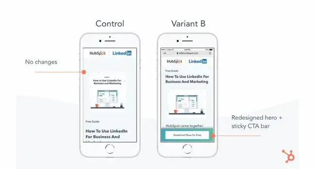
As an example, HubSpot tested four mobile CTA design variants. The best-performing version increased conversion rates by 10% and was projected to generate 1,400 more content leads and 5,700 more form submissions monthly.
Finally, always stick to your original goals and iterate accordingly.
Look beyond surface-level metrics to understand the full impact of your changes. For example, if you've increased click-through rates, make sure it also leads to higher conversion rates or customer satisfaction.
This cycle of experimentation and optimization will let you build digital experiences that meet user needs and help you reach your business goals.
Pro tip: If you’re interested in exploring A/B testing, I recommend trying this free kit to help you run a successful experiment.
Tips for Designing Experiences that Boost Conversion
Now I’ll dive into some best practices for increasing conversion rates on your website.
1. Define a clear purpose for each web page.
Every page on your website should have a specific goal — whether it’s to sell a product or trigger a content download. Here are some ways that could look.
- Homepage. Introduce your brand and guide users to key sections of your site.
- Product page. Encourage visitors to purchase a specific item.
- Category page. Help users browse and compare related products.
- About page. Build trust and share your brand story.
- Contact page. Facilitate communication with your company.
- Blog post. Educate users and encourage further engagement.
- Landing page. Convert visitors with a specific offer.
So, define the primary purpose for each page and stick to it. This will make sure your visitors stay focused and progress towards the target action.
Design every element on the page to support this goal. Remove any distracting or irrelevant content. To illustrate, you should avoid cluttering your product pages with unrelated promotions or excessive cross-selling.
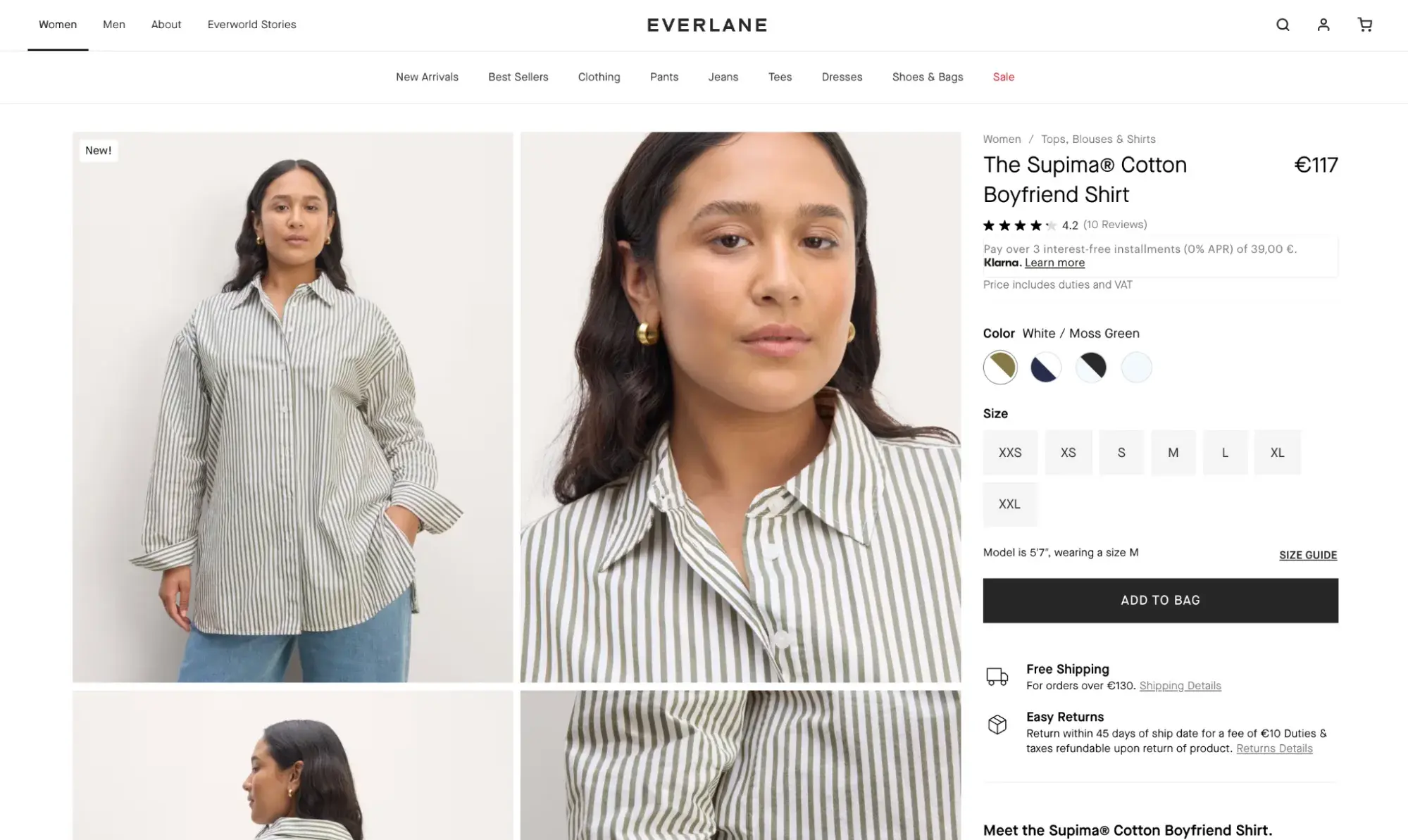
For example, Everlane’s product pages focus on providing essential elements about each item without distracting the user.
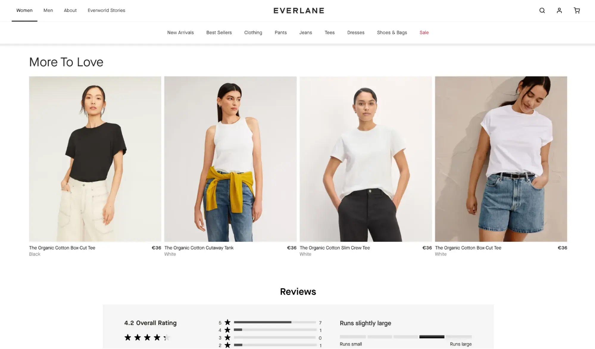
The users only see a few relevant items when they scroll down:
At the same time, Temu users see dozens of product suggestions — sometimes irrelevant — on each product page.
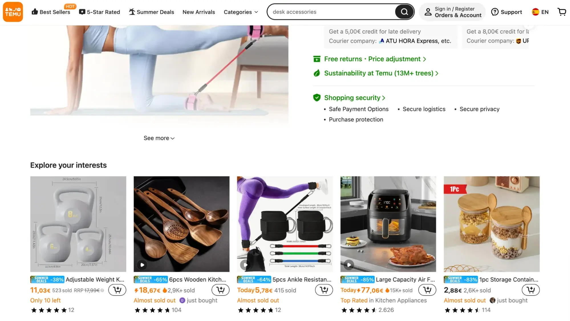
This approach can be useful for websites pushing for high-quantity cheap orders but is less helpful for brands like Everlane.
2. Design intuitive website navigation.
Intuitive navigation helps with both user experience and conversion optimization. It ensures users can find what they’re looking for quickly and easily.
I recommend trying things like:
- Using clear, descriptive labels for navigation items,
- Implementing a logical hierarchy in your menu structure,
- Providing multiple ways to access important pages (e.g., main menu, footer links, in-content links),
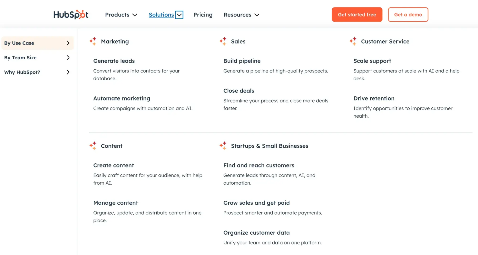
At the end of the day, it’ll also depend on your specific context. For example, you can implement a “mega menu” if you have many products or categories like we did at HubSpot.
3. Optimize your website for better performance.
Technical performance can directly impact your website’s SEO because it helps create a smooth user experience. When your website loads quickly and functions well, visitors are more likely to stay and explore. Search engines like Google notice this, which can boost your rankings.
Slow-loading pages, frequent errors, and non-existing pages can all drive users away before they even interact with your content.
I recommend that you conduct regular website audits and focus on:
- Optimizing page load times.
- Ensuring mobile responsiveness.
- Fixing broken links and 404 errors.
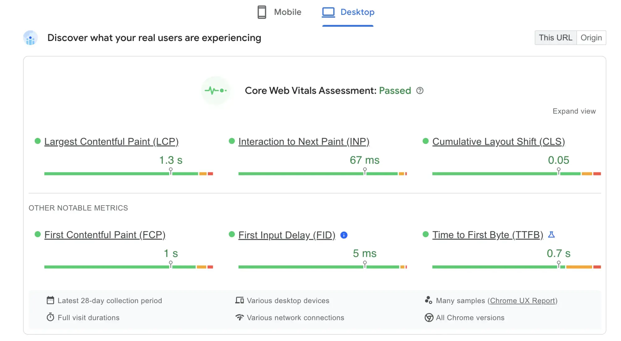
I use the Google PageSpeed Insights tool to measure and improve Core Web Vitals. It’s a collecting of metrics measuring user experience for loading performance, interactivity, and visual stability of your pages.
4. Personalize experiences for different user types.
Personalization tailors content, website elements, offers and interactions to specific segments. It helps you create highly relevant experiences that convert users at a higher rate.
You can use different strategies like:
- Behavioral personalization. Customizing content based on user actions and browsing history.
- Demographic personalization. Adjusting messaging for different age groups, genders, or locations.
- Contextual personalization. Adapting content based on time, device, or referral source.
For example, Zalando personalizes the user’s feed and generates offers based on their past purchase behavior.

There are many tools you can use to automate personalization. One of my favorites for this is HubSpot's CMS, which helps you create personalized websites without deep technical knowledge.
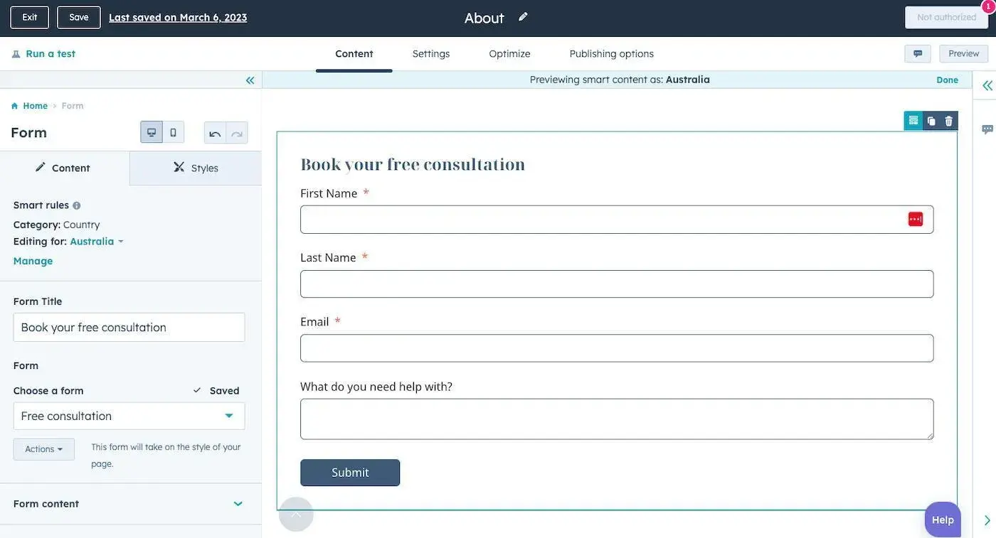
You can personalize various on-site experiences, show users the most relevant content, and improve their experience by adding chatbots. All this is essential for increasing conversion rates in an organic way. Here’s an example of how you can optimize your forms and add smart rules to customize them for each user.
5. Optimize website forms.
Web forms are often the final step in a conversion process. Optimizing and personalizing them is also essential for improving the on-site experience and increasing conversion rates.
Some of the things you can do include:
- Create a clear web form header.
- Make your forms visually appealing and use brand colors.
- Minimize the number of fields to only what's necessary.
- Use smart fields to remove fields that users have previously completed.
- Auto-fill information when possible (e.g., zip code based on location).
- Explain why you’re asking for information.
- Optimize your forms for mobile.
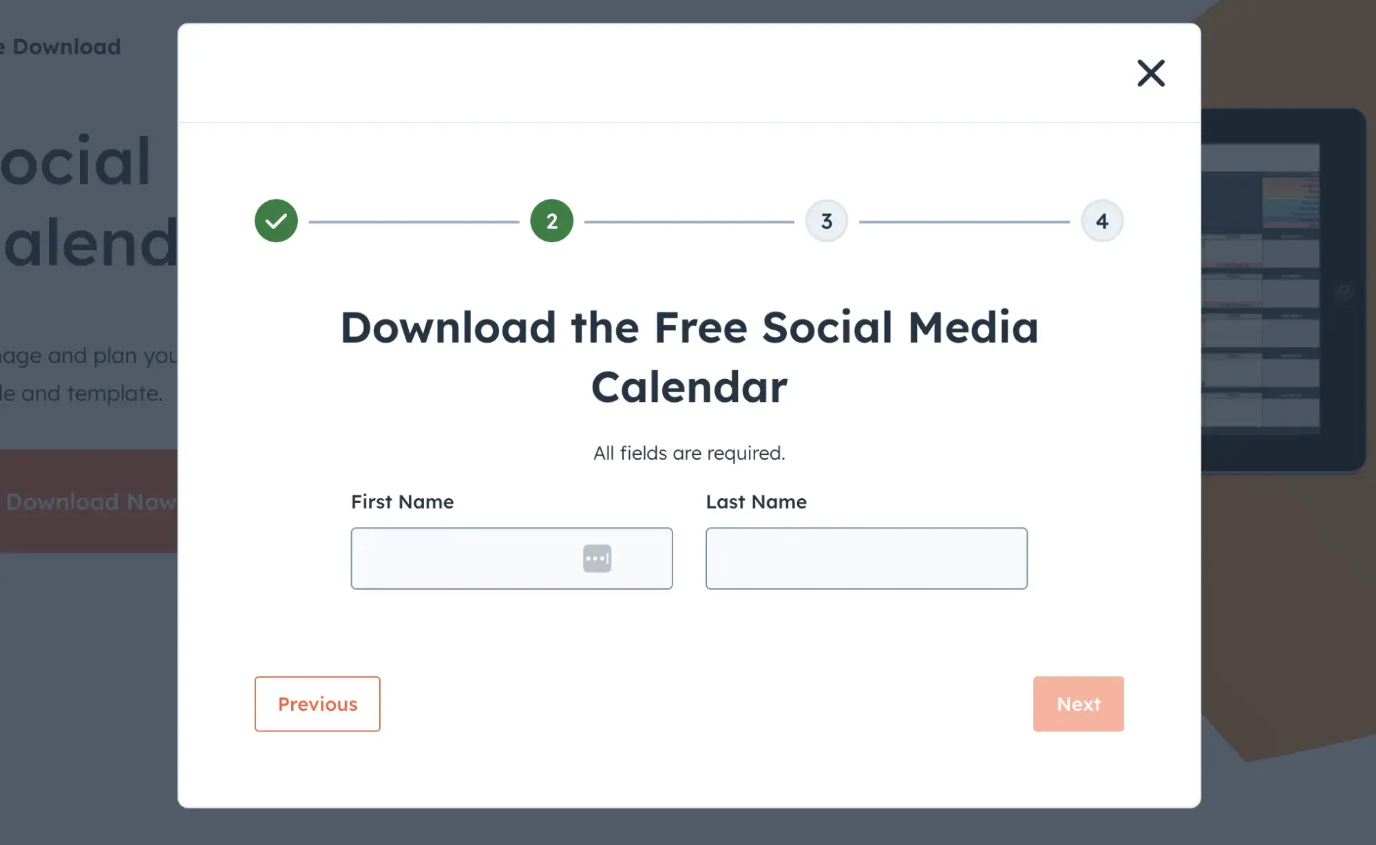
At HubSpot, we use progressive download forms, meaning there‘s a step for each question. This makes the process feel less overwhelming for users. It also increases the likelihood of conversion, as users are more likely to commit once they’ve started the process.
6. Improve the post-conversion experience.
The user journey doesn't end at conversion.
A positive post-conversion experience can make the customers come back, purchase more items, and recommend your product to other people.
Focus on the following elements:
- Provide an instant confirmation page and email with a personalized thank you message.
- Customize and optimize the onboarding process.
- Offer content related to users’ conversion actions (think knowledge bases and email nurture workflows).
- Suggest complementary products or services based on the user’s conversion.
- Ask for initial feedback on the conversion process.
- Invite users to join your community or user groups.
- Introduce loyalty, rewards, and referral programs.
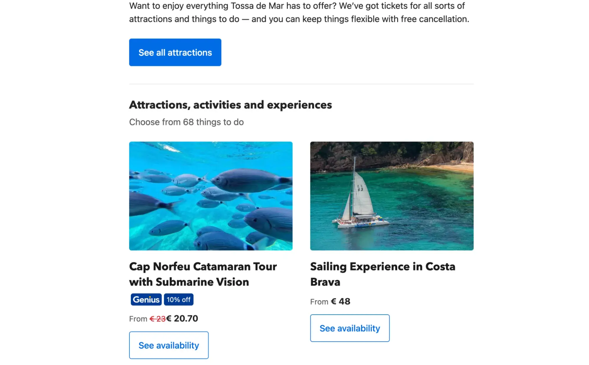
Here’s a look at how Booking.com sends personalized emails recommending fun activities in your destination once you’ve completed the reservation:
Connect UX and CRO to Build Lasting User Experiences
I’ve learned that combining UX and CRO strategies helps you design experiences that build trust and convert users at scale. It also lets you optimize the overall user journey and spot opportunities to nurture your existing traffic.
My main takeaway is this: Start by setting clear goals and collecting user data to identify pain points in the customer journey. Then, design experiences that make conversions feel natural. Tactics like simplifying navigation, optimizing forms, and personalizing content can help you reach your goals.
Remember, ongoing optimization and collaboration between different teams are key to your success.
Conversion Rate Optimization


.png)