If you're looking to create a budget website on an easy-to-use platform, Google Sites may be the perfect fit. While setting up a Google site is relatively straightforward, that doesn‘t mean a Google Sites tutorial wouldn’t be helpful.
I‘ve built plenty of Google Sites for a variety of purposes over the years, so I know what you need to make a compelling website on the platform. I’ll walk you through the ultimate Google Sites tutorial that will answer any questions you have about using the tool to create your website.
Table of Contents
- What is Google Sites?
- Is Google Sites free?
- How to Use Google Sites
- How to Make a Website for Free on Google
- Should You Use Google Sites?
- Best Google Sites Templates and Themes
- Google Sites Examples
- Google Sites Pros and Cons
- Google Sites Tips
- Google Sites FAQs
What is Google Sites?
Google Sites is Google's content management system (CMS) where you can create a website for free. You can use your own domain and customize your template with copy, images, fonts, headers, footers, and menus. If you're an experienced website builder or consider yourself tech-savvy, Google's framework provides plenty of web development and deployment options to leverage, too.
I've witnessed Google Sites undergo plenty of changes since it debuted. Originally, it looked similar to how Google Docs does now. Since then, Google has added functionality and new features, making it a viable contender for business owners and creators looking for an easy-to-use CMS.
If you've got the classic version of Google Sites already up and running, I suggest you make the switch to the new interface. I find the updated design framework much easier to use, thanks to drag-and-drop design elements and the ability to quickly insert text, images, and videos.
HubSpot's Free Website Builder
Create and customize your own business website with an easy drag-and-drop website builder.
- Build a website without any coding skills.
- Pre-built themes and templates.
- Built-in marketing tools and features.
- And more!
If you don‘t make the switch, you aren’t using Google Sites to its full potential. I suggest you use the new Google Sites because it boasts plenty of features the older version doesn‘t. I love that the new Google Sites was created specifically for users who don’t have experience with code.
I’m also now able to see drafts of my website, preview changes before publication, adjust my site for mobile compatibility, and add a Cloud search box to my website. All of these features were previously impossible.
Pro tip: If you’re unsure where to begin with creating your website, Google Sites provides some templates you can peruse and use. However, I recommend you customize whichever you choose. Otherwise, it will be a cookie-cutter site your visitors can find elsewhere on the web.
Is Google Sites free?
Google Sites is completely free with any standard Google account. The number of sites you can make is only limited to the 15 GB of storage that comes with your account, but you can purchase more at any time. Remember that this storage maximum is shared with all your other Google apps.
Because of its nonexistent price tag, Google Sites is a good place to start for those who want to create a quick website. For instance, I used the Google Sites CMS to build websites for courses I took in college, as the websites were free to create and offered a sense of professionalism.
Should You Use Google Sites?
Google Sites is a fantastic tool for quickly creating free websites. But there are definitely some scenarios where I recommend considering something more advanced. Here are a few situations where a Google Site should or should not be used:
For simple or low visibility websites? Yes.
If you’re aiming for a high-traffic commercial website, Google Sites may not be the best option. But for sites that target a highly niche audience, it’s ideal.
Think of it like this: If you’re expecting your website to be discovered by a target audience, I recommend choosing another option. But for sites you’ll be sending to people directly for specific purposes, it’s ideal.
For example:
- Personal resume websites.
- Professional portfolios.
- Family updates.
- Wedding websites.
- Hobby showcasing websites.
- School or club activities.
- Event information pages.
- Community group updates.
So it’s not surprising that w3Techs found that Google Sites is only used by 0.1% of all websites in 2024.
For ecommerce websites? No.
Any advanced functionality is not ideal for Google sites. But when it comes to ecommerce in particular, I recommend looking elsewhere for paid website building platforms that easily integrate with ecommerce tools like Shopify.
Even Google itself highlights that Sites is not intended as an ecommerce platform, although it does provide some tips for basic functionality.
That being said, if I was doing something simple like redirecting people to a payment page for gift cards, I might consider it. But not for multi-category, multi-product ecommerce sites.
For websites with super simple design needs? Yes.
If all you want is a template or theme that you can add your own colors and tweaks to, then Google Sites is a great choice.
But if you’re planning on any detailed customizations or want a good level of control over things like layout, mobile responsiveness, etc., then I would look elsewhere.
This is especially true since Google Sites went through an update in November 2016. While lots of functionalities were added to the new version, many handy items from the legacy version were also removed.
Here are just a few items no longer available on Google Sites:
- HTML editing (this is a biggy for customization).
- Tables.
- Site width editing.
- Mobile editing.
- 33 theme categories (it’s now down to just six).
So I wouldn’t turn to Google Sites for anything that needs more than adding your own images and text and customizing colors.
In those instances you’ll want a comprehensive Content Management System (CMS). A CMS enables you to edit to your heart’s content and, in most cases, still provides plenty of templates and easy-to-use editors for you to achieve the look and content you need.
Still in the planning process but want to redesign your site? Check out this workbook for redesigning your website to get a planning guide and templates to guide your decision making.
For websites that you want to appear in Google Search? No.
In the irony of all ironies, Google Sites is one of the last tools I would recommend using if you want to build visibility for your website in Google’s own search results.
The tool is highly restrictive when it comes to all the “under the hood” editing that’s required for search engines to effectively access, understand and display your website for the right search queries.
Here’s what you cannot do for SEO on a Google Site:
- Build site categories.
- Meta descriptions.
- Meta titles.
- Define canonical URLs.
- Choose a site display language.
- Generate XML or HTML sitemaps.
- Subpage listings.
- HTML editing.
It would probably be quicker for me to say that you essentially can’t do anything SEO-related in Google Sites. Even building and maintaining a blog is almost impossible.
How to Use Google Sites
- Step 1: Open Google Sites.
- Step 2: Build your site header.
- Step 3: Add layouts, text, and images to your homepage.
- Step 4: Add a footer.
- Step 5: Add pages.
- Step 6: Click “Publish” when you’re done.
Let‘s look at each of these steps in more detail. Since you’ll probably have some questions during the process, it's worth opening the Google Sites Support Page for a list of some of the most common Google Sites functions. I recommend you bookmark this page so you can easily access it while creating your site.
What would a Google Sites tutorial be without a step-by-step walkthrough? I went through the steps detailed below to create a website. Check out the final result before we begin so you can see what your site will look like when it's done.
Step 1: Open Google Sites.
Head to Google Sites to start creating your new website. If this is your first time building a website, but you‘re a seasoned Google user, you’ll find that the layout of this page is similar to all other Google products, such as Google Docs and Google Slides. As far as I‘m concerned, this is a huge plus because there’s not a significant learning curve.
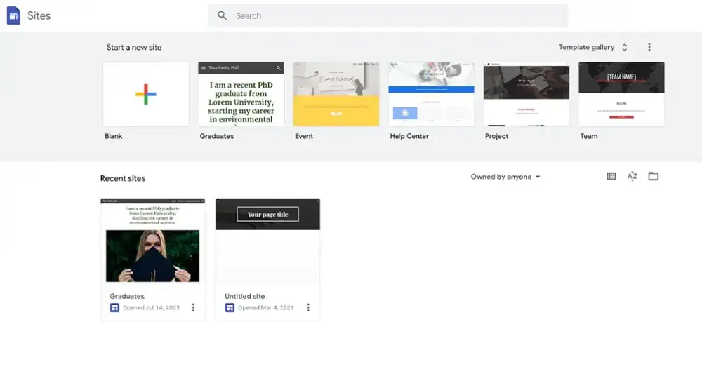
To begin creating your website, you can either use Google‘s templates or start a site from scratch. Even if you aren’t going to use a template, I suggest you give them a quick look to get an idea of what the template websites include.
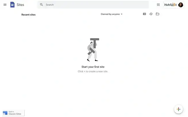
Here’s how the page will look if this is your first time opening Google Sites.
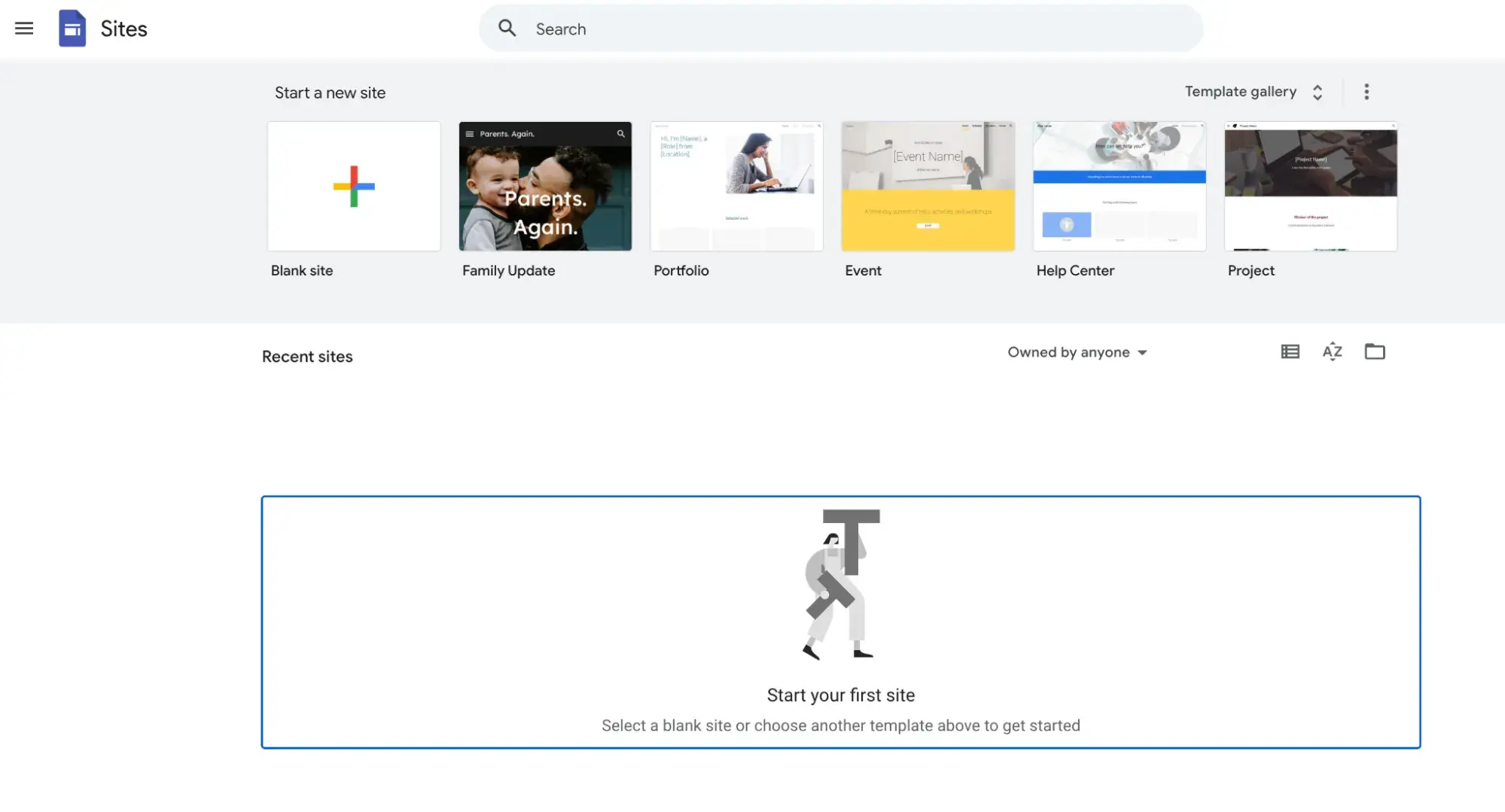
Free templates are available directly from Google, allowing you to quickly change things like fonts, color schemes, or layouts. You can also purchase and install new themes and templates. I've included a handful of top templates and themes later down below.
I recommend taking a look at the templates first to see if any strike your fancy. To access them:
- Click Template gallery in the upper right-hand corner of the header.
- Click the arrows to expand this box so you can check out all the offerings.
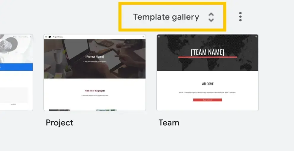
Google has done a fantastic job, including templates for most personal and professional use cases. That said, because of its limited functionality, I wouldn't really recommend this tool for business users. Overall, Google Sites is better suited for personal or educational use.
For creating a business site, I recommend you consider a more robust option such as Content Hub, which offers business tools in addition to a website builder. (You can also get started with Content Hub for free, which makes it a compelling option, too.)
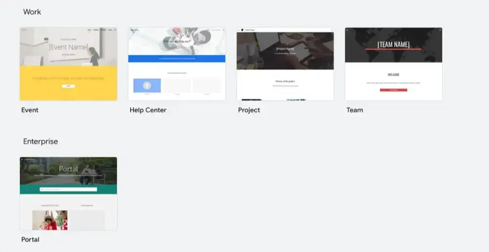
For other users, Google Sites offers templates aplenty. Here's a quick overview of how you can use the Google Sites templates:
- For work. You can create an event homepage, help center, project website, or team website.
- For small businesses. You can create a dog walker site, holiday party homepage, portfolio website, restaurant website, or salon website.
- For personal use. You can create a family update site, digital portfolio, or wedding website.
- For educational uses. You can create a website for graduates, professors, classes, clubs, or students.
As you can see, there are a variety of ways you can use Google Sites. However, you‘re better off not building anything too complex. For more robust websites, you’d be better off opting for a more comprehensive CMS. No shade to Google Sites — it's great for what it offers. However, its functionality is limited when compared to website builders like WordPress.
I‘m going to create a website for a coffee shop review site from scratch, even though I know nothing about coffee (proud whatever-is-available drinker). I will always go for a local roast, though. Just don’t ask me to remember its name.
Step 2: Build your site header.
Even if you start a site from scratch, Google Sites will include a header for you to edit right away and hit the ground running. This is awesome — it makes starting a site much less intimidating, as you don't have to figure out where to add the header.
The process is intuitive:
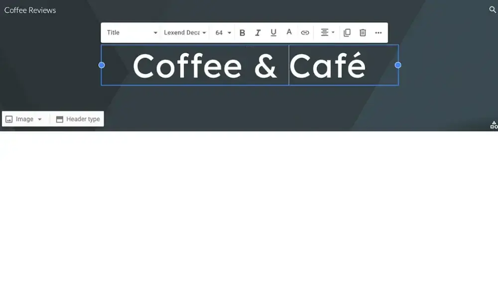
- Click on the header text and start editing.
- Your standard text options will come up: Text style, font, text size, and formatting.
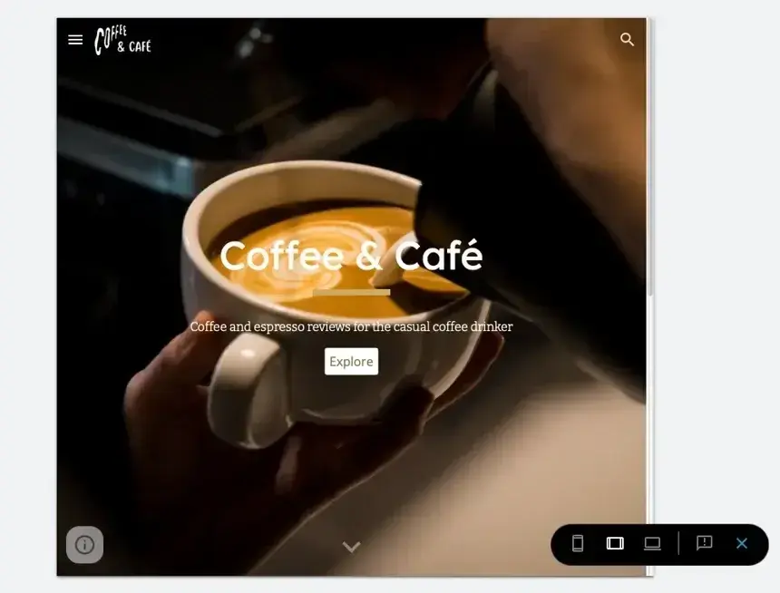
- Click around and get acquainted with your options. I named my site “Coffee & Café,” as you can see below. (Creative, I know.)
Add your logo.
Next, I updated the logo. In the upper left-hand corner, hover over your site name, and click Add logo.
This will open your site settings, where you can both upload a logo and a favicon. The favicon is the small symbol that appears next to your website name on a browser tab. This icon also appears in users' favorites if they happen to favorite or bookmark your site.
I recommend you don't skip this step — it can make a significant difference in making your website feel more polished and professional.
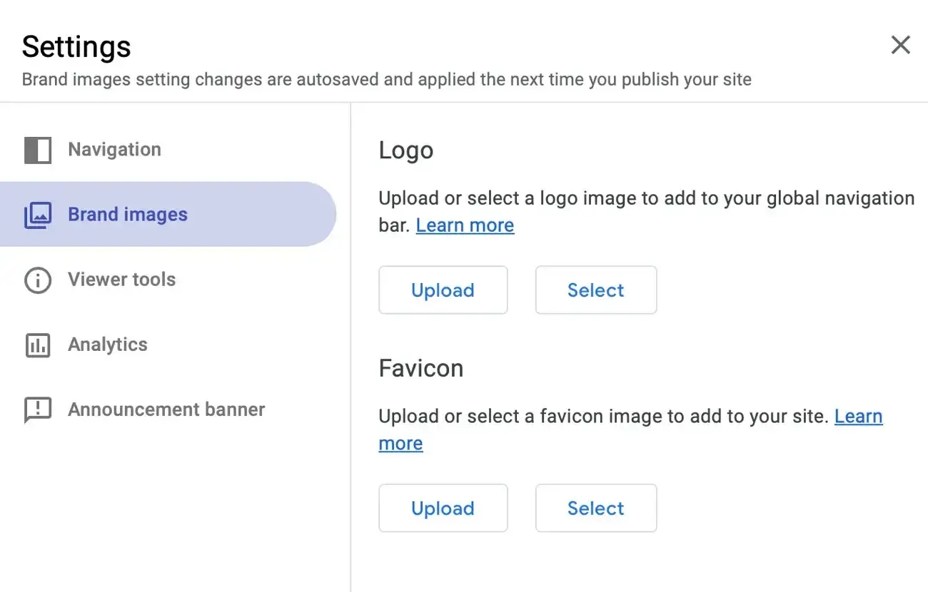
One thing I noticed when uploading a logo is that it‘s very, very small unless you’re careful. For my Google Sites logo, I used the dimensions 1000 pixels wide by 500 pixels tall, and that worked out pretty well.
Remember to add alt text, too, for website accessibility purposes. (If you want to learn more about website accessibility, which I recommend you do, check out this helpful web accessibility checklist.)

HubSpot's Free Website Builder
Create and customize your own business website with an easy drag-and-drop website builder.
- Build a website without any coding skills.
- Pre-built themes and templates.
- Built-in marketing tools and features.
- And more!
Change your header type.
Google Sites gives you the option of changing your header type to a full-height cover image, to a narrow banner, or to your title only. To access these options, hover at the bottom of your header and click Header Type.
There, you'll see your options. I chose Cover so that my header took up the entirety of the page. I encourage you to try out the different options to determine which suits your branding the best.

Add a background image.
Next, you‘ll want to choose a background image unless you’re using a title-only header. At the bottom menu of the header, click Image.
Here are your options for adding a background image. You can:
- Upload an image from your computer.
- Browse Google's options.
- Browse your internal Drive library.
- Search Google itself.
- Insert an image via a URL.
Remember to choose an image you have the rights to use, or select a free stock photo website. If you don't, you risk copyright infringement, which is a major no-no.
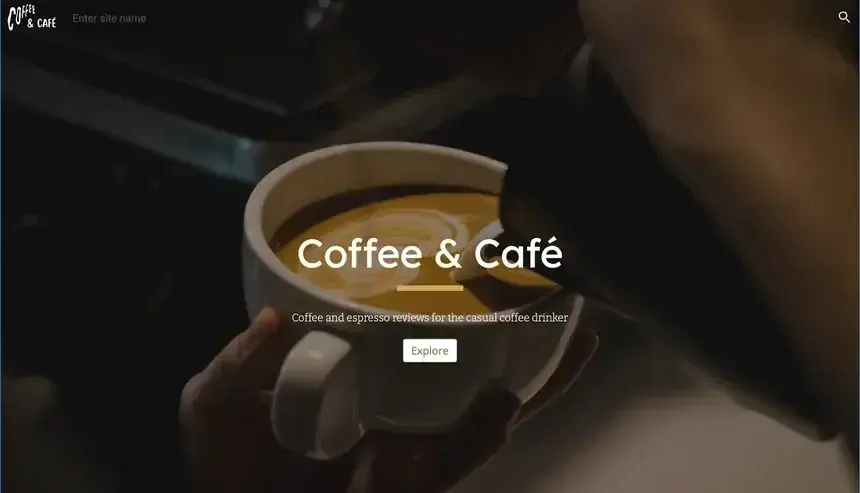
I chose to look for an image from a free stock photo website called Unsplash. Here's how my header turned out. Pretty spiffy, if you ask me.

My site is looking good so far, if I do say so myself. You can use pretty much any dimensions for your Google Sites header's background, so long as the dimensions are above 1200 pixels wide. This allows your picture to look high-quality while having a lower image file size.
At the bottom of the right-hand corner, you can change the anchoring for the image. You can also toggle the background image's “readability,” which makes your image lighter or darker so that your text is clear and provides better accessibility.
Add subheadings and buttons.
We're not finished yet. Google Sites allows you to add additional elements to your header so that you can pull viewers in. To do so, you can double-click anywhere on the cover, and a menu will pop up:

From this menu, you can add:
- Text
- Images
- Uploads (from either your local drive or your Google Drive)
- Embeds
This last one is neat because if you're building a landing page, you could embed a website form you create on a form builder tool, directly into your header. If you're launching a newsletter and want to offer visitors the opportunity to get it sent to their inboxes, this would be a great option.
Alternatively, you can simply go to the Insert tab on the sidebar, and then choose your element from there. When I used this method, the new element inserted itself into the body of the page, but all I had to do was drag it over to the header, and it snapped to the grid.
I decided to add a subtitle and button to add some personality to my site.
Explore Themes.
Before we move on from the header, I wanted to draw your attention to Google Sites' themes on the right-hand side, located under the Themes tab. These are different from templates. The themes allow you to choose a general aesthetic for your website, whereas the templates offer a pre-arranged format.

You can also create a theme with custom colors and fonts or upload one from your local drive. The opportunities for customization aren't endless, but they are suitable for our needs.
I chose the “Aristotle” theme. One cool note here is that Google Sites will automatically sense your brand colors and change its themes' colors to match, which saved me time.
Step 3: Add layouts, text, and images to your homepage.
It's time to start building my homepage. Using the Insert tab in the right-hand sidebar, you can add layouts, text, images, and videos. Let's go over our options for page building and customization.

- Content Blocks. These are premade layouts that you can insert into your page. They come with placeholders for images, headers, and text.
- Collapsible Group. Create a section with sections that can expand or retract.
- Table of Contents. Insert a table of contents that automatically populates based on your page's headings.
- Image Carousel. Insert a carousel of pictures. This is an awesome way to add visual interest to your website, as well as make it look more polished.
- Button. Add a button with a link. When I used this feature, I was unable to adjust the spacing around the text; you can only change the alignment of the button.
- Divider. Add a line that runs across your page to split different sections.
- Spacer. Insert an area of white space, which you can resize by dragging.
- Social Links. Create links to your social media profiles. You can upload custom icons, but Google Sites will automatically generate icons for the most common social sites. You should definitely do this if you are building a small business page or portfolio.
- Placeholder. Add an “empty” block to insert an image, video, or map later. Helpful for creating a layout without yet adding content.
- Cloud Search. Insert a search function to your page. I generally don't recommend this unless you deactivate the search icon at the top of your website header.
- YouTube. Add a YouTube video from the entire YouTube library, or upload a video.
- Calendar. Insert a widget from your Google Calendar. This only shows your agenda; it wouldn't replace a meeting scheduler embed widget.
- Map. Add an embed from Google Maps. This is great for companies with brick-and-mortar locations that want to share the information in an easy-to-read manner.
- Docs, Slides, and Sheets. Insert an embed from any document in your Google Drive; users can scroll through the entire file, which can be exceedingly useful for internal team websites.
- Forms. Insert a Google Form, but you'll need to create it ahead of time; there's no option to create it straight from Google Sites.
- Charts. Insert a chart taken from a Google Sheets file; you‘ll also need to create the file ahead of time. Google Sites won’t import the entire spreadsheet but only the charts found inside.
I recommend starting with content blocks so you don't have to build layouts from scratch. Not only will this make your layouts look more professional, it will save you a lot of frustration.

We have several options here, all of which include different setups for your images and content. For instance, one of the content blocks includes two columns with an image placeholder on each.
The image placeholders can also be used to insert videos, calendars, and even maps. I love how many different options there are for content blocks, so you can bring your site to life however you feel fit.

One thing I noticed was that if you add the wrong video from YouTube, there's no way to replace it; you can only delete the element. Thankfully, all you have to do is re-insert a video element into the page.
You can adjust every section‘s background color. Google Sites pre-picks colors that align with your color palette. This can be a little limiting, but it’s also useful if you‘re short on time. (And yet another reason why this tool is great for students or young professionals — it’s polished without taking up too much time.)

I also observed that there's no option to adjust the margin or padding on each section. You can, however, re-order the layouts and add spacers to create more white areas.
Remember to preview your page on different device sizes as you add new elements. At the top, click on the “Devices” symbol.

This will allow you to preview your content on mobile phones, tablets, and desktop windows.
Step 4: Add a footer.
Your website footer is a helpful section at the bottom of the page where you can add social links and copyright information. Some site owners also opt to add contact information or details about their location or hours of operation. To add one, simply hover at the bottom line, and the option will come up.

When you create a footer on Google Sites, it will automatically come with a text module you can edit. You can also add images, maps, and calendar widgets, but I kept it simple — I simply added the logo and social links.
You have the option of creating different columns. To do so, drag the content onto the footer and drop it where you'd like. Google Sites will automatically snap your content to the closest grid.
I suggest you check out other websites you love to get a feel for what their site designers added to the footer. This can provide you with some inspiration as you navigate what to add to yours.

Step 5: Add pages.
Google Sites allows you to create new pages under the Pages tab in its sidebar. Click the plus sign at the bottom.

You can add a new menu section, which is not a page but rather a heading that users can hover over to access subpages. You can also import an entire web page from another site or point to an external link. To me, this is a major perk of using Google Sites.
I chose to create a plain new page and gave it a name. You could potentially customize the URL's path (the words that appear after the ‘/’ symbol in the domain), but I only recommend doing this if your page‘s name is long or if you’re targeting a certain keyword with the URL.

Now, let's add a map and a contact form to this page. You probably know the drill by now: Go to Insert on the right-hand side, then click Map.
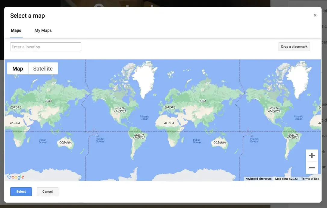
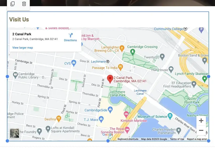
I inserted HubSpot's corporate address. You can resize the map by dragging the dots in the corner.
Next, let's add a Google Form, but remember that you must have created it beforehand before inserting it. Go to Insert, then click Form.
I found it easy to locate the exact form I was looking for, but it was difficult to make it look like it belonged on the page, so I recommend using a form builder instead (such as HubSpot's free form tool) and embedding it into your page.
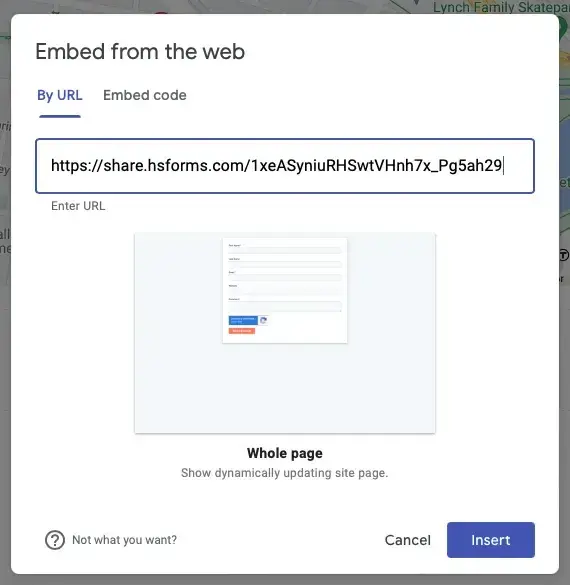
To embed, simply go to Insert and then Embed. I used the URL of my form, and it rendered beautifully. That's what I call a success.
Step 6: Click “Publish” when you’re done.
If everything looks good, we're ready to publish. I recommend reviewing your site settings to ensure everything looks in order. Then, click the Publish button in the upper right-hand corner.
Choose a new URL address for your site. Unfortunately, it will be located at a subdomain of a subdomain, like this one:

No, it doesn't look as professional as a custom domain. Luckily, there's a way to work around it: You can attach a custom domain to your website. Domains vary in pricing, but if you are using Google Sites to build a website for your business, I think it's worth the money. Here are instructions to connect a custom domain to your Google Site.
Don't forget to make your site public:
- Click the MANAGE text below your web address.
- Set your site permissions.
- Don‘t toggle the box that says "Request public search engines to not display my site" unless you don’t want to appear in Google search results. This may be a good option if you're creating a private family or company site.

HubSpot's Free Website Builder
Create and customize your own business website with an easy drag-and-drop website builder.
- Build a website without any coding skills.
- Pre-built themes and templates.
- Built-in marketing tools and features.
- And more!
Just like Google Docs, you can even get a shareable link to allow others to edit your website. This is great for students working on a group project. However, once you‘re done working with your peers, just remember to update the permissions so random visitors on the internet can’t edit your site and undo your hard work.

If you ever make changes and hit Publish again, Google Sites will give you a chance to compare the changes side-by-side. I think that's a pretty neat feature that allows you to publish with confidence.
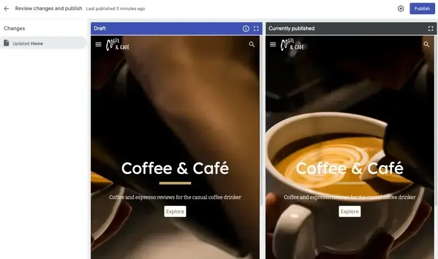
Curious to see the final result? Here it is.
Seems easy, right? It is — for the most part — thanks to Google‘s efforts in streamlining the creation and publishing process. But if you feel overwhelmed, here’s a more beginner-friendly tutorial on how to make a website for free on Google.
How to Make a Website for Free on Google
- Open Google Sites.
- Name your Google site.
- Title your first web page.
- Choose your site layout.
- Add media to your site.
- Expand your site content.
- Choose and add a theme.
- Publish your Google site.
- Choose your web address and set viewing rights.
- Incorporate your own URL.
1. Open Google Sites.
Head to Google Sites to get started. Click on the multicolored + button in the bottom right.
2. Name your Google site.
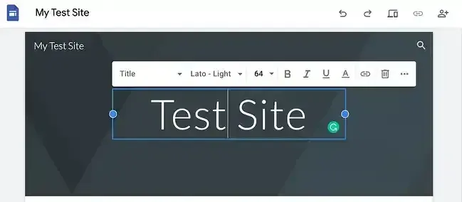
In the top-left of the screen, click Enter Site Name and choose a name for your new website. You can always go back and edit this later when you‘re building your site, so don’t worry too much about it.

3. Title your first web page.
Click on Your Page Title and enter a title for your page. You can change the font size, add bold or italic text, and include links.
4. Choose your site layout.
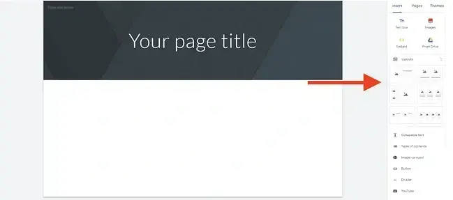
On the sidebar, you'll see multiple options for page layouts, including single images with text, multiple images, and more. Click on the layout you prefer or drag and drop it into your new website.
5. Add media to your site.
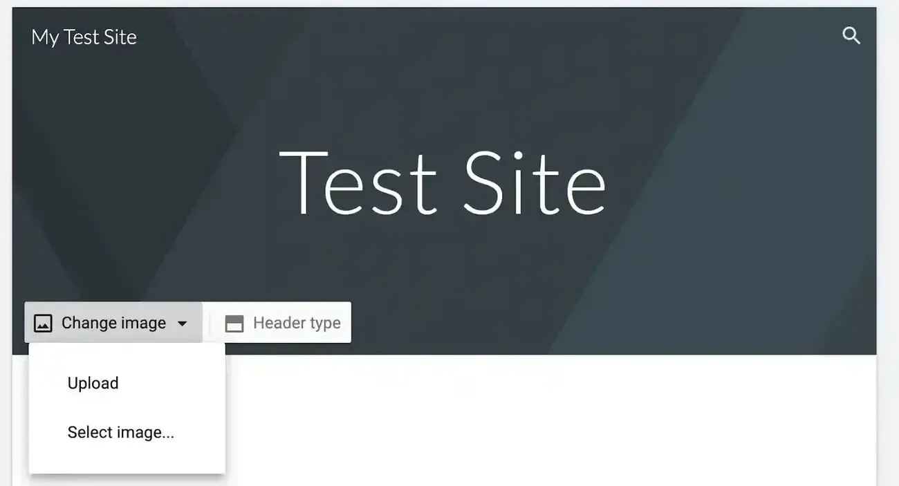
As you create more web pages, add titles and body text in the “Click to edit text” area, then click Change image. This brings up a menu that lets you upload media — an image from your computer or Google Drive, a video from YouTube, or a Google Maps image. (Casual reminder again to make sure you have the right to use the images you've selected.)
6. Expand your site content.
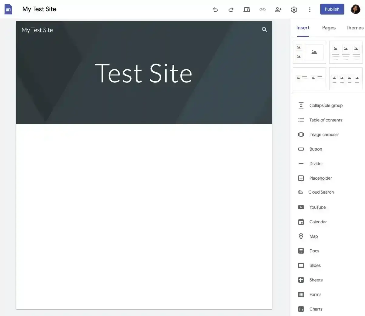
Add additional context and content using the menu on the bottom-right of the screen. Here, you'll find options to include collapsible text menus, tables of contents, image carousels, and even buttons. Need inspiration? Check out my Google Sites examples below.
7. Choose and add a theme.
Click Themes and choose from the available free themes with multiple color schemes and fonts.

8. Publish your Google site.
When you‘re happy with your site’s layout and content, click Publish in the upper right-hand corner. You're almost done creating your website.

9. Choose your web address and set viewing rights.
You can now select a web address and select viewing or editing rights for your site, allowing visitors to view your site or make changes simply.
10. Incorporate your own URL.
If you prefer to use a URL you already own, visit this Google Support page and follow the steps listed — you‘ll need to verify you own the URL, point your URL to your Google site through your hosting provider’s platform, and then directly assign your custom URL. You can also register a new domain name for your Google site.
Best Google Sites Templates and Themes
As noted above, Google Sites offers several free templates and themes. However, these templates are extremely common — so I'd recommend staying away from them if you are building a business website.
That being said, you don't have to build out a website theme all on your own. There are several reasonably-priced, paid options available that give your site a competitive edge and allow you to get the website up and running quickly. I picked these templates because they are:
- Suitable for professional use.
- Clean and responsive.
- Easy to navigate.
- Aesthetically pleasing.
Here are my favorites that I suggest you consider, created by the Google Sites experts such as Steegle.
1. Consulting Experts
Price: $79
Great for: Consultancies, B2B organizations, and agencies
A professional business needs a professional site, and Steegle created a template just for this. Consulting Experts is a vibrant, customizable layout that helps you tell the story of how you can take your clients from point A to point B better than the competition can. The image carousel and Google Maps integrations provide a platform for you to display additional content that makes it perfect for B2B-style websites.

2. Accounting Team
Price: $79
Great for: Small-to-medium sized businesses
If you‘re looking for a modern Google Sites template that features bold, clean lines, check out Accounting Team by Steegle. It comes with a full-width and mobile-responsive layout, and it’s equipped with an icon set that works for both form and function. I love that you can include buttons that link to your social media accounts so you can grow your entire digital presence directly from your website.

3. All Saints College
Price: $299
Great for: Elementary and high schools, colleges, universities, and trade schools
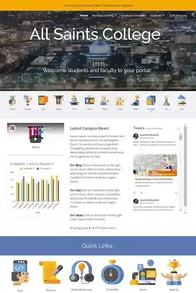
Students, guardians, teachers, professors, administrators, staff — the list of people who keep the education system running smoothly is pretty long. But it doesn't have to be difficult to manage everyone in one place. The School Website template is a solution that not only has the capacity to communicate campus news for these groups, but also provides public and private access to content that each group might need. Custom icons make this template easy to navigate so everyone finds the information they need.
4. Real Estate Intranet
Price: $299
Great for: Marketing agencies and real estate agencies
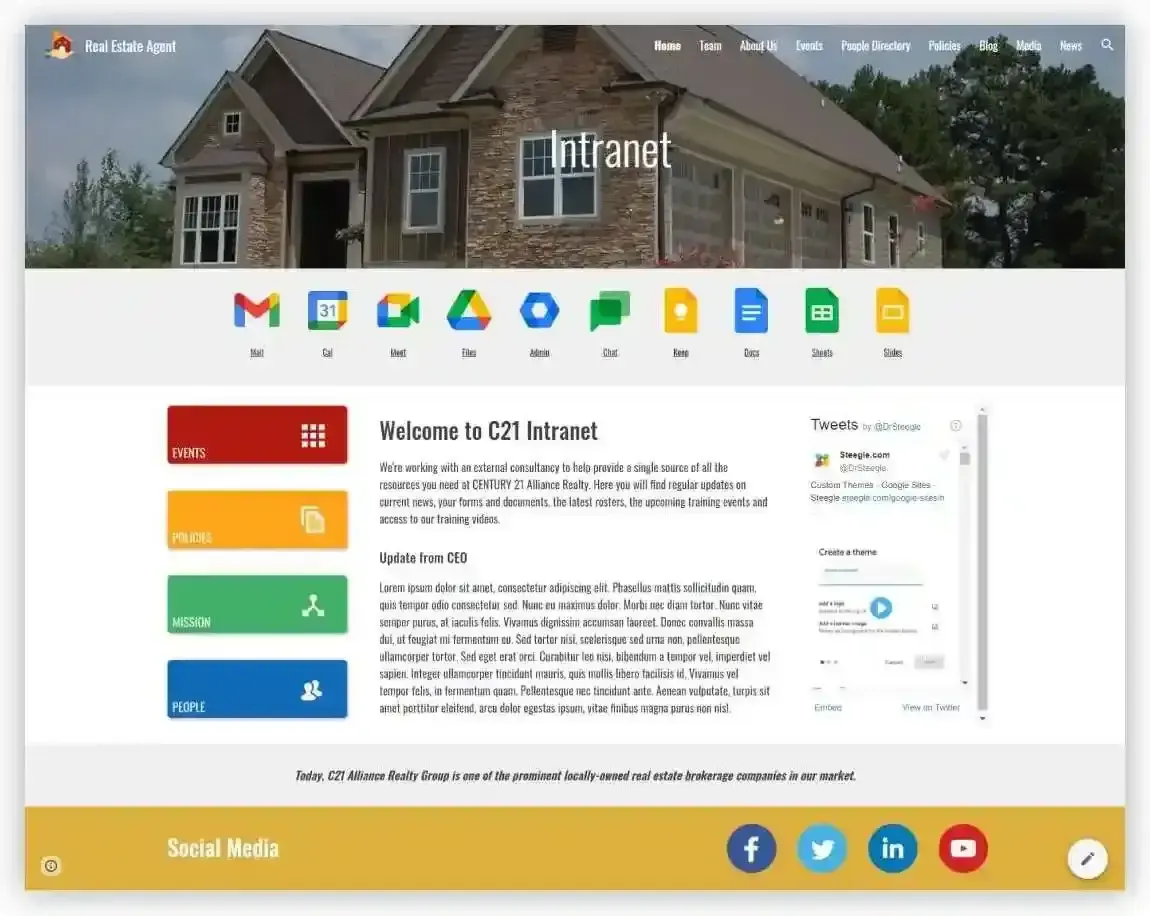
There are several similarities between marketing and real estate agencies — one being the need for a digital presence that captures the attention of potential customers. The Marketing Agency template by Steegle is one of the best Google Sites templates I‘ve seen for this purpose. Your Google site will stand out with a vibrant design that’s capable of conforming to your business's brand and style, which makes it an excellent pick regardless of what industry you are in.
5. Leisure Template
Price: $79
Great for: Leisure, hospitality, and fitness clubs
Wouldn't it be nice for members of your fitness club to have access to all of the classes you offer on demand? That and more are possible with the Leisure theme for Google Sites. Steegle built a customizable layout for your website that becomes the digital home base for your members. This template supports video, a live display of your social media feed, and a suite of Google tools your members can use to collaborate, discuss, and share information.
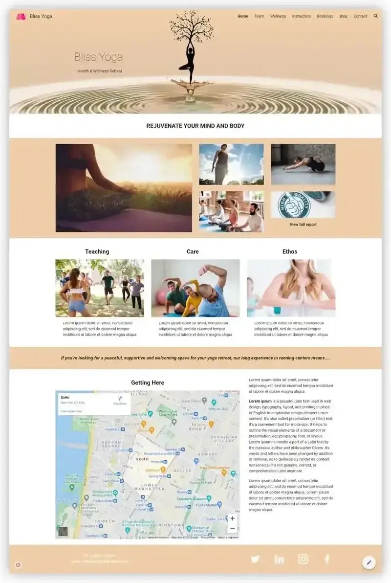
6. Photo Portfolio Template
Price: Free (through Google Sites)
Great for: Photographers, artists, designers, and illustrators
If you run a creative freelance business, look no further than this portfolio template, directly available through Google Sites‘ template library. It not only includes ample space to showcase your work but also a project page template you can easily edit and replicate. That way, you can dive into the details of each project. It also includes a premade "About" page with space to include your education, work experience, and clients. I love how straightforward this template is, but also how you can customize it to fit your creative business’s needs.
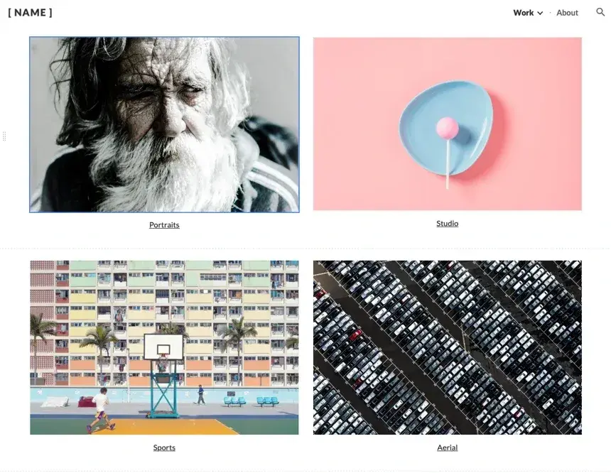
7. Family Update Website Template
Price: Free (through Google Sites)
Great for: Individuals, parents, and family bloggers
Are you interested in sharing your life with others in a more consistent fashion than social media? This family update website template may have been created for parents but could just as easily be used to share your travels, side projects, and thoughts with your family and friends. It includes space to feature photos, stories, updates, and even tips if you‘d like. The best part is that it’s free. Simply choose it from the Google Sites template library, and you're ready to go.

Google Sites Examples
So, what exactly does a great Google site look like? That's a great question — and one I can help you answer. I scoured the web for the most captivating and intuitive Google Sites that will inspire you to create your own. I looked for examples that:
- Demonstrate the vast range of site types you can build with Google Sites.
- Feature centrally placed CTAs (something I highly recommend).
- Showcase how you can embed content with Google Sites.
- Provide inspiration for potential pages you can add to your site.
Here are some of my favorite examples of successful Google Sites.

HubSpot's Free Website Builder
Create and customize your own business website with an easy drag-and-drop website builder.
- Build a website without any coding skills.
- Pre-built themes and templates.
- Built-in marketing tools and features.
- And more!
1. Petersfield High School
This Google Sites example uses inviting colors to welcome students, teachers, parents, and staff to the site, which is heavily adorned with photos and slideshows of the children who attend the school. This site shows just how versatile Google Sites can be when it comes to delivering multimedia content. All of this is done without compromising site speed and loading ability.
What I like about Petersfield High School's Google Site:
- Prominent photos.
- Embedded videos.
- CTAs and navigation buttons.
- Detailed header menu.

2. Jirvus Technologies
The Jirvus Technologies website is overflowing with gems that will inspire your website design. From the high-quality image background to the clean CTAs, this Google Site showcases many of the platform's best features that you can bring to life on your own site. The logo display also stands out to me, as it is a compelling addition to this site.
What I like about Jirvus Technologies' Google Site:
- Responsive layout.
- Clean CTAs.
- Client logo display.
- Call-out feature boxes.

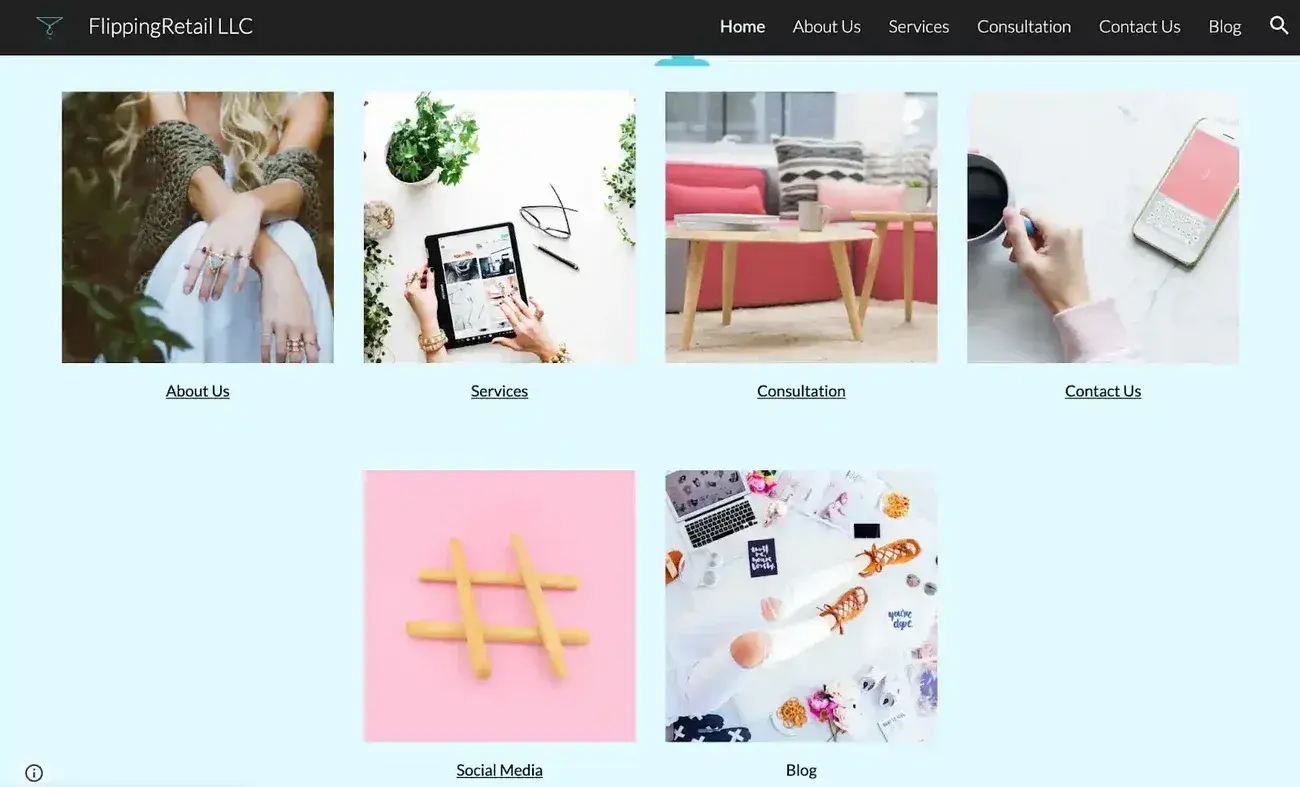
3. Flipping Retail
Google Sites is the chosen CMS for Flipping Retail, a consulting business focused on helping Amazon sellers market their products directly to consumers. This simple site has just a few primary pages: Home, about us, services, consultation, and blog, which keeps the site fast and simple to navigate. The visitor can find exactly what they need, which makes it a great vehicle for driving conversions to the Google form on the Consultations page.
What I like about Flipping Retail's Google Site:
- Focused on conversions.
- Simple to navigate.
- Easy to understand layout and theme.
4. B&B Property Sample Site
The B&B Property example site is a template available for purchase from Lemon Squeezy, and it shows just how well you can combine stunning visuals with clean design, right within Google Sites. Every feature from map and video embedding to carousel images and dropdown FAQs are showcased in this small but mighty site example. It even shows how you can incorporate plugins from Jotform for a contact form and embed a live X (formerly Twitter) feed right on your web pages.
What I like about B&B Property Sample Site:
- Clean design but rich and engaging visuals.
- Embedded YouTube video.
- Jotform integration.
- Contains both standalone and carousel modules.
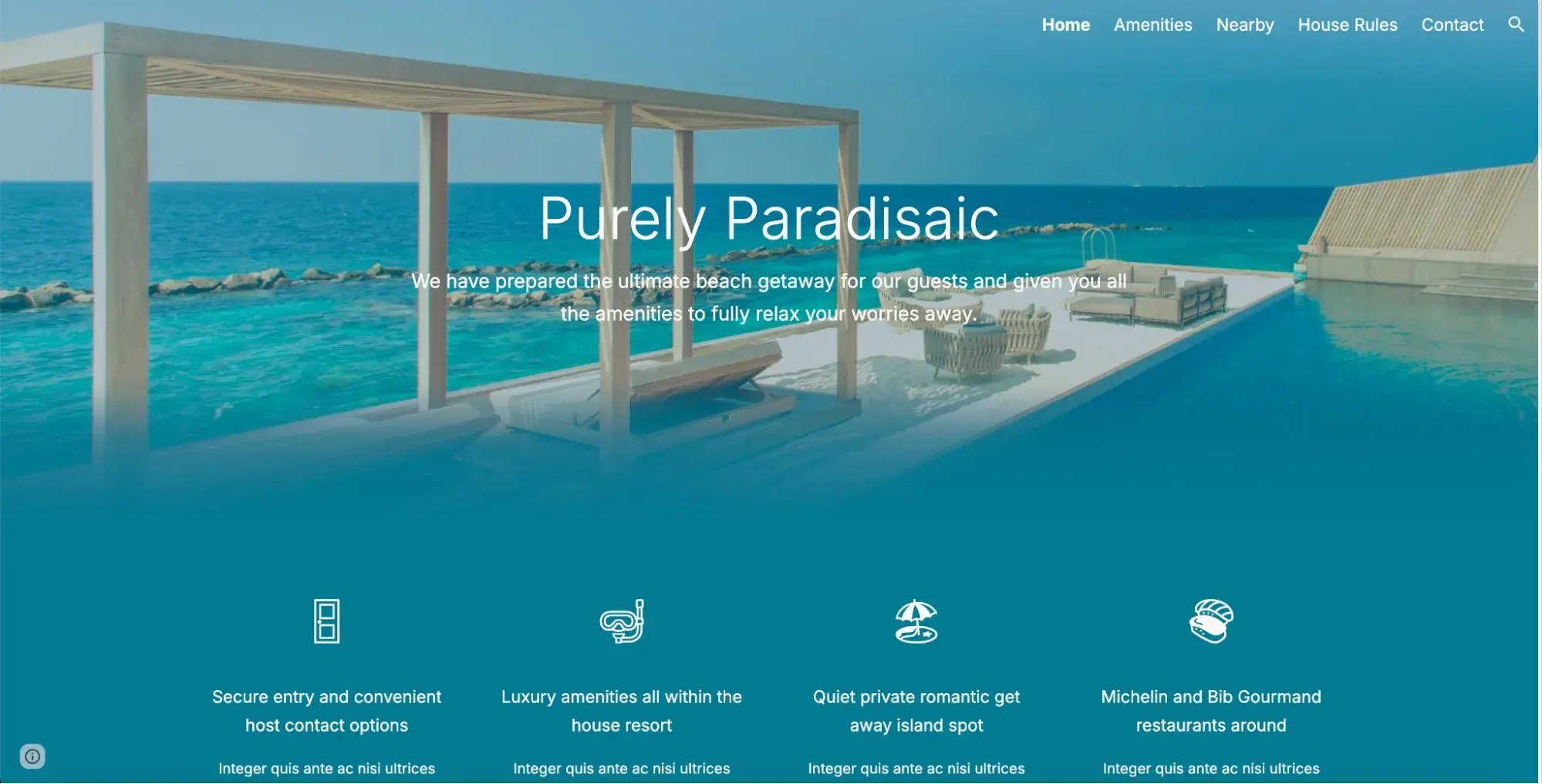
5. JSVFOTO
The JSVFOTO website is extremely simple but effective: Each image links to a specific photo category which keeps the reader safe from feeling overwhelmed when they first land on the site. The generous use of negative space focuses the visitor's eyes on the reason they clicked — to see beautiful photography. This site reminds me that sometimes with website design, less really is more.
What I like about JSVFOTO's Google Site:
- Simple design.
- High-quality visuals.
- Limited, impactful copy.
- Generous use of white space.

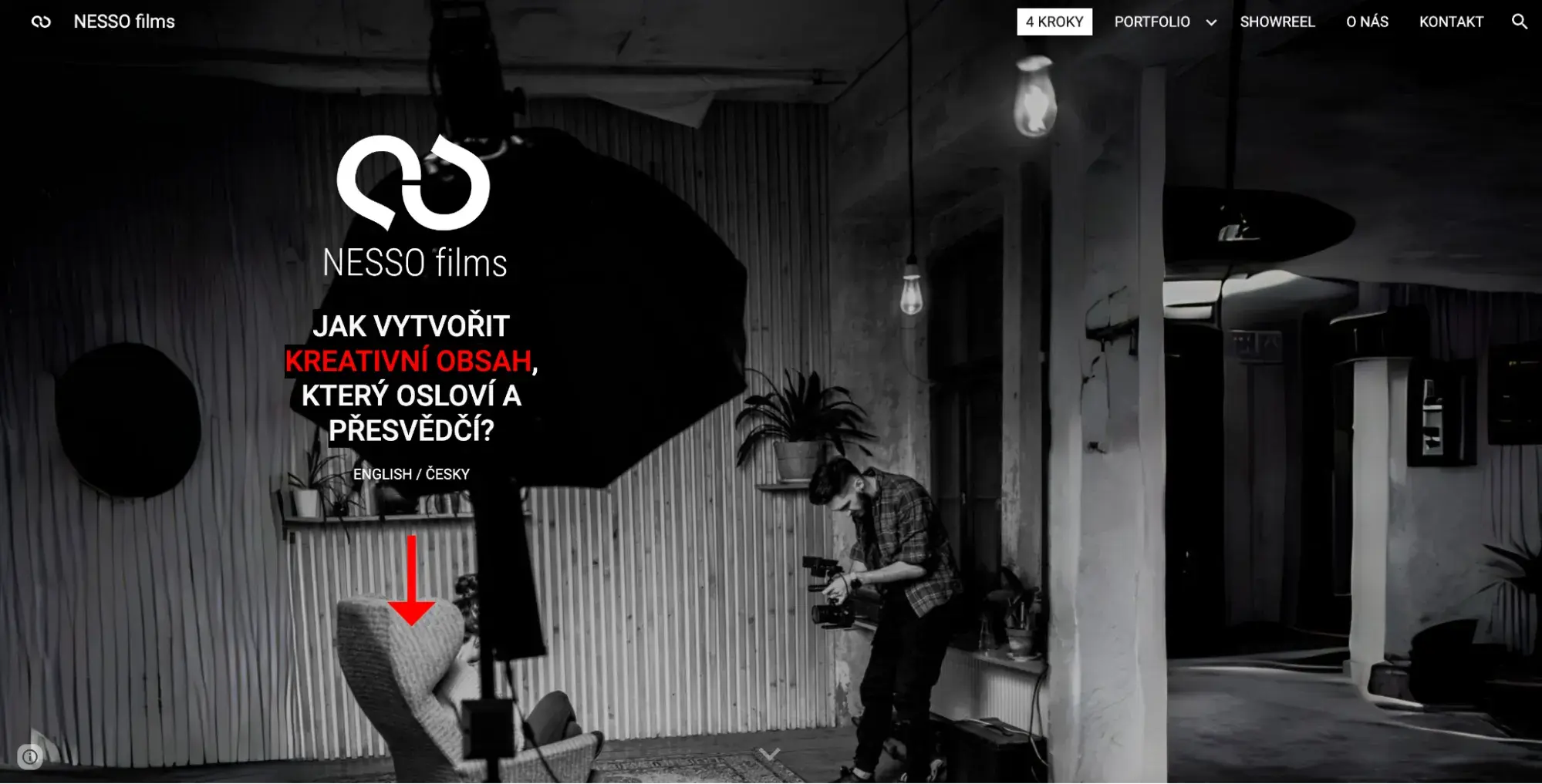
6. Filip Rzepka
Filip Rzepka is a Czech videographer and video editor with commercial and set experience and a focus on storytelling with the camera. The homepage of his NESSO Films site is striking with its dark colors, white and red text, and subtle movement. The use of video on this site is well-executed as it simply uses embedded YouTube links that don't slow down the site, which means a positive user experience for the visitor.
What I like about Filip Rzepka's Google Site:
- Embedded YouTube videos.
- Large footer social media icons.
- Image cards.
- Hero background video.
7. DrPete Technology Experts
This organization provides IT consultancy services, auditing, and project work to businesses ranging from manufacturing to financial services. The user is met with big, bold text and a cool color scheme the moment they hit the page. Plus, there‘s no question about what the purpose of the website is and who the company serves, as it’s one of the main features on the homepage.
What I like about DrPete Technology Experts' Google Site:
- Bold title text.
- Information cards.
- What, Who, Why section.

8. JMD WORKS
Artists will find a lot of inspiration in JMD Work‘s Google Site. This bright, cheerful site welcomes the reader to Joe’s artistic style. Here, he showcases his portfolio of writing samples and artwork. Below that, he links to some of his best projects — and the links open in a new tab so the reader doesn't lose their place on the JMD site — something that we also do at HubSpot!
What I like about JMD WORKS' Google Site:
- Organized portfolio.
- Bright color scheme.
- External links to portfolio projects.
- About Me bio.

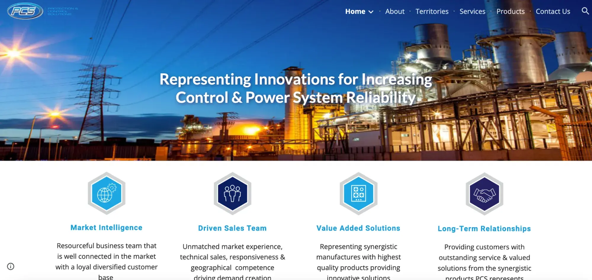
9. Protection and Control Solutions
PCS is a professional technical sales organization in the electrical industry. The company uses a dynamic, compelling image of a power plant on its homepage, coupled with hexagonal icons to guide the user through a streamlined experience on the site.
What I like about Protection and Control Solutions Google Site:
- Vibrant hero image.
- Unique navigation icons.
- Image grid.
10. El Paso Gridley Schools
Did you know that it‘s possible to make a website for a school using Google Sites? If you’re creating a site for this purpose, El Paso Gridley Schools is a great source of inspiration. This example site includes some of Google Sites' best features like icons, customizable buttons, and a Google calendar widget.
What I like about El Paso Gridley Schools' Google Site:
- Unique icons.
- Custom CTA buttons.
- Events calendar.
- Report a problem Google Form.

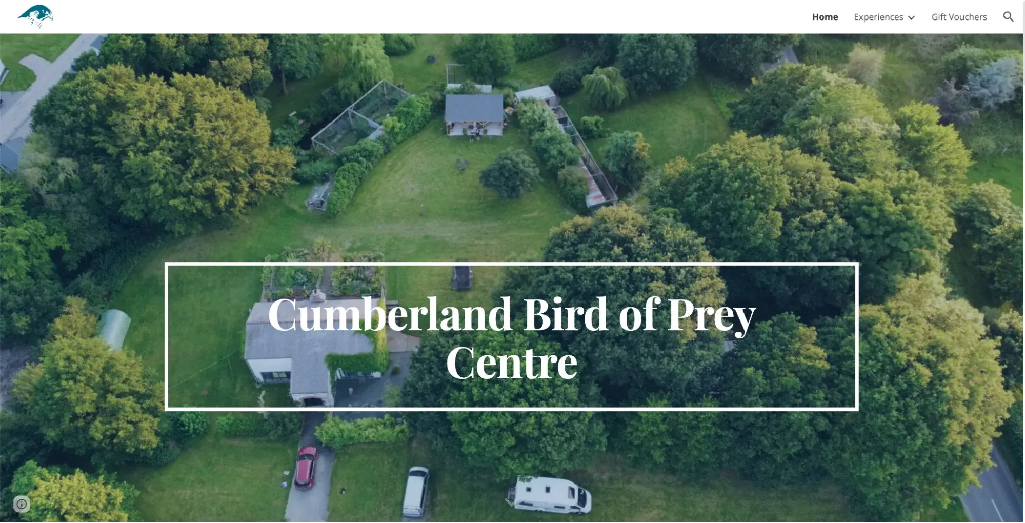
11. Cumberland Bird of Prey Centre
One of the best parts of having a Google Site is the ability to share your business, side hustle, or hobby with the public for free. This universal access to the platform makes it easy for companies like Cumberland Bird of Prey Centre to provide unique wedding ring delivery services. (That‘s right, you can have your wedding ring delivered to the altar by a bird!) On this website, you’ll find internal links to other pages on the site for more details about services, a live view of the company's Facebook page, and a map of the Cumberland Bird of Prey Visiting Centre.
What I like about Cumberland Bird of Prey Centre's Google Site:
- Embedded YouTube videos.
- Internal links.
- Embedded Google Maps.
- Email subscription.
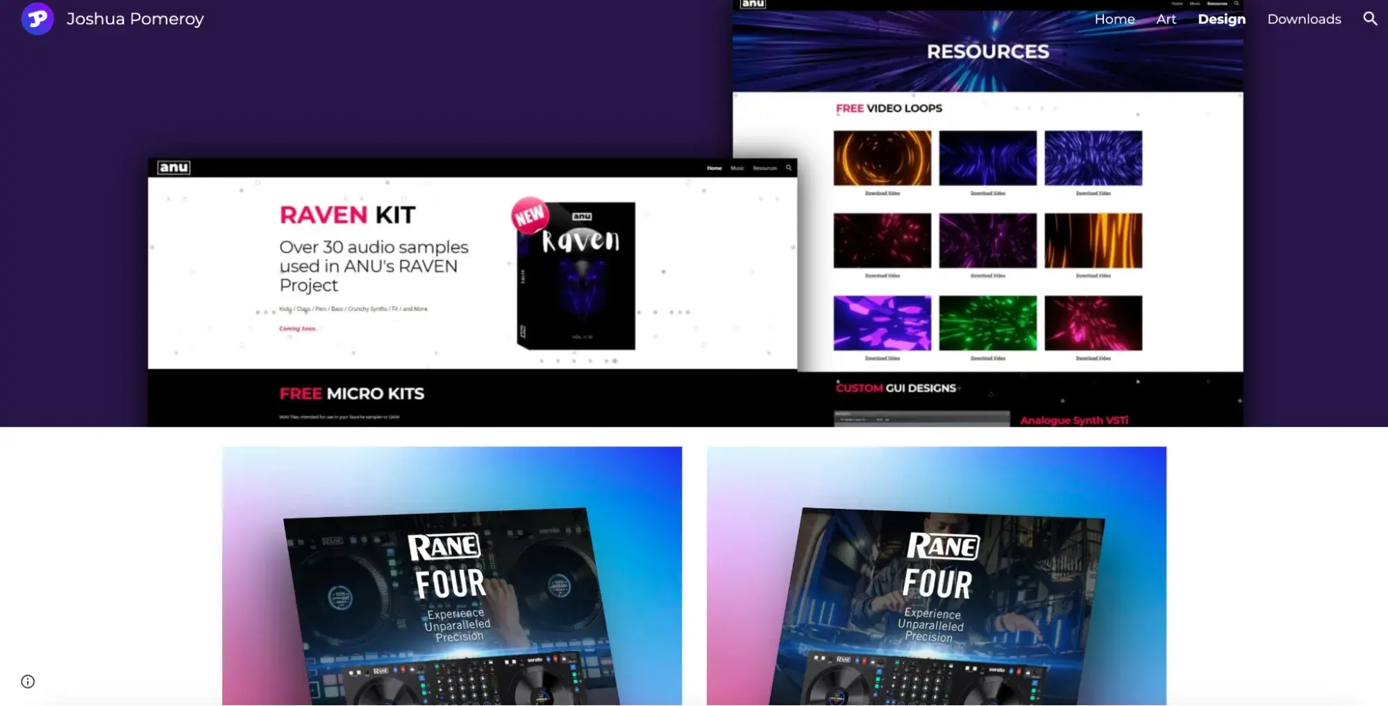
12. Joshua Pomeroy
While Google Sites may have limited functionality compared to other website builders, graphic designer Joshua Pomeroy uses a simple full-width grid layout to let his work speak for itself. The images jump off the page with splashes of color against a black-and-white background. In fact, most of the copy appears toward the bottom of the page — after you've been wowed by the intricate visuals.
What I like about Joshua Pomeroy‘s’ Google Site:
- Colorful graphics.
- Symmetrical grid layout
- Limited, impactful copy.
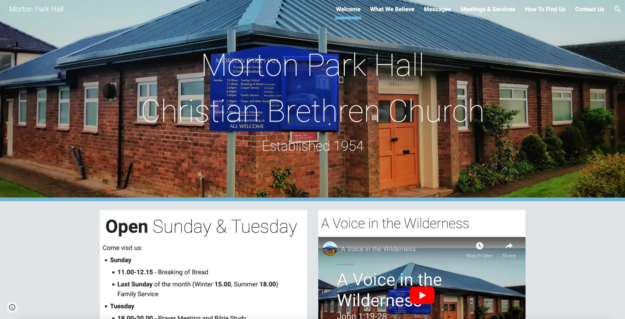
13. Morton Park Hall
Some of the best elements to include on your Google Site are a welcome message, a straightforward navigation bar, and plenty of photos. Morton Park Hall does all of that and more, which makes it a great site to emulate. In addition to these features, the church includes a video that gives the viewer a glimpse into what the organization is like.
What I like about Morton Park Hall's Google Site:
- Welcoming hero image.
- Hours of operation.
- Embedded Google Map.
- Embedded YouTube video.
Google Sites Pros and Cons
I’ve been pretty clear that, although it’s very easy to use and comes with some nice templates, my only real use case recommendation for Google Sites is for personal or very small-scale websites. But let’s dig into the specific pros and cons.
Pros
Free Website Design
Designing a website can be costly, even with a more simple site builder. Google Sites is totally free and comes with tons of templates to choose from.
Free Hosting
Not only is the website building free, I also don’t have to worry about paying for hosting on Google Sites. Hosting is often another added (and often unforeseen) expense that beginners uncover during their journey of building a website. So it’s nice to know that Google Sites covers this.
No Experience Required
Although a CMS like WordPress is a typical option for creating websites, you generally need at least a baseline level of coding knowledge for these more complex platforms. One thing I do like about Google Sites is that it’s a zero-code platform, making it really easy for beginners.
Collaboration Features
One of the best Google Sites use cases that I’ve seen is using the tool to build a site for a bachelorette party. The group kept the site permissions private and added us all as editors. The beauty of this was the ability for multiple people to work on the site together at one time, so we could collaborate on the design and wording before sharing the event site with other attendees. The ability to collaborate in real time on a website like this is definitely a pro of Google Sites.
Automatic Mobile Responsiveness
I think I could place this in both the pro and con column for Google Sites. On the one hand, mobile responsiveness is automatically built into your site as you create it. So it looks good on any screen size. But it means you can’t directly edit the layout or content of your mobile site. That being said, the fact that this is built-in functionality is a huge plus for beginner website builders.
Cons
Lack of App Integrations and Plugins
Google Sites integrates seamlessly with other products in the Google suit like Docs, Sheets, and others. But it’s almost impossible to integrate Google Sites with other apps to expand its functionality. So forget connecting it to your CRM or anything like that. Most of the websites I work on need this ability to integrate and use plugins even at the most basic level, so this is one area where Google Sites is a real let down.
No Custom Site URLs
Like any website builder, Google Sites does let you customize the slug of your URLs. But the piece before that is long and clunky, and you can’t edit it. For your business name to appear in a nice, clean URL on your site, you need to pay for a domain and hosting and connect it to Google Sites. I know this is fairly standard practice for any free website builder, but the Google Sites URLs are particularly long and complicated.
Very Basic Editing
Google Sites is extremely limited in what you can edit, especially from an overall layout perspective. Even if I start with a completely blank site without using a template, I’m forced to choose from pre-set content blocks. This is fine for a simple site, but you won’t be able to get creative.
Looking to overhaul your website design? Check out this Free Lookbook for websites in multiple industries and use cases to get inspired!
Google Sites Tips
I‘ve walked you through a comprehensive and simple Google Sites tutorial and even showcased some of the best themes and examples. But that’s not all I have to share — take a look at some of my tried-and-true Google Sites tips.
1. Build CTA buttons.
If you're looking to capture visitor attention and drive sales or service conversions, include a strong call-to-action that communicates what your brand is about and what you offer. Along with compelling copy for your CTA, it's also a good idea to add CTA buttons that let users click through to newsletter signups or download pages that offer immediate value.
Pro tip: Place your primary CTA in a few spots throughout your website. This boosts the likelihood your visitors will see and, ultimately, interact with it.
2. Create a table of contents.
For pages that have a substantial amount of content, it‘s a good idea to create a table of contents (ToC) that makes it easy for visitors to find what they’re looking for with a single click. Here‘s why: If you make users scroll too long to find specific information, they’ll simply take their business elsewhere.
Pro tip: Trying to determine what to include in your table of contents? I suggest listing out the headers.
3. Take advantage of Google tools.
Slow pages frustrate users and make it hard to capture attention. As a result, it's a good idea to leverage tools like Google PageSpeed Insights to see how your site is performing and where it can be improved.
Pro tip: If you‘re not happy with what you see when you use Google PageSpeed Insights, it’s not too late to change it. You can follow these suggestions to speed up your website.
4. Improve your contact page.
It's also a good idea to boost the impact of your contact page. This means going beyond basic email addresses to offer multiple ways for customers to get in touch. Where possible, include a contact form, email address, phone number, and social accounts to cast the broadest net possible.
Pro tip: Of course, you‘ll want to display your contact page on your menu. But I also recommend that you add your contact information (or a hyperlink to your contact page) on your website’s footer. The reason? To reduce as much friction as possible for visitors who are considering reaching out. Meet them everywhere they are.
5. Streamline navigation.
Keep your site simple to encourage repeat visits. This means choosing one organizational structure and sticking with it. For example, you might choose top-bar menu navigation or opt for a sidebar approach. That way, users understand that they can access any page on your site by clicking on a tab in your header or sidebar menu.
Pro tip: If you need help picking which would be a better fit for your business, this guide will help answer any questions about site navigation.
Google Sites FAQs
Give yourself a pat on the back — you've made it nearly all the way through my Google Sites tutorial. Before you head over to Google Sites to start building your site, here are a few FAQs I think you should have the answers to.
1. Is Google Sites a good website builder?
The answer depends on what you‘re looking for. Suppose you’re building your first site to generate customer interest and establish a digital presence. In that case, Google Sites reviews say it‘s an ideal starting point because it’s free, easy to use, and naturally integrates with other Google services.
If you‘re looking to build a more robust sales or service website, however, you may be better served by more robust site design tools that come with a monthly or yearly cost. It really depends on what you’re looking for.
2. How do I upload to my website on Google Sites?
Uploading files to your website is simple: Open your site, select Insert, select the file you want to upload, click Insert again, and then Publish in the top right-hand corner.
Note: Google's official help page recommends first publishing your file in Docs, Sheets, or Slides before uploading to improve response times.
3. How do I earn money from Google Sites?
While it’s possible to sell products or services on your Google site — especially if you have a Google Business account — one of the easiest ways to earn money is by displaying ads using Google AdSense.
Step 1. Create an AdSense account.
Step 2. Head to the More Actions menu at the top-right of your site > click on Manage Site.

Step 3. Click Monetize on the left-hand side of the page > then Monetize this site. You’ll be prompted to log in to your AdSense account.
Step 4. Once you log in, open any of your site’s pages in edit mode > Insert > AdSense to insert ads directly onto the page or into the sidebar.
You can also customize displayed ads to ensure they match the overall theme or tone of your site — and if users decide to click through, you get a small payment for facilitating the click.
4. How do I point my domain to Google sites?
When you make a Google site, the URL will display as sites.google.com/a/domain/yoursitename. While this works for personal pages, I suggest you invest in a custom URL if you're planning to use your site for professional activities or product sales.
Here's how to point your domain to a Google site:
Step 1. Start by registering your preferred domain with a domain name registrar.
Step 2. Head to the Sites setting of your Admin console and select Custom URL then click Add > Continue and enter your current Google Sites domain.
Step 3. Select Continue again, and then enter your custom URL and click Add Custom URL.
5. How do I delete a page on Google Sites?
Here's how to delete a page on Google Sites:
Step 1. Click Pages on the right-hand side of your site
Step 2. Select More for the page you want to remove and choose Delete.
Made a mistake? Sites pages are stored as files in Google Drive Trash and can be restored. To permanently delete a page or site, you also need to empty your Google Drive Trash.
Get Started With Google Sites
Google Sites is an easy-to-use website-building platform that lets you quickly create and publish new sites. While it can‘t compete with some more in-depth, paid, and freemium alternatives — such as WordPress, Squarespace, or Wix — it’s a great way to get your site up and running without the costs of professional design and development.
Editor's note: This post was originally published in March 2020 and has been updated for comprehensiveness.

HubSpot's Free Website Builder
Create and customize your own business website with an easy drag-and-drop website builder.
- Build a website without any coding skills.
- Pre-built themes and templates.
- Built-in marketing tools and features.
- And more!


![How to Make a Website With User Accounts and Profiles [With WordPress, Wix, and More]](https://knowledge.hubspot.com/hubfs/make-website-with-user-accounts-1-20240712-739219.webp)


![How to Convert Your Website Into an App [+ 5 Brands That Did It]](https://knowledge.hubspot.com/hubfs/how-to-make-a-website-an-app-1-20241104-8509132.webp)


![How to Get an SSL Certificate [+10 Best Free SSLs]](https://www.hubspot.com/hubfs/free-ssl%20%284%29.webp)

