.png?width=112&height=112&name=Image%20Hackathon%20%E2%80%93%20Square%20(10).png)

Here‘s everything that we’ll cover:
What are UX principles?
UX principles are design and usability guidelines that make your project user-friendly. You need to consider UX principles if you want to create great experiences for your users.
Some examples of UX principles include putting the user first, implementing a clear hierarchy, talking with customers to better understand them, testing for usability and accessibility, and many more.
No matter what your website or app is about, these basic UX principles can help you create the best experience possible.
Why UX Principles Matter
By following principles instead of “winging it,” you can ensure that you're able to always deliver consistency in the designs that you create. Beyond helping you create better experiences, these principles can also help you streamline your design practices and work more efficiently.
Instead of reinventing the wheel each time, you can follow a set of tried-and-true best practices to create better designs and experiences.
Essential UX Principles
Now that you better understand why basic UX principles matter, let's dig into the full list of 17 UX design principles and best practices that you should incorporate into your designs.
Make Sure the User Always Comes First
While all of the other UX principles on this list are important, they all fundamentally point to one overriding principle — the user should always be the priority.
Everything that you do should always fit with the answer to this question: “What is best for the user in this situation?”
While this is one of the most basic UX principles, it's something that you need to always remember.
In some situations, that might mean that you must put aside your preferences to do what‘s best for your users. For example, you might think a design is ugly or below your standards, but it could still be the best option if it’s what's right for your users.
To be able to put users first, you'll also need to understand them at a deeper level:
- Who are your users?
- What pain points are your users experiencing?
- What level of knowledge do your users have?
- What are your users trying to accomplish?
- Where are your users located?
To help you achieve this, you'll want to have clear customer personas and always talk directly with your customers (another principle on the list).

Try to Be Consistent
To make it easier for visitors, it's essential to be consistent across everything you do, including the interface design, content organization, and so on.
By staying consistent, you help users achieve cognitive fluency (AKA processing fluency). This is the ease at which people can understand and process new information.
Instead of figuring out how to use your product/website's interface each time, users will become familiar with your product over time — as long as you stay consistent. This helps them achieve what they want faster.
For example, let's say you have a callout box that explains/summarizes important information on a page. By using the same callout box design/style across your entire site, users will learn that they can go straight to this box to discover the most important information on a page.
A great example is Wirecutter, which uses a consistent design for all of its “How we picked” and product summary boxes. Readers can instantly jump straight to these boxes to get the most important information, which creates a great experience for them.

Implement a Clear Hierarchy
A clear hierarchy is another important UX principle because it helps users understand and navigate your website. There are two types of hierarchies that you'll want to consider:
- Visual hierarchy
- Informational hierarchy
Visual hierarchy deals with the design of a page and how different elements interact with one another.
For example, the heading text should be a larger font size than the body text. This simple visual hierarchy helps readers digest information and shows that headings deserve more emphasis than body text.
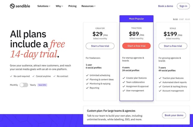
Other ways to implement visual hierarchy include colors, whitespace, and so on. For example, see how Sendible uses orange to alert users that they can try it for free (and also to draw their attention to the most popular plan).
To learn more, we have a full guide to visual hierarchy.
Conversely, informal hierarchy deals with how your site‘s content is organized across different pages. For example, grouping high-level content and breaking out less important content into subtopics. We’ll discuss this in more depth when we talk about information architecture below.
Design and Test for Accessibility
If you want to create a great experience for all your users, it's essential to design for and test for accessibility.
If you‘re unfamiliar with this term, accessibility means making your website/software usable by as many people as possible, regardless of their situations. For example, someone who’s visually impaired might use a screen reader to navigate your website.
To that end, it‘s important to put accessibility front and center throughout the entire design process. Beyond that, you’ll also want to test for accessibility to ensure you didn't miss anything.
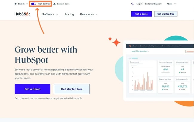
For example, here at HubSpot, we offer a “High Contrast” version of the site, which is one way to help create more accessible experiences for users whose vision requires a higher contrast design.
To learn more about accessibility, you can check out our ultimate guide to web accessibility and our collection of accessible website examples.
To help you implement accessibility in your own designs, you can follow our web accessibility checklist and use these web accessibility testing tools to help you detect potential issues.
Test for Usability
In addition to testing for accessibility, testing for usability is essential. While usability and user experience are different, good usability is still critical to creating a good user experience. In a nutshell, usability refers to how easily people can use your product to accomplish a specific goal.
Usability testing is a more structured process whereby you test the usability of your offering. In plain language, this means that you have users try to perform the task and document any issues or roadblocks that they encounter.
If needed, you can run tests with your existing users or turn to services such as User Testing.

To learn more, check out our full guide to usability testing and our roundup of usability testing tools.
Incorporate Visual Storytelling (Narrative Design)
Visual storytelling, or narrative design, tells your users a story using your design. This helps you create an experience that will last with your users beyond their initial visits.
To help you do this, you can use animations, images, videos, and other design elements. You can then apply these elements throughout your site or in more structured storytelling scenarios such as the following:
- Vertical scrolling (AKA scrollytelling).
- Animated charts and visualizations.
- Chronological timelines.
- Image hotspots.
For a great example of how visual storytelling might work, you can check out the Inception Explained website, which explains the Inception movie using visual storytelling.

Have Clear Information Architecture
Information architecture is the structure of your website/interface, including organization, labeling, hierarchy, and so on.
Some aspects of information architecture include categories, tags, other taxonomies, sitemaps, metadata, navigation, etc.
Having a strong information architecture can improve UX in two main ways:
- It makes it easier for users to understand your site and what you offer.
- Visitors can more easily find the content/tools they're most interested in.
For an example of excellent information architecture, you can look at how Airbnb allows users to filter by the most relevant taxonomies to their search, such as whether the property has a dedicated workspace.

Planning these taxonomies can help you categorize your content in ways that create a great user experience.
To dig into this topic more in-depth, you can read our guide on what information architecture is and why it matters.
Make Navigation Easy
Ideally, you want the most important areas of your site to be accessible in a single click from anywhere on your site. You can put the primary content as the main navigation menus and then show drop-down submenus with related items.
You can rely on your information architecture and hierarchy to decide on the relationship between these menu items and sub-items.
You can turn back to the New York Times Wirecutter for a great example of navigation. The main navigation menu quickly lets users jump straight into the content that's most relevant to them:
- Users first select a high-level category — e.g., “Kitchen” or “Home & Garden.”
- Users see a menu that provides further navigation options based on Wirecutter's information hierarchy.

To learn more, check out our ultimate guide to website navigation.
Remember That Less Can Be More
When you‘re creating a design, it’s easy to want to pack it with as much content and visuals as possible. However, sometimes less can be more, which is why this is another important UX principle.
By eliminating clutter from your designs, you can help your users focus on the stuff that's really important to their experiences.
For example, research from Human Factors International found that using whitespace to highlight key elements improved visitor comprehension by almost 20%.

To get some further inspiration, check out our roundup of nine websites that use white space well.
Use Clear, Straightforward Language
When it comes to the text content on your site, it's important to use clear, simple language to create a great user experience. Avoid jargon whenever possible and use language that all your users will have no problems understanding.
This is especially true for buttons and other interactive elements. If users can‘t immediately understand what a certain option does, your product’s user experience will suffer.
For example, look at how Coursera uses clear text like “Go to certificate” instead of more generic text like “Learn more.”

Choose Typography Wisely
Because so much of the content your users will interact with involves text, typography can play an essential role in user experience.
There are a few guidelines regarding typography as a UX design principle and best practice. Typography can…
- Affect how easy it is for visitors to read and consume your content, so it‘s important to choose typography that’s easy to read within the context of your site.
- Play a role in creating a visual hierarchy, as we discussed earlier. For example, you might use a different font for headings versus the body text, which helps to show the hierarchical relationship between the two elements.
- Create a certain feeling or aesthetic, which can impact more intangible aspects of the user experience.
You can read our beginner's guide to web typography to learn more.
For an example of using typography to improve user experience, you can look at a classic publication like The New Yorker. Its unique typography creates a great experience for the type of people who are interested in The New Yorker, all without sacrificing any clarity.

Gather Feedback from Your Customers (Before and After)
If possible, you'll want to try to connect directly with customers early in the design process. Gathering insights directly from your customers can help you shape the design process early on before you commit to any direction.
In some cases, you can interview users in a one-on-one scenario. Many users will be open to direct interviews, especially if your product is important in their workflows.
Beyond one-on-one interviews, you can also use more automated solutions to gather customer feedback before you start designing. Here are a few ideas:
- Send an email to your users asking for feedback, either as free-form responses or as part of a survey.
- Display a survey box or feedback box on your website.
- Add a page for a new feature you‘re considering (even if you haven’t launched yet). You can then collect user feedback on this page to help shape how that feature might work.
You'll also want to incorporate customer feedback into your decisions after launch, too.
To help you do this, you can use many of the same principles as above, including the following:
- Perform customer interviews after launch to understand their experiences with your live product.
- Add a feedback widget to your site. Many pre-built tools can help you do this, such as Marker.io, Appzi, Usersnap, and others.

In addition to gathering qualitative feedback, you can also use quantitative data to gather feedback. For example, you can look at your web analytics data to see time on page, engagement, bounce rate, and so on.
Incorporate User Interface Design Patterns Whenever Possible
Design patterns are generalized, reusable solutions to commonly occurring problems/tasks.
Incorporating design patterns into your work is a critical UX principle for two main reasons:
- Your users are familiar with these design patterns, making it easier to accomplish tasks. Instead of thinking about how things work, they'll automatically recognize the design pattern and work more fluently.
- It can save you time while you're working. Instead of reinventing the wheel, you can apply a common design pattern as needed.
To see some examples and find helpful design patterns, you can use a site like UI Patterns.

This site lists different user interface design patterns for various use cases, including getting user input, navigation, and more.
Give Users Control Over What They Need (But Not What They Don't)
To create a great user experience, you need to give users the exact right amount of control.
It‘s kind of like Goldilocks — too much user control can be confusing and overwhelming, but too little user control can be frustrating because users feel like they can’t perform the actions that they need.
To know the “right amount” of control, you'll need to understand your users at a deeper level. This includes their backgrounds, their technical knowledge, and so on.
For example, look at how the WordPress Gutenberg editor lets users customize the interface experience to meet their needs.

Users who just want to write content can opt for distraction-free writing mode, while developers who prefer to work directly with code can change to a code editor view.
Offer Users an Emergency Exit
Tying with the previous UX principle about giving users the right amount of control, it's also important to always give your users an “emergency exit,” in the words of Jakob Nielsen.
The basic idea is that some of your users will almost certainly make a mistake at some point. And when that happens, you want to give users an easy way to fix errors.
One of the most common solutions is offering undo/redo buttons. If a user makes a mistake, they can just click the undo button to make things go back to how they were before.
For example, see how Toggl, a popular time-tracking tool, displays a floating “Undo” option if a user deletes a time log entry. This allows a user to recover the entry if they accidentally deleted the wrong one.

Other examples of emergency exits include the following:
- A “Back” link to take users back to the previous page/screen.
- A “Cancel” link to cancel the current task or process.
- A “Close” link to close the current window/screen without applying any changes.
Confirm Key User Actions
So far, many of the UX principles on this list have focused on how you can design and structure your website to create good user experiences.
However, you also want to prevent users from creating their own bad experiences, which is what this UX principle is about.
For example, let's say you have a button allowing users to delete all their data. This can be an important feature for many sites, and users will have legitimate situations where they want to delete their data.
But at the same time, if a user were to accidentally delete all of their data, that would most definitely not create a good user experience.
To avoid this situation, you must confirm key choices before performing any major changes. This could often ask users to click another button before performing the action.
You might want to go even further than that for crucial decisions. For example, many web hosting providers require users to manually type in the website name to delete that site from the hosting account.

This makes it pretty much impossible for a user to accidentally delete a website.
Include Personality (But Without Losing Clarity)
Adding some personality to your design can be a great way to help your product stand out and enhance the user experience. You can incorporate personality via text content, illustrations, and videos.
However, it's important to remember that you should never let personality interfere with clarity. For example, adding “personality” to button text is more likely to confuse than it is to help you create a better user experience.
To see personality in action, check out the Knobby Underwear explainer section. The illustrations add some personality to the design, such as the pelican delivering products for free. But at the same time, the text and buttons don't sacrifice any clarity.

For other ways to create a great user experience, you might also be interested in our roundup of the best UX tools. And if you're still early in your career, you might want to read our guide on becoming a UX designer.
Implement These 17 UX Principles Today
That wraps up our collection of 17 UX design principles. Follow these best practices to create great user experiences in your digital products. If you incorporate these principles into your UX design philosophy, you can repeatedly create functional designs that delight your users.

User Experience

![How to become a UX designer, a step-by-step guide [expert tips]](https://53.fs1.hubspotusercontent-na1.net/hubfs/53/become-a-ux-designer-1-20240731-321437.webp)


![How to Add a Parallax Scrolling Effect to Your Website [Examples]](https://53.fs1.hubspotusercontent-na1.net/hubfs/53/scroll-Aug-11-2023-05-24-08-8793-PM.png)

![20 UX Design Examples Hand-Picked by Experts [With Analysis]](https://53.fs1.hubspotusercontent-na1.net/hubfs/53/ux-design-examples-1-20250404-8425368.webp)