The tug-of-war between design, marketing, and SEO is a challenge I face every day at work. The obsession with optimizing for all three simultaneously often leads to a cluttered, confusing user experience. In this article, I’ll show you what I mean and offer some tips for improving your site.
Table of Contents
- Why is over-optimizing bad?
- Over-Optimization Mistakes to Avoid
- How to Avoid SEO Over-Optimization on Your Site
- Find the Sweet Spot Between Google and Your Audience
Why is over-optimizing bad?
SEO over-optimization sacrifices clarity and usability in the pursuit of perfection, often leading to frustration instead of results.
Keyword stuffing, excessive internal linking, and irrelevant content targeting might seem like good optimization strategies, but they can actually harm your search rankings and, more importantly, your credibility with visitors.
First, there's the user experience nightmare. When design elements, marketing CTAs, and SEO-driven content are all competing for attention, your website becomes chaotic.
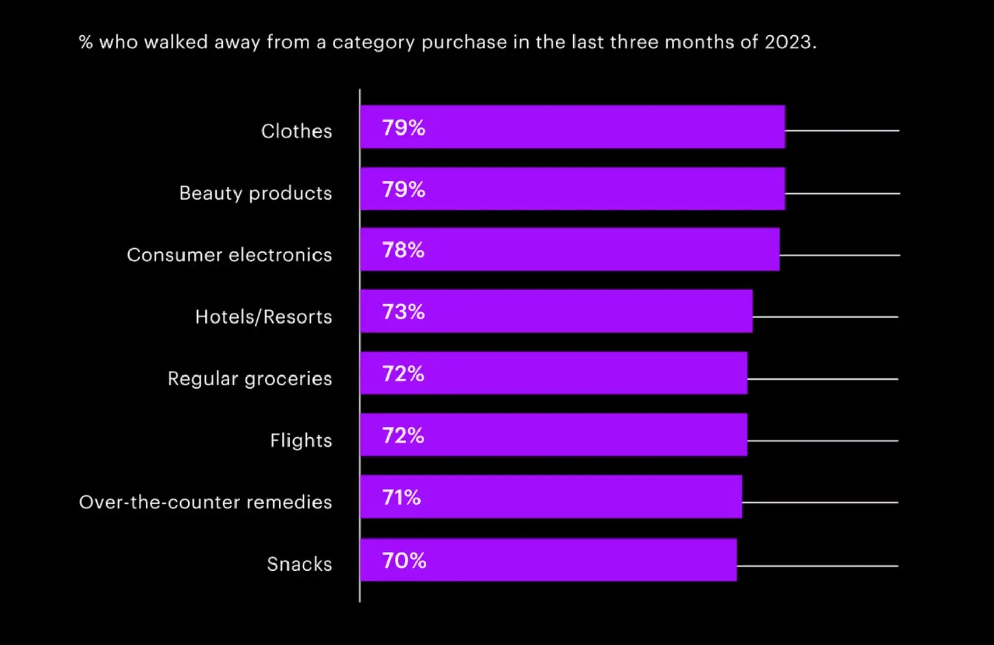
This overload doesn't just frustrate visitors — it actively drives them away. A report by Accenture found that 74% of consumers had abandoned their shopping baskets in the past three months because they felt bombarded by content and overwhelmed by choice.

The visual assault of an over-optimized website can be equally damaging. While half of first impressions are website design-related, cramming your site with every trendy design element — from parallax scrolling to multiple pop-ups — doesn't make it more impressive.
Instead, it creates a disconnected experience that leaves users confused and underwhelmed. I've seen beautiful websites ruined by the addition of unnecessary design elements, all in the name of “optimization.”
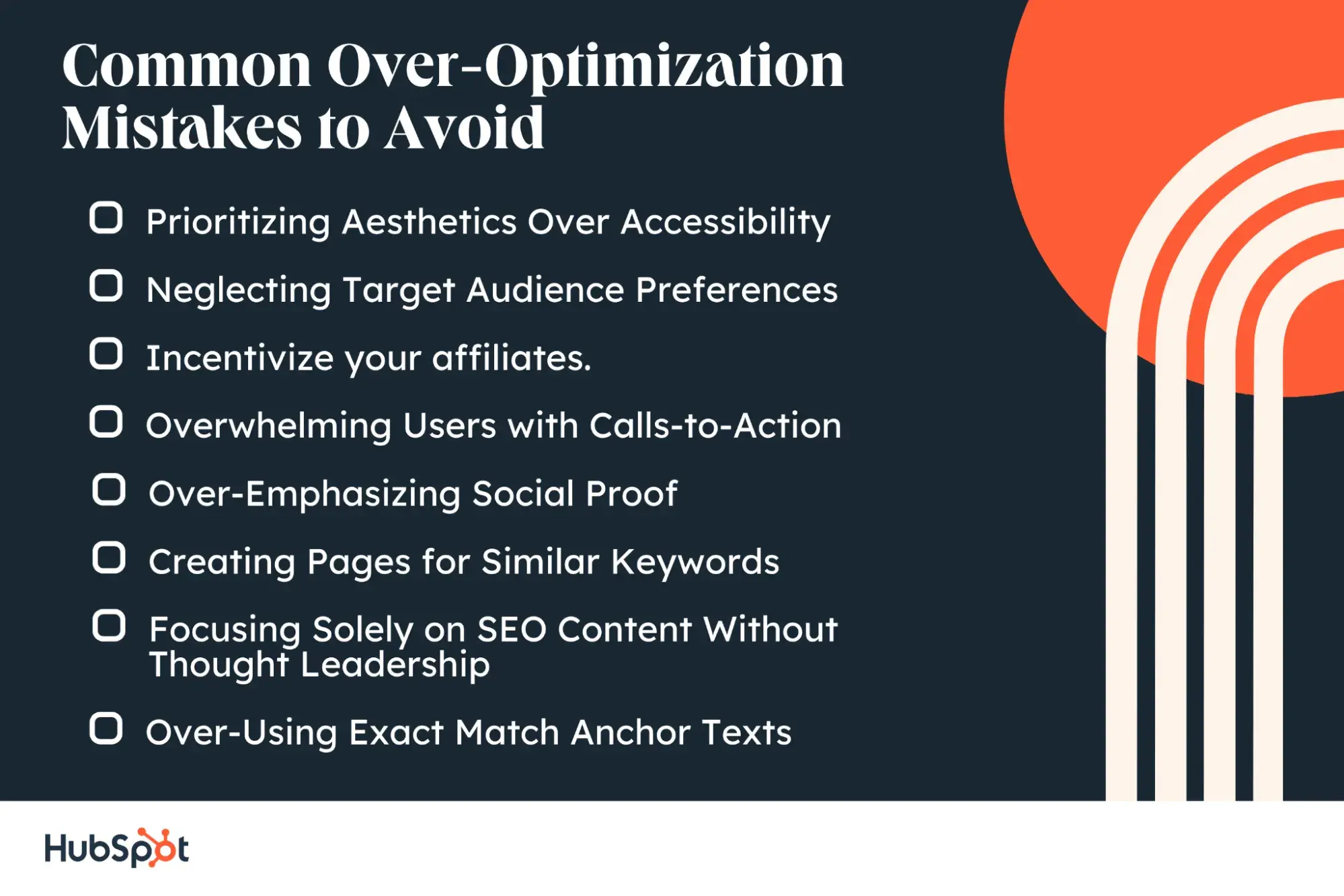
Over-Optimization Mistakes to Avoid

Prioritizing Aesthetics Over Accessibility
When beauty is the priority, designers can make choices that are more visually appealing than necessarily functional or user-friendly. Creative elements like cut-off typography, cool image transitions, trendy color schemes, and parallax effects might attract visitors, but they can create barriers for users with physical or visual disabilities.
In spite of the fact that design and accessibility aren't mutually exclusive, creating both a beautiful and accessible website requires additional time and development resources.
Neglecting Target Audience Preferences
Before investing in animations, bold colors, and fade-in transitions, consider whether your target audience has the time and patience for these features. What impresses one user group might frustrate another, potentially leading to frustration, increased drop-off rates, or even negative brand perception.
Test your design choices with real users, gather feedback, and analyze engagement metrics to ensure your visuals enhance rather than hinder the experience.
Overwhelming Users with Calls-to-Action
Marketing-focused websites often feature multiple CTAs in their navigation bar, header, footer, sidebar, and other sections. It might even feature a lightbox popup with a CTA. Different CTAs might encourage customers to schedule a call with a sales rep, book an appointment, contact customer service, sign up for a newsletter, and more.
While this approach aims to drive conversions, it can backfire by overwhelming visitors with too many choices.
Monitor your analytics — if conversion rates are stable but traffic is declining, you might be pushing too hard for immediate action.
Over-Emphasizing Social Proof
Customer reviews, testimonials, and award badges build trust — but when overdone, too much social proof can feel manipulative, making them question the authenticity of your claims or disengage altogether.
This is particularly problematic for visitors who are still in the early stages of their buying journey and aren't ready to make a purchase decision.
Instead, sprinkle in social proof naturally; use it to reassure, not overwhelm.
Creating Pages for Similar Keywords
Keyword cannibalization occurs when multiple pages on your site compete for the same search terms. This common mistake often happens unintentionally, especially on larger websites with both educational and commercial content targeting similar topics.
Evelina Milenova, who manages SEO at Opinion Stage, encountered this exact issue:
“One of the things that we noticed is that we had articles on our Help Center that were ranking for the same or similar keywords to some conversion pages that we had. And they were basically competing with each other,” she said.
Careful content auditing and consolidation are the key.
As Milenova explains, you can identify these issues as you “search for these keywords, through going on Google Search Console and seeing what kind of keywords these pages are getting clicks from.”
Once identified, focus on consolidating content to create stronger, more comprehensive pages that can rank better and serve user intent.
Focusing Solely on SEO Content Without Thought Leadership
While business blogging and keyword-optimized content are important for driving traffic, creating content purely for search engines can limit your brand's authority and influence. True thought leadership content showcases expertise, offers unique insights, and tackles industry challenges — not just to rank for keywords.
Balance your content strategy between SEO-driven pieces and forward-thinking content that establishes your brand as an innovative voice in your industry.
Over-Using Exact Match Anchor Texts
Overemphasis on exact match anchor texts creates an unnatural linking pattern that can trigger Google's spam filters and misses opportunities to build topical relevance through varied anchor text.
Natural link profiles typically include a mix of branded, partial match, and generic anchors, along with naked URLs and click-here style links.
As Usman Akram, Organic Growth Strategist at Omniscient Digital, explains:
“What most link builders fail to understand is that Google doesn’t look at anchor text in isolation—it considers the entire page to understand the link’s context.
“I was a link builder until the end of 2020 and saw significant traffic growth for the sites we worked on by focusing on partial match, branded, and even generic anchor texts. The key was ensuring the surrounding text provided the right context rather than relying on exact match anchors.”
How to Avoid SEO Over-Optimization on Your Site
A website that’s over-optimized will have invested in all three focus areas — design, marketing, and SEO — in an unbalanced way. Visualize a website with parallax sections, lots of CTA buttons, and blog posts with overly long titles and chunky paragraphs. Sound familiar?
Not to worry. If your website is a victim of SEO over-optimization, it‘s easier to remedy than you might think. Using tools like HubSpot’s SEO marketing software can help you track and fix these issues by providing detailed content strategy analysis and showing you exactly where your pages may be competing with each other. This makes it much easier to maintain a balanced optimization approach without falling into common pitfalls.
Start by assessing your website's main purpose.
Here are some questions to help you assess your website’s purpose:
- Is your intention to create a memorable experience?
- Do you want to captivate your user?
- Do you want to impress your audience?
- Do you care more about driving your audience to take action and convert?
- Do you want to develop a closer relationship with your audience through social media?
- Is your audience time-poor?
- Do you want to rank on Google?
- Are you relying on organic traffic through Google?
It might be hard to narrow down your top priority. Answering these questions on a 1-8 grading scale will help you order your priorities. Consider who your target audience is, what motivates them, what the expectations of your industry are, and what your business goals are.
Questions 1-3 are geared towards design, questions 4-6 towards marketing, and questions 7-8 towards SEO. So, if your highest grades are at the top of the list, then you should focus on design. If they’re at the bottom, then you should focus on SEO. If they’re in the middle, then focus on marketing.
Once you have figured out your principal driver, you can realign your optimization strategy and elect a leader in that field to drive the new strategy.
- If it’s design, enhance the visuals on your site.
- If it’s marketing, cut down on visual effects so visitors can see and access your CTAs more easily.
- If it’s SEO, shift your focus from engaging and delighting visitors to attracting them to your site.
Ultimately, it’s up to you to make the right cuts to create a well-balanced optimization strategy for your unique website.
Find the Sweet Spot Between Google and Your Audience
Writing this piece reinforced a truth I’ve seen across countless websites: We often pile on SEO over-optimization without stepping back to see the whole picture.
The endless drive for perfection in design, marketing, and SEO has created websites that attempt to cater to everyone at once. What started as best practice has turned into a barrier, and sometimes, doing less — but doing it thoughtfully — works better for both search engines and users.
Editor's note: This post was originally published in April 2021 and has been updated for comprehensiveness.
Technical Seo


![9 HTML SEO Tags That Impact Your Ranking [Cindy Krum's Tips]](https://53.fs1.hubspotusercontent-na1.net/hubfs/53/html-seo-1-20241119-1659249.webp)


