Globally, the average cart abandonment rate is now 74.61%. As if that’s not enough, the luxury and jewel ecommerce industry recorded the highest rate of 83.19% in November 2024. In short, businesses are losing a lot of money to this shopping behavior.
But guess what I also discovered? You can recover your money when you send cart abandonment emails to anyone who hasn't completed their purchase.
Whether you sell to consumers or other companies, these emails actually work. According to Klaviyo and Omnisend, cart abandonment emails generate more engagement and revenue than any other type of email.
Want to learn more about this kind of email? Then, this guide is for you. I did a lot of research and I’m going to share 18 examples to inspire you, 12 best practices you need to know, and abandoned cart email templates to get you started.
Table of Contents
What is an abandoned cart email?
An abandoned cart email is an email sent to customers who almost made a purchase to encourage them to complete their transaction. Abandoned cart emails can be triggered by buyers leaving the final checkout page, placing an item on their cart, or abandoning the purchasing process at any point.
Abandoned cart emails are one way to convert lost business and turn a hesitant prospect into a customer.
If you feel you’ve lost your customer’s business once they fail to click “Check out now,” don’t fear. Customers navigate away from the checkout page for many reasons, and abandoned checkout emails can help you finally win their business.
But what kind of tools can you use to send abandoned cart emails? For non-email marketers, this may feel like a difficult question to answer. But don’t worry! I’ve identified the tools you need below.
- Ecommerce Point-of-Sale Software: First, you need a point-of-sale software that can detect when users abandon their carts. Most tools offer this feature, and a few come with a built-in emailing tool to send abandoned cart emails.
- Ecommerce Website Builder: If you’re a new retailer, you can benefit from switching to a dedicated ecommerce website builder. These types of site builders come bundled with point-of-sale software and attribution reporting, helping you send abandoned checkout emails to customers.
- Email Marketing Service: Of course, you need an email marketing tool to send the emails to your contact database. Most point-of-sale software and website builders can integrate with email marketing tools, and vice versa.
Bonus tool: Try an AI email writer to get your emails drafted and out the gate faster.
Now that you know the tools required, I’m going to share some cart abandonment email templates.
Abandoned Cart Email Templates
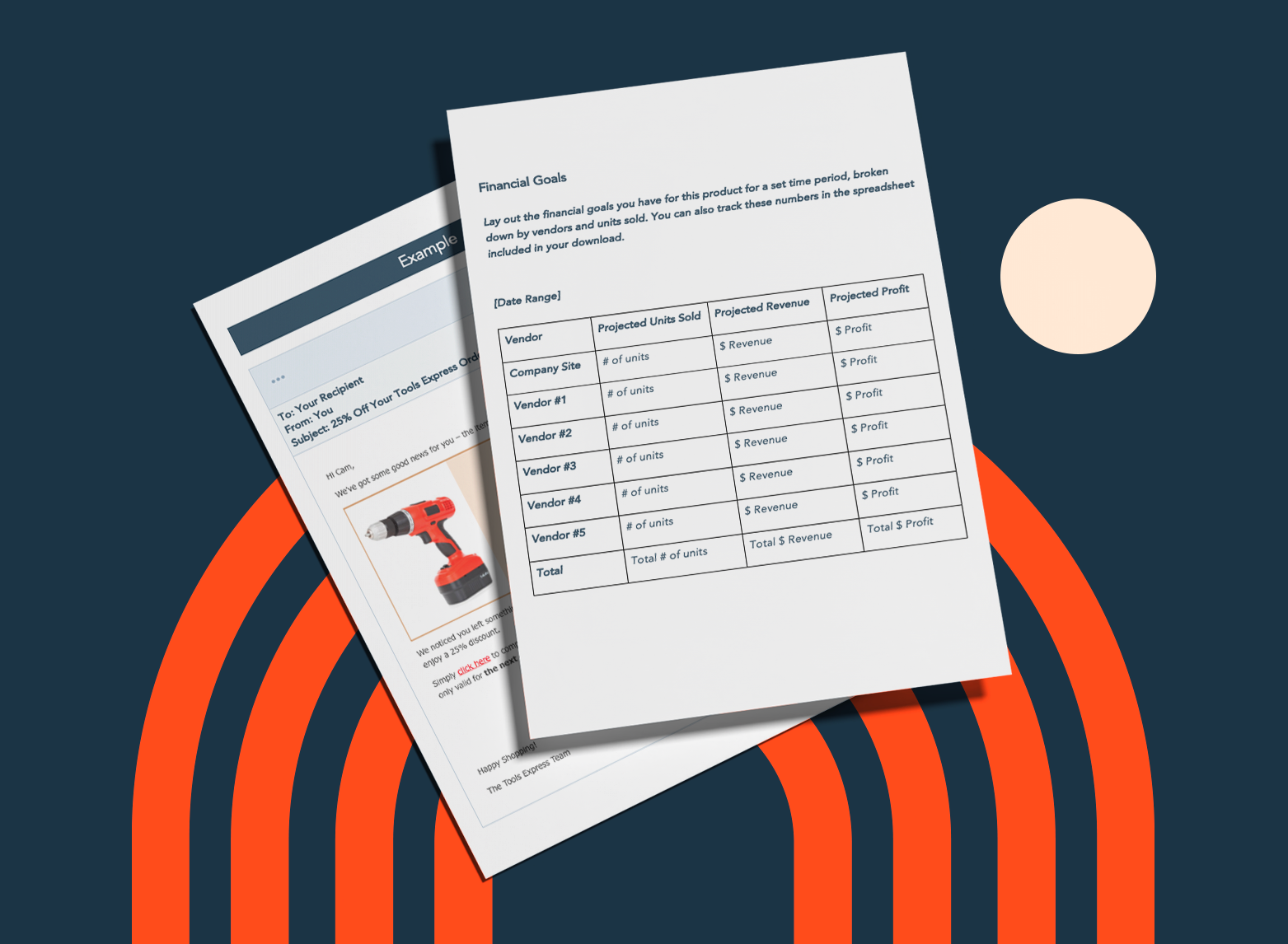
I was excited when I discovered that you can build abandoned cart emails with available templates in any email marketing tool. Tools like Squarespace, Wix, or HubSpot have templates to help you get started.
However, while you can use a pre-made template for the layout, I suggest you customize the message, images, and design.
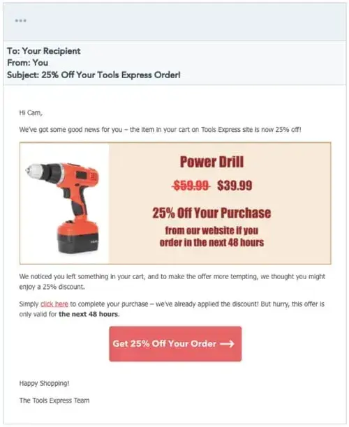
Here's an example template from our marketing kit:
Download HubSpot's Abandoned Email Template
The messaging in abandoned cart emails is fairly simple. Below is an outline of the basic structure:
- Snappy subject line
- Introduction text
- Items left in the cart
- Offer or discount
- Checkout button or call-to-action (CTA)
- Reviews or social proof
- Closing text
While this outline is helpful if you're sending one abandoned cart email, consider a drip campaign for your cart recovery emails. A drip campaign is a series of automated emails.
Now, let’s take a look at the 18 best examples I found to inspire you.
Best Abandoned Cart Email Examples
1. Prose
Subject line: Your formulas are up-to-date
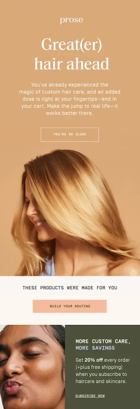
The email above was sent to me by hair care company Prose after I left the site before completing my transaction.
This email checks several boxes: It uses a catchy tagline (“Great(er) hair ahead”) as a friendly reminder to revisit the site, it has an enticing CTA encouraging folks to “Build Your Routine,” and it uses a discount to add urgency. Combined with a friendly tone and clean graphics, this email is pretty persuasive.
What I like: The “Build Your Routine” CTA is unique and true to the brand, extending the personalized customer experience that began when I first visited the website. When crafting your abandoned cart emails, try to build upon your established branding to create a seamless CX.
2. Sonos
Subject line: Circling back

This email from Sonos uses unique and engaging copywriting to entice customers to complete their purchase. They include a beautiful product image and incentives such as:
- Free shipping on every order.
- Shop now, pay later.
- Try it for 45 days.
Several unique CTAs like “Take another look,” “Return to cart,” and "Shop now,” encourage customers to complete their purchase at any point in the email. And if you have questions or need assistance, their phone number and live chat link are provided. They also have links to some of their product categories at the bottom of the email so you can continue shopping and browsing.
What I like: This abandoned cart email is a great example, and I like it for many reasons. First, they offer not one, but three, juicy incentives to address reasons why shoppers abandon their carts. They also provide ways to contact them and to learn how Sonos mitigates their environmental impact.
All these elements help Sonos build trust and encourage recipients to quickly complete their purchase without hesitation.
Depending on the type of product you sell, your abandoned cart emails should both entice and inform the recipient.
3. Peel
Subject line: Still Thinking it Over?
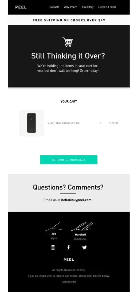
The best element of Peel‘s abandoned cart email is the free shipping offer. Not only do they encourage customers to purchase what’s in their cart, but they also include an incentive for buyers to add more items to their cart and complete checkout.
This is a classic and effective layout for an abandoned cart email: intro text, items in cart, CTA, questions, and footer.
What I like: Peel includes text that creates urgency for buyers, such as “Don’t wait too long!” and “Order today!” but they don’t include it as the heading. This strikes the right balance between casual (“Still thinking it over?”) and urgent.
I also like that it includes the founders’ signatures at the bottom, making the company feel personable and small. This is a good move for smaller businesses whose CEOs are involved heavily in the everyday tasks of the business.
4. Away
Subject line: Back in stock: The Bigger Carry-On

Short, sweet, and to the point, luggage brand Away has an abandoned cart email that lets customers know they can still complete their purchase.
It features introduction text (“Back in stock”), CTA (“Shop Now”), purchase benefits (“Free Shipping Over $100,” “Free Returns”), and closing text offering more navigational paths (“New arrivals”, “Suitcases,” and so forth).
With this email, customers won't get distracted by extraneous information and will focus on the action Away wants — purchase completion.
What I like: Away not only prompts recipients to buy an abandoned item, but also offers more avenues for purchase, such as exploring new products and other categories. No matter which link users click on, they’re bound to end up at a checkout page again.
When including links in your emails, make sure they lead to a purchase.
5. Dyson
Subject line: Items in your basket at dyson.com
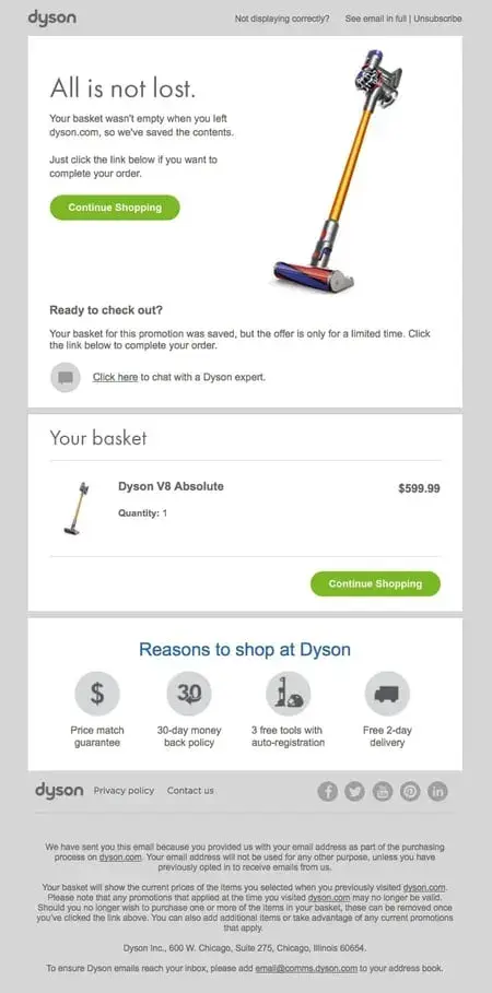
In this example, I think Dyson does several things well:
- They use clear text that is helpful and fun to read. For example, “All is not lost” and “We saved the contents” let the customer know that Dyson wants to be helpful.
- They include an image of the product and list the item still in the customer's cart.
- They add a sense of urgency. The text, “Your basket for this promotion was saved, but the offer is only for a limited time” creates a sense of importance about this purchase.
- They include two CTA buttons. This allows customers on mobile to see a CTA button even as they scroll down. These buttons make it easy to complete their purchase at every touchpoint.
Overall, this email includes the right elements, while also showcasing a sleek, clean design that makes it easy to read.
What I like: Dyson plays to one common fear of online shoppers: Losing the contents of their carts and forgetting what they meant to purchase. That alone might make the recipient feel like they should check out before all is lost. Avoiding pain is sometimes a more powerful motivator than gaining a benefit.
When creating your checkout abandonment emails, you might use a similar psychological trick.
6. Virgin Atlantic
Subject line: You’re nearly there
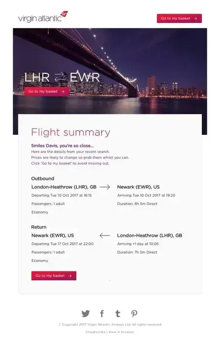
In this example, Virgin Atlantic uses engaging text and three CTA buttons to encourage customers to complete their purchase. The personalized intro text, “Smiles Davis, you're so close…” makes customers feel like they're being spoken to directly while also reminding them how close they are to travel.
This email also includes flight information, so they have everything they need to make a purchase. When writing your own abandoned cart emails, this is a good example to follow because it takes away any roadblocks for the customer.
What I like: I love how personalized this email is — down to the outbound and inbound locations of the flight. It also includes an image of the destination, indirectly increasing the recipient’s desire to fly. When sending abandoned cart emails, you might include an image of the customer’s “destination” — a happier self, a new product on their shelves, or any other positive result.
7. Ugmonk
Subject line: Offering you my personal email
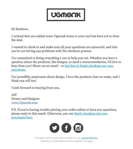
Ugmonk uses a different approach to their abandoned cart email.
They focus entirely on personalization, making it seem like the owner and designer is reaching out directly to answer any questions.
Plus, they include two in-line CTAs so the customer can finish checking out instantly if they want. This is a simple approach that your target audience may prefer.
What I like: This email feels more like a message from a friend than from a company, making it feel less like a “sales” play and more of a “get to know you” play. I especially love how it’s signed by the company’s CEO, and how he mentions his passion for design. If your company is small or sells a niche product, consider taking a friendly, frills-free approach like this one.
8. Drop
Subject line: Smiles Davis, still interested in the Massdrop x MiTo SA Pulse Custom Keycap Set?

Drop‘s abandoned cart email is a good example because of its use of images and copywriting. Drop creates urgency in the bolded text "ends in 19 days."
After they create urgency and include their CTA, they also add other items that the customer might be interested in based on what’s in their cart.
This is a good strategy to get the customer back on their site browsing other items they might want, hopefully turning into a completed purchase.
What I like: Drop creates a sense of urgency, but isn’t pushy, and it includes various product images to entice potential buyers. I especially love the extended catalog below the fold, providing additional items the recipient might want to consider.
9. Google
Subject line: The Google Wifi in your cart is going fast
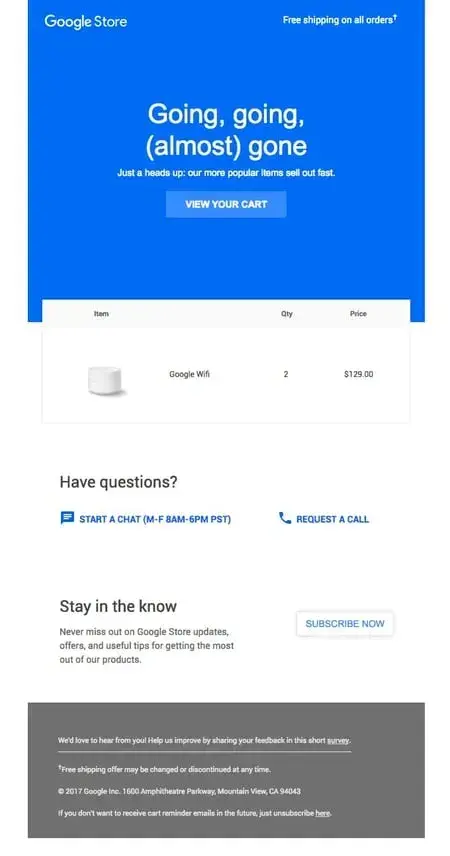
I think is a perfect example of an abandoned cart email because it includes every element: Great copywriting, clear CTA, personalization by showing the customer‘s cart, and urgency.
With text like "Going, going, (almost) gone" and "Our popular items sell out fast", customers are engaged. They also feel compelled to complete their purchase so they don’t miss out.
What I like: This email closes with a CTA to answer questions and subscribe to their product updates. Again, Google focuses on ensuring the customer feels like they don't want to miss out on anything.
10. Chatters Salon
Subject line: Don’t miss out! Get it before it’s gone…

In their abandoned cart email, Chatters Salon creates a sense of urgency with the phrase,“Get it before it’s gone.” It’s in their subject line. And once you open the email, you’ll see a bigger version in capital letters.
The “Complete Checkout” CTA is also effective. To further encourage customers to quickly complete their purchases, they offer free shipping on orders that are $75+ and the irresistible option of making four interest free payments.
What I like: I love the sleek design, the sense of urgency, the convenient payment plan and the free shipping for orders above $75. All the key elements are present. As a result, I believe recipients will be motivated to quickly complete their purchase. And even buy more, so as to enjoy free shipping.
11. Casper
Subject line: Did you forget something?
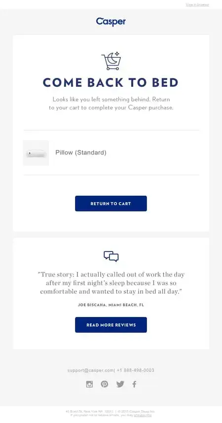
What I love about this example is that Casper uses social proof. Word of mouth and reviews are becoming increasingly important in the world of marketing. When people don‘t complete a purchase, it might be because they haven’t finished searching.
Casper's abandoned cart email makes it easy for the customer to pick up where they left off in their research. Plus, it includes snappy text and clear CTA buttons that entice the customer to continue shopping.
What I like: Casper’s email is short, simple, and effective — and includes a clear call-to-action that’s impossible to miss. But I especially love the second call-to-action to “Read more reviews.” Someone who hesitated to finish their purchase may have done so because they’re not sure Casper is “worth it.” Reading more reviews is key to convincing this type of buyer.
12. Stetson
Subject line: Still Thinking It Over?
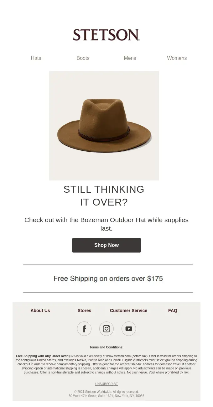
Stetson’s email has a simple no-frills design that features a lovely product picture. It creates a sense of urgency with the text, “Check out with the Bozeman Outdoor Hat while supplies last” and a “Shop Now” CTA button that’s effective.
They also offer free shipping for purchases over $175 and a navigation menu at the top for those who want to continue browsing and shopping.
What I like: I’m impressed that this email is short and sweet, and still ticks all the boxes — from the subject line to the product image to the sense of urgency and the free shipping for purchases over $175.
Pro tip: This type of free shipping is better than having none at all, since it can encourage people to buy more so as to qualify for it. If your business cannot offer free shipping for every single purchase, consider this type instead.
13. Moschino
Subject line: You left something behind
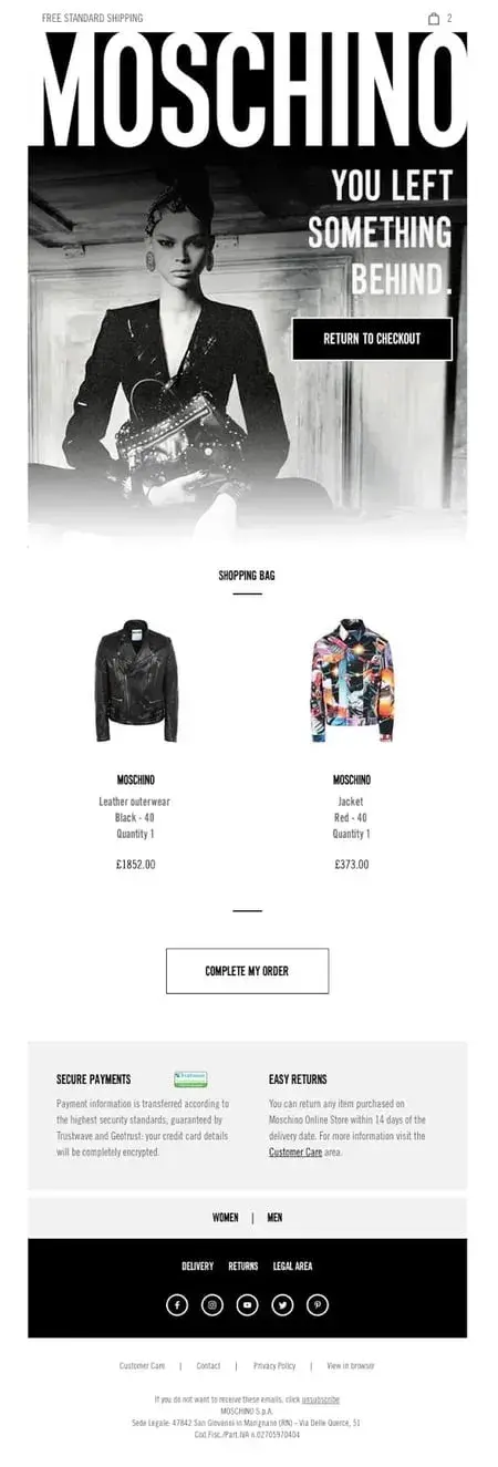
The bottom of Moschino‘s email is unique because it includes information on secure payments and easy returns. For clothing ecommerce businesses, these are some of the top reasons that customers don’t want to make a purchase online.
With their abandoned cart email, Moschino is trying to quell any doubts and take away any reason for hesitation. Plus, they list the items in the cart and use clear CTAs.
What I like: Moschino’s email is highly on-brand, down to the imagery, font, and colors. Plus, as mentioned, it includes notes on their payments being secure and their returns being simple and easy — a concern a potential buyer might have, since Moschino’s offerings are on the more expensive side.
If you sell luxury goods, you might consider a similar approach.
14. Haoma
Subject line: Any questions?

Haoma is a luxury skincare brand that knows its customer might hesitate to splurge — so instead of sending an abandoned cart email that prompts users to complete their order, it prompts them to ask for help if needed.
The button at the bottom seals the deal by inviting users to add the item back to their cart. This technique is helpful if the visitor only browsed your website or removed the item from their cart before checking out.
What I like: If you run a luxury brand, you can take several steps to reassure buyers that they’re making the right choice. You can offer assurances about returns and safe transactions, as Moschino does above, and give them a second chance at learning more about their potential purchase.
These steps can sometimes be more effective at driving purchases than including a CTA to “Buy Now.”
15. Luno
Subject line: Your Luno Air Mattress Order
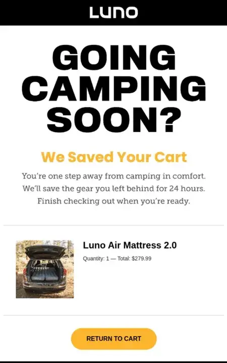
Luno’s cart abandonment email takes several steps to reel in hesitant buyers. It reminds them of an enjoyable activity they could partake in (“Going camping soon?”), tells them how they’ll benefit (“You’re one step away from camping in comfort”), and includes a gentle nudge with a time constraint (“We’ll save the gear you left behind for 24 hours”). The unmissable CTA seals the deal.
What I like: Luno’s careful and targeted copywriting makes this one of the most effective abandoned cart email examples I’ve ever seen. When creating your own email, pay attention to the copy — it can sometimes play a bigger role than imagery or other elements.
16. Le Puzz
Subject line: Missing a puzzle?
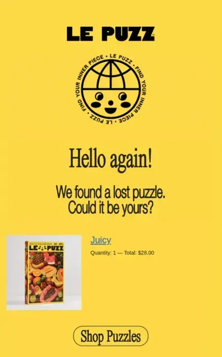
This cart abandonment email from Le Puzz hits all the right notes: It’s peppy, inviting, and probing, but not pushy. Its call-to-action, “Shop Puzzles,” gives the recipient a chance to browse through more options in case they no longer want their previous choice.
I think this is an excellent technique for brands where users might quickly change their minds about their choice, which might lead to an abandoned cart. Prompting them to browse the catalog again is an excellent way to recapture this type of lead.
What I like: Le Puzz’s playful brand voice and bright brand colors play a huge role in its abandoned cart email. From its cheery “Hello again!” to its whimsical “We found a lost puzzle. Could it be yours?” the company encapsulates the fun experience of completing one of its puzzles.
If you sell one specific product, you might want to take a similar approach — bringing the product experience to life with your copy and colors.
17. Alex Mill
Subject line: Get Them for 15% Off!

This email from Alex Mill uses a simple and clean design to communicate a compelling discount offer that’s difficult to miss. The subject line “Get them for 15% off” is good enough to get recipients to open the email.
The text, “Good News: We saved your picks” and “You Get Them For 15% Off” nudges the customer to quickly grab the discount and complete their purchase.
Beautiful pictures of items viewed by the customer are featured and more than one CTA button makes it convenient for customers to complete their purchase at any point.
What I like: I love that Alex Mill addresses their customers' reasons for cart abandonment in this email. Added to the discount, they also offer free shipping, plus free and easy return. For those who want to continue shopping, links to shop men and women’s clothes are provided. And customers who have questions are encouraged to contact them or check out their FAQ page.
This strategy can also work for you if you take the time to understand your customers.
18. Dollar Shave Club
Subject line: Where did you go?
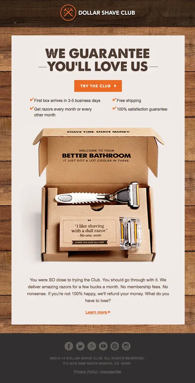
This example from the Dollar Shave Club does a great job with their interesting and engaging copywriting, plus the lovely picture of their monthly box and its content. The subject line asks a simple question, "Where did you go?” to generate interest.
Once you open the email, the bold text, “We Guarantee You’ll Love Us” cannot be missed. Plus the reasons why they’re so sure:
- First box arrives in 3-5 business days
- Free shipping
- Get razors every month or every other month
- 100% satisfaction guarantee
What I like: In this abandoned cart email, Dollar Shave Club reminds customers they have nothing to lose when they complete their purchase. And I love it because it’s effective. The delivery period is clearly stated. They also offer free shipping, and are ready to refund your money if you’re not 100% happy.
Since there’s nothing to lose, I’m sure most prospects won’t hesitate to complete their purchase.
Abandoned Cart Email Best Practices
Next, I’m going to share 12 important best practices you need to keep in mind when planning your abandoned cart emails.
1. Send an abandoned cart email sequence.
Instead of sending just a single email, a series of emails will work much better for abandoned cart emails. Also called an abandoned cart flow, the emails could be structured like this:
- Email 1. Cart reminder (sent a few hours after cart abandonment).
- Email 2. Follow-up (sent a few days later).
- Email 3. Promotional discount (sent a few days after email two).
According to Klaviyo’s 2024 Benchmark Report, abandoned cart flow drives:
- The highest revenue and conversion rates out of all automated flows.
- High engagement across ecommerce industries.
Also, according to Omnisend, their merchants who sent just one cart abandonment email got 14.76 orders, while those who used the three email strategy achieved 24.94 orders in total.
One thing I also discovered is that you can experiment with another email sequence and frequency to find out what works best for you. For example, maybe you want to send four to six emails over a specific period of time and check your results.
Pro tip: I’d recommend taking your business goals, product line, industry, and everything you know about your target audience into consideration when deciding on your email sequence.
Want to generate your copy faster and increase your productivity? I’d suggest trying the Hubspot AI email writer.
2. Choose the correct timing.
Research shows that timing these recovery emails is crucial. Email tracking can provide you with valuable insights into your audience's engagement patterns. With tools like our free email tracking software, you can see precisely when prospects engage with your emails and click links, helping inform your timing strategy.
Send your abandoned cart emails within a few hours after a customer abandons their cart. This is because your customer may still want to buy shortly after leaving the site. A timely reminder can recapture their attention and help them complete their purchase.
For example, if you work at a company like Zappos, and someone doesn't complete their purchase, you might send an abandoned cart email anywhere from three to five hours after they leave your site without completing a purchase.
At minimum, I think you should send the first abandoned cart email within 24 hours. That said, it‘s important to test when your customers are most likely to react to that email. And make sure you’re choosing the right timing for your customers.
Analyze customer behavior.
I suggest you use tools like Google Analytics or HubSpot for insights into customer behavior. And use metrics such as:
- How much time they're spending on your website.
- Common cart abandonment times.
- Peak engagement hours.
This data can help you choose the best time to send your email. Read here to learn how to create and analyze abandoned cart data with HubSpot.
Test different send times.
Depending on your business goals, products, industry, and target audience, test different send times. In fact, I’d recommend you test specific times of the day or days of the week.
If you wait too long, your customer may lose interest or look to a competitor for the same product. But if you hit “Send” at the wrong time, your customer may feel overwhelmed or ignore your email. Both will make it tough for you to recover that sale.
Use behavioral triggers for timing.
I discovered that marketing automation tools like HubSpot can be used to add workflows and set up triggers for specific customer behaviors.
Useful triggers might include returning to your website, adding items to the cart again, or spending a certain amount of time on the site. Then, use these triggers to send automated follow-up emails.
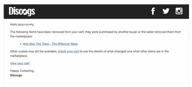
For example, this Discogs email doesn’t have a fancy design, but it lets the owner of this abandoned cart know that they missed out on the item in their cart. At the same time, it offers a quick link to find that product again and complete the purchase.
3. Personalize, personalize, personalize.
Personalize your abandoned cart emails to customers with real-time information, such as:
- Customer name
- Items they left in their cart
- Product images
- Prices
This personalization can persuade them to go ahead and complete the purchase, since they’ve already expressed interest by adding them to their cart. It's also a reminder of the specific items they may still want to buy.
Jordan Pritikin, who used to work as a marketing leader at HubSpot, gives this advice: "When you're writing an abandoned cart email, personalization is key."
Pritkin continues, "What was the actual product or service that was abandoned? What are the value propositions that most resonate with the individual you're sending to? Why did they object to the purchase initially and how can you, as the business, help assuage those objections? The more personal your abandoned cart email, the more likely it is to succeed."
As you personalize your abandoned cart email sequences, I’d suggest keeping these tools and tips in mind.
Use customer segments to target customers.
While you may not be able to send unique emails to each customer, I learned that useful customer segments can help you create personal emails.
Use a CRM to segment customers by demographics, purchase history, browsing behavior, and more.
Use dynamic content and other tools.
I also discovered that tools like smart content rules and dynamic content can help you personalize your abandoned cart emails and landing pages.
You can update pages across your website or display unique content for your customer segments. These tools make it easier to add unique images, prices, and product suggestions to your emails.
Create personalized offers.
Once you have the segments and tools you need to customize your emails, I suggest thinking carefully about your abandoned cart email content.
To develop specific offers for customers, HubSpot email marketing tools can help you create, personalize, and optimize your emails.
Discounts, free shipping, and limited-time promotions might appeal to anyone, but my findings reveal that these tactics will be more effective if they align with specific customer interests and needs.
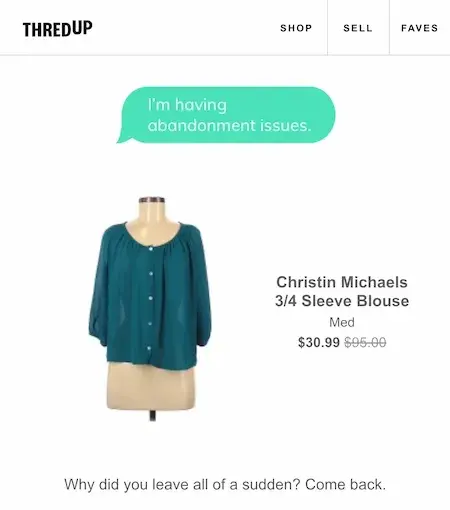
Ideally, your offers should refer to their past purchases, abandoned items, or segment pain points, like this example from ThredUp:
4. Include a CTA to resume shopping.
Your abandoned cart email should encourage customers to complete their purchase. For example, the CTA might be something like “Buy Now” or “Resume Your Order.”
Creating a CTA that takes them directly to checkout will save your customers time. It will also make it easy to review their items and further encourage them to complete the purchase.
To create an effective CTA for your abandoned cart email:
Add a clear value proposition.
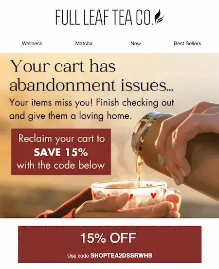
Your email should highlight any extra value your customer would get by completing the purchase. I’d recommend putting this value at the start of your email to motivate them to complete their order, like the offer below from Full Leaf Co.
Check out these CTA examples for more inspiration.
Create urgency or scarcity.
Mention limited stock or add a time-sensitive offer to create a sense of urgency in your CTA. I found out this will give your customer a compelling reason to take action.
HubSpot customers: Deliver personalized CTAs with HubSpot's CTA Builder.
5. Pay attention to your copywriting.
Another thing I learned is that your copy should be snappy, concise, and compelling. Great copywriting is interesting enough to entice someone to complete their purchase. It should also be friendly and mirror your brand voice.
Copywriting can make a big impact on cart abandonment if you:
Make it easy to scan.
Your copy should get to the point and be easy to read. Break up the text into short paragraphs, or bullet points, to make it more scannable.
It's also a good idea to use great email design to create scannable cart abandonment emails.
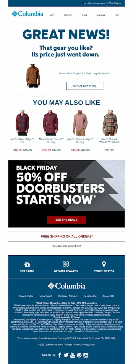
Images should be attractive and exciting but also support or enhance the message of your specific email. Product images directly from abandoned carts can be especially effective, like this abandoned cart email example from Columbia:
HubSpot customers: Check out the knowledge base to learn how to add a product or abandoned cart module to your email here.
Focus on customer pain points.
It's important to keep the copy succinct, but it must feature relevant solutions to specific customer pain points. As you highlight value and benefits, I suggest you show how that purchase solves a problem or fulfills a need.
6. Include an enticing subject line.
Your subject line should be interesting enough to get people to open the email.
For example, using something like discounts, humor, or questions could intrigue the customer enough to click. If you wanted to include a promotional offer, your subject line could be something like “20% off all purchases.”
Get local.
If your business operates in specific regions, think about tailoring the subject line with local references. Localization can build an immediate connection.
Create urgency.
Try adding limited offers like “Limited time offer” or “Only 2 left in stock” directly to your subject lines. This can motivate your customers to open the email and take quick action.
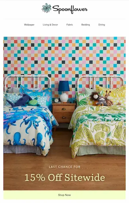
Subject line: Last day for 15% off your order 🌤
Add intrigue.
Try abandoned cart subject lines that arouse curiosity with questions, teasing language, or surprising statements. For example, “Can't decide? We've saved your cart for you.”
Test for catchy subject lines.
It's tough to write engaging subject lines, but I found that tools like CoSchedule's Email Subject Line Tester or SendCheckIt can help you create powerful subject lines, for more email opens and conversions.
7. Consider adding social proof.
My findings also reveal that you can use reviews, UGC, and testimonials to strengthen your email branding. This tactic can also increase longing for abandoned products that customers left in their carts.
Offer social proof from customers.
I’d recommend adding customer feedback, images, reviews, or testimonials in your copy. This can help you build interest, trust, and credibility. It can also address any concerns your customer may have about completing their purchase.
Pro tip: I recommend tools like HubSpot, Yotpo, or Trustpilot, which can help you collect and manage customer reviews.
Add social proof from industry experts or influencers.
Quotes or endorsements from reputable sources are attractive additions to abandoned cart emails. These opinions of authority can sway a customer's decision to complete their purchase.
Check out this influencer marketing guide to get started.
Showcase UGC.
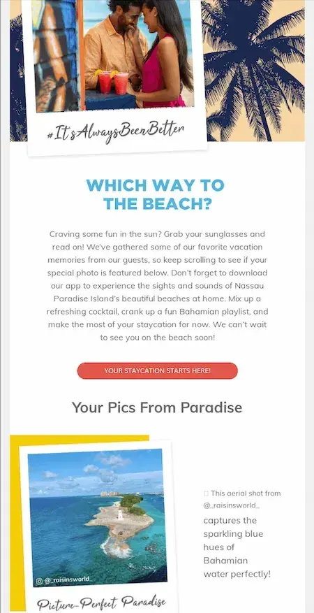
User-generated content (UGC) might include customer photos, videos, or social media posts. If your customers are showcasing their experience with your products, find a way to include it in your email to add urgency and authenticity.
I also noticed that tools like TINT or Social Native can help you collect and curate UGC.
Take a look at this UGC example for inspiration:
Highlight rankings.
Add product ratings or rankings from recognized brands to your abandoned cart emails. I found that star ratings, satisfaction scores, or product rankings quickly show customers the quality and popularity of your brand. This validates their initial emotional impulse to buy and can lead them to complete the sale.
8. Share more product options.
To rekindle their interest and help customers buy faster, I’d recommend sharing more options related to items left in their cart.
I know this can be tricky since you don’t want to overwhelm them with too many choices. But what if these related options are a better choice and they didn’t even know you had them? I’ve heard stories from people around me who have experienced something similar.
Therefore, study the items left in their cart and share:
- Similar items and options that do basically the same thing.
- The same item in different colors, designs, patterns, and so on.
- A more affordable option of the same item.
- A more expensive option of the same item with more features.
- Complementary accessories they might find useful.
As an alternative, also think of having a product quiz in your cart abandonment email. Ask questions to find out what the customer really needs or is looking for. And use their answers to recommend products that might be great fit.
9. Provide your contact details.
I also discovered that you can encourage customers to reach out with questions, comments, complaints, and other valuable feedback, when your contact details are in your cart abandonment emails.
For example, include:
- A live chat link.
- An email address.
- A telephone number.
Done right, this can convince customers that you and your team are always ready and available to attend to their needs.
10. Ask for feedback.
I think it’s important to find out why your customers abandon their cart, instead of making assumptions. According to the Baymard Institute, people abandon their cart for the following reasons:
- I’m just browsing and not ready to buy.
- Extra costs are too high, such as shipping, tax, fees, and so on.
- The store wants me to create an account.
- I don’t trust the site with my credit card information.
- Delivery is too slow.
- The checkout process is too complicated or long.
- I can’t see or calculatethe total order cost upfront.
- The return policy is not satisfactory.
- Payment methods are not enough.
- Website had errors or crashed.
- Credit card was declined.
Sure, you can’t do much about people who’re not ready to buy. But did you notice all the other reasons are customer pain points you can fix?
In your email, I’d recommend using a friendly tone to ask them what happened, why did they leave without completing their purchase, and how can you help. You can encourage them to call you or reply to your email. Or maybe you can even include a survey in your email.
With this valuable feedback, you can address the root causes of cart abandonment, provide a great experience for customers, and make more money.
11. Optimize for mobile.
Because it’s so convenient, more and more people now shop online through mobile devices. According to Statista:
- Mobile ecommerce sales reached $2.2 trillion in 2023 and now make up 60% of all ecommerce sales worldwide.
- Mobile ecommerce sales grew from 56% in 2018 and are expected to reach 62% by 2027.
And I also found out that around 77% of shopping cart abandonment occurs on mobile devices, compared to 68% on desktop.
Here’s the truth: If your emails are not mobile friendly, they won’t display correctly on mobile devices. And I’ve seen such emails before on my tablet. Not only do they look strange, but they are difficult to read and engage with.
They also provide a terrible user experience that can frustrate and annoy people, and even cause them to unsubscribe.
So, it's a good idea to optimize your cart abandonment emails for mobile.
For easy mobile interaction, make sure CTA buttons are also mobile-friendly, and easy to see and click.
Pro tip: To improve the mobile experience, I suggest you limit the number of clicks from CTA to checkout completion. And I’d also recommend checking your emails on different devices before sending them out.
12. A/B test your email to learn what’s most effective.
There are many different approaches to the abandoned cart email. But I’d suggest A/B testing different variations to see what works for your audience.
Do they prefer personalized emails? Discounts? Humorous text? It's important to find out.
Test different email elements.
I highly recommend you try different placements and types of social proof in your abandoned cart emails. Or, try email variations with shorter or longer copy, bullet points or paragraphs, or multimedia like videos or GIFs.
You can also A/B test different placements and messaging of your CTAs in your abandoned cart emails. Experiment with button colors, sizes, and text to optimize CTAs for click-through rates.
Make the most of email testing tools.
I also found out that tools like HubSpot's A/B testing feature or Split Test Automation can help you set up and measure subject line tests. While tools like Hotjar can give you insights into user behavior.
Analyze your testing results.
Here’s another thing I discovered. Don't just run A/B tests and run with your first impressions. Instead, analyze test variations and results. Then, measure the impact on your email KPIs such as:
- Open rates.
- Click-through rates.
- Conversion rates.
- Impact on different audience segments or buyer personas.
Then, use your analysis to refine your abandoned cart email strategy.
Important note: For useful A/B testing results, test only one part of your abandoned cart email template at a time. For example, if you test your subject line, CTA, and email image at the same time, you won't know which part of your email was the key to its success.
Here’s a free A/B testing kit that includes a guide, significance calculator, and tracking template for targeted A/B testing.
Create Abandoned Cart Emails That Convert
With stellar copywriting and branding, you can earn your customers' trust, convince them to complete their purchases, recover lost sales, and make more money. To help you achieve all these, I’ve shared everything you need to know to create and send effective abandoned cart emails.
In fact, I’m genuinely amazed at all the email templates and other tools available for this. And I’m also impressed that most of them are free.
As an email enthusiast, I learned a lot while working on this piece and collating the email examples. I hope they inspire you as you create your abandon cart emails.
Editor's note: This article was published in September 2019 and has been updated for comprehensive.

![12 great examples of welcome emails for new customers [templates]](https://53.fs1.hubspotusercontent-na1.net/hubfs/53/welcome-email-examples-1-20251024-7984960.webp)
.webp)
![4 types of emails that get the most engagement [+ 4 emails that fail]](https://53.fs1.hubspotusercontent-na1.net/hubfs/53/Untitled%20design%20(56).jpg)


![50 Ecommerce Statistics To Know in 2024 [New Data]](https://53.fs1.hubspotusercontent-na1.net/hubfs/53/ecommerce-statistics.png)