
What is a web design style guide?
A web design style guide — also known as digital style guide — is a resource where a brand collects and stores all design elements and rules for its website. It’s comprised of graphic elements, typography, color scheme, and general formatting for developers to reference and follow for cohesive website composition.
This type of style guide is to be treated as a manual that sets design standards for a company's digital presence. Its key purpose is to create a universal design style for the brand and ensure consistency across all channels and mediums, where you establish your logo, color palette, typography, imagery guidelines, and so on.
Unlike brand style guides that encapsulate a company’s logo, mission statement, buyer personas and tone of voice, web design style guides are centered on digital presentation like UX / UI.
But, as a UX designer myself, I've always been curious, what can you find in the digital style guides of influential companies like Apple, Google, and Starbucks?
Believe it or not, a lot of companies make this information publicly available — they just don't make it very easy to find. So, every time that I stumble across one, I bookmark it. Here are some of the best ones that I've found so far.
Examples of Awesome Digital Style Guides
1. Apple iOS
Apple's style guide is especially interesting because it details how to design an entire operating system. Monterey, one of the latest versions of Apple's OS X, has a more simplified user interface than its predecessor, Yosemite. Apple demonstrates this subtle-yet-palpable distinction with really nice graphical comparisons and then goes on to talk about the rationale behind every single aspect of the operating system's design. It gives you a window into the minds of the designers.

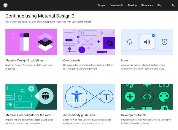
2. Google: Material Design
Google pioneered a design style called Material Design, which exists as a hybrid between Skeuomorphic Design (gradients, textures, light elements) and Flat Design (simple, colorful, geometrical.) In doing this, they combined the benefits associated with each design style, while avoiding the drawbacks.
Because Google has been practicing Material Design for a few years now, you've probably already interacted with it on a daily basis — Google Calendar app, anyone? This style guide details exactly what Material Design is and how Google uses it. And I have to say that it is, by far, one of the best style guides that I've ever come across.
3. Starbucks
This is one of the most minimalistic style guides that I've seen — and yet, it houses a ton of useful information. It places a heavy emphasis on code and you can tell that it was built by developers, for developers. It lacks brand-related elements, so it walks the line between a website style guide and code library.

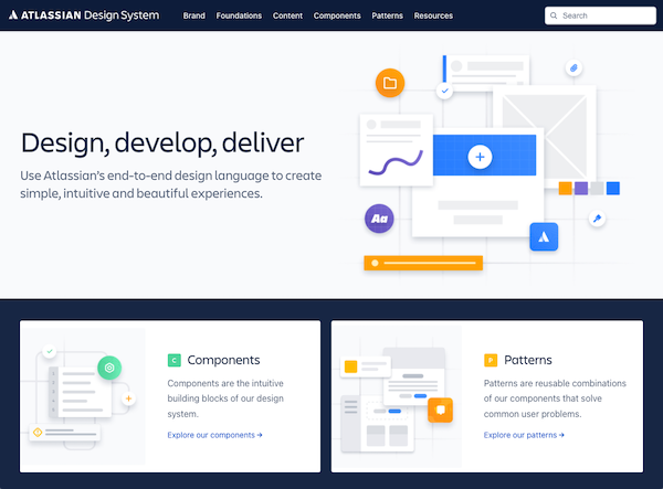
4. Atlassian
The product suite that Atlassian designs for is gigantic — so, naturally, they have a gigantic style guide. From foundational elements (like color palette and typography) to components (like tables and tooltips) to a full-blown pattern library, this guide has just about everything that you would expect from a product of this size.
Perhaps best of all, the rationale behind the entire style guide is summed up in three deceptively simple terms on the home page.
5. Mozilla
This digital style guide is primarily concerned with branding and communications. But with Mozilla taking a "privacy and open web" approach lately, it's cool to see how they reflect this in their design.
Mozilla’s homepage also does a great job of outlining how its UX/UI is supposed to be accessible to people with visual impairments or disabilities — something inclusive and necessary as technology becomes more innovative.

6. Buffer
Buffer’s style guide is small and concise, going from grid through modals all in one place. It’s a friendly reminder that your digital style guide doesn’t have to be flashy if it communicates all the right points. Companies looking for somewhere to begin can take notes from Buffer’s simplistic style guide components and build their own from there.

7. Yelp
If you're looking for a solid example of a website style guide, Yelp's got that covered. Not only is it thorough, but it explains its Atomic Design system as a cookbook, and divides site elements as ingredients contributing to a dish.
This thing has it all: typography, layout, forms, containers, navigation, and code snippets for each piece. They do a great job of explaining what each element is, where it should be used, and how it should be implemented.

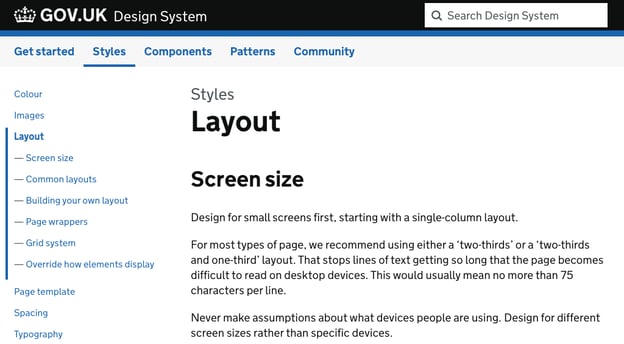
8. GOV.UK
England's government services website has been widely heralded as a prime example of high-quality UX. Why? Because it boasts a simple and easy-to-use design that accommodates excessive amounts of information.
If you're interested in what makes up a truly clean and effective design (hint: it usually starts with strong color usage, typography, and spacing), then GOV.UK's style guide is worth taking a close look at. Much like the site, it's very simple but very informative.
9. DeviantArt
The new DeviantArt style guide is unique because it's more than just a guide — it's an experience. It tells a story and leverages bold, full-width visuals to immerse the user in the emotional experience of the DeviantArt brand. That being said, it's strictly a branding style guide, so only items like color and typography are covered.

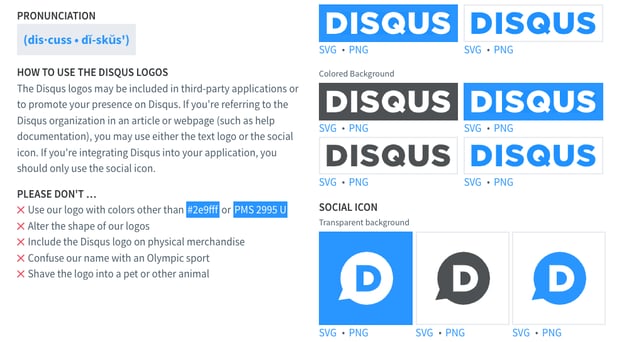
10. Disqus
Color, icons, typography, and logo ... Disqus keeps it short and sweet with this guide. But it's all presented in a very nice, organized manner. This guide could be used as a great example for "where to start" when creating a style guide of your own, as it hits all of the fundamentals.
Feeling Inspired to Make Your Own Guide?
Now it's your turn. By leveraging a digital style guide in your company, you can communicate your brand's design language to internal designers, agencies, advertising partners, and even customers.
Start with the basic foundational elements (color, typography, logo, imagery), add some usage guidelines ("do and don't"), and even incorporate some web components if you need to (modules, templates, code snippets. Use examples from other companies to learn from the best. Your team will be cranking out consistent designs in no time.

Design


![How to Create the Perfect Marketing Timeline [Template + Examples]](https://53.fs1.hubspotusercontent-na1.net/hubfs/53/project-timeline-template-1-20240919-3074583.webp)
![My Tips for Designing Great Website Imagery [With Canva, HubSpot, + 3 More Tools]](https://53.fs1.hubspotusercontent-na1.net/hubfs/53/Untitled%20design%20-%202025-02-14T161951.776.png)
![12 web design best practices & guidelines for usability [+ expert tips]](https://53.fs1.hubspotusercontent-na1.net/hubfs/53/website-design-tips-1-20251229-288711.webp)

![How to design a logo [step by step]](https://53.fs1.hubspotusercontent-na1.net/hubfs/53/Operation-everest-free-advertising-1-20250922-654468.webp)