If you’re creating a website for your business, then you probably have a long wish list.

You want the design to reflect the look and feel of your brand. You want to have the functionality required to meet the needs of your visitors without going over budget. And you want to create responsive layouts that display elements like buttons and forms consistently, no matter what device or browser the visitor is using.
By building with Bootstrap, you can check that last item off your list. Bootstrap is an open-source framework for quickly building responsive websites and mobile-first web projects. Because it offers a collection of reusable code, you won’t have to build a site from scratch.
To understand why over 21 million websites on the internet use Bootstrap, let’s take a closer look at what it is and how to use it.
Table of Contents
- What is Bootstrap CSS?
- How to Download Bootstrap CSS
- Ho to Use Bootstrap CSS
- Bootstrap CSS Examples
- How to Override Bootstrap CSS
![Download Now: 50 Code Templates [Free Snippets]](https://no-cache.hubspot.com/cta/default/53/34adf7eb-7945-49c4-acb8-f7e177b323e5.png)
What is Bootstrap CSS?
Bootstrap CSS is the leading CSS framework for developing responsive and mobile-first websites. This free and open-source toolkit comes with a responsive grid system, global CSS settings, extensive pre-built components including buttons, navbars, and forms, and optional JavaScript plugins to speed up the development process.
Though Bootstrap is an open-source toolkit for developing with HTML, CSS, and JavaScript, it is often referred to as a CSS framework.
To understand why, you must first understand that CSS is generally easier to learn for people at all levels of technical experience and is faster in browsers than JavaScript. For these reasons, Bootstrap developers wrote in CSS (and HTML) over JavaScript whenever possible. The CSS library included in Bootstrap is therefore much larger than the JavaScript library.
Since Bootstrap makes it easier and faster to create responsive websites, it appeals to many front-end developers and beginners in particular. However, it’s not recommended by all. Below we’ll look at why Bootstrap is so popular and when it’s ideal to use — and when it’s not ideal.
Why Bootstrap?
Bootstrap is the go-to toolkit for many front-end developers. According to W3Techs, it's used by 22.1% of all websites on the internet.
There are a few factors driving Bootstrap’s popularity. First and foremost, it’s open-source and therefore free to download and use. It’s also fully customizable, and compatible with all modern browsers. This is true of many CSS frameworks, however.
What sets Bootstrap apart from other development toolkits is that it was developed mobile-first. Meaning, the code was optimized for mobile devices (i.e. the smallest screen size) first and then scaled up to display on larger screens. As a result, building with Bootstrap CSS ensures that your site supports proper rendering and touch zooming for all devices.
Another reason Bootstrap is so popular is that it’s easy to use. It comes bundled with templates for typography, forms, buttons, drop-down menus, navigation, and other interface components. Using these pre-styled templates, you can add features that enrich the user experience on your site without having to code them from scratch.
When to Use Bootstrap
There are many reasons to use Bootstrap. We’ve discussed some above but let’s take a closer look at these reasons below.
1. You want a responsive website.
Building a responsive site is much easier using Bootstrap than doing so from scratch. Bootstrap comes with responsive styles, like containers and media queries, to ensure your site adjusts to the viewport. That means you don’t have to worry about whether your visitors are using desktops, tablets, or mobile devices.
2. You want to save time.
You can build your site quickly with Bootstrap. Once you download the framework, you can get started with a basic template and then add the components you need. These components are fundamental HTML elements, like tables, forms, buttons, images, and icons, that are styled with a base class and extended with modifier classes. Using these pre-designed components significantly limits the amount of custom CSS you have to write.
Consider Bootstrap buttons for example. The base class .btn is used for all the common styles you want for your buttons, like display, padding, border-width. With this class, you don’t have to keep repeating these CSS properties in your stylesheet to format every single button you add.
Modifier classes, like .btn-primary on the other hand, are used to add the more specific styles you want for your buttons, like color, background-color, and border-color of your buttons. This is just one example of how using Bootstrap components is much faster than coding them from scratch.
3. You’re familiar with HTML and CSS.
Though Bootstrap does simplify the process of building a site, you’ll have to be familiar with HTML and CSS to use the framework. For example, understanding the CSS box model will be important when using the container class and building your first Bootstrap grid.
The good news is you’ll only need a basic knowledge of coding to get started.
4. You have multiple people building out your site.
If you have multiple collaborators working on a site, then consistency is important. You don’t want buttons on your homepage to look different from buttons on your landing page, or to use a different website typography on your blog than anywhere else on your site — and so on. Using Bootstrap and its default settings, utility classes, and component elements can help ensure the front end of your site looks consistent.
5. You want to be part of a community.
Since Bootstrap is open source, it has a global community of developers and designers dedicated to supporting the framework. These developers and designers modify and enhance Bootstrap's codebase on GitHub. They also answer questions on Twitter, Stack Overflow, and in a dedicated Slack room. When using Bootstrap, you can leverage this active community to become a better Bootstrap user.
When Not to Use Bootstrap
While there are many benefits of using this CSS framework, there are some reasons not to use Bootstrap as well. Let’s take a closer look at these reasons below.
1. You want a unique website.
Since Bootstrap comes with pre-styled content, components, and templates, Bootstrap sites tend to look the same out-of-the-box. In fact, Bootstrap has been blamed for why websites today all look the same.
You can customize a Bootstrap site, but it’ll take time. Plus, if you have to override too much of the default styling, then it might make more sense to create your own stylesheet in the first place.
2. You want a theme.
The Bootstrap framework is not a theme — though there are Bootstrap themes available. Let’s compare the framework to a WordPress theme, for example.
When you install and activate a WordPress theme, it changes your entire site’s appearance. When you download the Bootstrap framework, aspects of your site’s appearance will change automatically, like the typography. But you still have to write the HTML and plug in the preset layouts, colors, and components you need to make up your website.
3. You want a fast-loading site.
Bootstrap can negatively impact the speed of your website. Why? Because it’s heavy — not in terms of KB, exactly, but in terms of how much the average user doesn’t use.
Bootstrap is less than 500KB. You can also take several steps to reduce that weight and mitigate its impact on load time. For example, you can use the minified CSS and JavaScript files Or you only download the CSS files, not the JavaScript ones.
But even with these steps, Bootstrap can still be too heavy for what you need. Most users don’t need all the components, utilities, and plugins that Bootstrap comes with, so they might be weighing down your site even if they’re not being used.
4. You don’t have time to learn and read through the Bootstrap documentation.
Bootstrap is considered an easy-to-use platform. It offers extensive documentation for every part of its framework, from its layout to content to components and more. That means virtually anyone can learn Bootstrap — it also means it will take time to read through the documentation and learn the framework. If you are looking to build a website as quickly as possible, then Bootstrap might not be as ideal as other solutions, like website builders.
5. You want to master HTML and CSS.
Using the pre-designed components and templates that Bootstrap provides makes it much easier and faster to build a website — but it can also stunt your growth as a coder. Creating with Bootstrap is like using a calculator to do algebra: you can end up with the result you want without totally understanding how you got it. That's why it's good to spend time creating your own custom components, even if you also learn and use Bootstrap.
Now that we understand what Bootstrap CSS is and who should be using it, let’s briefly discuss the different download options you have.
How to Download Bootstrap CSS
Before we walk through the process of downloading Bootstrap, it’s important to note that you can load Bootstrap remotely via BootstrapCDN or jsDelivr instead of downloading it. This will require visitors to have an internet connection to visit your site and will require you to post more code, however. As a result, downloading Bootstrap is the more popular choice.
There are two different forms of Bootstrap available for download. Each version — a precompiled and a source code version — appeal to different users depending on whether they prioritize ease-of-use or flexibility. Let’s take a closer look at each below.
Precompiled Bootstrap
The precompiled version is the most basic form of Bootstrap. You’ll download precompiled CSS and JS files and minified CSS and JS files that are easy to drop in nearly any web project.
Once downloaded, you’ll unzip the compressed folder and see the following structure.
bootstrap/
├── css/
│ ├── bootstrap-grid.css
│ ├── bootstrap-grid.css.map
│ ├── bootstrap-grid.min.css
│ ├── bootstrap-grid.min.css.map
│ ├── bootstrap-reboot.css
│ ├── bootstrap-reboot.css.map
│ ├── bootstrap-reboot.min.css
│ ├── bootstrap-reboot.min.css.map
│ ├── bootstrap.css
│ ├── bootstrap.css.map
│ ├── bootstrap.min.css
│ └── bootstrap.min.css.map
└── js/
├── bootstrap.bundle.js
├── bootstrap.bundle.js.map
├── bootstrap.bundle.min.js
├── bootstrap.bundle.min.js.map
├── bootstrap.js
├── bootstrap.js.map
├── bootstrap.min.js
└── bootstrap.min.js.map
Using the compiled version is easier and faster to use than the source code version — but it’s more difficult to customize. Any change you want to make to a pre-styled element or layout has to be applied with an override to the current styles.
If you want to customize the CSS and JS files included in Bootstrap as you please, then you’ll be better off downloading the source code version.
Bootstrap Source Code
The source code version includes the precompiled CSS, JS, and font assets as well as source files for the CSS, JS, and icon fonts respectively.
If you choose to download the Bootstrap source code, then you’ll unzip the folder and see the following structure.
bootstrap/
├── dist/
│ ├── css/
│ └── js/
├── site/
│ └──docs/
│ └── 4.6/
│ └── examples/
├── js/
└── scss/
The dist/ folder contains everything listed in the precompiled section above. The docs/ folder includes the source code for Bootstrap documentation and examples of Bootstrap usage. The js/ folder contains the source code for Bootstrap JS and the scss/ folder for Bootstrap CSS.
Since this version of Bootstrap requires you to have Autoprefixer and a SASS compiler, the set-up process is longer and more difficult than setting up the pre-compiled version. Once set up, however, you can change and customize the files any way you want.
Each version of Bootstrap is ideal for different use cases, but because the precompiled Bootstrap is simpler and faster to use, we’ll focus on that version for the rest of the post.
Below let’s look at how you can use the precompiled Bootstrap to build a website.
How to Use Bootstrap CSS
In order to use Bootstrap CSS, you need to integrate it into your development environment. To do that, you simply need to create a folder on your computer. In that folder, save your compiled CSS and JS files and a new HTML file where you’ll load Bootstrap. Then you can use Bootstrap templates to add interface elements to the page.
Let’s break down this process step-by-step.
Loading Bootstrap CSS and JS
First, create a folder on your computer called “bootstrap.” Move the compiled CSS files from your Bootstrap download into that folder. If you are also using the JS part of Bootstrap, move the compiled JS files into the folder as well.
In that same folder, create another file and call it index.html. Open this file with a text editor of your choice, like Notepad++. You can copy and paste the basic HTML template on Bootstrap’s official site into the file or code it from scratch.
Below is an example of an HTML page coded from scratch.
You’re now ready to load Bootstrap CSS into your project. Simply add the following line of code into the header of the index.html file, right before the </head> tag.
If you plan to just use the CSS part of Bootstrap, then you’re all set.
If you plan to use the JS part as well, then you need to add two more lines of code. Components including alerts, toggle buttons, carousels, and dropdowns require the use of JavaScript to function so continue these steps if you want to add any of these elements to your site.
First, you’ll need to load the jQuery library. To do so, download jQuery onto your computer. Unzip the file and save it in the “bootstrap” folder along with the compiled CSS and JS files and index.html file.
You’ll then add the following line of code in the index.html file. This time, you’ll add it to the footer, instead of the header, right after the <body> tag.
To load Bootstrap JavaScript, add the following line of code right after the call for jQuery.
Once you’ve completed these steps, this is what your index.html file should look like:
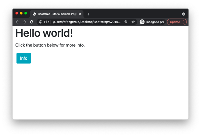
Once you save the folder, you’ll have a basic Bootstrap layout that looks like this:
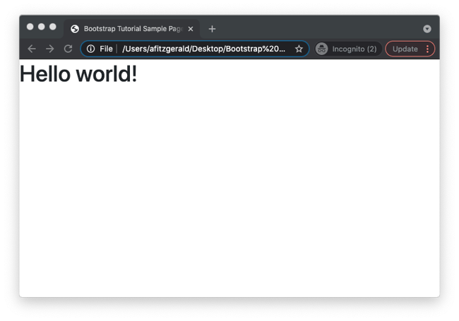
This can now function as the homepage of your site.
Building a Basic Template
To continue building this page, you can add a navigation bar, header, footer, glyphicon font, favicon, and other interface components. Let’s walk through adding one component — a navigation bar — step-by-step so you understand how to use Bootstrap.
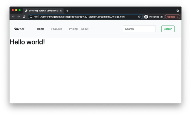
Say you want to add a Bootstrap navbar that looks something like this to the homepage:
 Now a prospect can arrive on your homepage and immediately find out more about your company, the features of your product, and your pricing — or they can search something else.
Below is the code for this Navbar example.
Let’s break this snippet down into its supported subcomponents: color scheme, brand, toggler, nav, and form.
Color Scheme
Take a closer look at that first line of code. See navbar-dark bg-dark? That calls for a dark background color. If you prefer a light color scheme, replace with navbar-light bg-light. It will look something like the following:
 Or you can choose one of the other default colors.
Brand
In that second line of code, see navbar-brand? That designates your company, product, or project name. Simply replace “Navbar” before the </a> tag with the correct name.
Toggler
Next, you’ll see a big chunk of code that denotes the toggle button. This button is hidden on desktop. It appears only on mobile, when the content of the navigation bar must be collapsed to fit the smaller screen.
In the code above, the navbar-toggler style is defined so the brand name shows on the left of the mobile screen and the toggle button on the right. Clicking on the button will reveal the collapsed content, as shown below.

Nav
In the next bit of code, see navbar-nav? Using this subcomponent, you can add links in your navigation bar. You just need to wrap the appropriate modifier class (nav-link) around the word you want to hyperlink.
Form
You can also add a form, like a search box, in your navigation bar with the form-inline subcomponent. You can see this bit of code at the bottom of the template above.
Now that you know how to add Bootstrap’s responsive navigation header with branding, navigation, and more, you can follow a similar process to add other elements to the page. Let’s take a look at a few of those below.
Bootstrap CSS Examples
Bootstrap offers HTML and CSS templates, or “examples,” to help you start building your site quickly. While Bootstrap Source Code comes with more advanced examples with custom components and layouts that add onto the framework, we’re going to focus on examples that use built-in components available in both the precompiled and source code versions.
We’ve already touched on a few examples above, including the Navbar. Below we’ll take a closer look at a few additional examples.
Bootstrap Grid
CSS grid systems are used for creating page layouts through a series of rows and columns that house content. In the Bootstrap grid system, rows must be placed within a .container (fixed-width) or .container-fluid (full-width) for proper positioning and padding. These rows are used to create horizontal groups of columns.
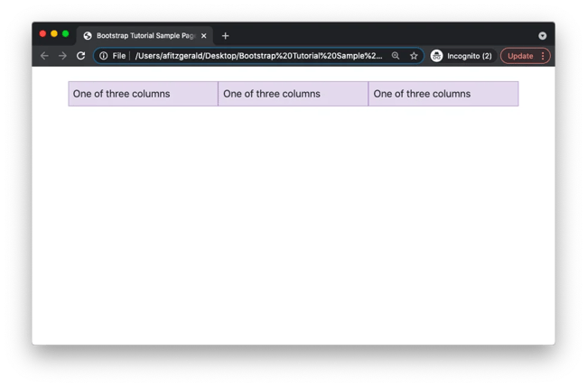
Since Bootstrap is a 12-column system, you’ll have to specify the number of twelve available columns you wish to span. Say you’d like to create three equal-width columns that are centered on the page across devices at any size. Then you need three “four-of-twelve” columns, as represented by the .col-4 class. Below is the grid example in full.
On the front-end of your site, it would look like this on mobile and desktop.
But what if you want the grid to appear one way on desktop and another way on mobile? Let’s say you want the columns to appear side-by-side on desktop, but stack on top of each other on mobile.
Then you can specify the width of the columns with the prefix for “small.” This would make the columns 100% wide until the small breakpoint (576px). Below is the grid example in full.
The video below shows how it would look on desktop and then change on mobile.
There are many more options you can play around with. Using Bootstrap’s grid system, you can create equal-width columns that span multiple lines. You can set the width of one column and have the sibling columns automatically resize around it. You can size columns based on the natural width of their content — and much more.
Bootstrap Alerts
You can add alerts to your Bootstrap site to provide important messages to your visitors. Bootstrap offers eight default colors for alert messages. Let’s say you want to add an alert to indicate that a visitor has successfully created an account, for example. Then you can use the example below.
It will look like this on the front-end of your site.

If you’ve loaded the compiled JS onto your site, you can also add a dismiss button to let visitors close the alert once they’ve read it.
Bootstrap Buttons
With Bootstrap, you can choose from several predefined button styles to quickly add buttons to landing pages or forms on your Bootstrap site. Let’s say you want to add an “info” button to your site. Below is the example and how it would look on the front end.
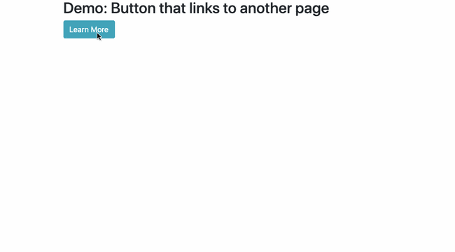
While the .btn classes are designed to be used with the <button> element, you can use them on other elements as well. If you’d like to turn a link into a button, for example, then you can use the code below:
Let’s say I wanted to add a button to my Bootstrap site that encourages visitors to learn more about CSS animation, for example. Then I could link the button to a blog post on the topic. Here would be the code:
And here is how it would function on the site:
You can change the color, size, and other aspects of your button by adding the appropriate modifier classes.
Bootstrap Carousels
A carousel is a slideshow for presenting a series of content, whether that's images, text, or custom markup. In web design, you can create a pure CSS carousel without JavaScript — or you can use Bootstrap to create one. In Bootstrap, carousels are built with CSS 3D transforms and a bit of JavaScript. Using a Bootstrap example, like the one below, can significantly speed up the coding process.
This example is a carousel with slides only and the previous and next controls.
Here is how it would look on the front end of your site:
 You can walk through the development process step-by-step in How to Create a Carousel Slider for Your Website in Bootstrap CSS.
Once you’re satisfied with the layout of your web page, you may want to customize the appearance of these and other Bootstrap components by changing their colors, font size, borders, or other existing Bootstrap styles. To do so, you can override the existing styles. Let’s look at how below.
How to Override Bootstrap CSS
Changing the default styling of Bootstrap CSS is simple. Create a file with your text editor and call it main.css. Here, add any custom CSS changes you want to make. Once you’re done, save this file in the same folder as your Bootstrap CSS and JS files and index.html file. Then, you just need to add one line of code to the header of your index.html file.
Remember how you added the following line of code into the header of the index.html file to load Bootstrap CSS on your site?
Right below this, paste the following code:
This will ensure that whatever CSS you add in the custom.css file overrides the default styles in the index.html file.
The structure of your index.html file should now look like this:
It’s important to note that this process of overriding the default CSS styles can work for both the precompiled version of Bootstrap and the source code version. With the latter however, you can also directly edit the Bootstrap SASS source code if you have experience with SASS.
Since many users don’t know SASS, let’s look at an example of editing the precompiled Bootstrap.
We’ll start with a simple layout created by developer and technical writer Tania Rascia. Building off the basic HTML template provided by Bootstrap, she added a navigation bar, jumbotron header, grid, and glyphicons using the templates bundled in the framework. The result is shown below.
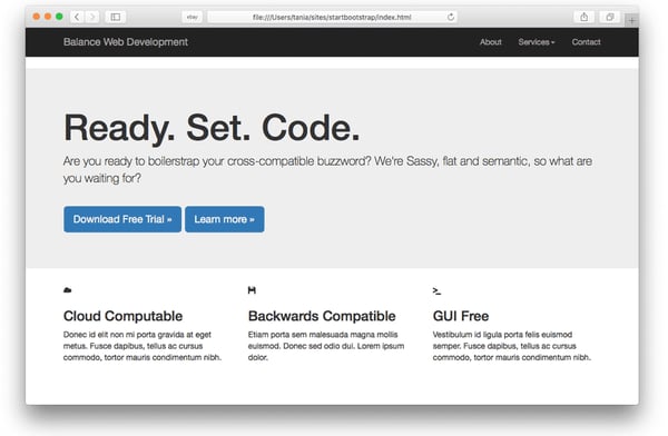
The page is clean, responsive, and cross-browser friendly, but rather austere. To personalize the design, Rascia added custom CSS to the custom.css file. By using CSS selectors, she was able to apply unique style properties to the HTML elements on her page.
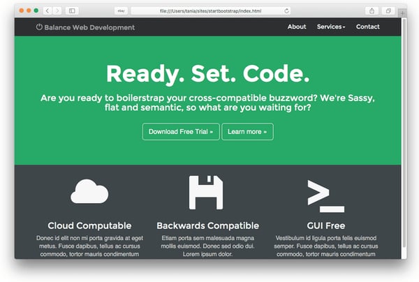
First, she wanted to remove the white space between the navbar and the jumbotron header. So she added the following code to the file using the class selector "navbar."
She also wanted to change the color of the jumbotron to green and the color of the font to white and center the text. She therefore added the following code to the file using the class selector "jumbotron."
She made several other changes as well. Rather than go through them one-by-one, I’ll just copy and paste the contents of her custom.css file below. You'll notice a mix of type selectors and class selectors are used.
With these changes, she’s completely transformed her Bootstrap website. Take a look below.
Using CSS overrides, the customization options are virtually infinite with Bootstrap. You can browse through the Bootstrap Expo for a look at some of the most creative uses of Bootstrap.
Building Your Responsive Site
Bootstrap is a powerful front-end framework for building and customizing a mobile-friendly site. With Bootstrap, you don’t have to start from scratch or give up control over the appearance of your site. Get started exploring this framework now to see just how much it’s capable of.


![How to Center an Image with HTML and CSS [+ Code Modules]](https://www.hubspot.com/hubfs/center-an-image-in-html.jpg)

![How to Import Bootstrap in React [The Beginner's Guide]](https://www.hubspot.com/hubfs/import-bootstrap-in-react.jpg)
![How to Create Scrolling Text With CSS [+ Code Examples]](https://www.hubspot.com/hubfs/Google%20Drive%20Integration/scrolling%20text%20css.jpeg)