.png?width=112&height=112&name=Image%20Hackathon%20%E2%80%93%20Vertical%20(50).png)
In this post, I've rounded up the most compelling fashion website design examples to inspire you as you create your own. However, if you want to start designing your fashion website right now, check out HubSpot's Free Website Builder to build your site with free themes, templates, and more.
What Are the Best Fashion Website Design Examples?
Ready to dive into the most visually appealing fashion websites? I’m showcasing examples from large and small brands alike.
1. Marnon
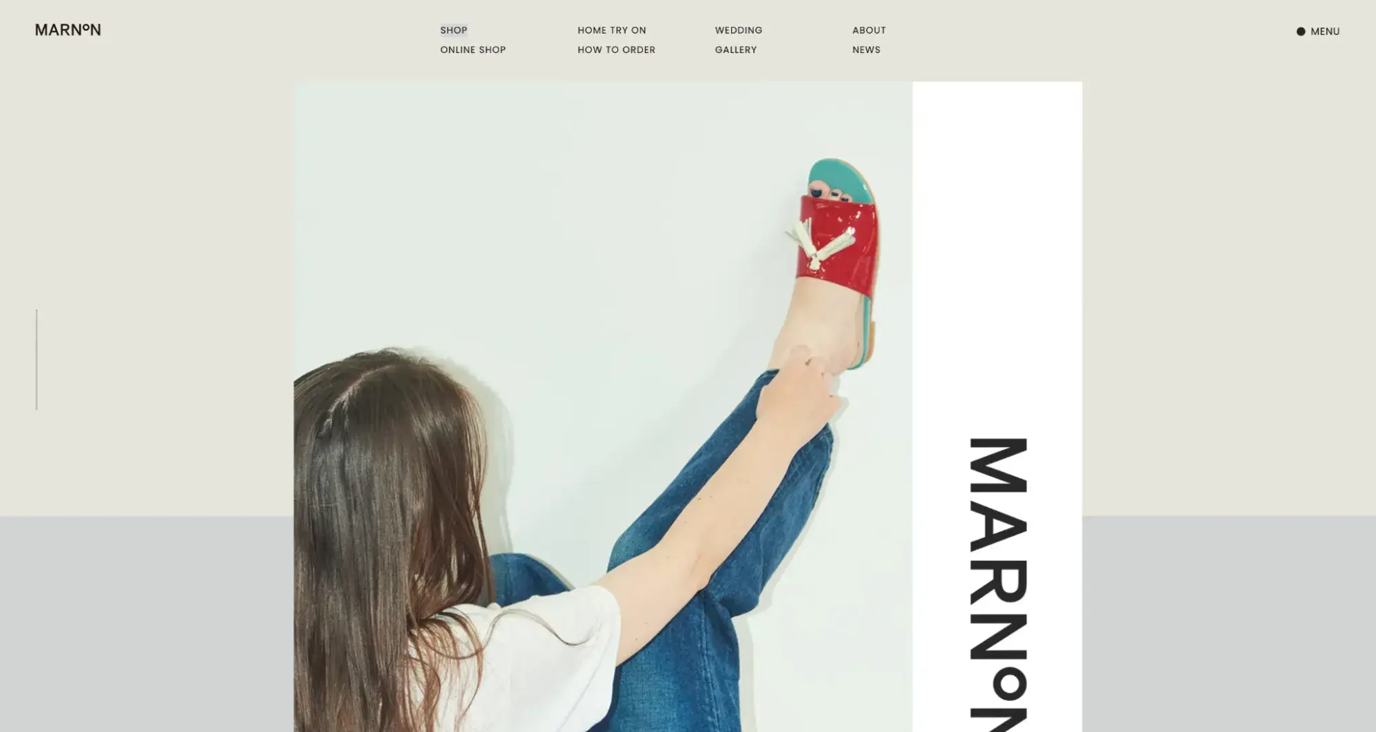
Japan-based fashion brand Marnon has an exciting website design. The site branding is visually compelling and features gorgeous product photography, an eye-catching font, and even a homepage that feels vaguely reminiscent of a print magazine.
This editorial-inspired website design is a nod to fashion magazines of the past. Plus, the film-style photography adds a dose of nostalgia too. I also appreciate how comprehensive the menu options are.
What I like: The website takes an artistic approach to its product photography. For example, you can see what Marnon’s shoes look like in everyday wear. I also liked how the website depicts how you can see the shoe in different colors, materials, and textures.
2. GANNI
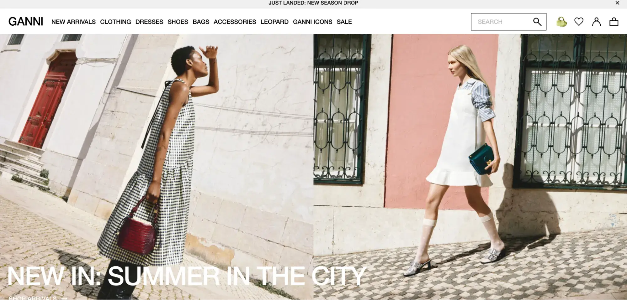
GANNI is also one of my favorite fashion website design examples for inspiration. The site emphasizes the navigation menu and uses eye-catching photographs. Plus, the entire site feels authentic to the brand and balances visually gripping images with copy and white space.
What I like: I like the innovative layouts used throughout the website's homepage. These layouts showcase the products and allow shoppers to add items to their carts.
3. Telfar
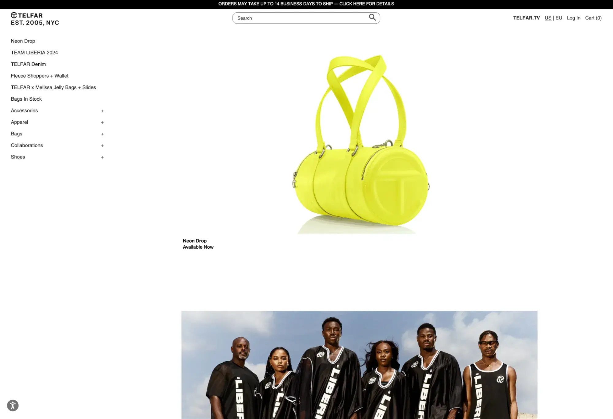
Next, we have Telfar. Speaking of white space, Telfar demonstrates how you can make it work. This site is minimal yet chic, which makes it easy to digest. I love the vertical navigation and the centrally located search bar. Another strength is Telfar's outstanding product photography.
What I like: The website has a user-friendly interface and plenty of whitespace, which makes the product image stand out.
4. Sandy Liang
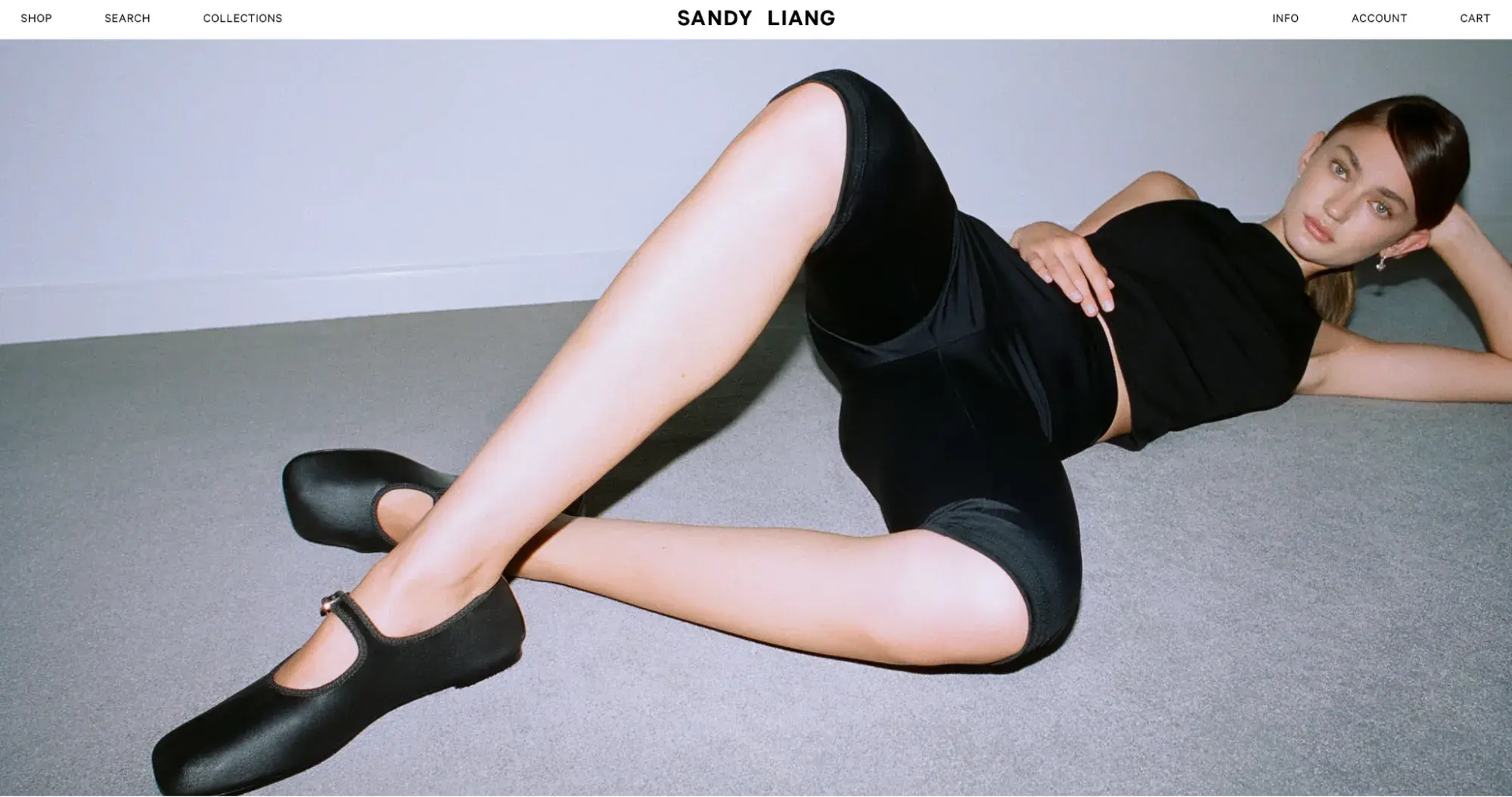
The homepage of fashion brand Sandy Liang's site features a full-width header image. The
image changes over time (perhaps in months) but always has a 90s feel because they are usually taken with direct flash.
What I like: I love the footer, which contrasts beautifully with the darker image. It offers information about the brand, directions to the brick-and-mortar shop, and other essential information.
Plus, Sandy Liang scores points for being an accessible site.
5. Cos
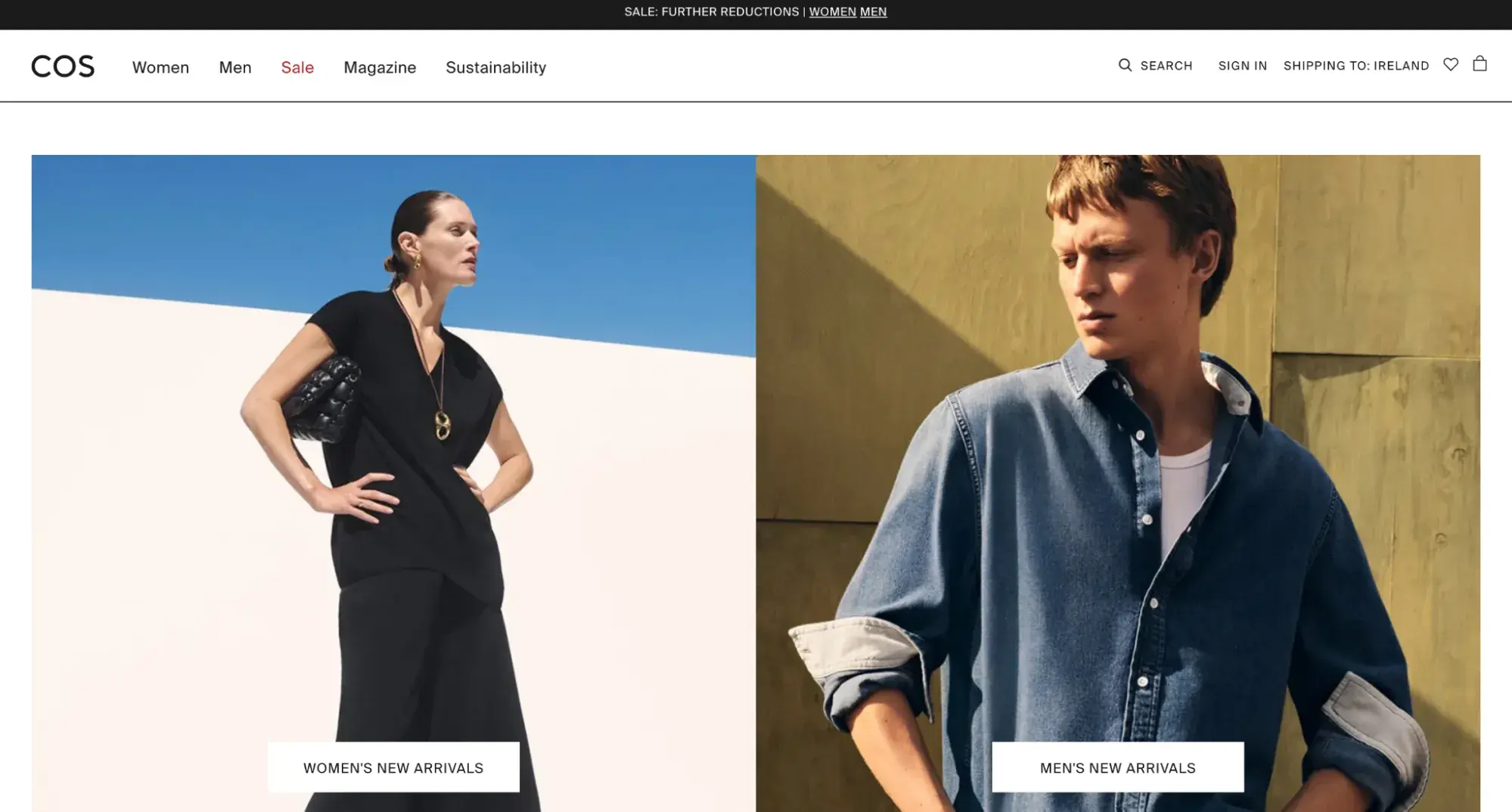
Cos is another example of outstanding fashion website design in practice. Cos sells minimalistic clothing, and its website reflects this. The entire site is sleek and streamlined. The footer is robust and offers various pages visitors can navigate effectively.
What I like: The site’s design is simple and does well in attracting visitors with a sales offer. The sustainability information also makes me aware of the brand’s eco-friendly fashion practices.
6. Lisa Says Gah
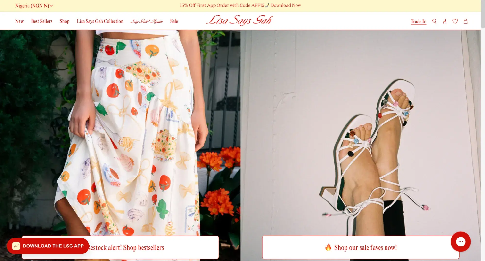
Lisa Says Gah's website scores points because it is on-brand. The quirky, sustainable fashion brand uses a nostalgic print, features a colorful background, and sprinkles charming touches throughout the site, such as flower-shaped sparkles when you move your mouse. Plus, Lisa Says Gah intertwines recognizable emojis with headlines, which plays to its Gen Z audience.
What I like: The website has interactive elements, like the flowery cursor movement, reinforcing the brand’s cute look. It also features high-quality imagery and zoom-in functions that showcase the products.
7. Marrisa Wilson NY
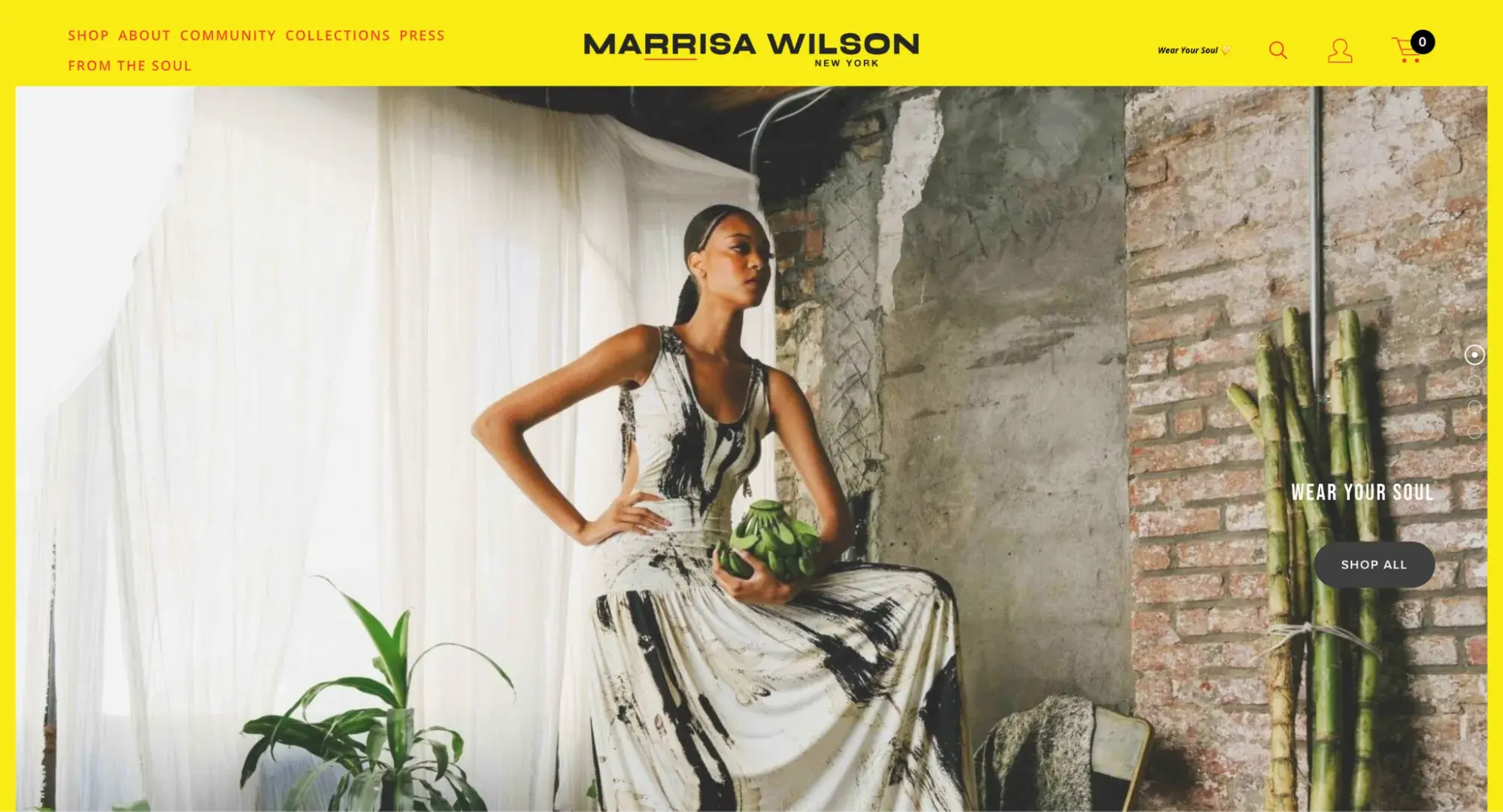
I love how Marrisa Wilson‘s website incorporates bold colors in the site’s background. The gorgeous photography showcasing the new season‘s looks immediately catches the visitor’s eye. The font is also on-brand and stands out.
What I like: The site integrates with Instagram so visitors can get inspiration for how to style the clothes they buy from the website.
8. Autumn Adeigbo
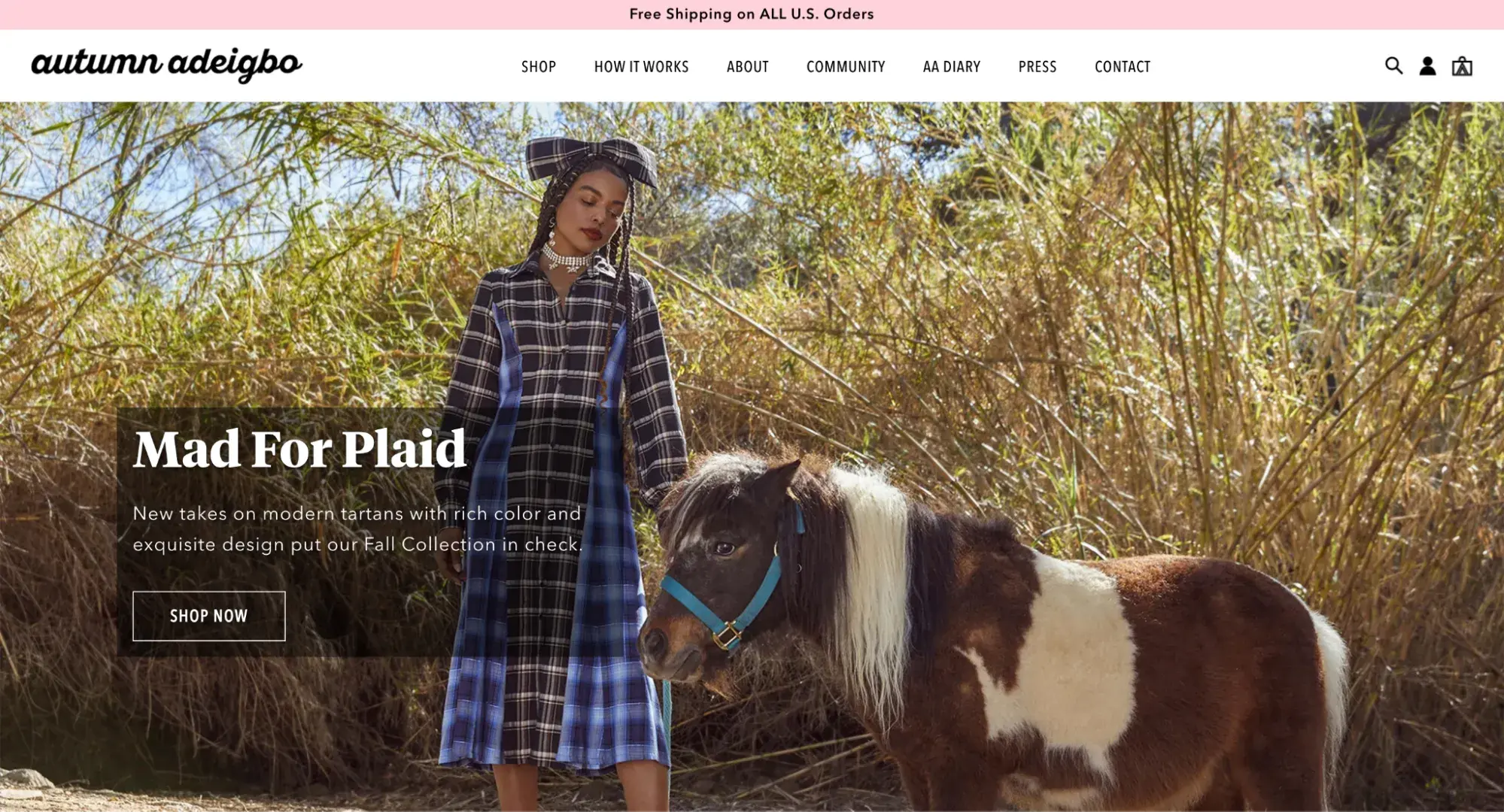
Another one of my favorite fashion website design examples is Autumn Adeigbo. The navigation is visible thanks to the contrast between the pink and white. In addition, the photography used on the homepage establishes the brand's fun-loving, lighthearted tone. As you scroll down, Autumn Adeigbo provides a gorgeous example of how you can use a pattern as a background on your site — and what it looks like when you pull it off successfully.
.png)
Free Website Design Inspiration Guide
77 Brilliant Examples of Homepages, Blogs & Landing Pages to Inspire You
- Agency Pages
- Ecommerce Pages
- Tech Company Pages
- And More!
Download Free
All fields are required.
Form not available
What I like: Like Marrisa Wilson’s website, Autumn Adeigbo also features social media integration on its website. The site also features style guides and features from reputable fashion publications like Vogue and LA Times.
9. Sézane
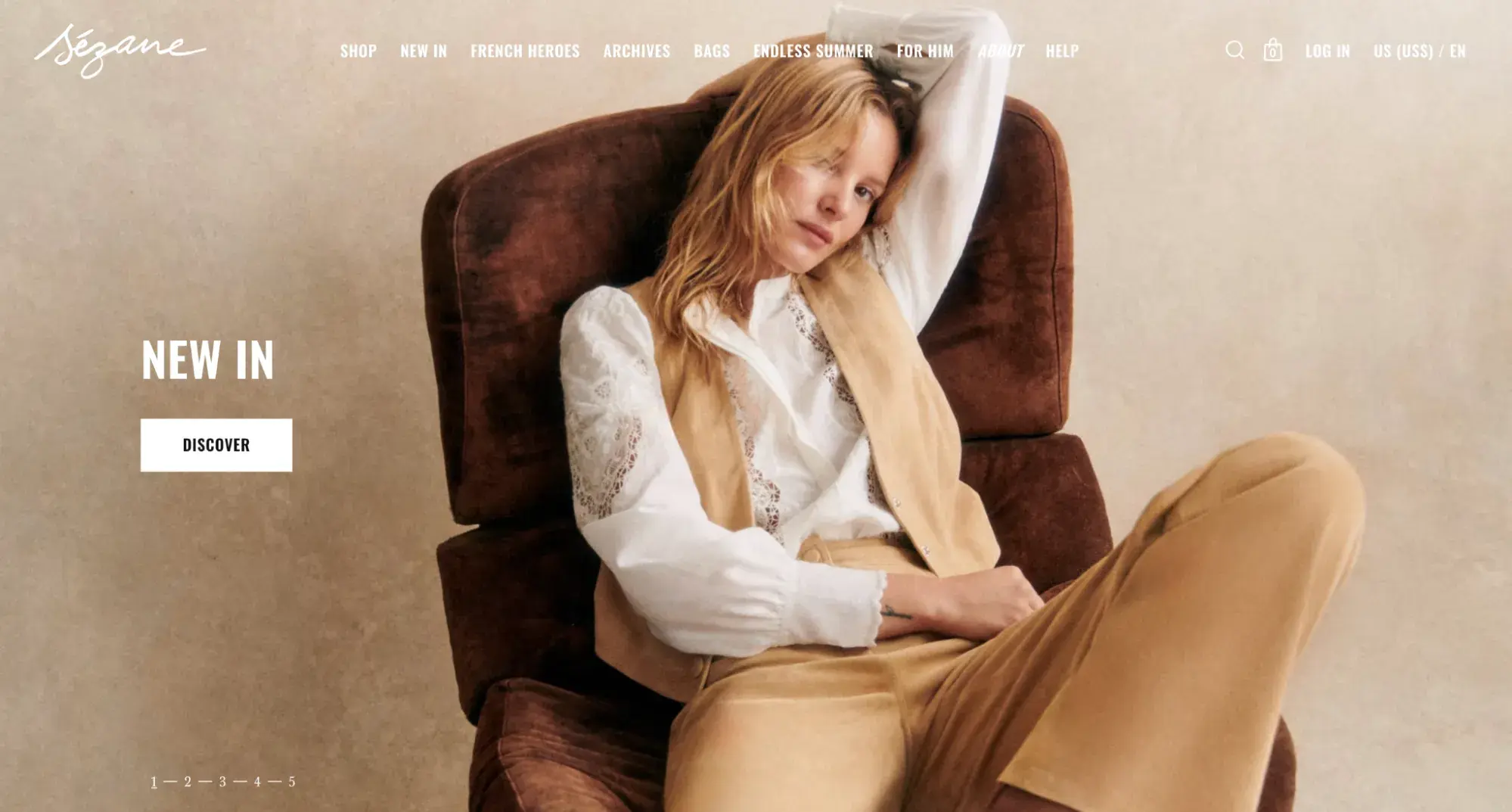
The Sézane homepage reveals precisely how powerful a well-placed call to action can be. Thanks to the color contrast between the sliding header images and the white button inviting visitors to “Discover,” your eye is instantly drawn to the CTA. I also love the product photography and its intrinsic feeling to the brand.
What I like: The homepage is short but shows visitors the brand's different product categories. There is also information about offers like free delivery and returns, which will interest visitors.
10. Me + Em
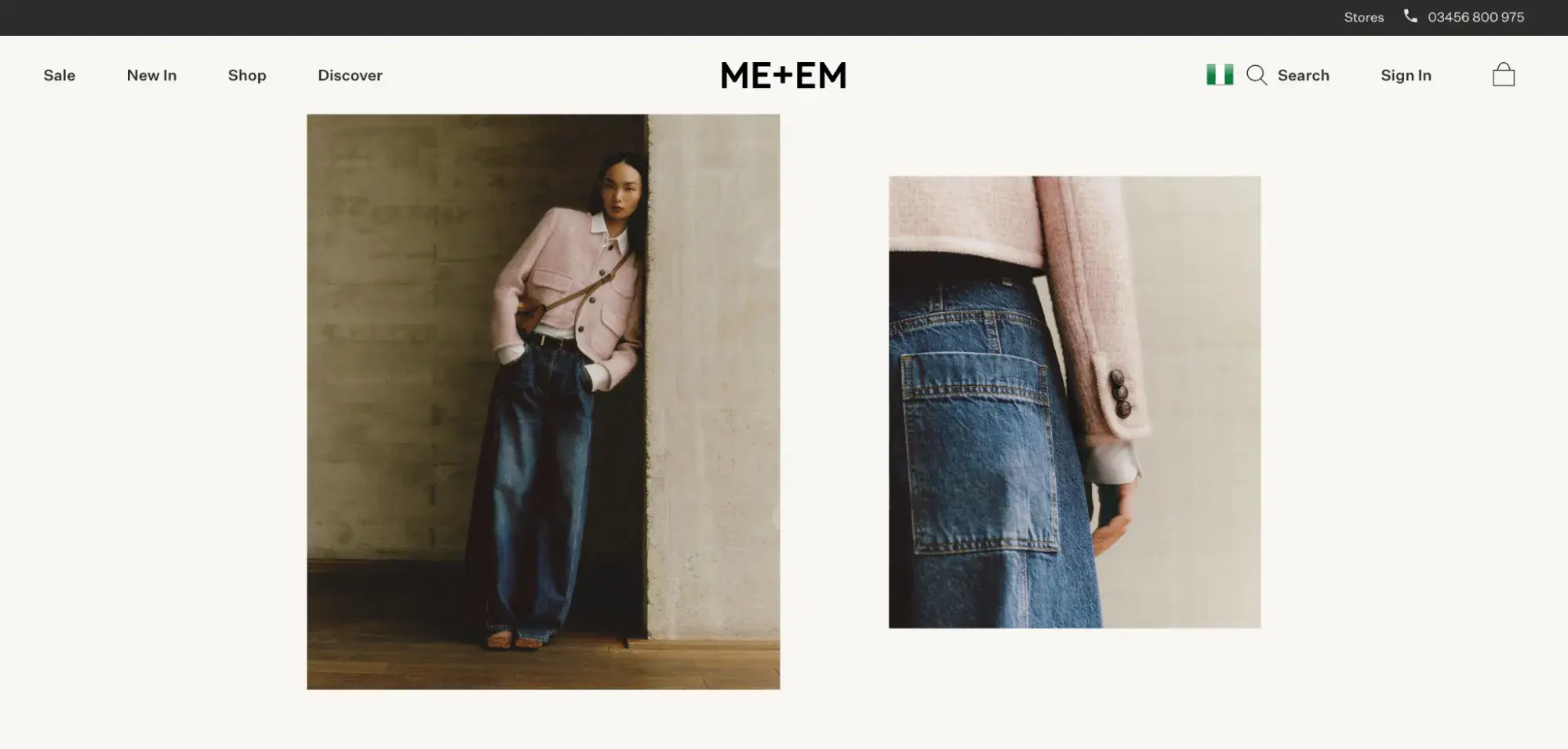
Me + Em is a fashion brand that demonstrates what good website design looks like in practice. The site is simple yet compelling, thanks to a beautiful font, gorgeous photography, and soft neutrals that add warmth to the background.
What I like: The photography here is stunning and showcases the brand’s latest collection. I also like the site’s testimonial section, designed to instill trust in visitors.
11. Staud
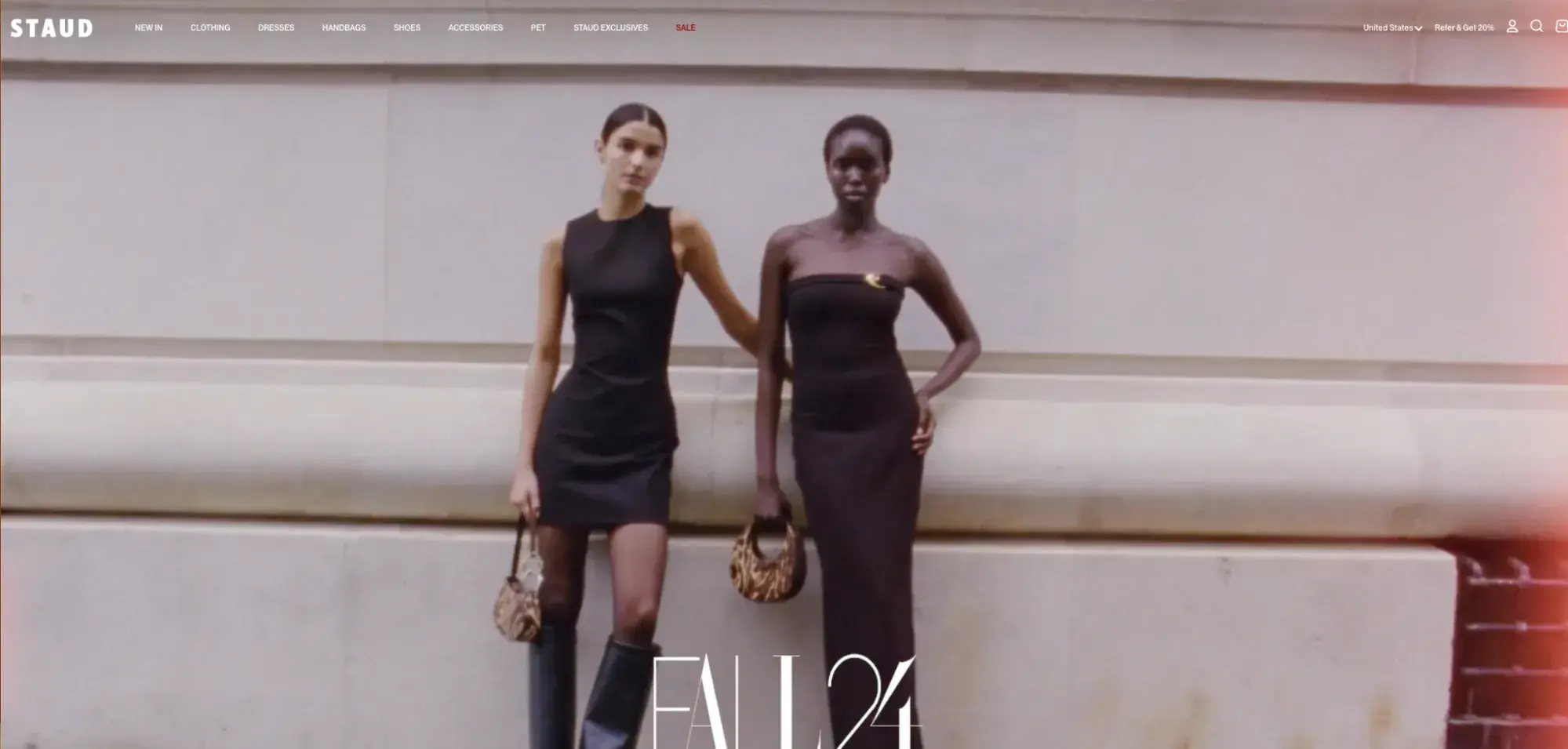
A video reel dominates the top half of the screen above the fold. Still, as you scroll down, you notice the site uses nostalgia-inducing photographs to showcase its different product subsections.
And, take note, ecommerce brands: One of our favorite features of the Staud website is how this fashion website design showcases the company's most popular products. Instead of making visitors search for the items they want to see, Staud presents them in a central place on the homepage.
What I like: Hovering over the navigation menus shows product images, which is a nice touch compared to a text-based dropdown menu.
12. Patta
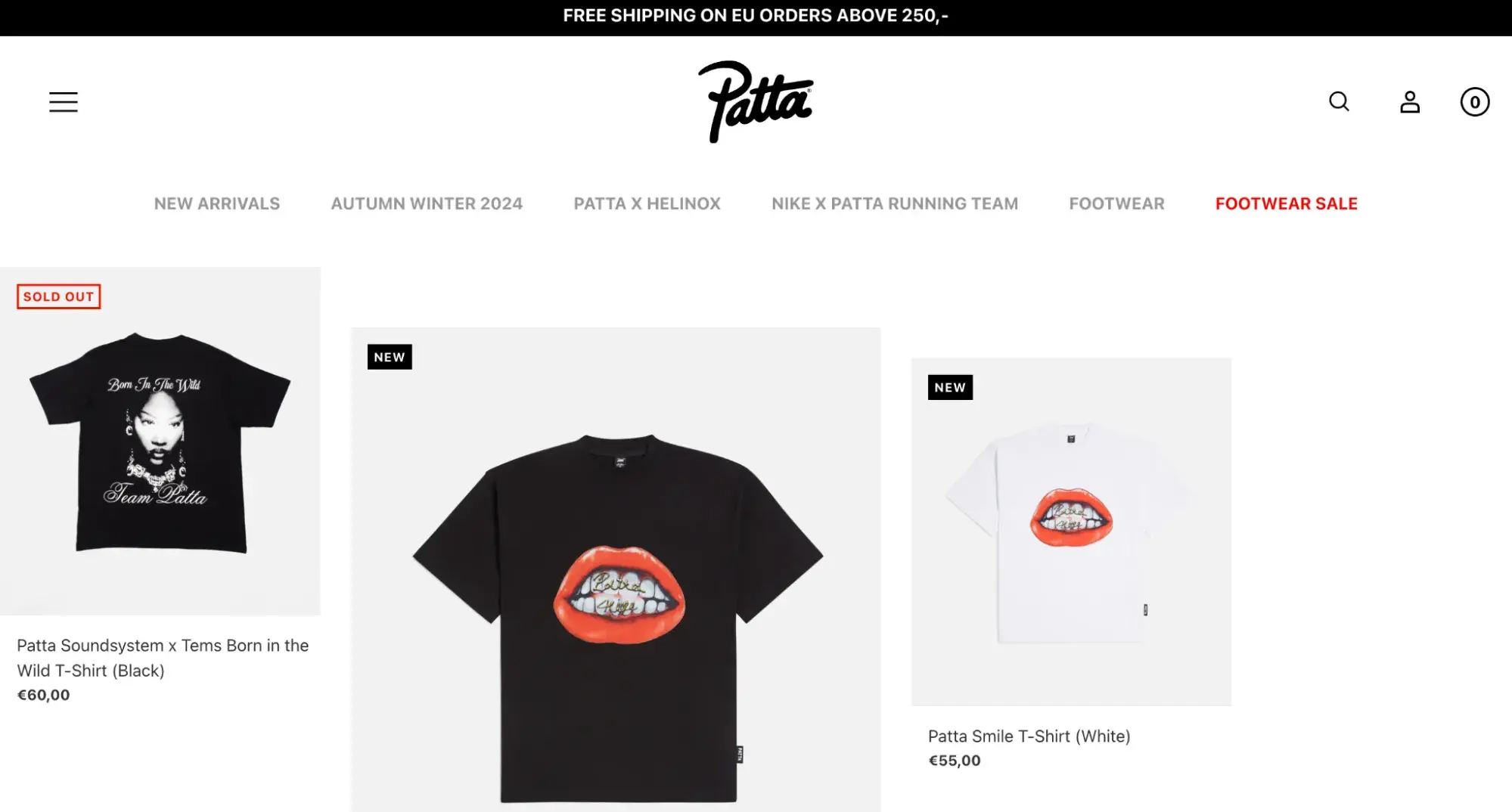
Patta is one of the most unique fashion website designs I‘ve found, which is why it’s one of our favorites. The top menu disappears as you scroll, leaving you with the logo, which is effective branding. The brand presents images of its products asymmetrically, making the homepage more visually appealing. The font is also strong and on-brand.
What I like: Aside from the photos showing how their products look on real-life models, the website also features its collaborations with celebrities — in this case, with Nigerian singer Tems. Such collaborations increase brand awareness.
13. The Roger
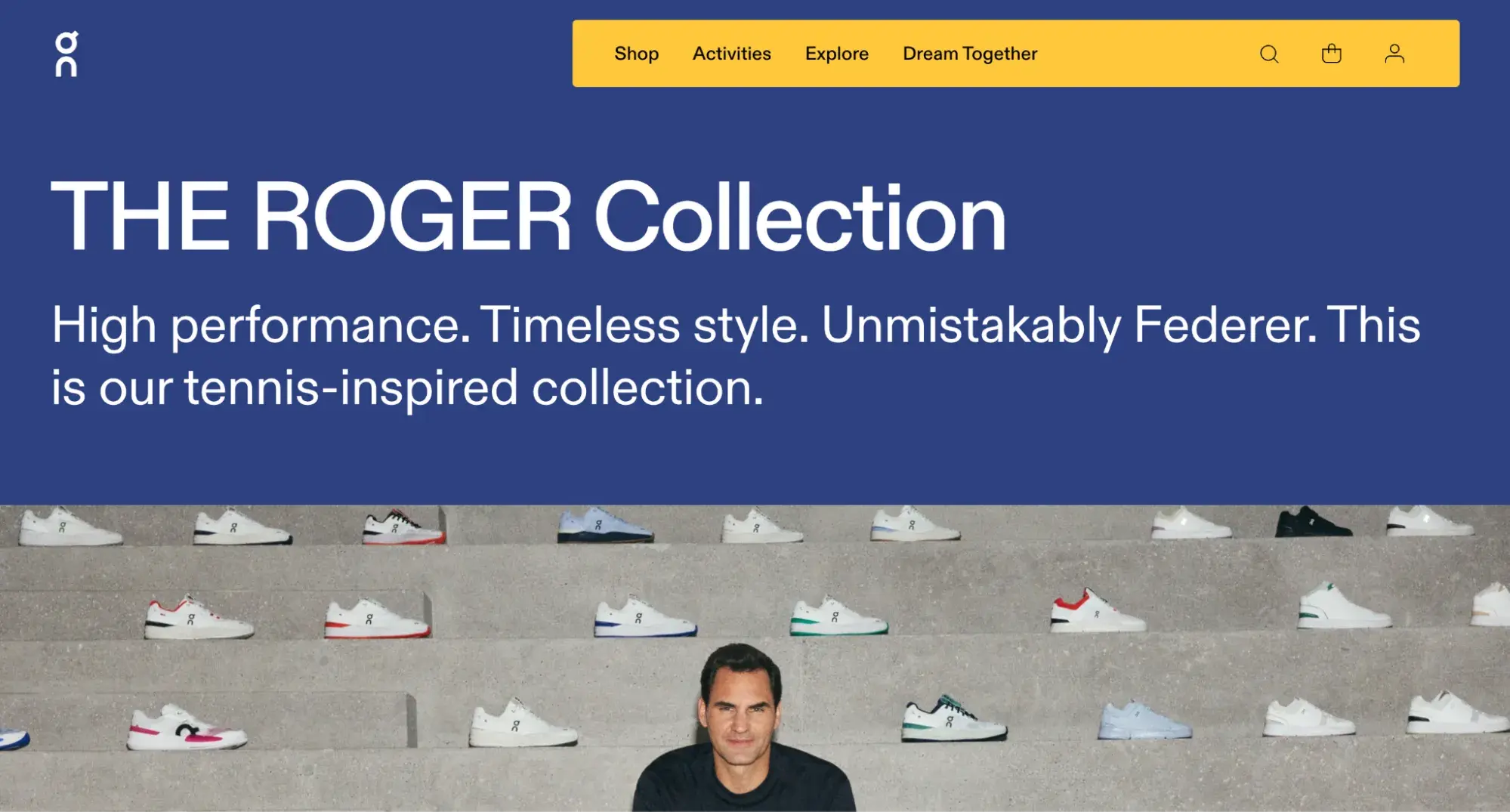
The Roger also scores points for its distinctiveness. The loading page is branded, which is an appealing addition. Then, when the site loads, you‘re invited into this company’s world, which feels all-encompassing thanks to the parallax scrolling features.
What I like: I like how this landing page focuses its copy on terms and expressions that Roger and tennis lovers would relate to. It also features vibrant images and media that make the page engaging.
14. Farm Rio
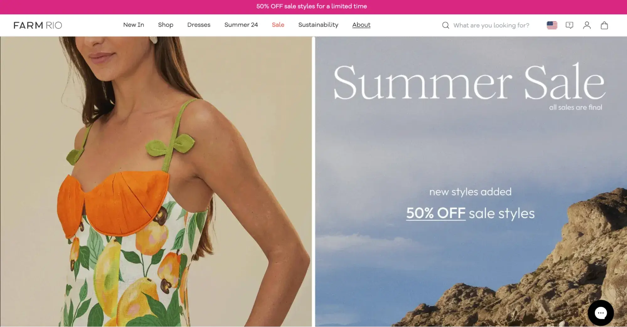
With bold splashes of color and excellent product photography, the Farm Rio site stands out for all the right reasons. As you scroll through the site, Farm Rio’s colorful dresses are on full display. The footer is another strength — it uses recognizable social media icons.
What I like: The site repeats the “Shop now” call to action throughout, making it quicker for visitors to take action.
15. Marcella NYC
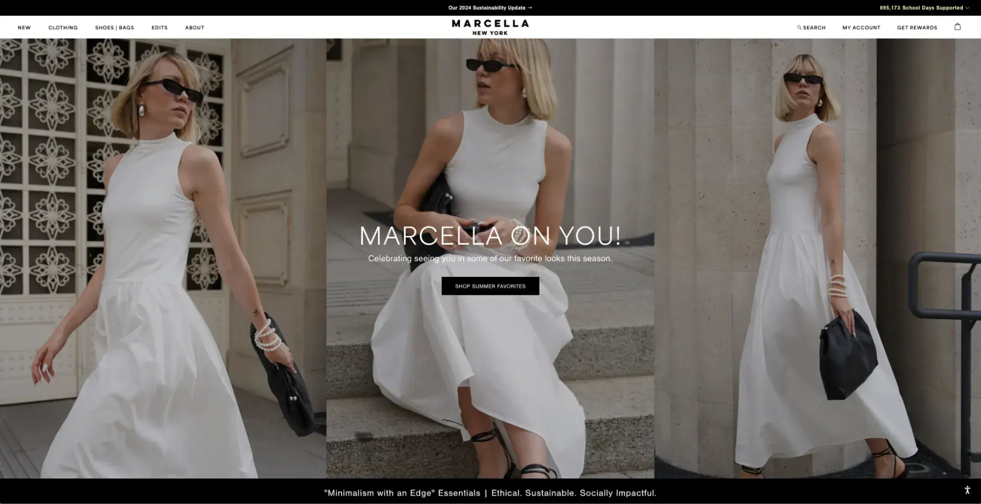
Marcella NYC is a minimalist clothing brand for women. The hero section features a full-width image, while the copy highlights the dresses on sale. The rest of the page uses white space to place focus on the products.
Free Website Design Inspiration Guide
77 Brilliant Examples of Homepages, Blogs & Landing Pages to Inspire You
- Agency Pages
- Ecommerce Pages
- Tech Company Pages
- And More!
Download Free
All fields are required.
Form not available
What I like: Visitors can quickly see the commendable work Marcella NYC is doing towards sustainability and supporting women globally. The site also features customer review as a form of social proof.
16. Rouvenat
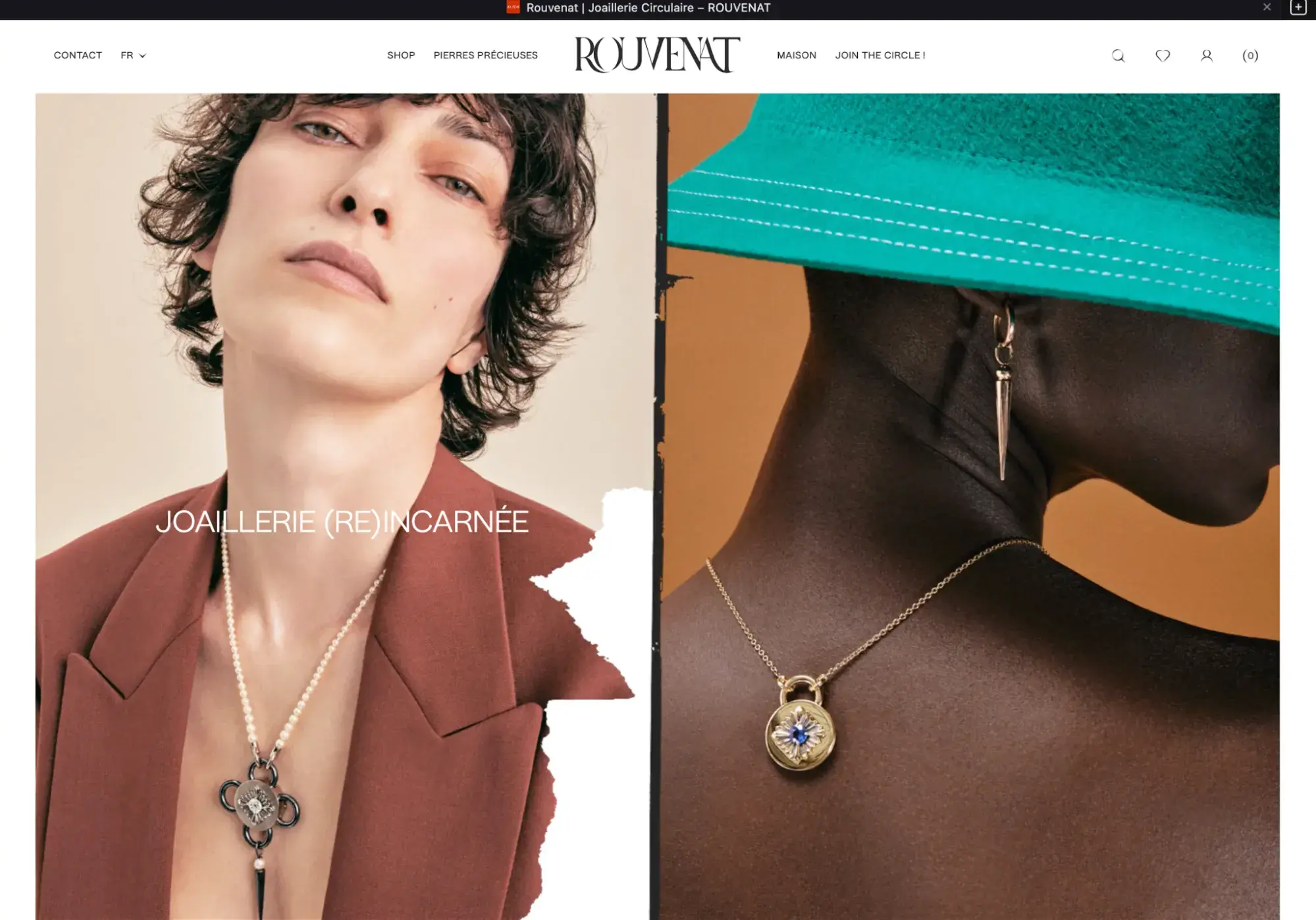
Up next is Rouvenat, a French fashion brand. When you hover over the two main images on the homepage, a scrapbook-esque motion occurs, which adds visual interest to the site. Parallax scrolling also brings it to life, and many colors are used throughout to illustrate the brand's story. The font is minimalist and authentic to branding, which we appreciate.
What I like: The website has interactive features that let you see the products in 3D.
17. Olive Avenue
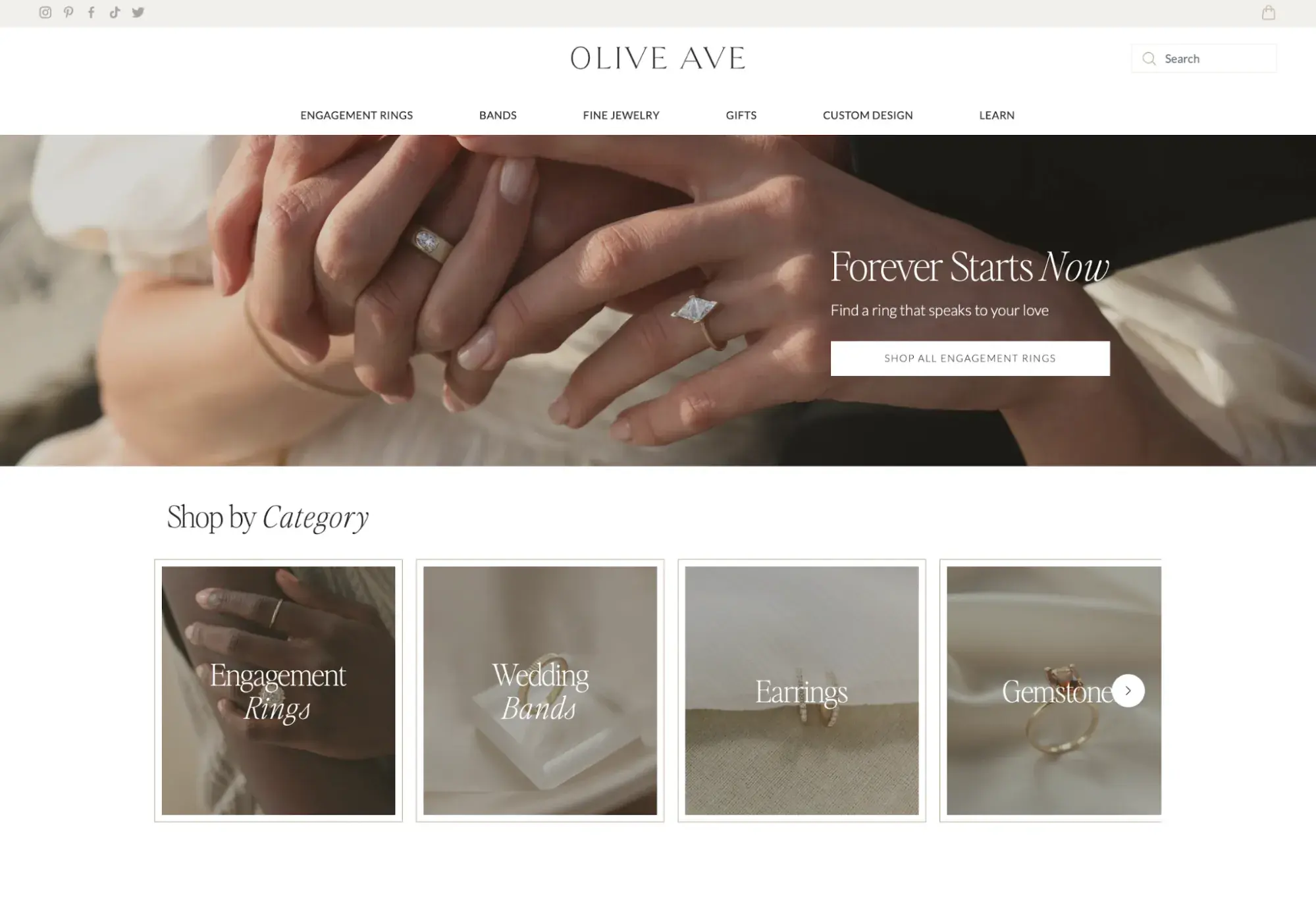
Olive Avenue‘s website is simple yet effective. It features clean fonts and an optimal amount of whitespace. Multiple images and a video reel showcase the products when worn. Plus, the menu at the top of the page is digestible and doesn’t offer too many options, which makes it easier to read.
What I like: Throughout the page, Olive Avenue reinforces the feeling expected from its target audience. The imagery highlights the products and the delight a partner experiences when they get an Olive Avenue piece.
18. Dior
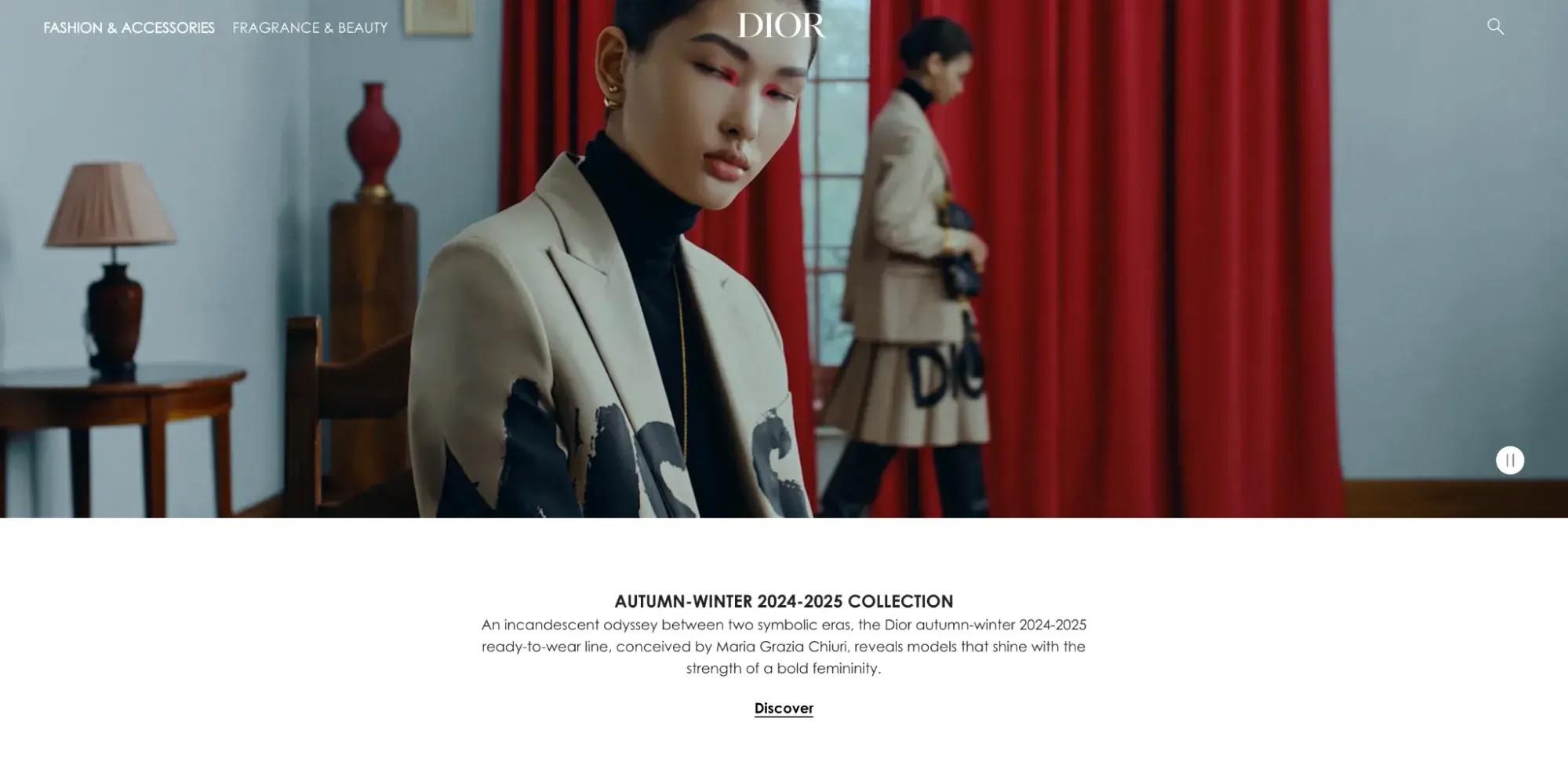
Fashion house Dior's site is a classic for a reason. I love how the video at the top of the screen shows closeups of the brand’s products and how they fit on a human model. Scrolling down the page will show more product images and collections for men, women, and children.
The footer also elaborates on the site options and invites visitors to sign up for the newsletter.
What I like: The website has a simple layout that’s easy to navigate and has visual consistency that solidifies Dior’s branding.
19. Lovello Elizabeth
Next is Lovello Elizabeth. Once you land on the page, you can shop for new arrivals and check the brand’s trending products. The site scores major points for its excellent use of video content to tell its brand story.
The footer is another top-notch portion of this site. There's a form inviting visitors to register for the company newsletter. The newsletter signup is in a high-traffic area, which means more eyes will be on it.
What I like: The site has a “Trending Products” section that helps visitors find products that are selling quickly.
20. Dauphinette
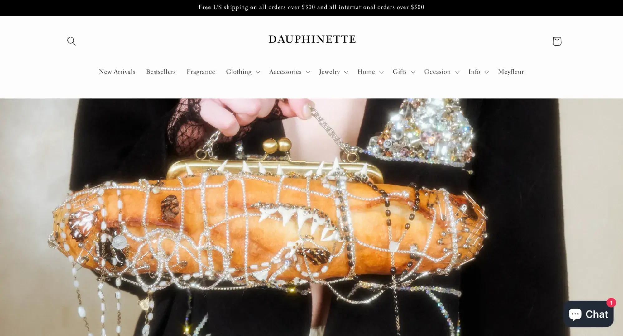
Another stand-out fashion website design example is Dauphinette. The site's eye-catching product photography demonstrates what makes the brand unique, and the stylish logo is also central.
What I like: I like the copy used for the newsletter form at the bottom of the page. Ditching the generic “Join our newsletter” copy, Dauphinette uses “The Happiest Newsletter on Earth,” which is more catchy and on-brand.
21. Pyer Moss
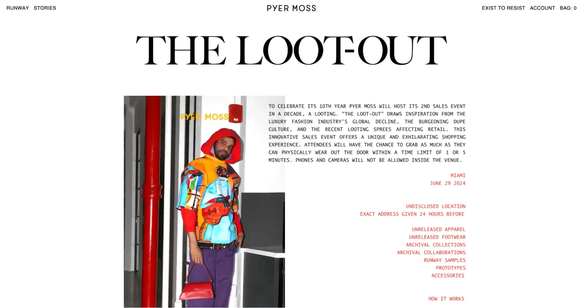
Pyers Moss's website takes an unconventional approach, similar to the brand’s fashion design. The page features a vertical video showing what happens at a loot-out, a sales event celebrating the brand’s 10th year in operation.
This site's navigation is unique. On the left, visitors can check out the “Runway” tab or view “Stories.” On the right, you can search, check your bag, or view your account.
What I like: The homepage appears seasonal, changing depending on whether there’s a promotion or a new collection. I like this approach because it keeps the brand’s audience curious about what to expect.
22. Sleeper
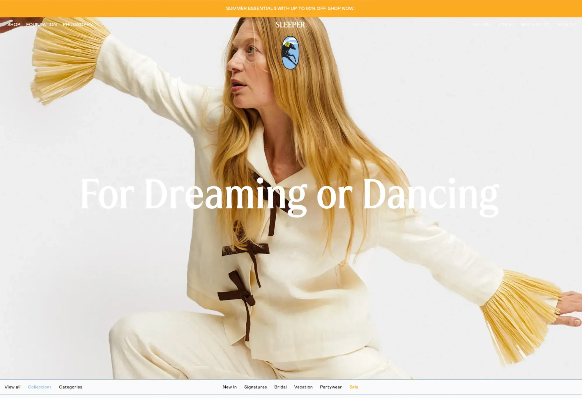
Sleeper‘s website is strong because it is simple. The font is simple enough, and the images feel authentic to the brand and showcase different products you can purchase. When you scroll down, you can check out the company’s Instagram page, which is embedded in the site.
What I like: The site showcases the products using bold imagery and a video. The footer area has the brand’s logo, which is hard to miss, and links to more information about the brand.
Use These Fashion Website Design Examples to Inspire Your Own
No matter what you hope to achieve with your fashion website design, you can’t go wrong with consistent branding, engaging calls to action, eye-catching imagery, prioritizing user experience, and adding aesthetic appeal.
These 22 fashion design websites are sure to get your creativity flowing. For even more inspiration, check out our free website design lookbook, which includes over 70 homepages and landing pages.
Editor's note: This post was originally published in February 2023 and has been updated for comprehensiveness.
Free Website Design Inspiration Guide
77 Brilliant Examples of Homepages, Blogs & Landing Pages to Inspire You
- Agency Pages
- Ecommerce Pages
- Tech Company Pages
- And More!
Download Free
All fields are required.
Form not available
Website Design Examples


![15 black and white website designs to inspire your own [+ pro tips]](https://53.fs1.hubspotusercontent-na1.net/hubfs/53/black-and-white-website-design-1-20250520-1336267.webp)

![Gradient Website Design Examples That Prove This Trend Is Far From Over [+Tutorials]](https://lh7-us.googleusercontent.com/htOWIbyCIoCMxSjC4gJunkGnhCzXpccjTrL8NwoGdRdCsSiEmEAxe_qBFkMrzy2Y8d3cwEr_DMzSGHq9Xi-hQFnMJCo8HDQJ1yQGigcSfFxI2QKXo0s7xXSB2sY-eALG1iUqnHXgomcDsnp7AHRSH1s)
![15 Brochure Website Examples to Inspire You [+ How to Make One]](https://53.fs1.hubspotusercontent-na1.net/hubfs/53/brochure-website-examples-1-20250319-362228.webp)
![28 Types of Websites to Inspire You [+ Real-Life Examples]](https://53.fs1.hubspotusercontent-na1.net/hubfs/53/types-of-websites.png)

