.png?width=112&height=112&name=Image%20Hackathon%20%E2%80%93%20Horizontal%20(56).png)

With the help of the Wayback Machine, we can see what our favorite websites looked like in years past. Whether you’re planning a website redesign and could use some inspiration, or you’d enjoy reflecting on nostalgic websites, we’ve rounded up 32 sites to peruse.
1) Google
.jpg?width=650&height=325&name=nostalgic-websites-google%20(1).jpg)
While Google essentially maintains its branding with its colorful logo and whitespace on the homepage, there are other aspects of the site that look entirely different today. In the 1990s, Google had unique offerings underneath the search bar. Today, the company leans into creating a personalized homepage for users by bookmarking their frequently visited websites.
2) Apple

Apple always takes a product-centric approach to its homepage. Even in 2001, you’ll notice that the company’s items were the website's primary focus. In 2022, Apple chooses to keep branding minimal yet distinctive. It features just one product to make the center focus of the homepage. The current homepage is also a testament to compelling copy; in just three adjectives, Apple paints a complete picture of why you should get an iPad.
3) Microsoft

In 2000, Microsoft's website was clunky and over-complicated. The abundance of words on the website and lack of whitespace made for an overwhelming user experience. Today, Microsoft’s site takes a cue from Apple and centers on its products. The site, as a result, is less dizzying and more digestible for visitors.
4) Mashable

Once upon a time, Mashable had a gradient background — not to mention a serious lack of imagery. Now, the site balances visuals with text. The company branding also no longer takes center stage and focuses on featured stories.
5) HubSpot

In 2006, the tech and marketing world was focused heavily on surviving and succeeding in a web 2.0 world. Small businesses were popping up worldwide, and HubSpot's website was focused on showing how the product could add value for these companies. Today, HubSpot still caters to small businesses but also medium and enterprise corporations. Now, our website focuses more on the product and features a lot more color than it initially did.
6) BuzzFeed

BuzzFeed was created to help users find their favorite things, including movies, music, fashion, ideas, and technology. The site still achieves this with a more visual and interactive approach. Today, the website balances images and text more seamlessly, but the site's overall feel is still intact.
7) The White House

In 2000, Bill Clinton was the President of the United States, Al Gore was Vice President, and the White House’s website had a very different look and feel. Then, the website featured a Declaration of Independence-esque script font and didn’t emphasize imagery — or storytelling, considering the text just welcomed visitors to the page. When you visit the site today, you’ll notice a large image and copy that focuses on current initiatives. We also love how the refreshed site focuses on accessibility with options to change the text contrast and size.
8) TED

Though TED’s 2003 website still looks outdated by today’s standards, it was ahead of its time, with most of the homepage featuring visual content. In 2022, their site still features various images but also balances copy — and there's only one main image above the fold. The site's overall feel today is less cramped and overwhelming than it was in years past.
9) Skype

In the early 2000s, Skype’s homepage featured several colors and lacked hierarchy. (And who knew the video call platform once had a red logo?) Today, Microsoft owns Skype, and the latter takes a cue from the larger organization’s look and feel. The site features whitespace, excellent visual hierarchy, and offers a compelling image of the product in action.
10) AOL

In 2000, AOL’s site had a variety of colors that weren’t cohesive, ultimately making the site appear messy. Today, the site features enough whitespace to balance the amount of copy and imagery it has. We’re also fond of the site's new font, as it’s visually appealing and easy to read.
11) Ask

Ask Jeeves rebranded as Ask. In 2000, the site lacked whitespace and featured a character — part of the site’s unique branding. Since dropping the second half of the name, there’s no longer a character on the site’s homepage. Today, the site looks much more like a news or publication site than a platform to ask questions and get quick answers.
12) Blockbuster

Remember the good old days of going to Blockbuster to pick out your movie and grab a few snacks? We sure do. What Blockbuster’s 1996 site lacked in hierarchy, it made up for in personality. Today, Blockbuster’s site is out of commission — and features a cheeky note that the company is working on rewinding your movie.
13) Coca-Cola

We’ll give it to Coca-Cola: Their branding is timeless. Coca-Cola's website from 2000 doesn't look too shabby compared to many of the outdated websites on this list. The brand understood the importance of visual content and simplicity in 2000, and they still do today. In 2022, their site focuses more on imagery and features less red than in the past, but it still feels cohesive with the rest of their branding.
14) Pepsi

Pepsi’s site in 2000 was cluttered, lacked visual hierarchy, and had too much going on. Today, we’re huge fans of Pepsi’s nostalgic homepage. It features a font that’s easy to read, plus the site doesn’t feel too cluttered. The company has also since moved its menu to the top of the page and cut back on how many tabs there are which is much better from a user experience standpoint.
15) Macy's

While Macy’s 2000 website doesn’t conform to today’s standards, we appreciate how cohesive the colors are. Interestingly, products aren’t at the forefront of Macy’s nostalgic site. Today, however, the Macy’s website tells an extremely different story. The website has a neatly organized menu and excellent visual hierarchy.
16) Amazon

In 1999, Amazon’s website was highly text-heavy, making it dizzying to look at. The vertical menu was also cluttered and difficult to digest. Today, Amazon’s menu appears on the top of the page, and the site seems significantly less overwhelming despite the fact that it still advertises various products.
17) Yahoo

In 1999, Yahoo’s website focused mainly on text and featured no imagery. Today, a very different story is told when you visit the platform’s site. Because Yahoo is a news site, there are images to accompany every story, plus a summary of what you can expect when you read the piece. We’re also a fan of the trending column on the right side of the site, as it makes it easy for users to understand what’s in the news at a glance.
18) Tumblr

In its infancy, Tumblr referred to blogs as Tumblelogs and had a text-centric website. Today, if you visit Tumblr while not logged in, you’ll see a mock dashboard that shows visitors what theirs could look like if they create an account. Today’s Tumblr site is also significantly more image-focused.
19) Pinterest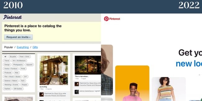
Remember when Pinterest was invite-only? As you can see from the screengrab of the 2010 Pinterest site, the platform had a completely different logo and a less sleek appearance. If you visit Pinterest today, you can create an account instantly — no request necessary. In addition, the platform features a live image that changes yet loads quickly. The copy is simple yet compelling.
20) Reddit

In 2005, Reddit was all about text. Reddit is still more text-focused than most modern sites. However, it does feature a balance of images. We like how the font Reddit uses today is still semi-nostalgic but is easier to read than it has been in the past. The site is also more visually compelling as it appears more like a news site.
21) Barnes & Noble

You’re probably starting to notice a theme at this point: The websites of years past were text-focused. Barnes & Noble is no exception. In 2000, the bookseller had a dense, visually unappealing vertical menu. The images took a long time to load — if they did. There’s also a lack of visual hierarchy, so it’s difficult for visitors to decide where to look. Today, the company’s site is significantly more digestible. It balances whitespace with imagery and text, and the designers cleaned the menu up.
22) Dunkin'
.jpg?width=650&height=325&name=nostalgic-websites-dunkin-donuts%20(1).jpg)
We’ll hand it to Dunkin’: They’ve stayed true to their signature color scheme for decades. This screengrab from their site in the 2000s is one of our favorites on this list. It’s shockingly minimalistic and features an image that wasn’t standard for the time. Today, Dunkin’ has plenty of whitespace, features cohesive branding, and balances graphics with the copy. The website also has an easy-to-follow menu and includes the company’s striking pink and orange colors.
23) Starbucks
.jpg?width=650&height=325&name=nostalgic-websites-starbucks%20(2).jpg)
In 2000, Starbucks got a few things right: Their menu is straightforward, and they featured images on their site, though they didn’t load. (Psst: These plugins can help ensure your content loads quickly if you have a "heavy" page so your website avoids a similar fate.) You’ll also notice their consistent logo. In 2022, Starbucks effortlessly offers a pop of color on its site without overwhelming visitors. The site features Starbucks’ signature font and includes an image promoting a recent collaboration with another company. The image itself also feels on-brand. We also want to call out Starbucks’ sparse yet effective navigation at the top of the page.
24) Walmart

For its time, Walmart’s site in 2002 was quite successful. It featured images and text which still dominate the website today. In addition, it had a better visual hierarchy than some of the other examples we’ve investigated. Similar to Dunkin’, one thing that Walmart does incredibly well is translating its famous color scheme to its site. In 2022, Walmart’s website has plenty of imagery and concise copy that enhances the graphics.
25) Target

There are also plenty of things Target got right in 2004. For one, the brand used its well-known color scheme. The site features images, too, and its branding is still largely the same. In 2022, Target’s site puts a much larger emphasis on visuals than it does on text. The branding is minimal yet effective, and the site features a simple menu that expands when visitors click on it.
26) The New York Times

We’re impressed: While New York Times has reworked its website since 2000, the website is remarkably similar. Even in 2000, figuring out where to direct attention was easy. The New York Times scores major points because its 2022 website resembles a newspaper. It features visual hierarchy, balances images with copy well, and we like how the font is distinctive yet easy to read.
27) Lay's

In 2008, Lay's website was green and featured very poor text color contrast. This makes it difficult for people to read the copy. Luckily, Lay's has since reworked its site. Today, it's still colorful but features better contrast. You'll also notice the site has plenty of Lay's illustrious yellow. The 2022 site seems far more on-brand than it has in the past.
28) McDonald's

In 2001, McDonald’s website featured a red background and yellow text, which wasn’t exactly optimal for readers. Now, McDonald’s site is minimalist. It features few colors aside from the brand’s distinct yellow and offers a variety of options for visitors to select from on the menu section. However, the menu isn't overwhelming because the rest of the website is so straightforward. The brand also taps its signature font for the 2022 website.
29) Sephora

Sephora's website in the early 2000s featured a balance of images and text. For its time, it was an example of a compelling website design. Today, the site adheres to modern web design trends. It has large images that are visually appealing and includes straightforward copy.
30) Netflix

In 2005, Netflix featured an image-focused homepage, which is quite different from today. In 2022, copy is the star of the show on Netflix’s homepage. The company also cleverly places a call to action at the center, so you’ll provide your email address and get started. In both 2004 and 2022, the main focus of the homepage was a call to action, which is noteworthy. We like the image in the background, which the text overlays as it features shows and movies you can enjoy with a Netflix subscription.
31) eBay

In the early 2000s, there was a lack of hierarchy on eBay’s site, which made it tricky for visitors to understand where to begin. This is also detrimental from a user experience standpoint. That has since changed, however. In 2022, eBay has a carousel above the fold on its site. It features a few products and promotions the company is currently offering. The site also features more whitespace than in the past, and the menu is paired back by comparison.
32) Burger King

In 2006, Burger King did feature a primary image on their site. The menu was also at the top of the site, but the font was difficult to read. In 2022, Today, Burger King features a neutral background and keeps the focus on its imagery. Copy is sparse yet effective. In addition, the company uses a font that offers a pop of personality yet is readable.
Take Site Redesign Inspiration from These Nostalgic Websites
If you’re seeking inspiration for your site redesign, look at these nostalgic websites to get an idea of how you can rework your landing page. These nostalgic websites prove that by using your unique branding, balancing images and text, and including a clear visual hierarchy, your site will look great for years to come.
Editor’s note: This post was originally published in April 2014 and has been updated for comprehensiveness.
![Blog - Website Redesign Workbook Guide [List-Based]](/hs-fs/hub/53/hub_generated/resized/78197628-483f-4ee0-8235-df4f95edd7ae.png)
Website Design Examples