The takeaway: If you're not updating your website regularly, you might fall behind the competition. In this article, I’ll show you how to update a website and share expert tips for successful website upgrades.
Table of Contents
How to Update a Website
1. Evaluate your current website performance.
Of course, before making any changes, it’s always wise to get a baseline.
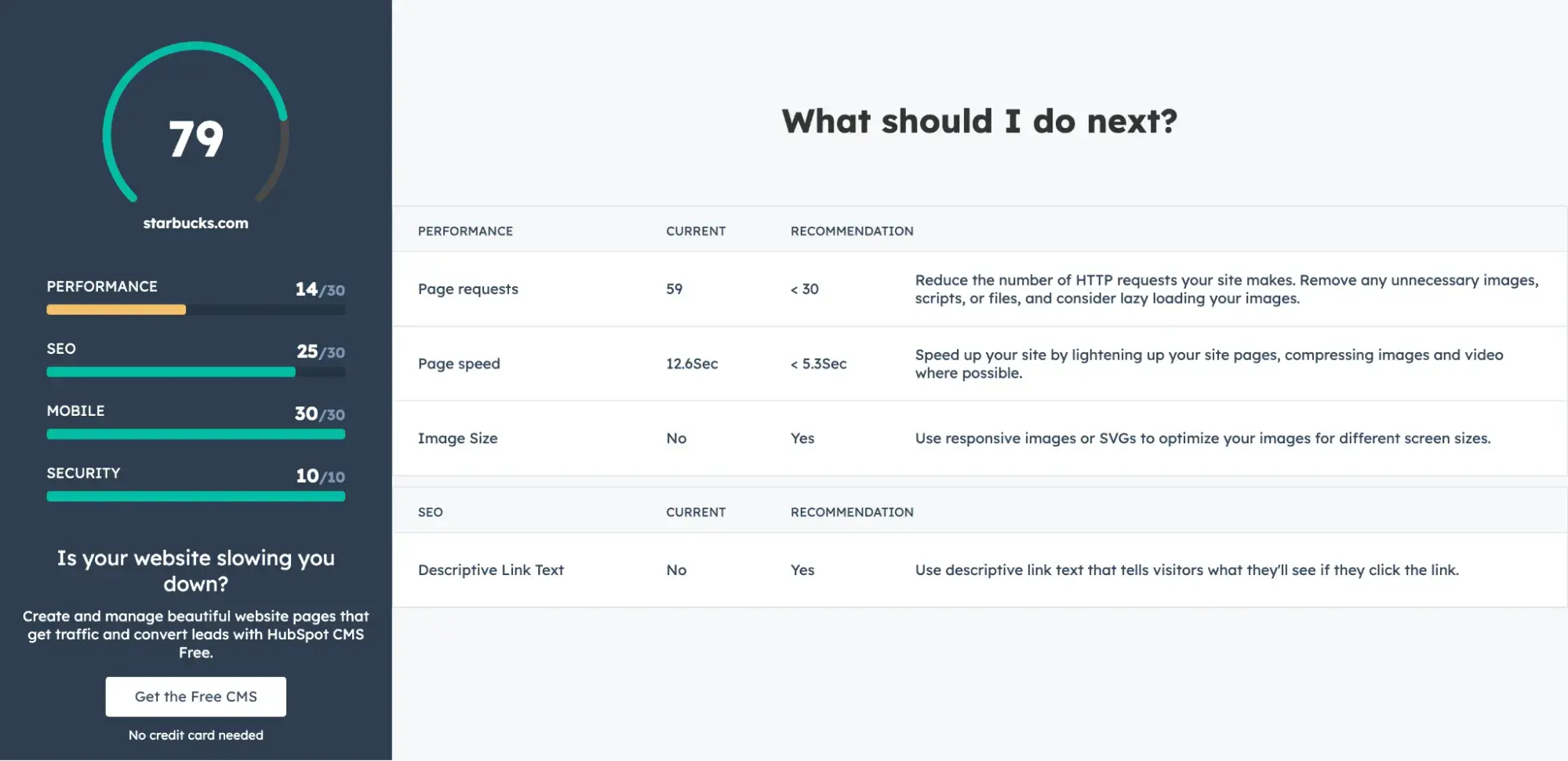
Run your site through a performance tool.
Website Grader is a great place to start, and it’s free. Within seconds, you’ll have a report that highlights changes you should make to improve performance, SEO, mobile experience, and security.
Analyze your analytics and reporting.
You’re likely already tracking KPIs. Start there. Check if any of your performance metrics are declining — these are the low-hanging fruit for updates.
Review key metrics like bounce rate, load time, session length, mobile responsiveness, and conversion rate to pinpoint areas for improvement.
Audit your website’s user experience, user journey, and design.
Start by auditing your website's design and performance to create an upgrade plan. Assess if your site appears modern and compares well with competitors.
Do a user journey audit, too. GrowthWaves, a B2B newsletter I’m subscribed to, observed that prospects were abandoning their onboarding process before validating their emails and paying. This led to lost revenue, causing GrowthWaves to implement a follow-up process that prompts users to complete their sign-up.
This example highlights the importance of reviewing and optimizing critical user interactions on your site to boost performance and maximize revenue.
2. Prioritize high-impact areas of the site.
According to the Databox study I cited in the intro, time constraint is the second most common reason businesses don’t redesign their site.
One way to scale this hurdle is to focus on high-impact areas first — the high-traffic, high-conversion pages. This includes your homepage, landing pages, and pricing pages.
Sunuva, a global fashion brand, is proof of how small design changes can lead to big results. As detailed in Smashing Magazine, UX/UI company Turum-burum conducted a UX audit and recommended small, manageable changes to increase the brand’s conversions.
One such recommendation involved a high-impact area of the site: the checkout page. Based on heat map data from Hotjar, Turum-burum could see that users focused a lot of their attention on the notification bar at the top of the page, which aimed to encourage shoppers to spend more to get free shipping.
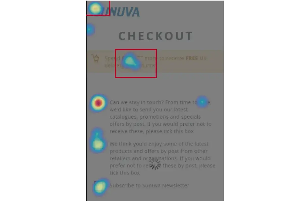
This notification was indeed prompting visitors to continue shopping; however, it resulted in up to 38% of them abandoning the cart entirely after doing so. Turum-burum recommended removing the notification.
That, plus some other UX tweaks, resulted in improved conversion rates for Sunuva.
3. Run frequent small experiments.
Never underestimate the power of small experiments.
One such experiment run by Kirsty Finlayson, director of marketing at Chameleon, proves that. So, what did she do? As she shared on GrowthWaves, she used Clearbit to identify the tech that website visitors were using.
She then used that information to personalize the homepage by highlighting the integration that Chameleon had for the specific software the visitor was using — resulting in about a 400% boost in conversions.
The lesson? You don’t have to do a full website redesign to boost performance. Frequent, minor updates and experiments are crucial to improving conversion rates continuously.
4. Test your messaging.
A lack of clear messaging can annoy buyers (like me!) and cause them to leave a website.

Does your website clearly communicate what you do? I’d recommend your audience to be the judge.
- Listen to sales calls. Positioning expert April Dunford recommends observing sales calls with new prospects and noting if your message resonates. If there's confusion early on, it’s a sign your messaging is unclear.
- Gather feedback from your ICPs. You can also use tools like Wynter to gather feedback from your ideal customer profiles (ICPs) and improve your messaging.
- Split test your CTAs. Run A/B tests to determine which calls-to-action (CTAs), messaging, and colors drive the most conversions.
5. Revisit your SEO strategy.
Start by asking, “Are we meeting our SEO content marketing goals?” If not, audit your site to identify pages that need content updates.
I recommend prioritizing the following:
- High-traffic pages published over 12 months ago. Regularly refreshing this content lets you maintain your ranking in search results.
- High-potential pages that do not rank for target keywords. Identify these pages by using tools like Ahrefs and Semrush.
Also, check for technical SEO issues like indexability, crawlability, and broken links.
If you're not hitting your goals, assess your content strategy next to find the root cause.
For example, you might find that as you publish content, your organic traffic does grow — but it doesn’t convert.
That’s exactly what happened to one of my clients, Belkins, a B2B lead generation company. Though its newly published articles were getting more search traffic, it wasn’t resulting in more leads.
Belkins fixed this in two phases. First, it deleted all pages with low potential. Second, it updated its content and published more pieces that aligned with the needs of its personas.
Recommended Reading: How to Revive an Old Blog Article for SEO
6. Evaluate competitor sites.
Don’t copy your competitors, but be aware of them. Their sites can offer valuable insights on what to do or avoid.
Also, gather inspiration from outside your industry. For example, I noticed many SaaS brands now feature demos on their homepages, like Chameleon and Speechify.
Upon researching, I discovered this is a growing trend. According to Navattic’s 2024 State of the Interactive Product Demo Report, demo popularity on B2B SaaS sites has increased by nearly 90% since 2022.
These demos allow visitors to engage with your product quickly without creating an account. If you’re a product-led company, consider adding an interactive demo to your website.
7. Conduct UX research.
Perform UX research to pinpoint design friction in areas like navigation and accessibility. There are a variety of UX research methods you can use, including:
- Heuristic evaluation, where you benchmark your site against usability heuristics
- Usability testing, where you observe users interacting with your site
- User surveys, where you send surveys to users to ask them about their experience on your site
Session recordings are one way to observe users interacting with your website so you can pinpoint any obstacles they encounter.
For example, Zenprint's marketing team puzzled over why users were dropping off of their site. So, they used Hotjar to observe session recordings, where they could trace mouse movements to see where users clicked.
Those recordings, plus funnels and heat maps, helped the team identify that its pricing table was problematic. By refining pricing, Zenprint decreased drop-off rates by 7%.
Feedback like this helps your team identify what to focus on next.
8. Don’t trivialize design.
I alluded to this earlier, but it’s worth reemphasizing the importance of good design because I still see many poorly designed websites out there.
Unbounce’s study of nearly 37,000 landing pages across 16 industries found copy has twice the impact on conversions as design.
However, design still plays a crucial role. According to a study published in Behaviour & Information Technology, visitors form an opinion about your site’s visual appeal in about 0.05 seconds.
This means design matters for a good first impression. So invest in good design. Pay attention to web design trends and web design best practices to create a distinct site.
Pro tip: If you need inspiration, download our free workbook on planning a successful website redesign. It contains guidance and templates to simplify your next website redesign project.
9. Review your site security.
According to the 2024 Hiscox Cyber Readiness Report, cyberattacks have risen for the fourth year in a row, with 67% of businesses having experienced them. And 13% of victims incurred losses estimated between $100,000 and $499,000.
But financial loss isn’t the only risk here: Stolen customer data and funds can seriously harm your brand's credibility. To safeguard your site, conduct regular vulnerability assessments.
Here are some key tips for securing your website:
- Install an SSL certificate.
- Keep your CMS and plugins up to date.
- Automate regular backups so you can quickly recover in case of a breach.
Pro tip: Learn more about protecting your customer data by downloading our free checklist created in partnership with Sophos, a British security software and hardware company.
Upgrading a Website: FAQ
What is a website update vs. a website redesign vs. a website refresh?
When someone talks about “updating” their website, they can mean any kind of change, from simply updating a WordPress plugin or adding new content to a blog post to something more complex like redesigning the entire website.
The terms can get confusing. So I asked someone who offers all of these services: Megan Good is the owner of web design company Geeked Out Media.
- What is a website update? “Website updates are like the routine changes that everybody needs to do month to month to keep their website running and functioning well,” Good explains. “So that could be plugin updates. That could be software and CMS updates.”
- What is a website redesign? “A redesign is going to be totally changing the structure, maybe upgrading you to a new CMS system,” she says. “It's going way beyond just a page change, or adding a blog, or things like that. It’s totally redesigning the structure, the feel.
“Usually, people come to us for a redesign when they want to rebrand or they want to add ecommerce to their site, things like that, that are much more advanced than just, ‘Hey, we need a new page,’ or ‘We need to update the wording on a page.’” - What is a website refresh? “A website refresh can be different than a website redesign,” explains Good. “So with a website refresh, we've taken people on the same CMS system, and maybe we’re just updating pictures or colors or adding a new logo, things like that, which still take time, but you might not be changing your services entirely.
“So you don't need to redo every page on the site. But you just want to give it a little bit of a new look or add a new functionality into the site without changing everything about it.”
How much does updating a website cost?
This varies widely, but I’ll list the least expensive to most expensive options:
- Low cost: Website update - This might include installing or updating plugins, updating to the latest version of WordPress, changing text, or optimizing images.
- Medium cost: Website refresh - A little more involved than a website update, a website refresh involves more of a design change. This might include changing the logo or brand colors.
- High cost: Website redesign - The most complex and expensive investment of the three. This might involve switching to a new CMS and a complete overhaul of your website’s design. We actually have an entire post on website redesign costs.
Why should I update my website?
Can you afford to lose two-thirds of your customers? I didn’t think so. And yet, a HostingAdvice survey of 500 U.S. consumers found that 75% have abandoned online purchases because the website looked outdated or unprofessional.
On the flip side, 92% of consumers said they feel more confident in a business when its website functions smoothly, highlighting the importance of user experience.
It’s no wonder so many businesses redesign their website every few years.
If competitors regularly update their websites — and you don’t — you risk losing revenue opportunities because of a stale site. That’s why I recommend setting yourself up for growth by proactively updating your site content and design.
Pro tip: Track changes so you can evaluate whether your website updates are helping.
You can use software tools to do this, but it can also be remarkably low-tech. Amy Rigby, senior staff writer for the HubSpot Website Blog, said she’s a fan of using a simple spreadsheet.
“When I owned a travel website, I manually tracked changes in a ‘changelog’ Google Sheet,” she says. “Every time I made a change to a blog post, I wrote the date, the change, the post’s ranking, and the post’s traffic.
“Each month, I’d track the post’s ranking and traffic to see if it was improving post-update. It was revealing and allowed me to pinpoint exactly what kind of website upgrades were actually working for me.”
When should I update my website?
During a Product or Brand Re-Positioning
As a business grows, your company's positioning and products may evolve. An outdated website can misrepresent your business, leaving customers with an inaccurate view of your offer.
Refreshing your site — particularly your homepage — can help align your messaging with your current position. This alignment helps reframe how existing customers see you and gives new visitors an up-to-date picture of your brand.
For example, I knew Wynter initially positioned itself as a message-testing tool. Below is a screenshot of the homepage from June 2023.

The product’s capability has grown, and now it positions itself as a market research platform, thus prompting an update of its homepage, as shown below in a screenshot from April 2025:

Pre and Post-Launch of a New Offering
Your website is ideal for highlighting what’s new in your business. Whether it’s a new product, feature, or pricing update, refreshing your site keeps both new and returning visitors informed of the latest developments.
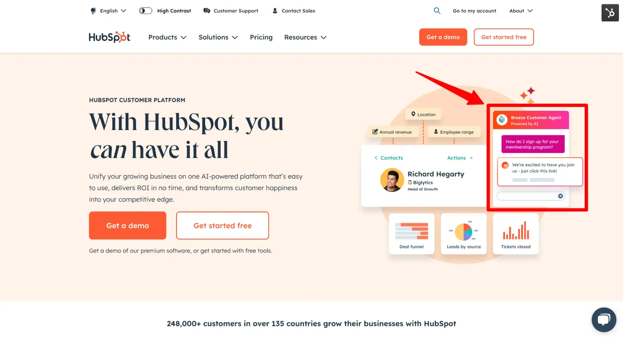
For example, HubSpot unveiled its collection of AI tools, Breeze, in September 2024. To draw attention to this launch, HubSpot updated its homepage hero section with a graphic of the Breeze Customer Agent.
I’ve annotated the screenshot below to show the major change:
For comparison, here’s how the homepage looked in August 2024, before Breeze launched.
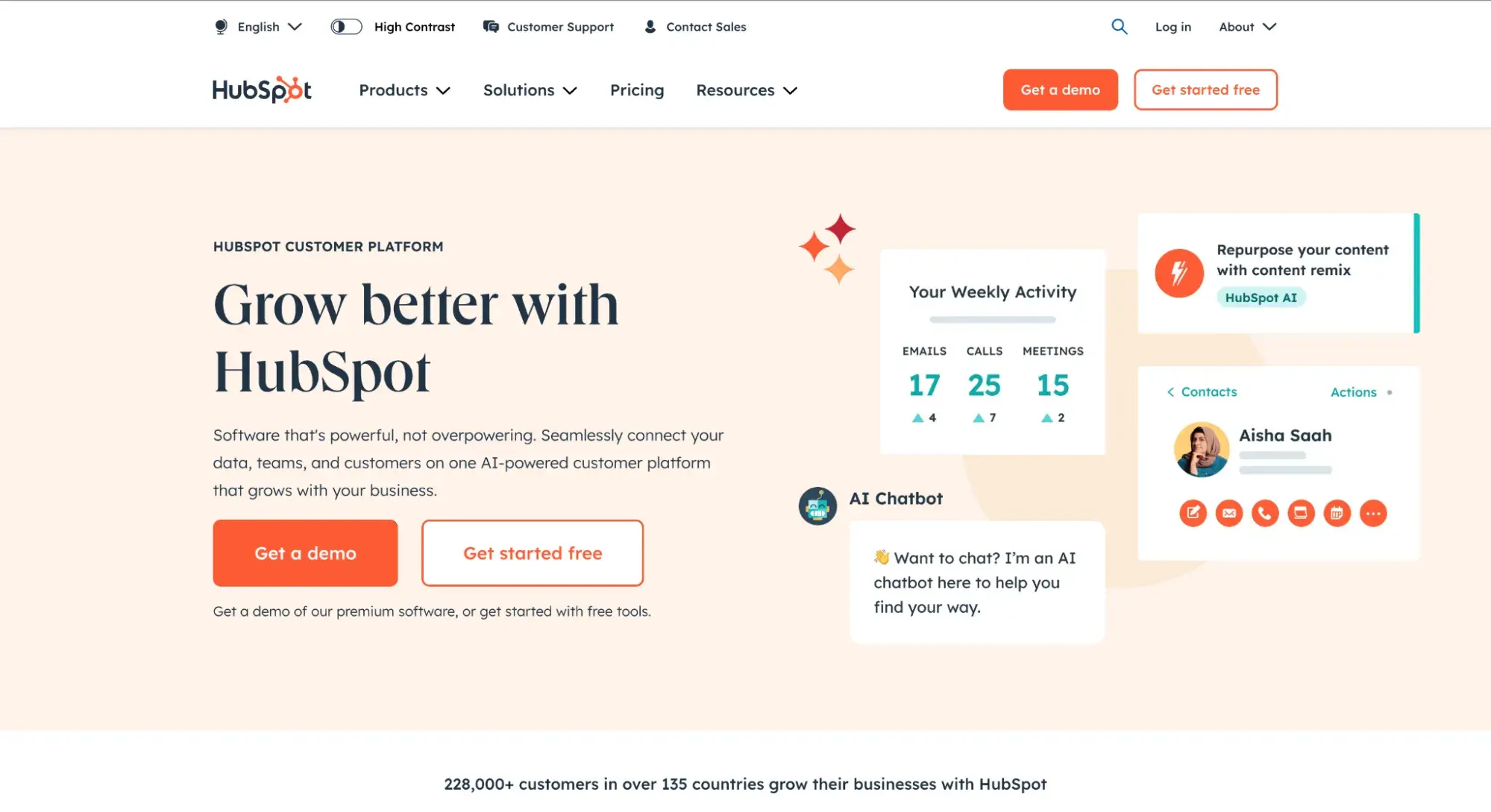
Pro tip: Don’t forget to regularly update any stats on your homepage, including number of customers. Notice that HubSpot did just that in the two different screenshots above.
When Capitalizing on Trends
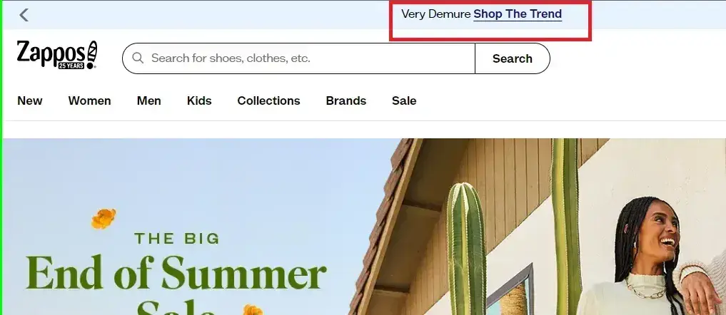
It’s common for brands to jump on viral social media trends to boost social reach. However, I like how Zappos did something less common: they took advantage of the viral “very demure” TikTok trend to drive engagement on their site.
For the unfamiliar, the “very demure” trend emerged from a satirical TikTok video by content creator Jools Lebron. What Zappos did was add a navigation bar to their site that read “Very Demure Shop The Trend.” The bar also included a link to a dedicated landing page showcasing select clothing items aligned with the trend.
Do I need to be tech-savvy to update my website?
It depends. If you’re using a no-code website builder or content management system (CMS), you’re in a good position to update your own website even with little to no tech skills. That’s because the entire point of a CMS is that it’s easy for non-technical users to manage their content without touching code.
Some tasks that non-technical folks can usually pretty easily do to update their website:
- Change text
- Upload images
- Update WordPress plugins
- Fix broken links
- Compress images to improve page speed
- Switch to a new website theme
However, there might still be some technical issues that require a developer to fix.
"When this happens to me, I hire a developer to do one-off fixes," says Amy Rigby of HubSpot. "I also used to subscribe to a monthly WordPress maintenance package when I was running a higher-traffic website. This was remarkably affordable, by the way — less than $50/month."
Some tasks that might require web design and development help:
- Redesigning an entire website
- Switching hosting providers
- Migrating a website to a new CMS
- Troubleshooting technical issues
What tools do I need to upgrade my website?
- Website builder/CMS - This is where you’ll be able to edit your website’s text, images, and templates/themes. I highly recommend trying Content Hub, which has a free plan.
- Performance checker - This will help you check your website speed.
- Graphic design tool - This is how you’ll resize, crop, and edit images.
- Analytics dashboard - This will help you track your website’s metrics, such as traffic, bounce rate, and conversion rate.
- SEO/keyword research tool - This will help you target keywords and measure if you’re ranking for the keywords you want.
How does having an outdated website hurt SEO?
Google favors content that is “fresh,” aka more recently updated. This makes sense: It’s in the search engine’s best interest to surface the results that have the newest information. The older a post gets, the less likely it is to be accurate.
Another way that an outdated website hurts SEO is in terms of performance. If your site becomes slow over time and you don’t fix these issues, it can hurt rankings. It’s part of Google’s Core Web Vitals, which measures the user experience and impacts your ranking.
Your Turn for a Website Upgrade
Updating your website is an ongoing process.
“Your website isn't a one-and-done project,” says Geeked Out Media’s Megan Good. “It’s living, it’s evolving, it's changing constantly, and you have to take care of it to stay competitive.”
She adds, “Otherwise, you've just wasted your money, basically, to build or redesign a site if you just plan to let it sit there forever. “
Whether it’s minor updates like optimizing your homepage or bigger updates like refreshing old content and adding interactive elements — these website upgrades can deliver significant results.
Now that I’ve armed you with these insights, here’s a plan of action: audit your site, implement some small experiments, and then make consistent improvements to keep your website ahead of the curve.
Editor's note: This post was originally published in September 2024 and has been updated for comprehensiveness.


.png)

