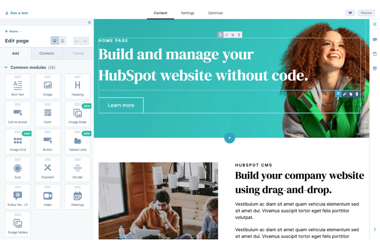
And when you're ready to build your own, don't forget to check out Content Hub to get started for free.
The 22 Best Black Websites
1. Designed by Women
 First up is Designed by Women, a website celebrating women's design contributions over the years. This website features a bold, powerful font that adds personality to the landing page and bright pictures of products scrolling behind the text against a black background. Designed by Women also features a unique footer, which features the logo in large text and an excellent array of page options.
2. Drive
 Drive is on our favorite black websites list because of its noteworthy typography. The company nestles video inside blocky, visually gripping letters. Additionally, the bright font contrasts sharply with the dark background. We love the company's commitment to the black-and-white theme as it incorporates pictures colored as such throughout.
3. Decimal Studios
 Decimal Studios has one of the most unique menus on any of the websites on this list. The menu options are distributed in the screen's top left and right corners on the desktop version. As you scroll down and hover your mouse over the different images, they jump out at the visitor, making for a more engaging experience.
4. Vinicius Siega
 This website lets the product take center stage. As you move your mouse around, it transforms into an eye-catching shape. Unlike many other sites, the menu of pages is in the bottom left-hand corner, so it doesn't detract from the main image.
5. NSS Mag
 This is one of the most unique black websites we've rounded up, so we greatly appreciate it. When you land on the site, you arrive on a grid-like page with images and a black background. However, that grid-style design rapidly transforms into a full-screen video experience that draws visitors into this brand's world.
6. Quantox
 When you land on the Quantox site, you are immersed in a digital space that whisks you away. Randomized letters transform into the heading text: Ideas made possible. Once that text disappears, a techy font appears on the screen. Interestingly, this site features a hamburger menu in a unique spot: At the bottom of the website toward the center.
7. Darkroom
 Next is Darkroom, which fittingly features a black background. This is one of our all-time favorite black websites because it balances images and graphics seamlessly. The photos are also in black and white, making for a more cohesive experience.
8. Babel Agency
 Babel Agency does an exceptional job showing how a text-heavy website doesn't have to be boring. Text dominates most of the homepage, and images appear when you hover over certain words. We love the nostalgic, typewriter-esque font used throughout.
9. Enecom Power
 Up next is Enecom Power. From the page loading screen to the homepage with an abstract-inspired font, there's a lot to love about the Enecom Power site. We love how the branding and font are consistent throughout and how the organization placed the menu in the top right corner, so it doesn't interfere with the user experience.
10. StudioBe4
.jpg?width=650&height=322&name=Screenshot%202023-03-24%20at%2012.36.33%20PM%20(1).jpg) Next up is StudioBe4. The main attention-grabbing element of this website is the copy that reads 'Tell Your Story.' The site features videos inside of the word story, which adds visual interest and helps give a sense of what the studio is all about.
Next up is StudioBe4. The main attention-grabbing element of this website is the copy that reads 'Tell Your Story.' The site features videos inside of the word story, which adds visual interest and helps give a sense of what the studio is all about.
11. Lunar
 Lunar is another excellent example of how much parallax scrolling effects can add to your site. The site seems simple when you land on it, given that the company name is above the fold. As you continue scrolling, you view the product from several angles.
12. Express Shoe Repair
 Express Shoe Repair, an NYC-based shoe shop, offers an eclectic, scrapbook-esque website. Thanks to the moody photography and refined font, the dark background creates an intimate yet elevated feel.
13. Seventimes Media
 Seventimes Media oscillates between a black and white background throughout the site, but the majority is black. When you land on the site, a video shows the company's previous work. At times, there's a black frame around the video, which helps add cohesiveness to the rest of the website. When you click the hamburger button, a full-screen menu appears against a dark background.
14. The AI Gallery
 Next up is the AI Gallery, which makes visitors feel as if they've been transported to a different world. There's a video playing in the back, and the site's title is layered over. The menu is nestled in the corner, and when you click it, it expands in a manner cohesive with the rest of the website.
15. Golda Zahra
 Golda Zahra's website also employs parallax scrolling to make it aesthetically pleasing and engaging. When you land on the site, your eyes are drawn to the center of the screen, where an image of Golda is centered against the text. This website is an excellent reminder that less above the fold really can be more. The menu options are neatly tucked into a hamburger menu in the top right corner.
16. Thirty Entertainment
 Next up on our list of favorite black websites is Thirty Entertainment. The header text takes center stage on this site, and the blocky graphic logo contrasts sharply against the darker background.
17. Bonne Sobriyearte
 This black website demonstrates that you don't have to have a ton of visual elements to make things exciting. The Bonne Sobriyearte lets the logo and bubble font take center stage, making for a more effortless user experience. Because these elements are already complex enough to hold a visitor's attention, Bonne Sobriyearte takes a less-is-more approach and keeps the rest of the homepage simple.
18. Foam
 Next is Foam, a photography website that switches from a black background to a white one. As you scroll down, the site oscillates from light to dark, which makes for a visually exciting experience for visitors. We love how at specific points of the website, the mouse hover turns into a button inviting you to 'read more.'
19. Dopegood
 Dopegood does a few things right: For starters, it has a visually gripping load screen, so visitors don't bounce while waiting for the website images to populate. When the site images appear, above the fold showcases graphics that immediately draw you in. As you scroll down, bright whites and neutrals pop against the dark background, making it one of our favorite black websites.
20. Nathan Smith
 Typography takes center stage with Nathan Smith's portfolio website. When you hover over the Instagram text, email, or phone number, the letters scatter in a playful way, which adds character to the website. Parallax effects bring Smith's work to life as you scroll.
21. Cappen
 Cappen's site is another example of how text-heavy can be visually engaging. A scrolling gradient line in the right-hand corner also enhances the overall look of the site, plus the blocky, futuristic font.
22. Humana Studio
 Rounding out our favorite black websites is Humana. This site features large text yet integrates graphics and parallax scrolling features for an excellent user experience. We love how comprehensive the footer is, too, with information regarding how to get in touch and an array of social media links.
Use these black websites to spark creativity.
Now that you know how aesthetically pleasing black websites can be, it's time to start making your own.
Website Design Examples
.png?width=112&height=112&name=Image%20Hackathon%20%E2%80%93%20Vertical%20(50).png)


![15 black and white website designs to inspire your own [+ pro tips]](https://53.fs1.hubspotusercontent-na1.net/hubfs/53/black-and-white-website-design-1-20250520-1336267.webp)

![15 Brochure Website Examples to Inspire You [+ How to Make One]](https://53.fs1.hubspotusercontent-na1.net/hubfs/53/brochure-website-examples-1-20250319-362228.webp)
![28 Types of Websites to Inspire You [+ Real-Life Examples]](https://53.fs1.hubspotusercontent-na1.net/hubfs/53/types-of-websites.png)

