
How to Choose the Right Website Template
I have a pretty good idea of what you might’ve been doing before finding this post. You were probably staring at a list of hundreds (or maybe even thousands) of website templates with not much idea of how to choose the right option from that huge list.
I know this because I’ve been in that exact same spot in my 10+ years of website building. For me, it’s usually choosing a WordPress theme, but you might be trying to find a template for a different website builder.
Regardless of what type of template you’re choosing, my experience has taught me that focusing on these seven areas can help you choose a website template that will work well for your site.
HubSpot's Free Website Builder
Create and customize your own business website with an easy drag-and-drop website builder.
- Build a website without any coding skills.
- Pre-built themes and templates.
- Built-in marketing tools and features.
- And more!
1. Check for key integrations from the start.
Before going any further, you should always make sure that the template you’re looking at is specifically built for the way that you want to create your website.
For example, if you’re using HubSpot Content Hub for your website, you’ll want to browse the many website templates made for HubSpot Content Hub. If you’re using WordPress, you’ll want a WordPress theme. If you’re coding your site from scratch, you’ll want a pure HTML website template.
Once you’ve verified that, you’ll also want to make sure your template supports any other essential tools that you’re using, as a template won’t be much use if it doesn’t fit your business needs.
For example, if you’re building a WordPress ecommerce store powered by WooCommerce, you’ll want to make sure that your chosen WordPress theme has built-in support for WooCommerce.
Pro tip: If possible, try installing the template and essential extensions/integrations on a test site. That way, you can perform your own integration testing instead of relying on the developer’s marketing copy.
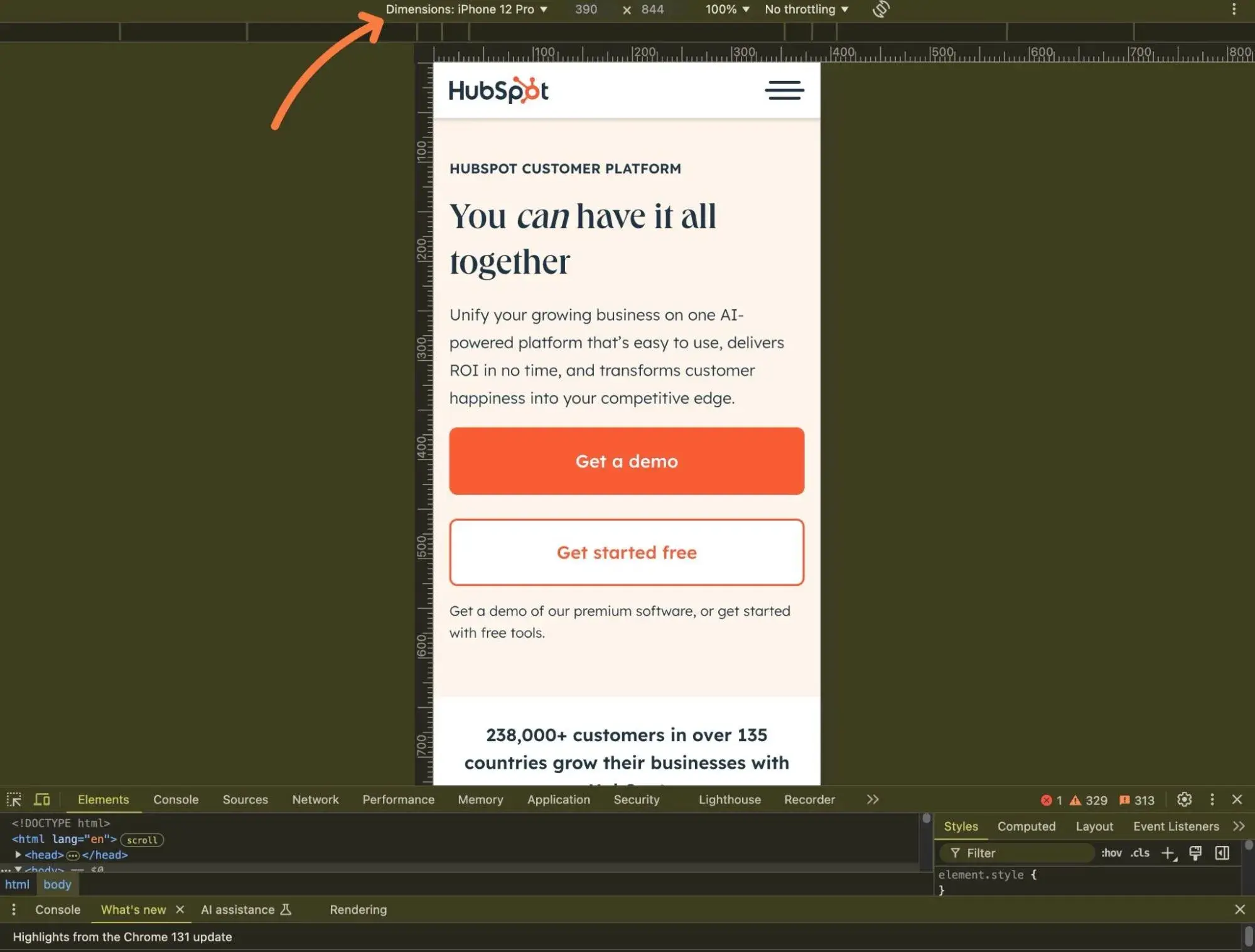
2. Test your template’s responsive design.
Responsive design means that your website will automatically adapt to the size of a visitor’s device. For example, it would look one way for people browsing on their computers and a different way for people browsing from their smartphones.
Pretty much all modern website templates are responsive by default. If your template doesn’t support responsive design, you should cut it from your list immediately (but it’s unlikely that you’ll find any templates without responsive design in 2025 and beyond).
However, responsive design is not just a checkbox that you need to look for. Instead, you need to make sure that the responsive design is actually done well on different devices, which requires that you actually test the template in different situations.
Here are a few tactics that I use to check a template’s responsive design:
- Open the template on physical devices. If you have your own smartphone and tablet, you can just open the template’s demo site on those devices to experience the responsive design directly.
- Use your web browser’s developer tools. If you don’t have physical devices, you can also use your web browser’s developer tools to emulate different devices.
- Use a tool like BrowserStack. As an alternative to developer tools, you can also use a tool like BrowserStack to see how the template would look on thousands of different devices.
Pro tip: For quick responsive testing, you can also use a browser-based tool like Responsive Web Design Checker. While it doesn’t always allow full interaction like the other methods (e.g., I find that mobile menus won’t display sometimes), I think it’s great for getting a quick idea of what the template will look like on different devices.
3. Assess conversion optimization (for goal-oriented websites).
You probably have a goal for your website. You might want to generate leads for your business, sell products, showcase your work in a portfolio, or something else.
Whatever your goal is, I recommend trying to find a template that’s already optimized to help you achieve that goal.
For example, if you want to generate leads, you should choose a template that is designed to help you place an eye-catching, conversion-friendly lead generation form. The template might not include its own lead generation form — you could use the HubSpot Form Builder for that. But it should at least include the space for such a form, as well as any other needed optimizations.
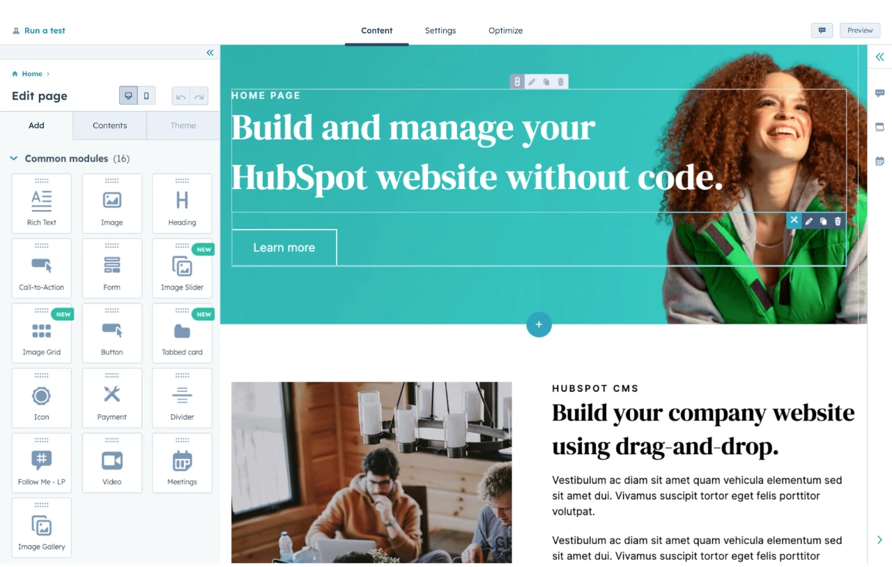
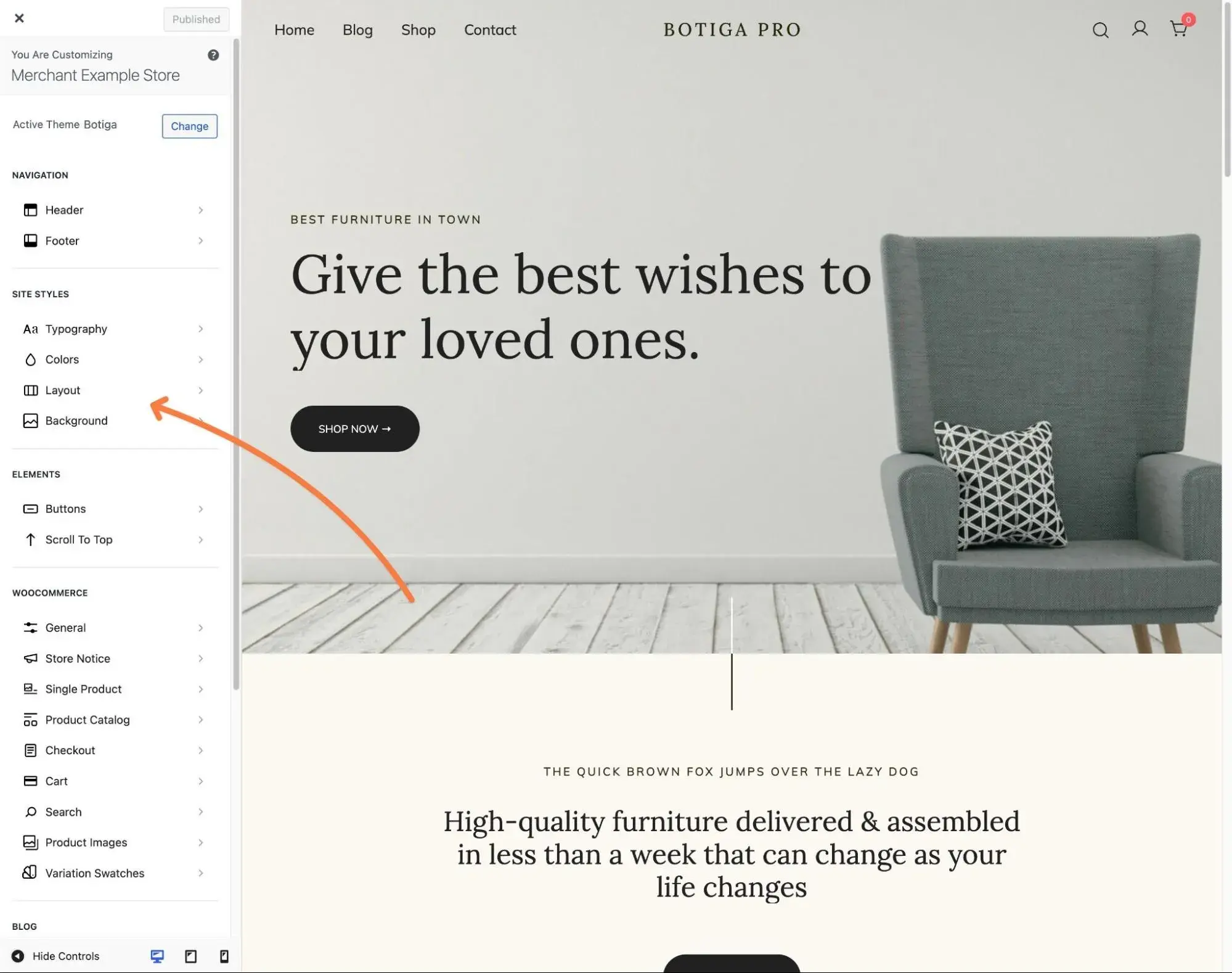
4. See how customizable the template is.
If you’re lucky, you’ll find the unicorn of website templates — a template where every element already perfectly matches your site’s brand, and you don’t need to change a single pixel.
However, in my 10+ years of building websites, this has never happened to me. Even if the template is almost perfect, you’ll still probably want to make at least a few changes before calling it a day.
Template customization can have a lot of variation.
For example, if you’re choosing a WordPress theme, there are a bunch of different customization routes that themes use. I’ve seen themes that use the Customizer, Site Editor/Full-Site Editing-based themes, custom theme options areas, themes with built-in visual builders (like Avada), themes that rely on third-party builders (like Elementor), and so on.
Here are some questions I recommend looking into when it comes to template customization:
- Can you customize your template?
- Do you get code-free customization options?
- If you do have code-free options, what are those options like?
- Can you easily customize your template with your own code if you do want to use code?
- Do you have some type of visual preview while you’re making your changes? Personally, I find it really frustrating when I have to “save and refresh” every time I make a change.
Pro tip: If you don’t feel comfortable working with custom CSS, I highly recommend choosing a template that offers a robust set of interface customization options, as this will give you more flexibility for customizing your template.
HubSpot's Free Website Builder
Create and customize your own business website with an easy drag-and-drop website builder.
- Build a website without any coding skills.
- Pre-built themes and templates.
- Built-in marketing tools and features.
- And more!
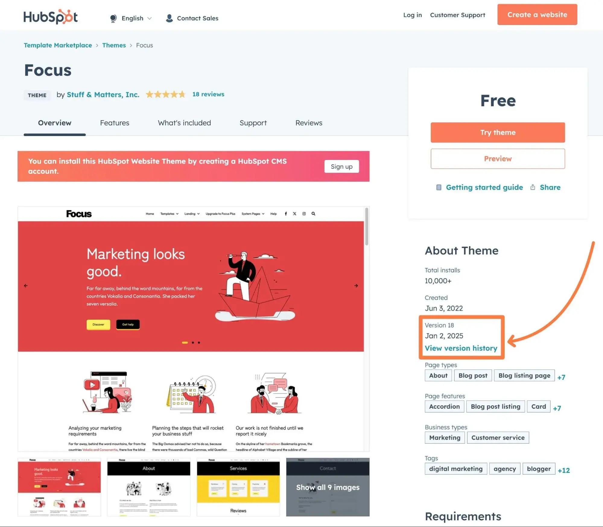
5. Make sure the developer still supports your template.
There’s nothing worse than finding a great website template only to discover that it’s essentially been abandoned by the original developer.
While it might be tempting to use a template where the developer has disappeared, my experience has shown me that this is a recipe for disaster, especially if you’re using some type of content management system (CMS).
Instead, I recommend making sure the template still receives these two types of developer support:
- Code updates. You should make sure the developer is still actively updating the template, especially if the template is for a CMS (e.g., WordPress). These updates might be required to address changes in the underlying CMS.
- Customer support. You should check what customer support you can access if you need help with anything. For paid templates, I think you should expect a minimum of six months of direct customer support (ideally a year). For free templates, you’ll typically need to rely on customer support forums (if you get any support at all).
Most template marketplaces will show you the “last update” date for a template, which should give you a good idea of code updates. For customer support, you might need to consult the developer’s terms and conditions.
Pro tip: Make sure to check the specific customer support policy for whatever template you choose, as different templates will have different support periods and methods of offering support.
6. Factor in performance and load times.
As your website’s foundation, your chosen template will play a big role in your website’s performance and load times.
Because of how important load times are to user experience and conversion rates, I highly recommend assessing each template’s performance before making your final decision.
Unfortunately, my experience has taught me that just testing the performance of the template’s demo site doesn’t always work well. This is because developers often use non-performant hosting for their demo sites and add scripts and software that might not be present on your own site.
If the template is free to use, I think the best way to assess performance is to install it on your own website (or your own test website) and test its performance that way.
If you can’t do this for some reason, you can read reviews from other users or ask the developer directly.
Pro tip: I recommend reading our guide on how to properly measure site speed if you’re not sure how to test a template’s performance.
7. Check for accessibility.
Web accessibility is the practice of making your website usable for everyone, including people with disabilities. One example would be making it so that people using screen reader devices can easily navigate your site, though there are a lot of other aspects of web accessibility.
While your website template is not the only thing that will affect your website’s accessibility, it does play a big role. For that reason, I also recommend checking to see if a website template follows good accessibility best practices before finalizing your decision.
This is not only important for creating a good experience for your site’s users, but it’s also the law in a lot of jurisdictions.
Pro tip: To assess accessibility, you can analyze the website template using one of these accessibility testing tools.
How to Use a Website Template
- Match your branding.
- Pick a unique color scheme.
- Choose fonts wisely.
- Design for scannability.
- Be consistent.
- Keep it simple.
- Update as needed.
Once you’ve chosen the right template for your website, I think it’s important to ensure that you’re effectively using that template on your site.
Here are some tips to help you do just that.
1. Match your branding.
Your website is an opportunity to make a statement about your brand identity. When customizing your template, you don’t want to just look different for the sake of looking different from the default template or your competitors. By bringing your company’s unique branding into your digital presence, you’re reinforcing what makes your business unique.
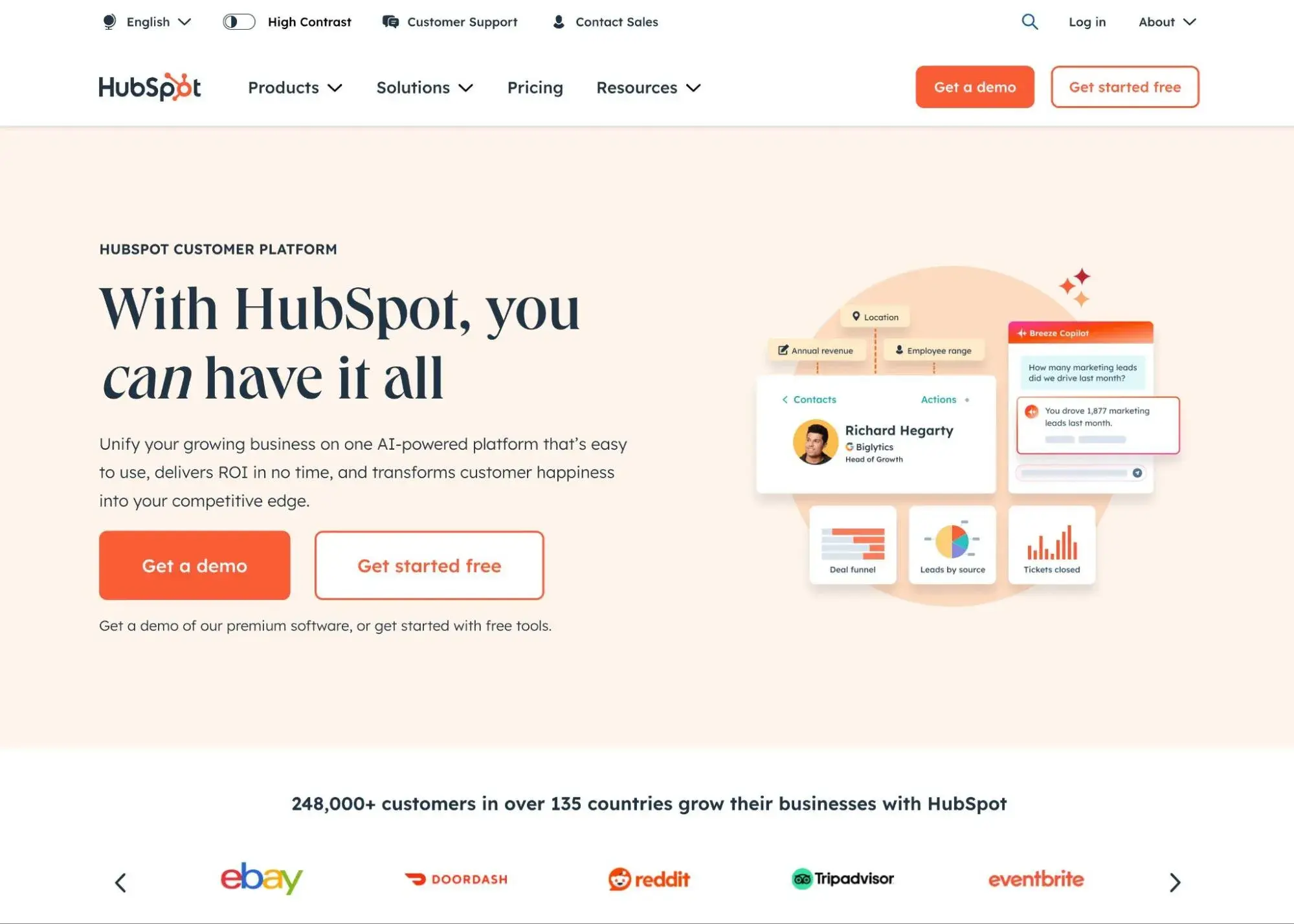
For example, you’ll see HubSpot’s signature orange across the entire HubSpot website.
Obviously, your first step is adding your business name, tagline, logo, and other aspects of your brand. Be sure to replace placeholder copy with text written in your brand voice. The same goes for stock images, any icons, animations, and so on — these are all invaluable opportunities to tell your brand story, so don’t waste them!
If you don’t have the budget to work with a designer for unique branding elements, I also recommend trying an AI logo generator or AI image generator. You can also use an AI text content tool, though I recommend editing the text to put it in your own voice.
Pro tip: Keep your branding consistent across your entire website. Some websites don’t keep the same branding on inner pages, which can lead to a jarring user experience.
HubSpot's Free Website Builder
Create and customize your own business website with an easy drag-and-drop website builder.
- Build a website without any coding skills.
- Pre-built themes and templates.
- Built-in marketing tools and features.
- And more!
2. Pick a unique color scheme.
Picking your website’s color scheme is one of the most important design decisions you’ll make. It can impact your site’s accessibility, brand identity, and user experience.
Instead of sticking with a template’s default color scheme, choose new colors for your website. When doing so, consider color theory (how colors and visuals interact with each other to create an aesthetically pleasing design) and color psychology (how colors can change the perception of your brand psychologically).
Depending on your brand’s color palette, it’s also helpful to look at successful blue websites, orange websites, black and white websites, and other examples for inspiration. Remember: It’s most important that your website feels like a natural extension of your brand. Color contributes greatly to that, so choose your palette carefully.
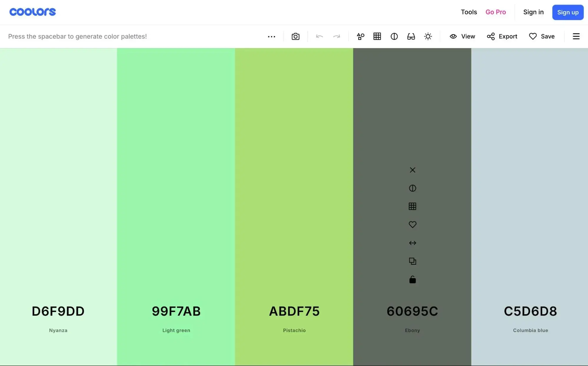
Pro tip: To help you find colors that work well together, I recommend using free tools like Coolors or Huemint. These tools let you choose one or more colors that you like and then generate a cohesive scheme based on those choices. Or, if you’re open to anything, you can just have them suggest entire color schemes for you.
3. Choose fonts wisely.
Website templates and themes provide multiple font options. However, just because they come with dozens of fonts doesn’t mean you should use them all on your site. Instead, stick to two or three fonts and create a visual hierarchy using different font sizes.
Your font choices should also be accessible, meaning they have sufficient color contrast and are legible across multiple device types and screen sizes.
User experience is your main priority, and users are going to quickly leave a site with an overly complicated, tricky-to-read font. The result is a high bounce rate and important information getting passed over.
To learn more, check out The Beginner’s Guide to Typography in Web Design.
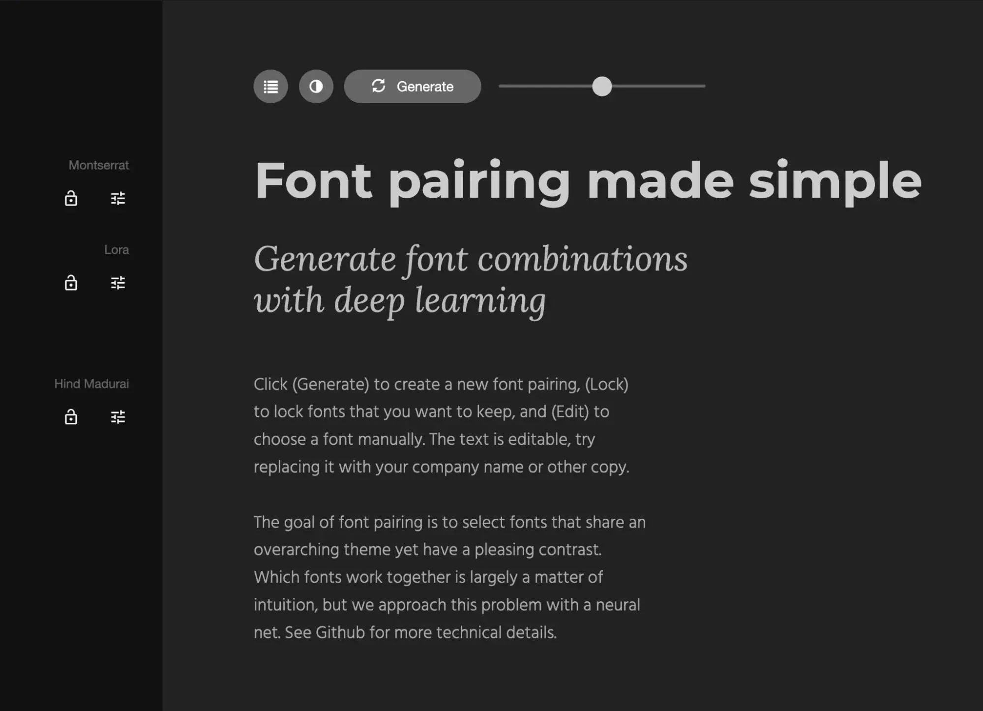
Pro tip: To find fonts that work well together, I love using free tools like Fontpair and Fontjoy. For example, with Fontjoy, you can choose one font that you like, and then it will automatically suggest two other fonts that you can pair with your choice. Super cool!
4. Design for scannability.
Even though you put a lot of thought into your content (as you should!), some visitors will skim it. To ensure that you’re creating a great experience for these people, you’ll have to design your site so that readers can still comprehend important information even if they’re scanning your content. That will require you to:
- Limit the amount of text.
- Use negative space.
- Incorporate images and videos.
- Create a visual hierarchy.
- Select readable fonts.
By incorporating these best practices into your site, you’re giving your content the best chance it can get to be absorbed by visitors.
5. Be consistent.
Because of how easy it is to customize most templates with drag-and-drop builders and other tools, it can be tempting to customize each and every page. In this case, however, less is often more. If you do customize each page, your website will appear inconsistent and disorganized instead of original.
Backgrounds, color schemes, typefaces, and even the tone of your writing should be consistent across all of your site’s pages to reinforce your branding.
That doesn’t mean every page has to look the same. In fact, specific types of pages, like landing pages and blog posts, should have different layouts but use colors, fonts, and other elements in a similar way.
The result is a website that feels intuitive to your brand and allows visitors to easily find what they’re looking for without getting distracted by a variety of different design elements.
6. Keep it simple.
Another result of the easy customization options is that you may feel tempted to overload them with animations, images, videos, and other widgets. When this occurs, your website will have a complicated layout that overwhelms visitors instead of informing and delighting them.
Instead, try to present visitors with the clearest information and options. Simplifying your navigation and making your calls-to-action (CTAs) stand out are great starting points. Your copy also contributes to this: the more concise, the better.
Pro tip: Whenever you’re thinking about adding some complexity to your page, I recommend asking yourself this question: Will what I’m adding actually make my website more effective at achieving my business goals? If the answer is “no,” I recommend leaving it off.
7. Update as needed.
Even if you choose the best template ever and customize it to perfection, you should be prepared to update it to meet your visitors’ needs and expectations as they evolve.
Furthermore, as new web design trends pop up and the technology you used in your original site becomes antiquated, you’ll have to pivot.
The list of reasons why companies redesign their websites goes on and on, but the point is the same: at some point, updates will be necessary.
This may require you to:
- Perform A/B tests.
- Implement strategies that work for competitors.
- Gather and implement feedback from your customers.
- Audit your site.
Pro tip: We have a free website redesign guide that can help you properly update your site and redesign it when needed.
HubSpot's Free Website Builder
Create and customize your own business website with an easy drag-and-drop website builder.
- Build a website without any coding skills.
- Pre-built themes and templates.
- Built-in marketing tools and features.
- And more!
Mistakes When Using a Website Template
Before closing out, I want to highlight some common mistakes people fall into when using a website template so you can avoid them.
1. Choosing a Template That Doesn’t Meet Your Needs
“Give me six hours to chop down a tree, and I will spend the first four sharpening the ax,” Abraham Lincoln supposedly said. The meaning of this quote can be applied to website design: choosing and preparing the proper tools for your site is vital. This is particularly true of templates. A website template is the foundation of a site. That means you need its design and functionality to align with your website needs.
Here are some factors to consider when evaluating website templates:
- What’s your budget?
- Do you need a template or theme?
- To what extent is this template customizable?
- Does this type of design reflect your brand personality?
- Is this template responsive?
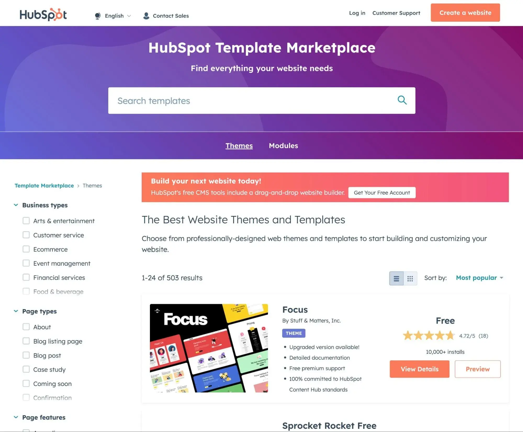
Pro tip: HubSpot now has a theme marketplace where you can browse through catalogs of free and paid themes.
How to Fix This:
Searching for the pre-built template with the specific layouts, elements, and compatibility you need takes time and patience — and, sometimes, budget in the case of premium templates. But it will be well worth the investment if the template provides the design and functionality you want.
2. Choosing a Template With Unresponsive Elements
The best website templates provide users with an excellent experience whether they are on mobile or desktop. Considering that mobile devices accounted for anywhere from 51% to 75% of total website traffic in January 2025 (depending on the region), having a responsive website is no longer a nice-to-have — it’s a must.
Nowadays, almost all pre-built templates and sites are advertised as responsive. However, some have non-responsive elements (such as text and shapes) that do not adjust based on screen width.
Others have non-responsive layouts with fixed elements, like a fixed navbar, that will not be scrollable when the viewport becomes narrower than the page content, like on a mobile device. Luckily, there’s a workaround that can help you find the perfect responsive theme.
How to Fix This:
As I mentioned earlier, you can avoid these issues by testing the template on different physical devices or using device emulation in your browser’s developer tools or tools like BrowserStack.
3. Using a Free Template with Branding
A free template doesn’t automatically mean poor quality. In fact, some of the best website templates are entirely free to use. However, a free template often displays the logo or other branding of the theme developer, which can make your site seem less professional.
Worse still, free templates can include malicious code. Nulled themes, which are copies of premium WordPress themes that have been modified and made available for free, are a particular security risk.
How to Fix This:
In some cases, editing the branding of the theme developer is as simple as clicking “delete” — but make sure you are not violating guidelines by doing so. If you’re using a free template, you may be required to include the developer’s branding. Sometimes, you can avoid this by simply purchasing a paid version of the template.
Or, if malicious code is what you’re worried about, use a third-party maintenance service that offers tools to scan themes and templates for any malicious code so you can ensure it’s safe before installing it on your site. For example, WordPress Malware Scanner by MalCare will let you scan your site for free.
4. Ignoring User Reviews
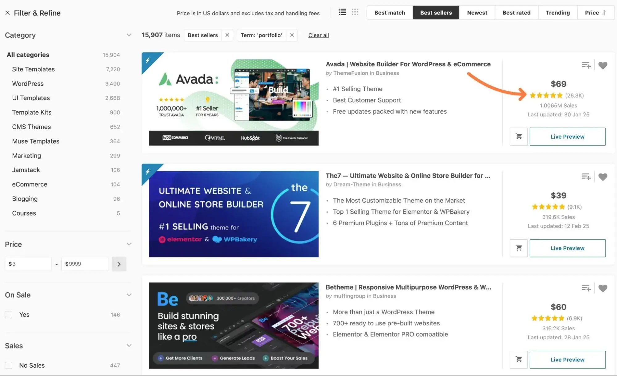
Most marketplaces selling pre-built templates allow customers to leave reviews. You’ll want to check these before buying a template for your site. If there are many one-star ratings, for example, then there may be serious flaws or limitations that would also frustrate you.
ThemeForest is the largest marketplace for themes and templates and allows customers to rate products they’ve purchased. When searching for templates, you can filter by star ratings and by sales to improve your chances of finding a good template.
How to Fix This:
The best website templates boast plenty of five-star reviews, so I recommend you do your due diligence to figure out which templates are worth your time and which are going to make things more complicated than they need to be. You can also use a marketplace that features customer reviews to sort through the options and filter by ratings.
5. Choosing a Poorly-Coded Template
Based on my experience, there can be a lot of variation in the code quality of website templates for platforms like WordPress, Drupal, Shopify, and others.
Some templates follow all the best practices and use clean, lightweight code. Others … well, let’s just say I’ve seen some ugly things.
I know what you’re saying, though — “I’m not a developer. How the heck can I assess the code quality of the template that I’m looking at?”
HubSpot's Free Website Builder
Create and customize your own business website with an easy drag-and-drop website builder.
- Build a website without any coding skills.
- Pre-built themes and templates.
- Built-in marketing tools and features.
- And more!
While there’s no way for you as a non-developer to magically look at a template’s code to see if it’s “clean,” there are some proxy metrics that you can use to get a pretty good idea of this.
Let’s go through them.
How to Fix This:
As a proxy for code quality, I recommend looking closely at the following:
- User reviews. If you’re lucky, you might find reviews from people who are able to assess code quality. Even if you don’t find those reviews, a theme with good ratings has a much higher chance of boasting quality code (though not always, unfortunately).
- Performance. Poorly coded themes usually also have poor performance.
- Most recent update date. Developers who abandon themes usually don’t put as much work into writing quality code.
- Developer reputation. Look at the developer’s other templates, as they’ll usually have the same code standards for all of their offerings.
6. Not Customizing an Overused Template
Templates come with pre-styled content and components to save you time and development resources, but that also means the sites created with them tend to look the same out of the box. When either a template or framework becomes too popular, you have to ensure you’re customizing it or risk looking like most websites on the internet: pretty but not unique.
And if your website looks like everyone else’s, you risk losing visitors who came to your site to see what your company uniquely has to offer.
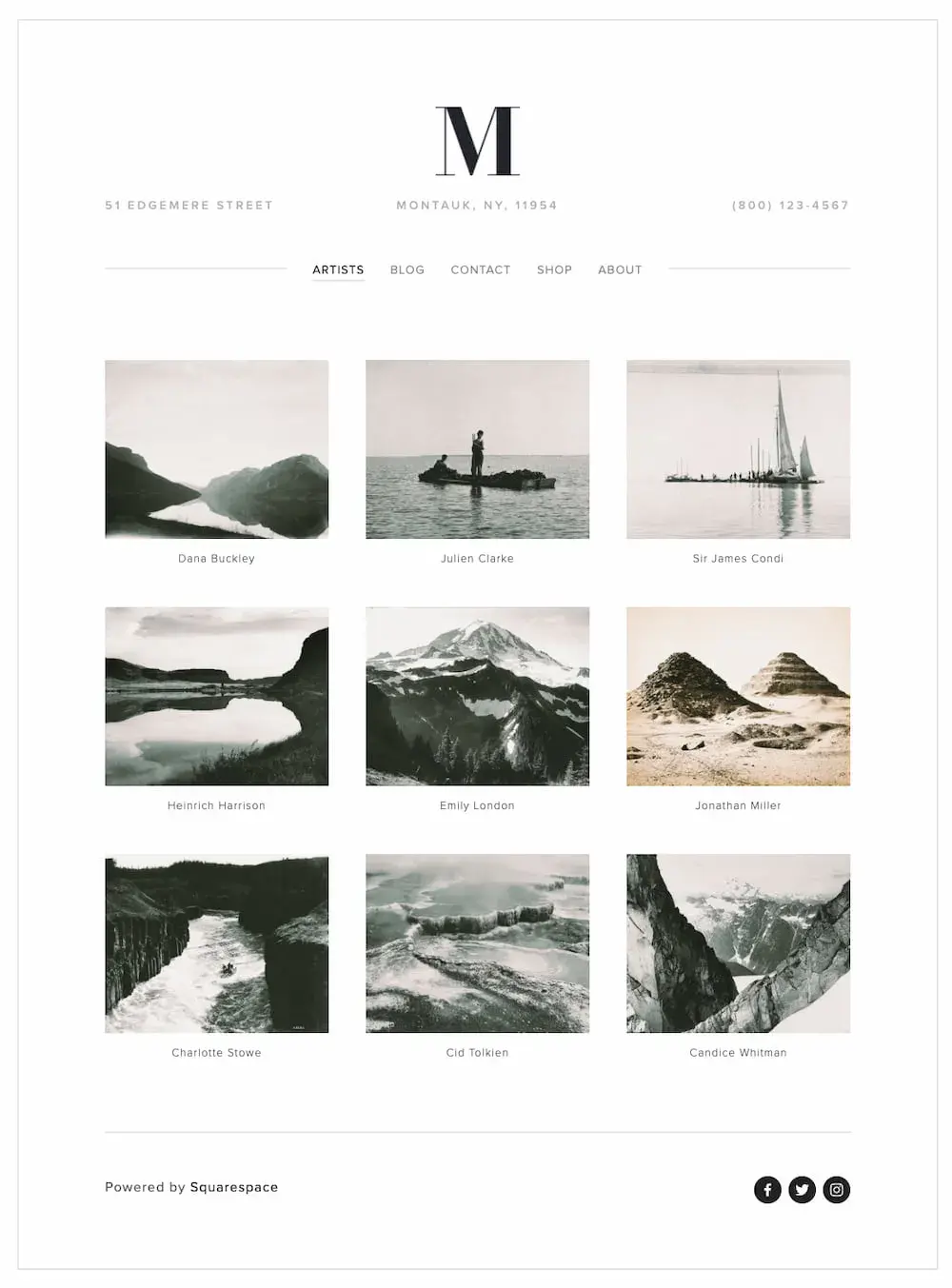
For example, for a blog post about Squarespace templates, web designer Paige Brunton browsed through about 100 photographer websites made on Squarespace and noted that the Montauk template is widely used — and under-customized — by photographers, so their sites looked very similar.
How to Fix This:
There are two potential fixes: You can heavily customize the template, or pick a less commonly-used template that’s still responsive, well-coded, and highly rated.
7. Disregarding the Rules of Good Design
Thanks to a meteoric rise in low-code and no-code development platforms, as well as pre-built templates, people with limited coding skills and even non-coders can create websites. However, while you can now create a website without coding, you can’t disregard the rules of good design.
Pre-built templates are professionally designed, but when users customize them, they can substantially alter the design. Customizing templates to fit your unique brand is essential, but website design guidelines like visual hierarchy, navigability, and consistency must be followed.
How to Fix This:
Luckily, it’s possible to learn design principles and best practices quickly. I suggest taking a look at our guide, 12 Guidelines & Best Practices for Exceptional Web Design and Usability, to get a more thorough understanding of what good design looks like.
Choose the best website template for your situation!
I’ve been where you are — staring at hundreds of website templates, trying to find the perfect one. It’s tough to do, but I hope that the tips in this post can help you choose a website template that will set you up for long-term success.
And here’s the great thing — you usually only have to make this choice once! So, push through the decision fatigue for now, and I promise it will all work out when you’re enjoying your beautiful, effective website.
Editor's note: This post was originally published in March 2022 and has been updated for comprehensiveness.
HubSpot's Free Website Builder
Create and customize your own business website with an easy drag-and-drop website builder.
- Build a website without any coding skills.
- Pre-built themes and templates.
- Built-in marketing tools and features.
- And more!


.jpg)