In this post, I‘ll share some website examples that leverage HTML to its fullest potential. We’ll also tackle the basics of HTML websites, learn how to build an HTML website, and explore some ideas for different types of websites you might want to create. By the end of this post, you’ll have a robust understanding of the best HTML page examples as you embark on your journey to craft your own.
Table of Contents
- Understanding the Basics of HTML Websites
- A Few Ideas for HTML Websites
- How to Make Your Own Simple HTML Website
- HTML Page Example
- Craft Your Perfect Website with HTML
Understanding the Basics of HTML Websites
HTML stands for Hypertext Markup Language and is the primary language of the World Wide Web (WWW). An HTML document sets the content and structure of a web page. When you view a page in your browser, what you see is your browser’s interpretation of an HTML file retrieved from a web server.
HTML and CSS
HTML is almost always used in conjunction with two other front-end languages: CSS and JavaScript. CSS (Cascading Style Sheets) is a language that controls the styling of a web page, including colors, fonts, and layouts. JavaScript is a programming language that enables more complex client-side features like interactive elements and animations.
HTML Versions
The most recent version of HTML is HTML5. Released in 2008, HTML5 notably contained several improvements to handle multimedia content like audio and video and semantically rich elements to describe page structure.
Going forward, there will be no more numbered versions for HTML. That means there will be no HTML6, and HTML5 is now called “HTML.” However, several improvements and enhancements have been released since HTML5 came out in 2008.
Getting Started with HTML
If you want to know more about HTML and how to write it, I recommend starting with our ultimate guide to HTML.
Because every website is written in HTML, regardless of the complexity of the site or the number of technologies involved, it’s a good idea to immerse yourself in it. And yes, this is true even if the website uses server-side languages like PHP (such as WordPress). With a tool like WordPress, the web server will process the PHP and query the site's database to generate the finished HTML document to deliver to visitors' browsers.
You can take any page and lift up the hood to see the HTML, CSS, and JavaScript code that brings it to life.
Later in this post, I’ll review some of the ways designers and developers harness HTML in their creative works.
A Few Ideas for HTML Websites
To get comfortable with HTML (along with CSS and JavaScript), it’s a good idea to create a website or two from scratch.
Even building a simple page can help you learn how HTML code for websites works and how it interacts with other frameworks, such as CSS and PHP.
Here are some ideas for beginner-friendly simple HTML projects you can create:
- A personal website. Create a personal site that shows off your resume, work experience, interests, skills, and personality. You can return to this project and revise over time as your skills develop.
- An informational site. Pick a topic you’re interested in, then code up a simple website that teaches visitors about it. You can play around with various technologies to enhance your storytelling — we'll share some examples below.
- A small business website or a non-profit website. You can volunteer to create a website for a small local business in your area. Or, you can help a non-profit and give it an online presence.
- A blog. While there are many great blogging platforms out there, consider making your own. A simple HTML website can work great for basic blogs.
- A portfolio. Want to show off your other creative works? Try building a portfolio, be it a photo gallery, a video showcase, or a collection of your writing. The best part? We even have a step-by-step guide for beginners on how to create a portfolio site with HTML.
To get started creating your first HTML site, I recommend following this excellent tutorial from freeCodeCamp:
As you get comfortable with HTML basics, you can branch out into bolder, more unique design choices.
Pro tip: Remember that even the most elaborate websites can often be boiled down to a handful of HTML features working together to make a cohesive experience.
HTML Website Examples
- Packabo
- Joshua’s World
- Ruby on Rails
- Understanding Neurodiversity
- Show Heroes
- Caffeine Post
- Dumpling Delivery
- Make Your Move (Adidas)
- Ayako Taniguchi
- Earth Eclipsed
- Pencilvania
- Sosai Mas Oyama
- DD.NYC
- La Guía de Cirugía Cardíaca
1. Packabo

What I like: When you first land on Packabo’s webpage, it looks technically complex. That’s the magic of web design — you can achieve most of the effects with plain HTML and CSS. While there are a few more complex design elements (for instance, the animated text and cursor, along with some moving images), the site’s appeal largely comes down to a clean look and a simple interface.
It’s worth digging into the page's source code if you’re curious. For example, when I checked out the code, I could see that Packabo used Webflow to build its site and some of the different HTML techniques that the site relies on.
Check out our guide to the “inspect element” tool to learn how you can do the same.
If you want to inspect the code of a website, Chrome offers great developer tools (like “inspect element”). However, most other browsers also offer developer tools.
Pro tip: If you need help choosing a color scheme for your site, here are a few I love.
2. Joshua's World
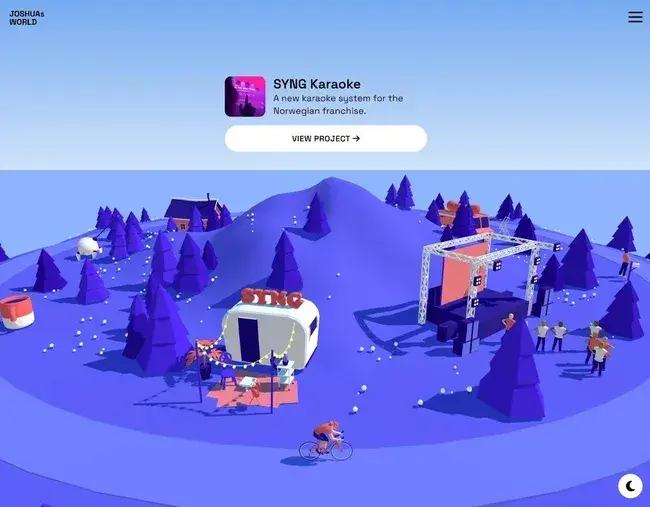
What I like: Joshua is an interactive designer who uses his interactive Joshua‘s World website to connect with potential clients. Visitors start on a simple welcome screen but can then enter the much more engaging Joshua’s World interface.
Visitors can then “ride” around the world on a bicycle while checking out Joshua‘s various projects and learning more about his experience. I think it’s much more engaging than a traditional portfolio that lists projects as thumbnails. And, given that Joshua is an interaction designer, I love how the design really shows off what he can do.
While most of the basic content on Joshua‘s website is powered by pure HTML, the interactive elements rely on JavaScript. Joshua also uses the Sanity content management system to help him manage his site’s content.
Overall, I think this is a great example of how you can use your website's concept to reinforce what your website is trying to achieve. Rather than just telling people about his skills as an interactive designer, Joshua shows people his skills.
Pro tip: Consider working with a web designer to create bespoke designs for your HTML site.
3. Ruby on Rails
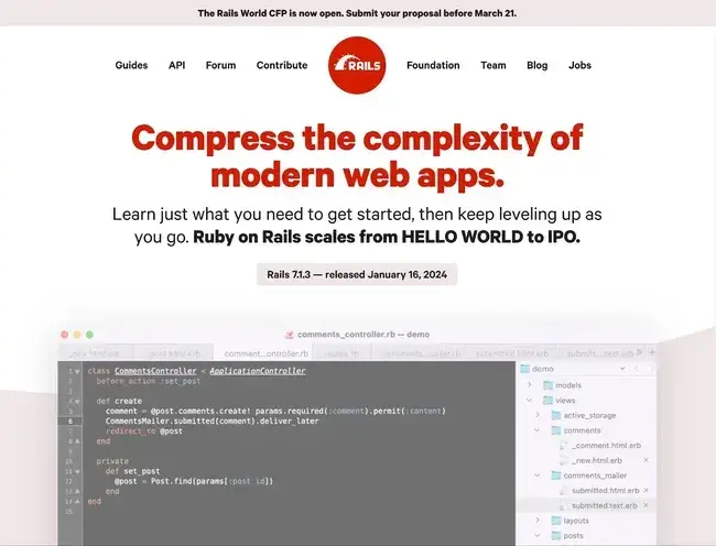
What I like: Ruby on Rails is a popular open-source development framework developers can use to build server-side web applications. The Ruby on Rails website does a great job of communicating that with a clean, modern design.
I especially like how the website is able to keep things interesting with its color and typography choices, rather than relying on more complex animations. The red headings give a pop of color, while the actual design is simple.
The entire site is HTML with CSS styling. None of the effects that you see require JavaScript. For example, the Ruby on Rails site creates interesting hover effects using basic CSS.
I think that it‘s a great reminder that you don’t need fancy CSS and JavaScript effects to build a great HTML website. Those elements can help in certain situations, especially with engagement and storytelling (as many of my other examples show). However, they are not a requirement to build an engaging website.
Pro tip: Make your website more engaging with thoughtful CSS animations. (Don’t worry — it’s not too tricky to learn!)
4. Understanding Neurodiversity

What I like: Project Lima is an inclusive design initiative that launched its Understanding Neurodiversity project to educate the public about neurodivergent individuals, how they operate in society, and some common social myths.
I recommend giving this experience a full watch if you have the time. It’s a touching blend of illustration, visual texture, music, sound effects, and meaningful storytelling to provide a better understanding of neurodiverse people.
In particular, the website’s use of scalable vector graphic (SVG) artwork is stunning and adds a visual framework for communicating the site’s information. Each screen transitions smoothly to the next with animated graphics. As far as online storytelling goes, I think this is as good as it gets.
Pro tip: Don’t forget that copy plays into the experience your users have on your site. This is something Understanding Neurodiversity does exceptionally well.
5. Show Heroes

What I like: The HTML5 video element was another major step in making HTML more robust and is now the standard for playing video on web pages.
Today, many websites employ this element for auto-playing videos, fullscreen videos, and video backgrounds. Take this great example from Intelligent Video Solutions — its homepage meets you with a full-width video background and overlays text, graphics, and a gradient to smoothly transition you down the page.
If you want to achieve a similar effect on your site, the HTML5 video element is the best way. I think that it’s a much cleaner alternative to, say, an embedded iframe from YouTube on your page.
Pro tip: For accessibility reasons, it’s a good idea to let users pause videos and also to let them choose whether or not the video plays sound.
6. Caffeine Post
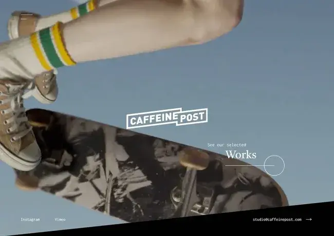
What I like: Caffeine Post is a post-production video studio that, as you might guess, also makes great use of the HTML video element. I love how the homepage immediately confronts you with a chaotic but immersive video montage of the company’s work and dares you to watch more.
The selected works page is a series of thumbnails, each itself a video element. You can hover your cursor over a thumbnail to watch it play in a loop and click on it to watch a longer video preview with sound. Plus, you can filter the works by category (commercial, film, etc.).
For such an impressive website, it might seem surprising that you can build many of its key features with just pure HTML. I think it just shows how far even simple web technologies have come over the past decade.
Pro tip: Don’t neglect the power that video can have in immersing your users in the world of your site. The best part is adding video to an HTML page example is easy.
7. Dumpling Delivery
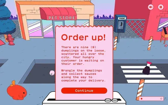
What I like: Microsites allow brands to experiment with new web design techniques while promoting a product. Mailchimp’s Dumpling Delivery website is a prime example of this: Visitors can play nine holes of virtual miniature golf in an attempt to deliver dumplings to hungry customers.
Just about the entire experience is built around HTML canvas, with some JavaScript magic happening in the background to make the game dynamics possible. Dumpling Delivery showcases the limits of what you can accomplish with HTML and JavaScript with some expert help.
The only thing that I don't like is that the website can take a little longer to load on slower connections. However, this is expected, given how much interactivity is going on with the site.
Pro tip: Love this site? I do, too. For more inspiration, take a look at some of our favorite interactive websites.
8. Make Your Move (Adidas)
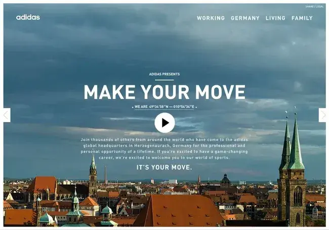
What I like: Adidas made this microsite to promote the company’s global World of Sports headquarters in Herzogenaurach, Germany. I like how it leverages video and crisp images to help you experience the space from every angle.
The website does a good job of putting visitors on a pretty defined path for the whole experience, starting with a video (displayed with the HTML5 video element) and following up with an image slideshow to highlight the best parts of working for the company.
I also like that there's no scrolling down — everything happens with side-to-side movement, which I noticed creates a linear feel to the storytelling experience.
Pro tip: Sometimes, a larger site doesn’t necessarily mean a better one. This is a great example of how using an HTML microsite can help tell a structured, digestible story about your brand.
9. Ayako Taniguchi

What I like: As we saw with the Understanding Neurodiversity website, music can add a layer of emotional depth to any browsing experience. Let’s now turn to another example in which music is the focus: The website for composer Ayako Taniguchi.
The HTML5 audio element allows websites to embed music and other sounds into web pages. You can also set audio to play on a loop and provide controls for users to control the playback of the sounds, as is the case with this site.
Each music sample is visualized with an interactive canvas background. The canvas was configured to react to both the music and cursor movements, which I think gives the music more of an emotional impact than a simple pause or play button.
It‘s a great example of how you can combine visual and audio effects to create or enhance a certain “feeling” in your website’s visitors.
Pro tip: I love how the music automatically pauses if a user opens another window, which I think reinforces how interactivity is an integral part of the experience.
10. Earth Eclipsed
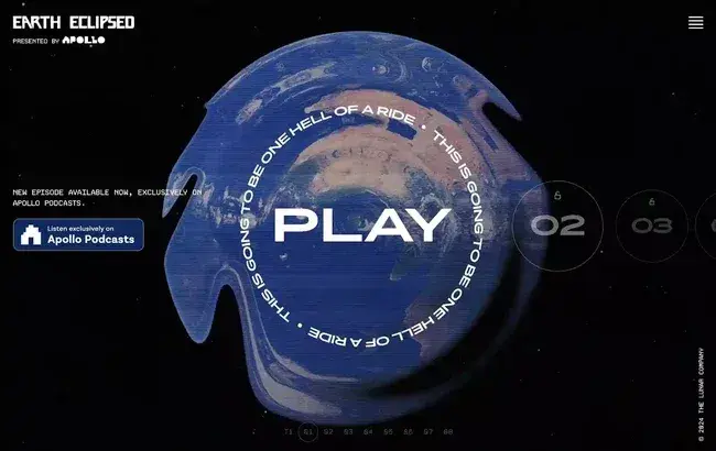
What I like: Here is another shining example of the HTML audio element in action: Earth Eclipsed is an award-winning science fiction podcast with an award-winning website — both were designed to transport you to a different place.
I think this site's main highlight is its unique player interface. The progress bar is laid out in a circle, and the time is displayed as a countdown over a looping video background of a rippling globe. This creates an extraterrestrial atmosphere to accompany the audio.
The website also incorporates many engaging scroll and video effects, including a fun video of all the Earth Eclipsed team members clapping.
Pro tip: Combining audio and video can give your site a competitive edge in a space saturated by so many engaging websites.
11. Pencilvania
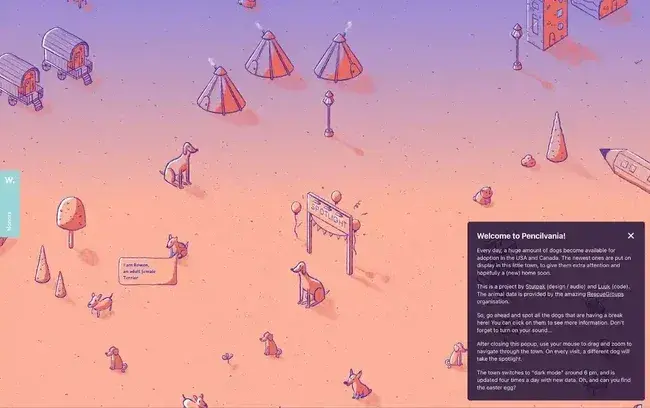
What I like: Pencilvania is a digital project that shows you the latest dogs that have been put up for adoption in the U.S. and Canada.
The entire site is a draggable canvas that updates daily with new data and will hopefully encourage a visitor or two to adopt it. I like how it also includes engaging audio effects, with a cute dog bark sound when visitors select one of the new arrivals.
In my opinion, this unique concept plays a big role in why the Pencilvania website received an Honorable Mention at Awwwards.
I think that you can easily translate this simple concept to other kinds of websites. You could have visitors explore your own virtual town, look for treasures, or feature different “landmarks” on your canvas that link out to other pages on your site or to your different projects. In my opinion, the Joshua's World website from above is another great example of these tactics.
Pro tip: If you want your site to shine, offer users something they haven’t seen or experienced before. Yes, you can do this with simple HTML — the concept matters most!
12. Sosai Mas Oyama
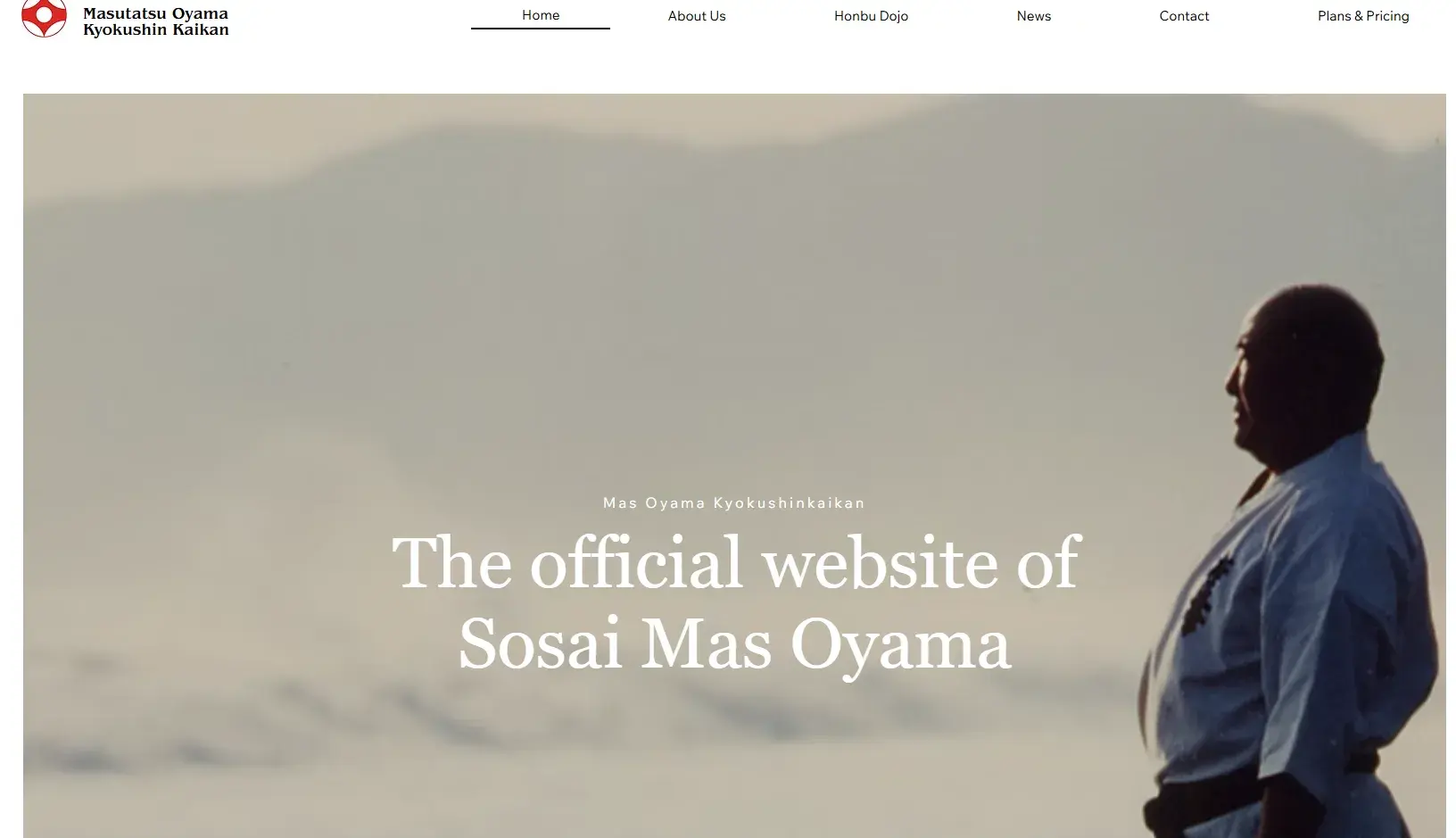
What I like: This website for this martial arts dojo displays mastery in controlling each design element to create an atmosphere. The designers have achieved harmony between each element by employing web textures, color gradients, parallax scrolling effects, and a fascinating full-screen background animation on the homepage.
I think that this site is also notable for its in-depth storytelling, detailing the history of the full-contact martial art of Kyokushin Karate and its founder, Sosai Mas Oyama. Of course, you don’t need programming experience to know how to tell a great story. But, when combined, they make for a powerful website.
Again, I think that this is a great example of how you can use HTML elements to enhance your website's storytelling and connect with visitors.
Pro tip: The eye-catching branding especially stands out on this website. This demonstrates how critical it is to have branding that feels intuitive to your brand.
13. DD.NYC
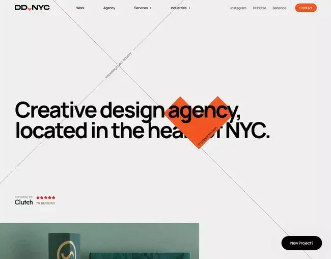
What I like: DD.NYC is a creative design agency located in New York City, hence the name. True to its creative agency roots, the DD.NYC website uses lots of interesting animations and scroll effects to create a more engaging experience for visitors.
For example, I love how the cross lines and “innovating your industry” text follow the user's cursor. It creates an interesting effect but without being annoying, like some other cursor effects can be.
The DD.NYC also has a certain “Easter egg”-type feature, where you can trigger a special dark mode by clicking the boxy heart icon with the text “Don't press this heart.” It also uses this interesting clickable button design in other site areas, such as the “Send” button for the DD.NYC contact form.
Pro tip: This offers an excellent example of how you can use small effects and Easter eggs to create a more engaging web experience for your visitors.
14. La Guía de Cirugía Cardíaca
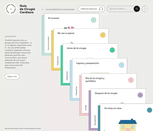
What I like: I wanted to end with an example that’s truly unique. La Guía de Cirugía Cardíaca is a Spanish-language website that teaches patients and their loved ones about heart operations. The goal is to guide the visitor through the process and alleviate any concerns they may have.
The site presents a lot of its information on animated cards, which are created with SVG files controlled with JavaScript. I think that the site does an excellent job of presenting these cards logically, from when a patient first receives their diagnosis to when they return home after treatment.
Pro tip: I love how the website uses some interesting scroll effects and cursor effects to keep visitors engaged once they scroll past the cards. Further down the page, it also includes playable audio episodes for visitors who prefer an auditory experience, which is another great example of the HTML audio element.
How to Make Your Own Simple HTML Website
If you've made it this far, you might be wondering how you can create your own HTML website, like some of the examples above.
While more advanced HTML page example options require a more in-depth mastery of HTML, CSS, and JavaScript, you still have options to build an engaging website, even if you're just getting started with learning these technologies.
Here are two routes that you can use to make your first HTML site:
Static HTML Website Generator
If you don‘t want to write all of your site’s HTML code from scratch, there are lots of static HTML website generator tools that you can use to create a basic HTML site.
If you’re not totally comfortable working with code, I think that the easiest option for most people is to use WordPress and a static site generator plugin like Simply Static.
You can build your website with WordPress, including using WordPress themes to control the design of your site. You'll also still be able to use a lot of WordPress plugins (though some plugins won't work as a static HTML site). Then, you can export your finished website as a static HTML site using the Simply Static plugin.
All you need to do is upload those HTML files to a static web host like Cloudflare Pages or Netlify, and you will have a simple HTML website that people can access from anywhere in the world.
If you don't want to use WordPress, there are also lots of other static HTML site generator tools with varying levels of complexity — here are some of my favorites:
- Webflow (like WordPress, it gives you an option to export your site as a static HTML site)
- Jekyll
- Hugo
- Gridsome
- Eleventy
- Pelican
Code From Scratch (or Use a Simple HTML Website Template)
If you feel comfortable working with HTML, CSS, and JavaScript for your entire site, you can also code your website from scratch.
Building a simple HTML website using HTML and CSS is a great way to teach yourself these fundamental web development languages.
You can use HTML code editors like Sublime Text or Atom to build your website on your local computer. Then, you just need to upload your site's static files to your favorite static website hosting service to make it live.
To help you save time, you can use a simple HTML website template or library. For example, I think the popular Bootstrap library makes it a lot easier to build a great-looking website, as it offers tons of pre-built components. This can save you from having to write every single line of HTML, CSS, and JavaScript from scratch.
I recommend checking out our guide to Bootstrap if you're interested. We also have posts on Bootstrap Buttons, building Bootstrap web forms, and overriding Bootstrap CSS when needed.
HTML Page Example
Using HTML codes for websites doesn't have to be complex — and by taking a look at some HTML page examples, you can see that for yourself.
Here‘s an HTML page example I love that demonstrates getting started isn’t as tricky as you think it will be.
See the Pen HTML page example by HubSpot (@hubspot) on CodePen.
On Codepen, I created an example of how you can get started building an HTML page. As you can see, it's rather intuitive.
Craft Your Perfect Website with HTML
Websites are everywhere. From mobile phones to laptops and desktops, we’re continually accessing, interacting, and engaging with websites.
As a result, it’s easy to forget what goes into building a great website. Spoiler alert: It’s HTML. If you’ve ever seen a great site and thought to yourself, “I wish I could build something like that,” or struggled to use a poorly-designed site and thought, “I bet I could do better” — you’re right.
Start with some HTML basics, build a few simple sites, and you’re well on your way to designing a website that engages visitors and keeps them coming back.
Editor's note: This post was originally published in May 2022 and has been updated for comprehensiveness.
Html





-2.webp)


![How to Embed Google Map in HTML [Step-By-Step Guide]](https://53.fs1.hubspotusercontent-na1.net/hubfs/53/Google%20Drive%20Integration/How%20to%20Embed%20Google%20Map%20in%20HTML%20%5BStep-By-Step%20Guide%5D-2.jpeg)
