Remember: Your website is your digital identity. Coding can help you build a presence that’s in line with your brand and showcases your mission. Keep your goal in mind as you work through the website coding process. Now, let's get into it.
Table of Contents
- What You Need to Know Before Coding a Website
- How to Code a Website
- Use practice projects to build your skills.
- Next Steps in Building Your Website
- Frequently Asked Questions About Coding a Website
- Get started with website coding today.
What You Need to Know Before Coding a Website
Before diving into website coding, let’s zoom out and look at an overview of what you're getting into. The good news is you don’t need a computer science degree or years of experience. The prerequisites are simpler than most people expect: just basic computer literacy, a willingness to learn, and a few free tools.
So, what coding does a website use? At a minimum, you'll work with three core languages:
- HTML for structure
- CSS for styling
- JavaScript for interactivity
These three are the foundation of virtually every website you visit. Once you're comfortable with the basics, you can expand into other languages depending on what you want to build.
HubSpot's Free Website Builder
Create and customize your own business website with an easy drag-and-drop website builder.
- Build a website without any coding skills.
- Pre-built themes and templates.
- Built-in marketing tools and features.
- And more!
Required Tools and Software for Coding a Website
One of the best things about learning to code is that you can get started with completely free tools. Here's what you’ll need:
- A code editor. This is where you'll write your HTML, CSS, and JavaScript. I recommend Visual Studio Code (VS Code) because it's free, beginner-friendly, and packed with helpful features like syntax highlighting, auto-completion, and error detection.
- A modern web browser. You'll use this to preview your work and debug issues. I recommend Google Chrome because its built-in developer tools make it easy to inspect elements, test responsiveness, and troubleshoot problems. Firefox and Edge also have developer tools.
- Basic computer skills. You should be comfortable creating folders, saving files, and navigating your file system.
Pro tip: You don't need to pay for anything to start coding. Your code editor, browser, and learning resources can all be free. Save your budget for hosting and a domain name once you’re ready to publish.
Time Investment
Is website coding easy? It depends on how deep you want to go, but the fundamentals are genuinely accessible for most people willing to put in consistent effort.
Here's a realistic timeline for learning each core technology:
- HTML (1–2 weeks). HTML is the most approachable starting point. You can learn the basic tags and document structure in a few days of focused practice and become comfortable building simple page layouts within a week or two. I like Codecademy’s free HTML course, which takes about seven hours to complete.
- CSS (2–4 weeks). CSS has more nuance than HTML because you're making design decisions — colors, spacing, typography, and layout. Expect a few weeks to get comfortable with the basics, and longer to master responsive design and more advanced techniques like Flexbox and Grid. Codecademy also has a free CSS course, which takes about six hours to complete.
- JavaScript (1–3 months). JavaScript is a full programming language, so it has a steeper learning curve than HTML or CSS. You can add simple interactivity (like button clicks or form validation) within a few weeks, but building more complex features takes longer. Budget at least a few months if you want to feel confident.
These timelines assume you're dedicating a few hours per week. If you can commit more time, you’ll progress faster. If you're learning casually, expect it to take longer — and that’s completely fine.
Web Development Languages Overview
Websites rely on a combination of languages, each serving a distinct purpose. Here's how the core technologies work together:
- HTML (HyperText Markup Language) defines the structure and content of your webpages. It tells the browser what elements to display — headings, paragraphs, images, links, and so on.
- CSS (Cascading Style Sheets) controls the visual presentation. It determines how HTML elements look: colors, fonts, spacing, layout, and responsiveness across different screen sizes.
- JavaScript adds interactivity and dynamic behavior. It's what makes buttons respond to clicks, forms validate input, and content update without reloading the page. While HTML and CSS are markup and styling languages, JavaScript is a full programming language.
These three languages are enough to build a complete, functional website. However, as you advance, you may want to learn additional technologies:
- Backend languages like Python, PHP, Ruby, or Node.js (JavaScript on the server) handle server-side logic, databases, and user authentication.
- SQL is used to interact with databases where your website stores and retrieves data.
- Frameworks and libraries like React, Vue, or Next.js help you build more complex front-end applications more efficiently.
For now, focus on HTML, CSS, and JavaScript. They're the foundation.
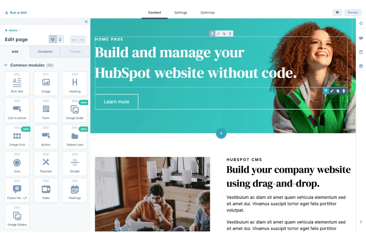
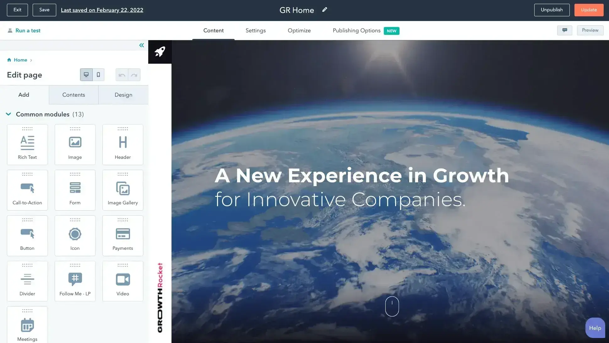
Website Builders: The Quick and User-Friendly Route
There is another way to build a website. Website builders are tools that let users create a website without needing to write a single line of code. They mostly involve drag-and-drop functionality and using pre-designed templates. I find that this process requires little to no technical expertise.
CMS platforms like HubSpot's Content Hub offer user-friendly interfaces, which are great for beginners. Many CMS platforms offer drag-and-drop capabilities so that you can easily position elements (e.g., a button) where you want them on the page.
While technical knowledge isn't a must, understanding the basics of HTML and CSS can be incredibly empowering and offer more customization options. If I’m using a website builder, I may want to add extra functionalities. I can then access the source code and make changes to add those extra features.
Start building your website with HubSpot's Content Hub.
Website Builders vs. Coding From Scratch
Here is a table summarizing the major differences between website builders and coding a website from scratch.
|
ASPECT |
WEBSITE BUILDERS |
CODING FROM SCRATCH |
|
Ease of Use |
Beginner-friendly; no coding skills required. |
Requires knowledge of HTML, CSS, and JavaScript. |
|
Customization |
Limited to pre-designed templates and drag-and-drop features. |
Full control over design, layout, and functionality. |
|
Learning Curve |
Minimal; ideal for beginners or non-technical users. |
Steeper; requires time to learn coding and web development principles. |
|
Time to Build |
Fast; websites can be built in hours or even minutes. |
Slower; building a website from scratch takes more time and effort. |
|
Technical expertise |
No technical expertise is needed. |
Requires technical knowledge and problem-solving skills. |
If you're in a hurry or not keen on diving into code, check out our list of the best free website builders. They're a great starting point.
However, if you're up for a challenge and want to craft a site that’s truly your own, then coding is the way to go. If you’re ready to learn some code, let’s walk through this process together.
HubSpot's Free Website Builder
Create and customize your own business website with an easy drag-and-drop website builder.
- Build a website without any coding skills.
- Pre-built themes and templates.
- Built-in marketing tools and features.
- And more!
How to Code a Website
In this section, I'll walk you through building a simple landing page from scratch using HTML, CSS, and JavaScript. You’ll learn how to:
- Structure content
- Add custom styling
- Make your design responsive
- Add basic interactivity
These fundamentals apply to virtually any web project, so even if your end goal is something more complex, this lays a solid foundation.
1. Define your website's purpose and goals.
Defining my website's purpose and goals is the first and crucial step I take when coding a website. In this step, I think about the kind of website I’m building and what visitors would expect from the experience. For example, a blog would look very different than a professional portfolio website.
This step helps me plan the website's structure. I can consider what features I would need to create a remarkable user experience.
Pro tip: I recommend writing down your audience personas. What demographics are more likely to visit your site? How tech-savvy are they? What key features will they need to take action on (e.g., contact forms, CTAs, important emails)?
2. Choose the right tools.
After I know my purpose, I can pinpoint the tools I need to make my site come to life. At this point, I would decide whether to code from scratch or use a website builder. If a project requires little customization or if the site admins have little coding experience, I’ll opt for a builder.
When I first started as a new developer, picking tools such as a code editor felt like navigating a maze. It's like finding that perfect pair of running shoes — the right fit makes the run smoother.
I remember the satisfaction when I found Visual Studio Code. It offers syntax suggestions so you can avoid simple typos that cause errors. On top of that, Visual Studio Code autocompletes closing tags for HTML and adds visual markers to your files so that you can easily tell different pieces of code apart.
Below, I highlighted the difference between a regular text editor and a code editor. The code works the same in both documents, but one is much easier to understand at a glance than the other.
You also need to pick the right web browser. I advise web developers to use Google Chrome because of its powerful developer tools that make inspecting and debugging code very easy. But the choice is yours.
3. Learn the basics of HTML, CSS, and JavaScript.
In learning how to code a website, you must learn the fundamental technologies.
- HTML: For structure (e.g., headings, paragraphs).
- CSS: For styling (e.g., colors, fonts).
- JavaScript: For interactivity (e.g., buttons, animations).
These languages are the building blocks of every website, and learning them can be very beneficial in the long run. That’s especially true if you are like me and have a passion for building websites.
However, these are not the only languages that you can use to code a website. Other common languages for frontend and backend web development include PHP, Python, Ruby, C#, and others.
As you upgrade your knowledge, you might want to start learning some of these other languages. But in the beginning, I recommend just using HTML, CSS, and JavaScript because they're the most common ways to code a website.
HubSpot’s Website blog has a number of useful resources that can help you level up your coding game.
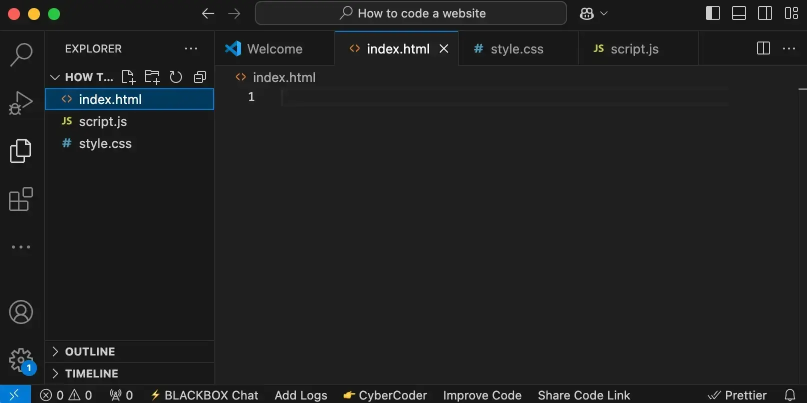
4. Set up your project folder.
Setting up a project folder for a simple website isn't so complicated. We start by creating a folder on our computer and opening it with our code editor.
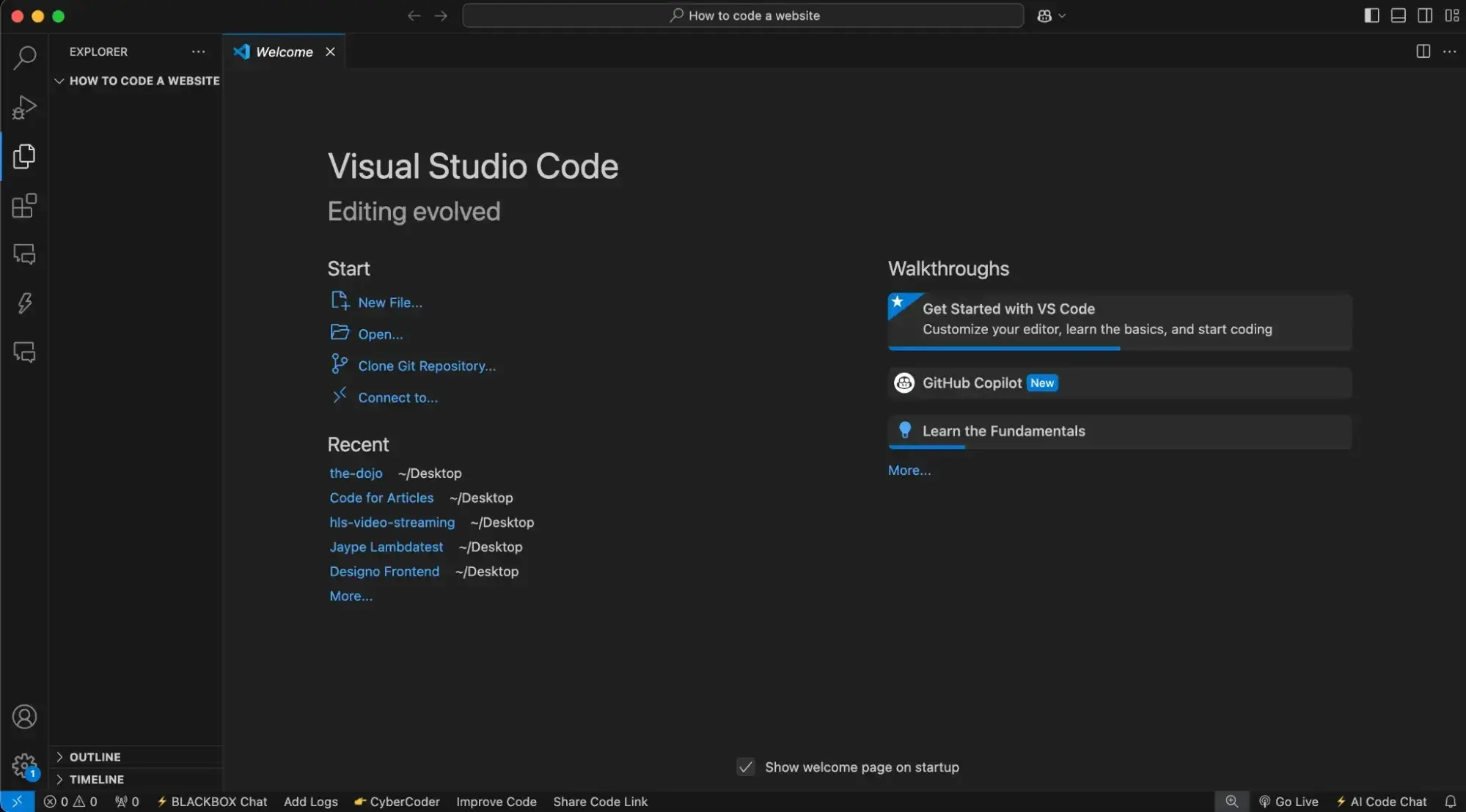
Next, we create files for the three core technologies:
- HTML File: Click the “New File” button and name it index.html. Remember, “.html” is the key here. It's like telling your browser, “Hey, I’m a webpage!”
- CSS File: Create another file and name it style.css. I usually call mine “style.css,” but feel free to name it whatever you like. The important part is the “.css” extension.
- JavaScript File: Add a third file and name it script.js. Also, feel free to name this whatever you want, but the “.js” part is a constant.
These files will serve as the foundation for our website, allowing us to organize your code efficiently.
5. Build the structure with HTML.
Now that we have the right tool for the job and understand our goal, it’s time to dive into the reason you’re here: coding.
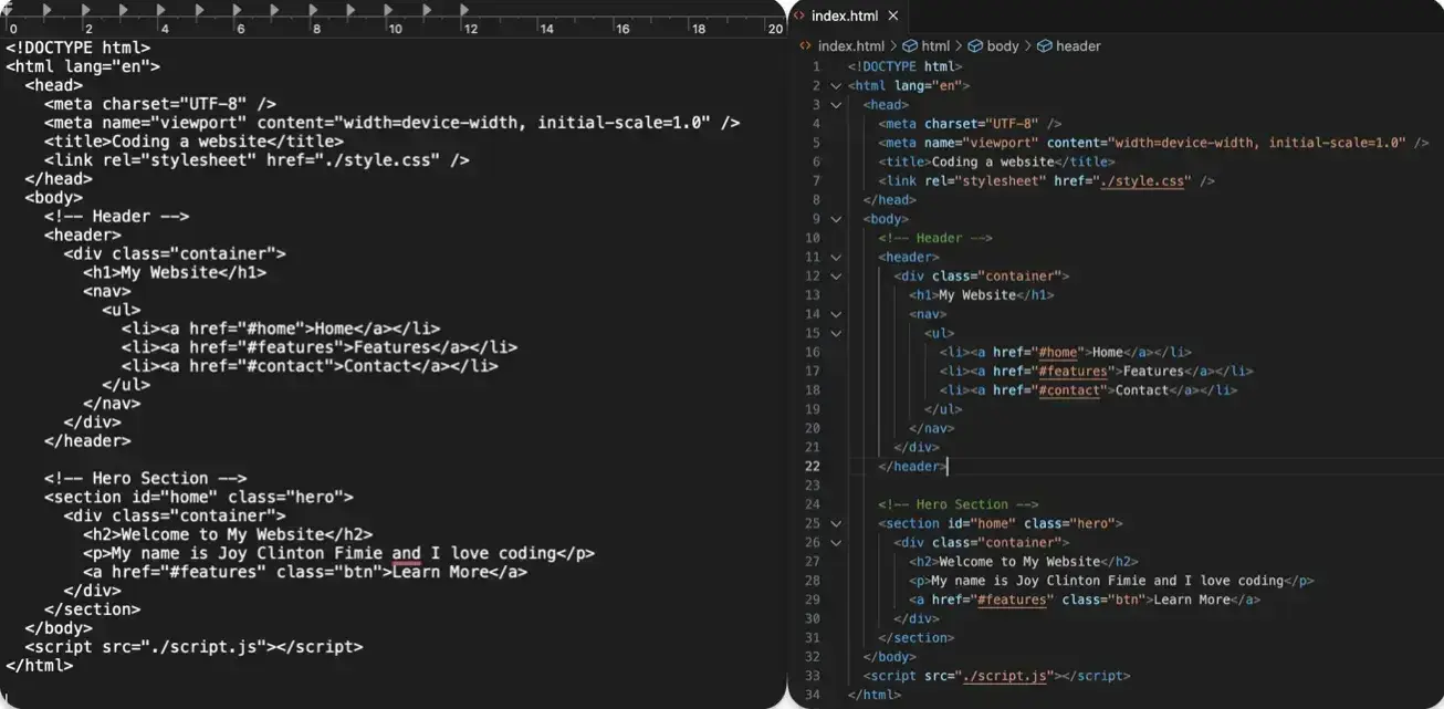
To get started, let's type the exclamation mark (!) in your HTML file and hit Enter. We get this boilerplate of code that gives us a solid foundation to build on.
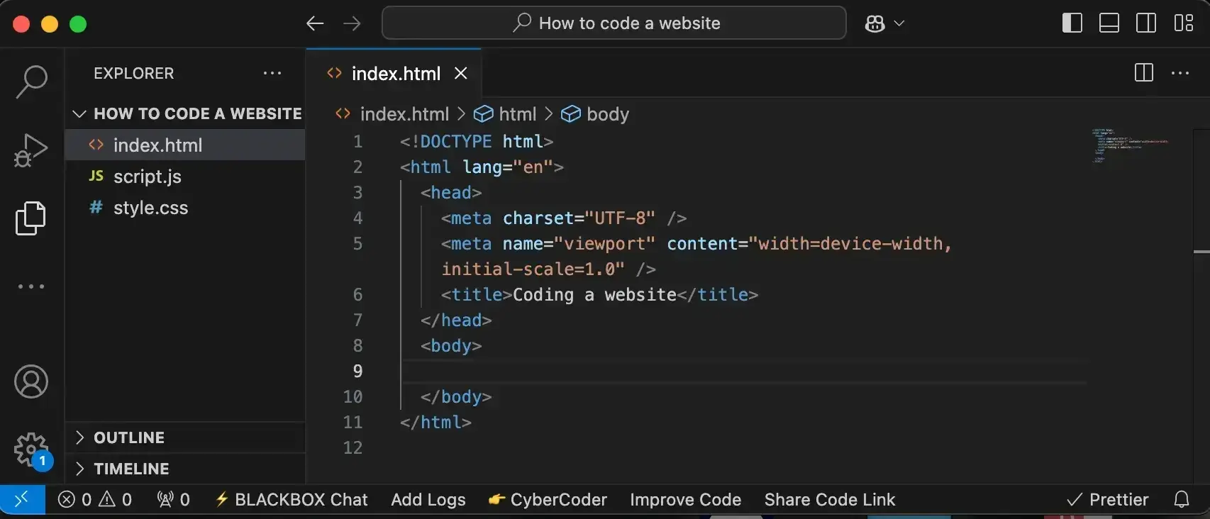
Let's review each of these pieces briefly:
- <!DOCTYPE html>: This is a declaration to the browser that this is an HTML document type that will tell it how to process our code.
- <html lang=“en”>: This opening tag wraps all of our HTML so the browser knows where our code starts and where it ends (note the closing </html> tag).
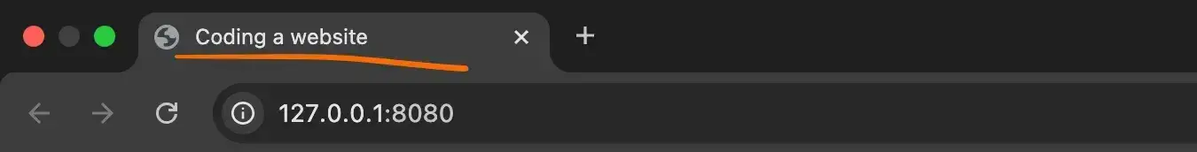
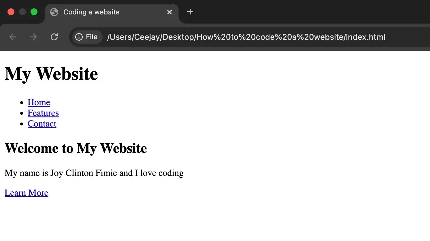
- <head>: This section doesn't show up directly on the webpage but holds important info like our page title, also known as our metadata. From the image below, you can see the title is “Coding a website.” We can set the title to whatever you wish.
- <body>: This is where all our content lives. We'll add elements to this next.
Pro tip: If you're not as familiar with HTML syntax, I recommend that you explore our HTML guide as a way to brush up on your skills before continuing.
Add content to your body.
Time to add some personality! I've gone ahead and added content to our webpage so we have something to look at. You can see the updated HTML under the <body> on the left and what the user will see on the right.
See the Pen How to Code Website Example: Basic HTML Doc by HubSpot (@hubspot) on CodePen.
Pro tip: The order of the attributes inside our HTML tag does not matter as long as they are all inside the tag.
HubSpot's Free Website Builder
Create and customize your own business website with an easy drag-and-drop website builder.
- Build a website without any coding skills.
- Pre-built themes and templates.
- Built-in marketing tools and features.
- And more!
Check your work
The moment of truth: If you’ve made it this far, you’re probably excited to see our hard work on the big screen (aka web browser). The simplest way to do this is to return to our File Explorer and right-click our HTML file:
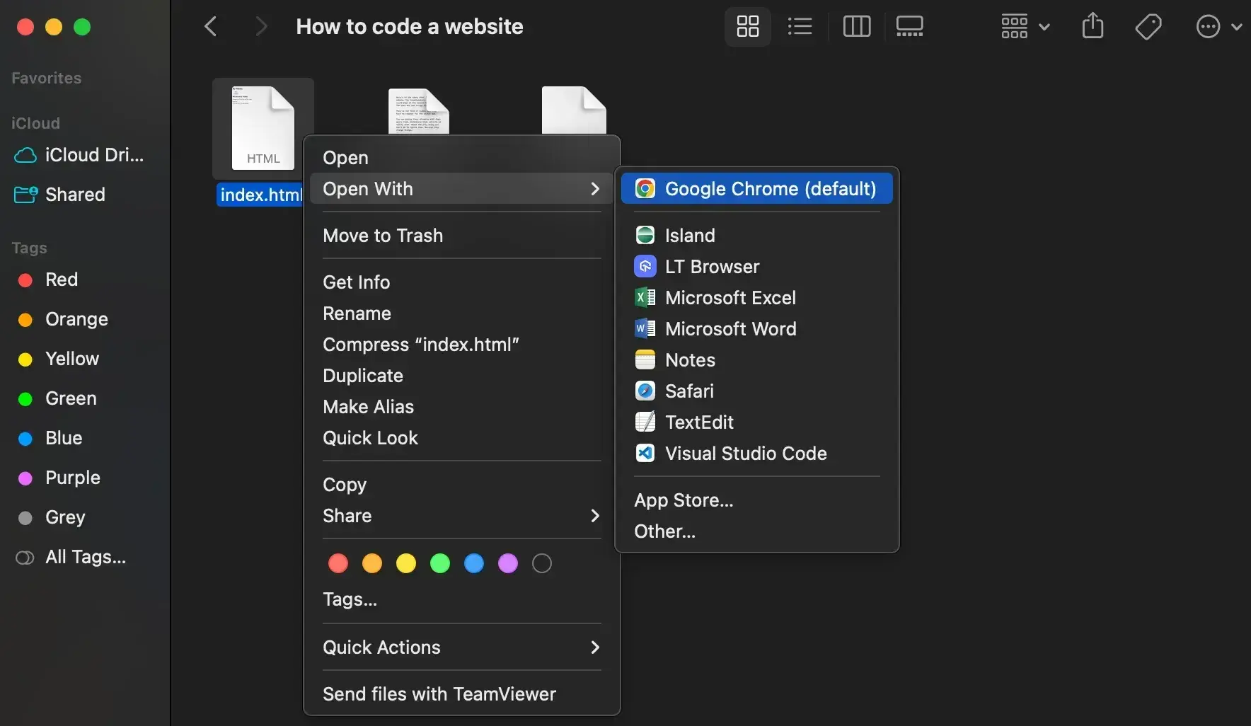
Once we've selected our web browser of choice, we should see our HTML file displaying like it’s a live webpage. Don't worry; only we can see it for now.
Pro tip: If you make additional changes, you will need to save your file and then refresh the page to see them take effect in the browser. This will be more relevant when I review how to change the aesthetics of our page in the next section.
If you prefer visual learning, watch this great explainer on creating a basic HTML website.
6. Style the website with CSS.
Now, let’s give our website its unique style with CSS. Imagine our HTML as a house’s structure; CSS is what turns this structure into a home with color and personality.
Pro tip: If you're unfamiliar with CSS, our CSS guide can help you learn the finer points of properties, syntax, selectors, and specificity.
Adding CSS Rules
Below is the CodePen of our website with the CSS rule added:
See the Pen How to Code Website Example: More CSS Rules by HubSpot (@hubspot) on CodePen.
To make our CSS styles apply to our HTML, we need to link them. This is done with a simple but crucial line in our HTML file’s <head> section. Here’s how it’s done:
<link rel=“stylesheet” href=“style.css”>
Once linked, our webpage will start to reflect the styles we defined in our CSS file. I like to think of it like coloring in a black-and-white drawing.
So, let’s work through an example. I remember the first rule I ever wrote was to change the text color. It felt like a magic wand.
Here’s an example: This rule targets all paragraph elements (<p>) in your HTML and turns their text color red. It’s amazing how a bit of color can transform a page.
p { color: red; }
Pro tip: Remember, for any specific styles you want to apply using classes or IDs in your CSS, you'll need to add those classes or IDs to the corresponding elements in your HTML.
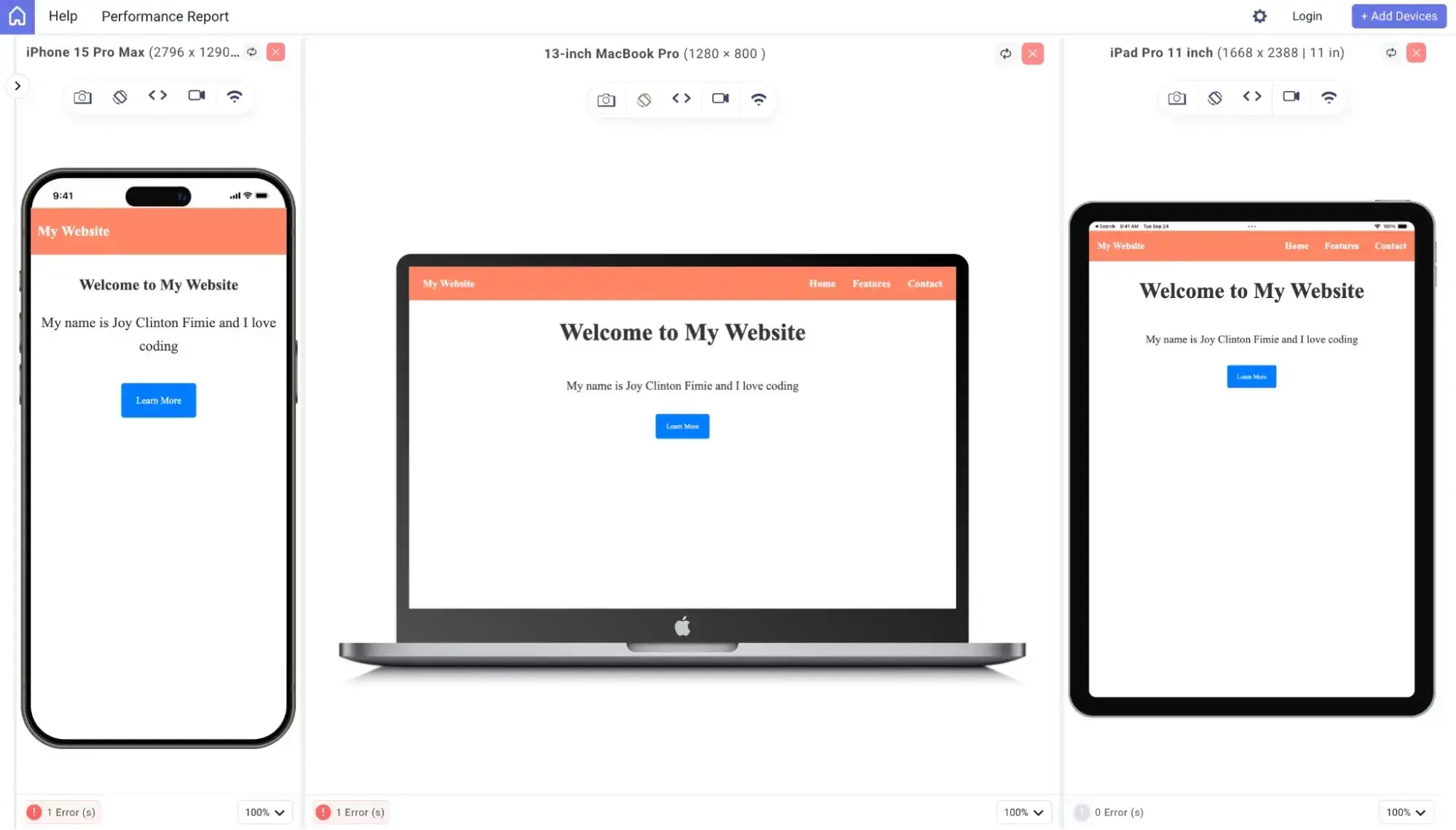
7. Make your website responsive.
To understand web responsiveness, we will turn once again to a metaphor. On one hand, we have a pond. The water inside the pond is always the same shape because the edges of the pond never change. On the other hand, we have a stream. The edges of the stream are always changing as it flows, and the water is always expanding and narrowing to fit that shape.
I like to think of static and responsive websites in the same way. The static website does not react to a change in the browser's size. Its contents will always be the same shape. Meanwhile, the responsive website constantly adapts to different browsers and screen sizes.
Until now, we have created a static website. The text elements will resize by default, but other elements will keep their original shape and size no matter how the display changes.
Meta Viewport Tag
Why does responsiveness matter? The first time I viewed my site on a phone and had to zoom in to read anything, I knew something had to change. That's when I learned about the <meta name=“viewport” content=“width=device-width, initial-scale=1”> tag.
Add this tag to your HTML's <head>. It ensures that your site scales correctly on any device.
Media Queries
Media queries are one way to add responsiveness to my site using custom CSS styles. They are applied using the @media at-rule.
Here is the syntax for adding a media query:
@media (max-width: 480px) { }
With this syntax, I can specify the condition under which my media queries will be applied. The condition is defined inside the parentheses. In this case, the styles will be executed only if the screen width is 480 pixels or smaller.
Let’s add some media queries to make our site responsive.
See the Pen How to Code Website Example: Media queries added by HubSpot (@hubspot) on CodePen.
Using the @media rule, I applied a different style that will be executed when the screen width is 768px or less (for tablets), and also another set of styles for when the screen is 480 pixels or smaller (for mobile devices). This is to ensure we have a uniform design that is not distorted on different devices.
Fluid Design
Media queries work best if we want to keep our elements at fixed widths. An alternative approach is fluid design.
Fluid design means using relative units like percentages instead of fixed pixels. It’s like making sure your picture takes up 50% of the screen, no matter how big or small that screen is. This approach saves you from writing multiple media queries. It’s all about making your website flow like water, fitting into whatever space it's given.
HubSpot's Free Website Builder
Create and customize your own business website with an easy drag-and-drop website builder.
- Build a website without any coding skills.
- Pre-built themes and templates.
- Built-in marketing tools and features.
- And more!
8. Add interactivity with JavaScript.
JavaScript adds interactivity and dynamic behavior to your website, making it more engaging for users. Unlike HTML and CSS, which are in charge of structure and design, JavaScript is a programming language, and it adds functionality to your website. Features like dropdown menus, image sliders, or form validation are all controlled by programming language (JavaScript).
Unfortunately, it is outside of the scope of this lesson to dive deep into the syntax and mechanics of JavaScript. Instead, I will provide a pre-written program so that we can focus on implementing it within our website.
Adding JavaScript
Below is the CodePen of our website with the JavaScript added:
See the Pen How to Code Website Example: JavaScript added by HubSpot (@hubspot) on CodePen.
In our HTML, we laid out the structure for a button, which we labeled “Learn More.” With JavaScript, we add functionality to that button.
First, we select the button with the class btn using document.querySelector(“.btn”) and store it in the variable learnMoreBtn. Then we add a click event listener to the button, so when the button is clicked, two things happen:
- The default behavior (like jumping to another section of the page) is prevented using event.preventDefault()
- An alert pops up with the message, “Thanks for your interest! We’ll show you more about us.”
Remember, the three fundamental files are independent and will only work together when they are linked. For our JavaScript code to actually work, we need to link it to our HTML file. To do this, we add this line of code just before the closing </body> tag:
<script src=“./script.js”></script>
And with that, our JavaScript should work perfectly.
9. Publish your website.
Once you’ve finished coding your website, the last step is to upload your files to a hosting service so that people can visit your website. While you can open your website’s files in your web browser, other people won't be able to access your website until you upload it to a website hosting service.
If you followed this guide, you created what's known as a static HTML website, which means you can use pretty much any hosting service. Personally, I recommend using Cloudflare Pages or Netlify to launch your project, which will let you achieve fast global performance with an entirely free hosting service.
In addition to that, you'll need a domain name for your website. If you use Cloudflare Pages, you can also purchase your domain name from Cloudflare Registrar. This is my personal approach because Cloudflare Registrar offers the absolute cheapest prices for domain names (and is also just generally a quality service). There are lots of other quality domain registrars that you can use, though.
Once you upload your website's files to the host and point your domain name to those files, you'll have a working website that you coded from scratch.
Use practice projects to build your skills.
You’re just getting warmed up. To hone your website coding skills, you need to keep practicing. Below, I’ve curated some HTML/CSS projects for beginners to practice their skills. If you like what you see, you can get these projects and 22 more in this free HTML/CSS tutorial ebook.
Project 1: Simple Blog Post Layout
Estimated completion time: 15-20 minutes
Let's start with the basics. In this beginner project, you’ll use pure HTML to code a basic blog post layout. Blogs are popular, and completing this project will help you understand the building blocks for a larger blog later on. The output will be a basic blog post with a title, author, date, body section, block quote, and image. Be sure to use a URL for a placeholder image for the “img” tag; otherwise, it’ll render as a broken image.
See the Pen Simple Blog Post Layout by HubSpot (@hubspot) on CodePen.
Project 2: Personal Profile Card
Estimated completion time: 20-25 minutes
Next, you'll create a personal profile card using HTML and a little bit of inline CSS to center the card on the page. The result will have a profile picture (use an image URL, even if it’s just a placeholder), your name, a short bio, and a few hobbies or skills — all center aligned.
See the Pen Untitled by HubSpot (@hubspot) on CodePen.
Project 3: Portfolio Page
Estimated completion time: 25-30 minutes
Alright, let’s throw in a little color to practice some more CSS skills. Every beginner developer and creative needs a portfolio to showcase their work. And lucky for you, portfolio sites are among the easiest to code. Here's a beginner HTML/CSS project that’ll help you create a webpage with a short bio, a list of projects and skills, and a CSS rule that will change the text color.
See the Pen Basic Portfolio Page by HubSpot (@hubspot) on CodePen.
Did you complete all three projects? Congratulations! Be sure to build on this momentum by downloading the full HTML/CSS for beginners ebook for free.
Next Steps in Building Your Website
If you’ve made it this far, take a moment to congratulate yourself. You’ve gone from perhaps never coding before to having the foundation of a website. We've covered a lot of ground between different concepts in HTML and CSS, and even touched on programming.
Now, let me share a bit about where you can go from here. This journey is far from over, and trust me, the road ahead is exciting.
HubSpot's Free Website Builder
Create and customize your own business website with an easy drag-and-drop website builder.
- Build a website without any coding skills.
- Pre-built themes and templates.
- Built-in marketing tools and features.
- And more!
Keep learning HTML and CSS.
HTML and CSS have more complexity than what we’ve covered today. These languages form the visible face of your website and are critical to your users’ experience. I’ve relinked the foundational guides to HTML and CSS below, as well as added some links to more advanced CSS topics.
You can always look for the best coding boot camps that can provide extra support to teach you HTML and CSS. It doesn't have to be pricey or even paid; there are free coding boot camps like freeCodeCamp, which I have personally worked with.
Foundational Guides:
- Ultimate Guide to HTML. A one-stop shop for everything you need to know to write HTML like a pro.
- Ultimate Guide to CSS. A one-stop shop to start using CSS to make your website wow your visitors.
Best for: Web designers and developers who want to enhance their website’s visual appeal and usability. Ideal for those aiming to create more engaging and aesthetically pleasing designs.
Advanced CSS Topics:
- Float — a simplified method for arranging HTML elements to the left, right, or center of a page.
- Grid — a rigid layout system for arranging content on a page in rows and columns that offers more customization than Flexbox.
- Flexbox — a fluid layout system for arranging content in rows or columns that is simpler to implement than a grid but offers less control over contents' positions.
- Animations — a method for adding flair to your page by animating HTML elements for different motions or visual effects.
Best for: Web designers looking to add dynamic, eye-catching elements to their sites. Ideal for those wanting to learn how to create engaging user experiences.
Learn JavaScript.
JavaScript was a turning point for me. It’s where websites start to come alive, moving from static pages to interactive experiences. Whether it’s adding a simple animation or building an entire web app, JavaScript opens up a world of possibilities. Don't be intimidated by its power; embrace it.
Learn Git and GitHub.
Learning Git and GitHub was like learning to save my game in the coding world. Git lets you keep track of changes and experiment without fear of losing your work.
And GitHub? It's like a social network for your code, where you can store it safely and collaborate with others. The first time I successfully merged a branch in Git, I felt like I had unlocked a new level in my coding skills.
Remember, you’re just getting started. In less than three years, I went from fumbling through my first lines of HTML to guiding others on their coding journey. Stay curious, keep experimenting, and practice regularly. Coding is a journey, not a sprint. I can’t wait to see where your newfound skills take you.
Frequently Asked Questions About Coding a Website
To finish out this guide, I want to cover some common questions that you might have about coding a website.
Is website coding easy?
Website coding is approachable for beginners, but it isn’t “easy” in the instant-gratification sense. In my experience, learning the basics of HTML and CSS is fairly straightforward. Many people can build a simple static webpage within days or weeks. The challenge usually comes from problem-solving, debugging errors, and understanding how different pieces of code work together over time.
The good news is that you don’t need to learn everything at once. If your goal is a basic website, you can start small and build complexity gradually as your confidence grows.
What coding does a website use?
Most websites are built using three core technologies:
- HTML to structure the content (headings, text, images, links)
- CSS to control the design (colors, fonts, layout, responsiveness)
- JavaScript to add interactivity (buttons, animations, form validation)
Together, these languages power the front end of the web — the part users see and interact with in their browser. More advanced websites may also use backend technologies like Python, PHP, or JavaScript on the server (via Node.js), but HTML, CSS, and JavaScript are the foundation for nearly all websites.
Is Python or HTML harder?
Python is harder than HTML. HTML is significantly easier than Python for beginners because HTML isn’t a programming language in the traditional sense — it’s a markup language used to structure content on a webpage. Most people can learn basic HTML tags and build a simple page very quickly.
Python, on the other hand, is a full programming language. It requires learning logic, syntax, variables, and control flow, which makes it more powerful but also more challenging. That’s why I recommend starting with HTML (and CSS) when learning how to code a website, then exploring languages like Python later if you want to add backend functionality or build more complex applications.
How long does it take to code a website?
It varies greatly based on complexity. For a basic homepage, it might take a few hours, while an ecommerce site could take weeks or more. Remember, a website can evolve over time; starting simple is perfectly fine.
How hard is it to code a website?
If you just want to code a basic website, you can probably pick up the fundamentals in a few weeks or months, assuming you're starting from scratch. However, coding more complex websites and applications will take more knowledge and practice.
Can I code my own website for free?
Yes, you can absolutely code your own website for free. You can find plenty of free code editors, such as VS Code, which is all you really need to code your site. When you're finished, you can also find free hosting for HTML websites, such as Cloudflare Pages. The only thing you might need to pay for is a domain name, which costs around $12 per year.
How do I make my website public?
Once you've finished coding your website, you can make it public by adding your website’s files to a web hosting service. You can use a static website hosting service like Cloudflare Pages or a more robust hosting service if you need server-side processing.
Can I make a website without coding?
Yes, you can absolutely build a great-looking website without code. I recommend using a website-building tool like HubSpot Content Hub or WordPress, as they both offer visual editors that let you set up everything without code.
Get started with website coding today.
While there are many different ways to build a website without code, I still think there's value in learning how to code a website yourself. Understanding how HTML, CSS, JavaScript, and other fundamental technologies function will be invaluable on the web.
Learning by doing is one of the best ways to teach yourself new skills, so I encourage you to play around with coding your own website, even if it's just something very basic, like my webpage example above. After you understand the fundamentals, you can then play around with AI-assisted web development.
If you need to build a more robust website with marketing functionality and a content management system, that's when I think you might want to turn to a dedicated website builder tool.
HubSpot's free website builder offers all that functionality and more. Best of all, you can still take advantage of your new coding skills with its flexible templating system.
Editor's note: This post was originally published in November 2021 and has been updated for comprehensiveness.
HubSpot's Free Website Builder
Create and customize your own business website with an easy drag-and-drop website builder.
- Build a website without any coding skills.
- Pre-built themes and templates.
- Built-in marketing tools and features.
- And more!
Website Development


![How to make a website with user accounts and profiles [with WordPress, Wix, and more]](https://53.fs1.hubspotusercontent-na1.net/hubfs/53/%5BUse%20(3).webp)
![How to build a Google Site that looks good and drives business [templates & examples]](https://53.fs1.hubspotusercontent-na1.net/hubfs/53/Website%20Redesign%20Terms.png)